On-Demand Webinar: Sign up to get our on-demand webinar delivered straight to your inbox and explore these 4 major UX and content strategy trends: The Revenge of the Homepage, Digital Storytelling, Leveraging Design Systems and Flattening Your Navigation.
Bold ideas are constantly shaping UX and content strategy. Website redesigns aren’t just about following trends—they’re about rethinking how we deliver value to users. Whether sparked by new leadership, fresh research, or a desire to innovate, certain decisions have the power to transform how your organization connects with your audiences. It’s not uncommon to redesign your website every three years. But what drives you to change your UX and content strategy?
We’re attracted to the next big shiny object!
In this blog post, we’ll look at four big ideas in UX and content strategy, helping you figure out if they’re worthwhile investments—or simply another passing trend. Should you jump on the bandwagon?
1. “Revenge of the Homepage”
Organic search has never been a guaranteed source of leads. But 2025 is the year to prioritize making your website a destination that draws visitors in and keeps them engaged.
When we map out a user's journey through a website, we often assume that users find content directly through organic search. They might be searching for a product or organization by name, looking for a research article or publication, or doing a broad topical search. Ideally, they'll land on a web page that is uniquely positioned to answer their question.
When someone googles the name of your organization or a specific relevant term, this is likely to pan out. But for deeper, topical searches, we can’t just assume success.
The trend is that Google is increasingly driven by ad placements. We can't assume that our content is going to surface to the top of search results just by being the most relevant. And it also seems that standard user behaviour is changing, as generative AI tools replace search engines for a certain share of user queries, and social media usage is in flux. If AI tools lead to unreliable results, will the users go back to bookmarking trusted sources? Time will tell.
For now, content teams may be feeling discouraged. What about all the value that teams have put into implementing SEO best practices for their content? On the other hand, it’s all the more important for organizations to position themselves as a trusted source of information that users could reference directly. Offering clear pathways to topical content by creating well-functioning and well-structured on-site search and navigation is more valuable than ever.
In 2025, more organizations should work hard to position themselves as a trusted source of information. It’s not only important for traditional media outlets. Government agencies, universities, public institutions, and healthcare organizations want to make it easier for users to go straight to the source and find the reports, research, and resources that the broader public and policymakers can rely on, through a dedicated, easy-to-search resource library.
My advice:
Focus on content that users truly care about. Rather than being driven by algorithms in your content strategy, make sure that you are using your website as an opportunity to stand out as an organization, inspire your users, and be a taste maker. By prioritizing bold perspectives over neutrality, institutions create content that’s memorable, meaningful, and distinctive.
The key is to invest in your core value content, and not try to answer every question that pops into the user’s head. This is how you’ll achieve the digital dream of clear pathways to delivering value for users. Here are some steps to take:
- Figure out the core value you bring in your thought-leadership content and make it easily accessible through your website. Make sure it’s cross-referenced, so that users don’t have to dig around in the navigation to find it. For a prime example, see the Policy Topics on the Harvard Kennedy School.
- Take pains to show that you’re a trusted source.
- Connect the content back to your end-user goals.
- Make the content easy-to-find through your website and showcase that you have this valuable repository.
For further reading, check out this 2024 The New Yorker article reflecting on many trends, The Revenge of the Homepage.
2. Act Like a Media Outlet
In the last five years, there's been a major trend towards Digital Storytelling: prioritizing visual presentation of data and turning every piece of content into a narrative. The best examples of digital storytelling include high-quality visuals that help the reader feel emotionally connected with the content. We don’t want to have to interpret raw information and walls of text; we want the website version of story time with a picture book.
The problem with digital storytelling is that it adds to the editorial nature of the content. It’s that much harder to get institutional consensus about what it should communicate. It makes consistently publishing and maintaining content more time-consuming and expensive. Content teams at times have to rely on designers (and/or generative AI) to create compelling visuals. And if every page of content you create is a landing page, there’s often more friction when change is underway: when your team is switching CMS or redesigning your website, migrating heterogeneous content takes more effort.
My advice:
Selectively go big! Connecting to users is what your website is designed to do. So focusing on a few immersive storytelling pages makes a lot of sense. Using interactive elements or beautiful photography goes a long way to fostering deeper user engagement. Features like clickable infographics, quizzes, and “choose-your-own-adventure” paths invite the audience to take part in the storytelling, resulting in a memorable experience.
You should take the time to add clear and compelling calls to action (CTAs) that match the narrative’s purpose. Tracking the effectiveness of these selected CTAs allows content teams to refine their approaches, focusing on what drives the most impact.
That said, not every page is worth this treatment, and you should invest in quality over quantity. For most institutions, investing in a few key pages or sections that do 80% of the heavy-lifting is practical; use attractive templates for other pages to stay balanced.
For most content, keep it simple and relate it to your brand. A strong, authentic narrative remains the core of any successful story. Spend effort making sure that the content actually connects your core audience to your main brand narrative and key differentiators.
Use what you have. Social media serves as a natural extension of your storytelling. You likely have videos, testimonials, personal stories, or other content already packaged up on your socials that tell a great story. If you’re producing content for another medium, don’t lose out on capturing that in a more evergreen format right on your website.
Adding user-generated content also helps create an authentic storytelling strategy that resonates across channels. Think video shorts from your audience members at a conference or honest product reviews with an affiliate disclaimer.
Read more about digital storytelling techniques and the range of options you have to invest in your content.
3. Design Systems
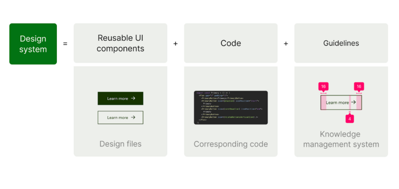
Everyone and their dog wants a design system. Designers love modularity; non-designers love structure and find the concept appealing. All in all, developing a design system seems like the ultimate solution to creating a set of building blocks for your website.
One of the biggest challenges of designing a platform that supports tens, hundreds or even a thousand websites is to create a design language that’s both coherent and flexible. Users should recognize the brand immediately when they arrive on your website, but also be able to see the role that different applications, sections, or websites play in their interactions with your organization.
Design systems help overcome this challenge by promising site owners flexibility and control over their content and strategy. At the same time, each component that’s placed on the website can be programmed to follow brand standards and accessibility guidelines. The dream is to balance customization and compliance.

My advice:
Truth is, you can build a good-looking website with or without a design system. The design system isn’t for the redesign! It’s for keeping everyone on-track after launch. Design systems are a tool to make sure you’ve covered all your bases in testing every possible combination of content and implementation of your design components. And that it’s going to scale up when you put those components into the hands of multiple people or teams in your organization. That’s why design systems are more valuable for large organizations that have multiple teams supporting the web presence, and multiple sub-organizations, brands, or branches represented on websites.
It’s a big investment to make upfront, and totally worth it if you can get enough people at your organization to invest in making it happen. Whereas if it’s just something the web team wants to “get” because they heard about it at a conference, it’s probably not going to work out.
Above all, don’t invest in a design system without investing in a governance plan that is going to make sure it’s well-implemented and maintained post-launch.
Read more about how big institutions can adopt design systems and how to do it right.
4. Flatten Everything
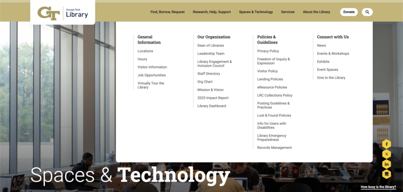
Let’s face it: massive mega menus frustrate users. There was a huge trend towards huge megamenus, and today people just want flatness. If it’s not in the top-level navigation, it feels like it doesn’t exist.
The problem with flatness is that your content has to go somewhere. You end up with websites that stuff so much content into a page that it seems to require endless scrolling. Otherwise, footer links galore, or orphaned pages that don’t seem to appear in a menu, which leave you clicking around in circles.

My advice:
Flatten the core offering of your website so that 80% of the user journeys you’re supporting can be completed within the visible menu link items.
Group content together to make it easy to find within a dedicated section of the website. This way, it doesn’t feel like you need to go down many levels to find something.
Make your website load fast so that users don’t feel penalized by additional clicks.
Figure out what is clogging up your main menu with so many links, and see if it’s possible to give selected users access to a secondary menu that fully serves these needs. For example, a university website might have a lot of useful links for current students; and these can live off to the side in a landing page designed especially for that audience.
Don’t solve your information architecture problems by hiding content within endless accordions. Accordions should feel predictable, not like an Easter egg hunt. And don’t rely 100% on search for people to find the orphaned content that doesn’t appear anywhere in your navigation. Define criteria for orphaned content that remains published on the website.
If any of these trends seem like a good fit for you, consider reading about it more in depth:
- The Revenge of the Homepage
- Digital Storytelling
- Leveraging Design Systems
- Flattening Your Navigation
The Big Takeaway
Don’t religiously apply new UX and content trends to your digital strategy without considering your goals and the actual objectives of your website. Be realistic about the maintenance of new content, systems, and navigation.
