On-Demand Webinar: Sign up to get our on-demand webinar delivered straight to your inbox and learn how flattening your navigation digital can play a roll in your UX and content strategy—plus three other major UX and content strategy trends: The Revenge of the Homepage, Leveraging Design Systems, and Digital Storytelling.
As UX designers strive to create clearer, more intuitive information architectures, the way we design website navigation has evolved. About 10-15 years ago, the rise of mega menus seemed like the answer. The thinking was simple: if content isn’t in your main navigation, users won’t be able to find it.
This led to sprawling, complex menus packed with content—so much that designers started using flashy dropdown designs and visual blocks to highlight key links. While mega menus can be effective for large sites with diverse audiences, they often overwhelm users instead of guiding them.
As users expect faster, more focused experiences—especially on mobile—website navigation has to evolve. The reverse trend—flattening your navigation—has emerged as a simpler, more effective approach. Flattening navigation means reducing the number of menu layers and categories to streamline the user journey. By reducing complexity and emphasizing key pathways, designers can create cleaner, faster, and more intuitive experiences. But flattening navigation presents its own challenges. If you remove too much structure, your content still needs a place to live. Without a clear strategy, this can lead to pages overloaded with content, endless scrolling, or orphaned pages that users struggle to find.
Practical Advice for Clearer Navigation
To strike the right balance, here’s what we recommend:
- Flatten your core offering: Ensure that 80% of the user journeys you’re supporting can be completed within visible menu link items.
- Group content strategically: Design dedicated sections that allow users to browse efficiently without needing to dig through endless drop-downs.
- Prioritize fast-loading pages: When users know they can quickly click through, they won’t feel frustrated by exploring deeper levels.
- Reduce clutter in your main navigation: If too many links are clogging up your menu, consider creating a secondary menu for select audiences. For example, a university website might place helpful links for current students in a dedicated landing page tailored to their needs.
- Avoid accordion overuse: Don’t hide critical content behind endless accordions. Accordions should feel predictable—not like an Easter egg hunt.
- Manage orphaned content: Establish clear criteria for content that doesn’t belong in the navigation but should remain accessible. Avoid relying solely on search to surface these pages.
What to Include (and Exclude) from Your Primary Navigation
- Include:
- The main actions users expect to take on your site.
- A clear link to contact you.
- Essential services and key content relevant to your organization’s goals.
- Exclude:
- Content users won’t actively search for in your menu (e.g., “user spotlights” or other complementary content).
- Links divided for administrative reasons rather than user experience.
- Items placed in the footer, which typically signals they are less important.
Testing Your Navigation
Flattening your navigation shouldn’t be guesswork. Tree testing is a valuable method to:
- Evaluate the clarity of your new sitemap.
- Measure how quickly and directly users find key content.
- Identify confusing labels or miscategorized items.
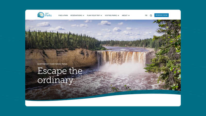
For example, in one project discussed in the presentation, a website improved its navigation success rate to 85% by testing and refining categories and labels. Even a simple change, like renaming a menu item, can significantly improve usability.
Practical Considerations
- Navigation Changes Are Relatively Cheap: Unlike large-scale redesigns, reorganizing your menu is often a straightforward and cost-effective improvement.
- Don’t Overdo It: Flattening doesn’t mean eliminating all depth—it’s about striking the right balance between simplicity and information availability.
Final Thoughts
When designing your website’s navigation, the goal isn’t simply to flatten the menu or build an elaborate mega menu—it’s to create a structure that aligns with what users need most. The links in your primary navigation should correspond to the information you want to emphasize, giving users quick and intuitive access to key content.
Effective navigation is predictable and familiar. Whether you choose to simplify your menu or leverage a more complex structure, the focus should always be on providing users with clear pathways to the information they’re seeking. By thoughtfully prioritizing key actions and grouping related content, you can create a navigation system that’s both efficient and user-friendly.
