Updated January 31, 2024
Did you know that outdated websites are more likely to be abandoned? In fact, 42% of people will leave a website because of poor functionality, and 38% will leave if the content or layout is unattractive. Websites must incorporate new design trends and technologies to stay competitive and meet user expectations.
So how do you know when your platform has passed its best-before date? This article explores 10 signs your website is outdated and needs web design services. We’ve explained the risks of letting your site get old, along with recommendations for fixing common issues.
Let’s dive in!
1) Your Users Find It Hard to Navigate the Website
Your website should help visitors find the information they need as quickly and easily as possible. Analytics or a website audit can help you see if your users are getting lost or giving up. If this is the case, your site probably needs a redesign or at least a sitemap refresh.
Some common navigation problems that can occur include:
- A cluttered layout
- Too many menu options
- A website structure that reflects your institutional structure instead of how users look for content
- Poorly labeled links
- Overly technical terminology and acronyms
- Dead ends
To make it more concrete, here's an example: let's say you're a university, and potential students come to your website to learn more about a specific program. If they are overwhelmed by the number of options presented to them in the main menu, they might not be able to find your "Programs" page, hidden in the second level under a page called "Registrar". In a worst case scenario, this experience might dissuade them from applying.
How Do I Solve This Issue?
There are a few things you can do to make it easier for your users to navigate your website:
- Simplify the layout. Remove any clutter from pages and make sure that the most important information is prioritized.
- Clean up your menus. Reorganize your navigation to better reflect how visitors use your website. Make sure that popular pages are easy to find in the main menu.
- Organize content with taxonomy. Got a lot of content? Use taxonomy terms to link pieces of content together under categories. This means you don’t have to put everything in your main navigation, but it’ll be easier for users to search your content.
- Use clear labels. Make sure users know what they’re getting when they click on a link. Avoid using ambiguous terms, acronyms, jargon, and “click here”.
- Ensure menus are responsive. Your website navigation needs to be easy to operate on mobile devices.
Learn more about information architecture mistakes that frustrate users, including messy taxonomy and poor content governance.
2) Your Website is Content-Heavy and Hard to Understand
Here are some ways to make your website content lighter and easier to understand:
- They're not sure if they're in the right place
- It looks like too much work to understand
- They can find an easier experience elsewhere
How Do I Solve This Issue?
There are a few things you can do to make your website less content-heavy and easier to understand:
- Break up content. Split your content into shorter sentences, paragraphs, and sections. User lists and clear headings to make content easier to scan.
- Add visuals. Images help users take in information and they offer a welcome break from text.
- Pull out facts and figures. These create visual interest and help new users understand what you do at a glance.
- Quality over quantity. Focus on creating and refining a few key pieces of content instead of a lot of lengthy text to “convince” users.
3) Lack of Clear Calls to Action
A call to action (CTA) is anything that prompts the user to take a specific action. It could be a “register now” button or a “learn more” link for example. If your website isn't converting users, confusing or unclear CTAs could be the culprit.
Common problems include:
- Hidden CTAs. They’re tucked away where the user might miss them entirely.
- Unclear wording. The user doesn’t understand what will happen next if they click.
- Too many CTAs. Users might get confused if a page is packed with CTAs.
CTAs need to be clear, prominent, and engaging. Users need a clear path to doing what you want them to do, otherwise they’ll get distracted.
How Do I Solve This Issue?
Here are a few ways to improve calls to action on your website:
- Prioritize. Map out which of them are most relevant to each section or page.
- Be consistent. Ensure that CTAs are styled and positioned in the same way from page to page, so that users can easily recognize and find them.
- Nail the copy. Use concise, action-oriented language such as “Apply” instead of “Applications.”
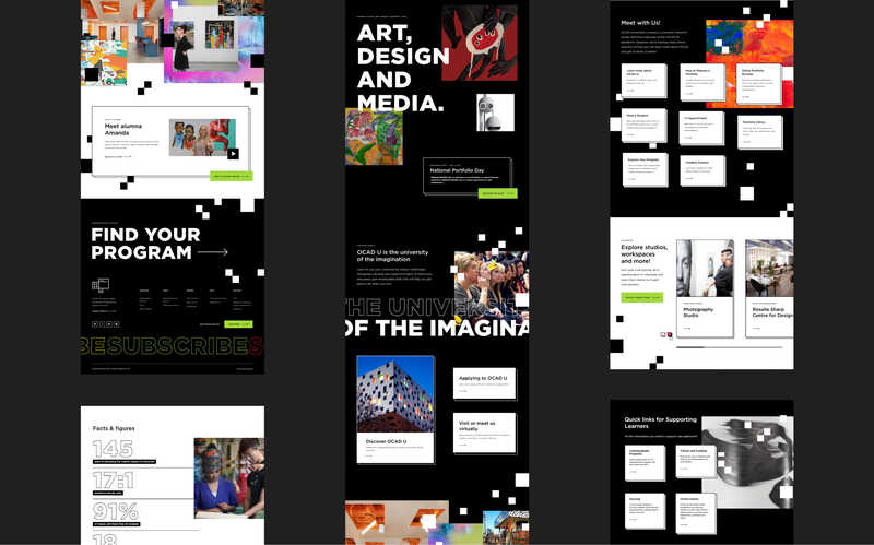
We helped OCAD U streamline its calls to action to create clearer user journeys on its new admissions website. Our strategy, design, and development work on this project helped the university to increase its number of applicants by 15% within a few weeks of launching.

4) You Have Outdated or Incorrect Content
Content is one of the most important aspects of a website. It can hurt your business if it misinforms or misleads users.
Common issues include:
- Incorrect information (e.g. a phone number that’s missing a digit)
- Low-quality content that doesn't follow brand or content guidelines
- Incorrect date or authorship
- Out-of-date statistics, addresses, or data
- Past events or publications that are no longer relevant
- Content feeds that are no longer updated (e.g. the last item was added a year ago)
- Lack of relevant metadata or tags
- Duplicate content
- Broken links
- Circular click paths (users end up back where they started when trying to do a task)
- Test content that someone forgot to remove from the website
How Do I Solve This Issue?
There are a few things you can do to improve your website content:
- Do a content audit. Identify content that needs to be updated, removed, merged, or improved to provide more value to your audience.
- Ask subject matter experts. Reach out to the relevant people to ensure that content is accurate, especially for technical or niche information. If you have a lot of content, prioritize pages that are accessed more often.
- Add an “Updated date.” This makes it clear if information has not been updated recently.
- Create a content governance plan. This lays out the purpose of specific content and who’s responsible for updating it. Make sure to use the right content governance model for your organization.
- Create a content calendar. This provides a clear schedule for updating static information and evergreen content, as well as for adding new dynamic content such as blog posts.
- Improve consistency. Consider creating a central source of truth for your content and brand assets with a Digital Asset Management (DAM) system.
5) The Search Results on Your Site Aren't Relevant
We expect search just to work, but in fact a lot of thought goes into ensuring that the right content is delivered to users. Outdated search functionality has a big impact on the user experience.
Common problems include:
- Poor prioritization – the most relevant content items don't show up at the top of the list.
- Incomplete search results – this might happen if some content isn’t indexed or hasn’t been associated with relevant tags or categories.
- Overlooking PDFs and metadata – the full-text search should look for the search terms in both of these.
How Do I Solve This Issue?
There are a few things you can do to improve the search results on your website:
- Test the search interface. Use realistic searches to see if the most important content shows up first.
- Review the tags and categories. Ensure that they’re complete and applied to all relevant content.
- Refresh the search index. This may need to be done regularly.
- Add summaries or key metadata. This helps users determine which search results are relevant to them.
- Boost selected fields. You may be able to configure your search engine to prioritize content based on search terms appearing in specific fields.
- Use a faceted search interface. This helps you avoid empty search results if a user's criteria are too specific.
Learn more about designing a site search experience that users love.
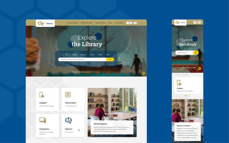
Looking for inspiration? Check out our collaboration with the Georgia Tech Library. We overhauled their website’s search functionality to accommodate the library’s expanding range of public classes, lectures and workshops. We added a bento box-style search mechanism that subdivides search results into groups according to the type of media and related tools and services.

6) Your Website Page Load Times Are Too Slow
The longer it takes for a website page to load, the more likely people are to leave. A site that loads in 1 second has a conversion rate 3x higher than a site that loads in 5 seconds.
Common problems with slow page load times include:
- iframe or embedded content – which load content from another website
- Controls triggering extra load – such as pagination and search filters
- Large media – such as images and videos that haven’t been optimized for the web and mobile
- Long pages – especially if they contain a lot of media
- Outdated content management system (CMS) – older versions don’t allow you to benefit from modern techniques for improving performance
- Heavy traffic – your hosting service may be insufficient or unable to handle spikes in traffic
How Do I Solve This Issue?
There are a few things you can do to improve the page load times on your website:
- Optimize images. Make sure to prepare images for the web so they don't slow down the load time.
- Use a content delivery network (CDN). A CDN will help to deliver your website content more quickly, by caching it closer to the user.
- Minimize HTTP requests. Reducing the number of HTTP requests that are being made will help page load faster.
- Upgrade your hosting. We often recommend Pantheon and Acquia to our clients for secure, high performance hosting services.
- Upgrade your CMS. Drupal 10 offers improved caching, lazy loading, and JS minification to give you a speedier site.
- Consider decoupled architecture. This can let you use modern frameworks like Vue or React on the front-end to optimize speed. Hybrid and fully decoupled architecture are particularly suitable for sites that get peaks in traffic, like e-commerce sites and news outlets.
7) You Need Developer Help Anytime You Want to Make a Change
One big advantage of having a CMS-based website is the ability to quickly and easily update content yourself—even if you’re not technical. But as your company grows, additional demands are put on the website. This can create content and design challenges that are too difficult to address by yourself.
Common problems include:
- Bigger costs and wait times. Relying on developers to make changes can slow things down and get expensive. Bottlenecks occur more easily when resources are stretched.
- Extra pressure on developers. Dealing with every little update needed on an outdated website pulls developers away from working on new features or security.
- Neglected content. Content is more likely to get out-of-date when making changes becomes difficult.
- Editing errors. If your website’s admin interface is messy and out-of-date, content editors will have a harder time doing their job and may make more mistakes.
- Inconsistencies occur. If you’re always relying on developers, it's a signal that HTML is hand-coded. This is less efficient and can lead to inconsistency in the visual design.
How Do I Solve This Issue?
Here are some ways to make it easier to update your website:
- Upgrade your CMS. A modern CMS makes it simple to create and change content. Drupal 10 features an intuitive admin interface (Claro), a powerful WYSIWYG editor (CKEditor 5), and the Layout Builder module with drag-and-drop tools for building custom layouts.
- Use a front-end development framework. You can improve content consistency by using a framework like Bootstrap, and combining it with a component-based approach to design.
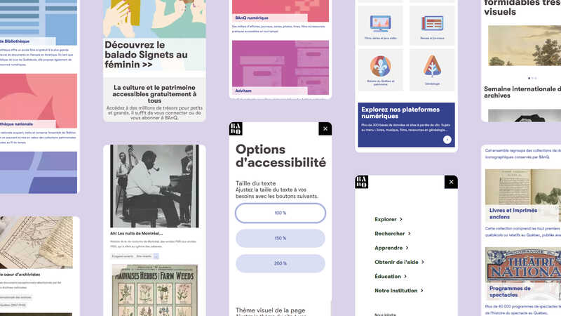
Here’s a great example: we customized 14 content types and 17 components in Layout Builder for Bibliothèque et Archives nationales du Québec (BAnQ). Their staff are now able to create dynamic content quickly and easily as a result.

8) You Have Too Many PDFs or Content That's Not Accessible
Outdated websites often suffer from content that doesn't meet web accessibility standards. Your organization may exclude users, limit its reach, damage its reputation, and be fined for not complying with relevant accessibility laws as a result.
Common accessibility issues include:
- Inaccessible PDFs – they don't use a template, semantic headings and links, or the tags needed for screen readers to interpret them. Often, content editors lack the skills or software needed to make PDFs accessible.
- Hand-written HTML – if content editors write HTML by hand and don't use semantic markup, this can lead to accessibility issues.
How Do I Solve This Issue?
Here are some ways to improve web accessibility:
- Use web content instead of PDFs when possible, such as for general information and forms.
- Comply with WCAG (Web Content Accessibility Guidelines) to make your content accessible to as many people as possible.
- Create accessible PDFs from a well-structured template and render them with a tool like Adobe Acrobat. Don’t use “print to PDF”.
- Use a content compliance tool like Siteimprove to test content accessibility and PDF accessibility.
Want to learn more? Download our free Drupal accessibility guide for 18+ practical tips or explore our web accessibility training.
9) Your Website Design Doesn't Allow You to Implement SEO Best Practices
SEO (search engine optimization) is the process of helping your website appear higher in search engine results pages. The higher it is, the more likely people are to find and visit your website. An outdated website may not use SEO best practices, making it difficult for your content to be found.
Common problems include:
- Using the wrong metatags – there may be a disconnect between the content on the page and the metatags that appear in search results.
- Non-indexed pages – if pages aren’t indexed by search engines because of an error or block, they won’t appear in search results at all.
How Do I Solve This Issue?
Here’s how to implement SEO best practices on your website
- Use the right keywords, titles, and descriptions. Tools like Moz or Ahrefs can help you conduct keyword research to understand what your target audience is looking for.
- Use semantic markup and logical defaults for metatags.
- Implement a readable URL architecture.
- Set up redirects for content that has been removed or when you change a URL.
- Add an XML sitemap to help search engines find and crawl your content properly.
- Make your site mobile-friendly so search engines are more likely to prioritize it.
- Use a content compliance monitoring tool like Siteimprove to create a review process for improving SEO.
- Implement analytics. Create event tracking to identify and leverage the content that’s most successful at attracting and converting users.
10) Website is Not Optimized for Mobile Devices
Most websites are responsive these days, yet the mobile experience is often under-optimized and can feel like an afterthought. These sites are missing big opportunities as mobile devices generate more than half of global web traffic.
Common problems with websites that aren’t optimized for mobile include:
- Poor navigation. Menus need to be designed to work well on mobile devices.
- Poor performance. Long pages, full-sized images, and auto-play videos make the loading time unnecessarily slow on mobile.
- Unoptimized content. Content in tables and PDFs are harder to read on mobile. Decorative elements add too much clutter on a small screen. Interactive features like maps or forms need to be tested on mobile devices.
How Do I Solve This Issue?
Here’s how to optimize your website for mobile devices
- Take a mobile-first approach to design, especially if users are primarily accessing your website on mobile.
- Convert PDFs to web content as much as possible, or provide summaries of PDFs as text.
- Use a testing platform to expand the number of devices and browsers you can test on, and ensure any interactive features are tested on mobile
- Identify elements to remove from the mobile experience such as decoration and large images .
- Consider mobile when designing menus and other navigation features. Test that controls are large enough and follow user expectations and standard practice.
- Use a CMS that’s mobile-friendly, even in the back-end as content editors often want to make changes on the go. There’s a big selection of modules and themes for creating mobile experiences on Drupal websites.
- Add a mobile preview option to the admin interface of your CMS to help content editors optimize pages for mobile devices.
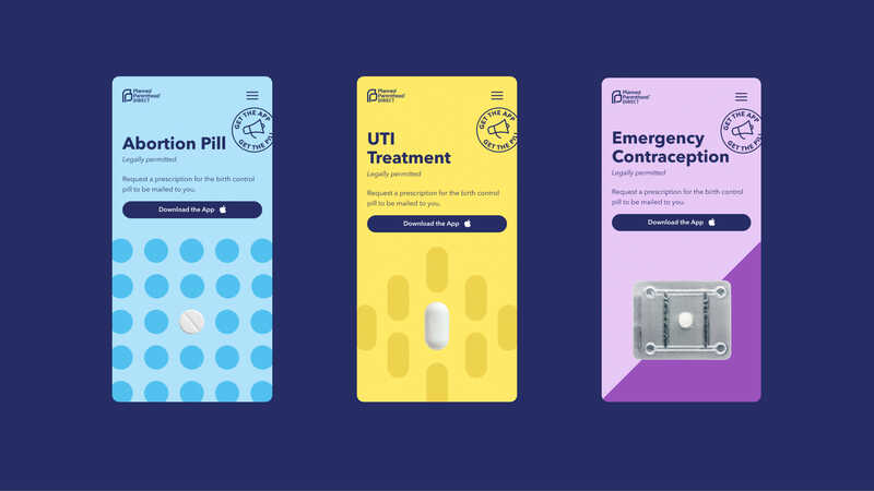
We worked closely with Planned Parenthood Direct to create a mobile-first site on Drupal 10. The website provides essential information about reproductive and sexual health care for users on-the-go. We prioritized mobile designs and layouts, and then adapted them to desktop.

Next Steps: Planning Your Website’s Future
User expectations are continually evolving, so your website should too. Your organization is bound to see a return on investment from good UX design. But keeping an outdated website will have a negative impact on your traffic, conversions, digital presence, and brand reputation.
If you recognize any of the signs that your website is outdated, it’s time to start planning your website’s future—whether that means a complete redesign or some simpler website improvements.

