
Still using an old version of Drupal? We’re confident you’ll want to update after seeing Claro, the new default admin theme in Drupal core.
Claro replaces Seven, which has only had minor updates since being designed in 2009. The new theme is a breath of fresh air for content editors, site builders, and anyone else spending time in the Drupal admin UI.
True to its name–Spanish word for ‘clear’–Claro is clutter-free and simple to navigate. It’s less intimidating to learn, more accessible for users with disabilities, and easier to use on mobile.
Claro was built using feedback from an admin UX study. As part of the Drupal Admin UI & Javascript Modernisation Initiative, it aims to:
-
Create a more approachable experience for site builders and content authors
-
Comply with best practices and accessibility standards
-
Embrace workflows, tools, and practices that are familiar to JavaScript developers
Claro was initially introduced as an experimental version in Drupal 8.8, became stable in April 2022, and is now the default admin UI in Drupal 10.
Below are some of the features we’re most excited about!
Improved Readability
Claro uses a base font-size of 16px to make text easier to read. Its modular scale for typography helps to create a clear and consistent visual hierarchy.
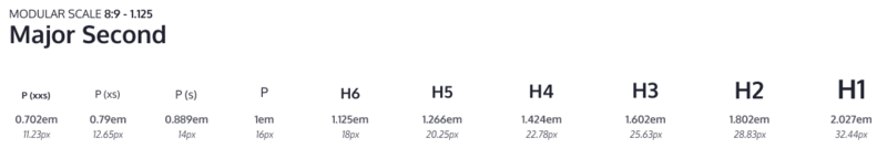
Claro’s modular scale for typography ensures consistent readability. Credit: Drupal.
Claro’s style guide is designed to use system fonts. This means improved performance and support for various writing systems. It creates a better experience for admins who want to use Drupal 10 in the typography or language they’re most comfortable with.

An example of the Claro UI with text in Devanagari rendered using system fonts on macOS. Credit: Drupal.
A Modern, Accessible Colour Palette
Claro has a light colour palette that’s easy on the eye. It includes both neutral and vivid hues, which can be paired together for high contrast. This helps important elements such as buttons to stand out.
Claro also provides out-of-the-box support for the Windows high-contrast mode: an assistive technology designed to help users with visual impairments.
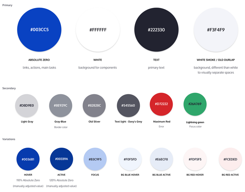
A clean colour palette is an important ingredient in Claro’s simple, accessible design. Credit: Drupal.
A high-contrast palette allows important elements to stand out in the Drupal 10 admin UI. Credit: Drupal.
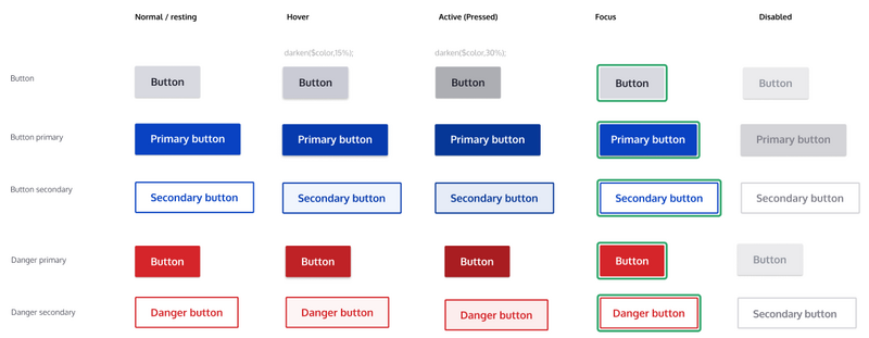
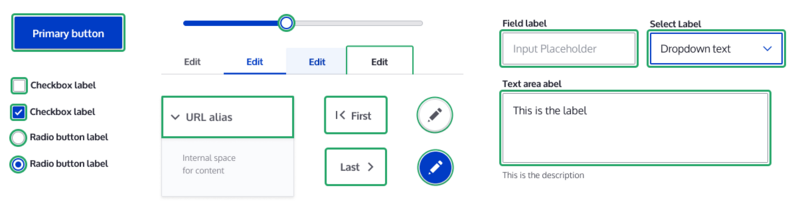
Buttons and Dropdowns
Buttons and dropdowns have been redesigned to make it more obvious that users can click or interact with them. There are various size variations for use in reduced spaces such as tables.
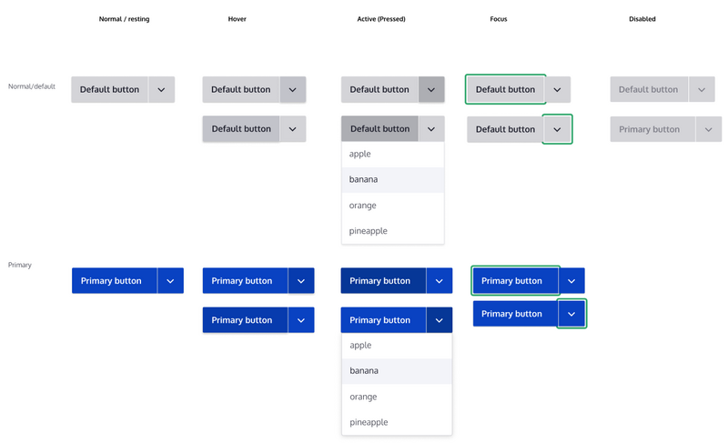
Claro offers a range of improved button and dropdown styles. Credit: Drupal.
Consistent Focus Styles
Claro maintains the same style for focus states across its components. This is an important improvement for usability and accessibility.
Focus styles are consistent throughout the Claro theme. Credit: Drupal.
Minimalist Iconography
Claro’s creators have worked hard to cut down visual clutter. The outlined icons you would have seen in Seven have been simplified in Claro for a clean, minimalist look.

Minimalist icons create a modern look in the Drupal 10 admin UI. Credit: Drupal.
Spacious Design
Claro’s generous use of white space allows for fewer distractions and easier navigation.
Paddings, margins, typography, and icons have been tied to the same modular scale. This helps preserve proportions and a consistent visual hierarchy.
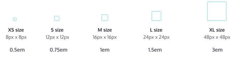
Claro uses a modular scale for sizes. Credit: Drupal.
Claro uses plenty of white space to give content room to breathe. Credit: Drupal.
Physical attributes – such as depth and shadow – have been applied to spaces and elements to make them easier to perceive.
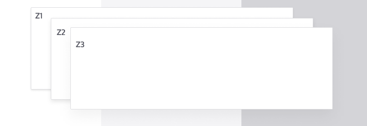
Depth and shadow are applied to create an environment that’s more familiar to the eye. Credit: Drupal.
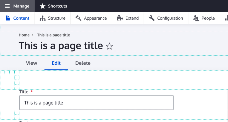
Easier Navigation
Claro has a simplified navigation to help you do your job faster. It reuses existing styles from other components for a consistent user experience.
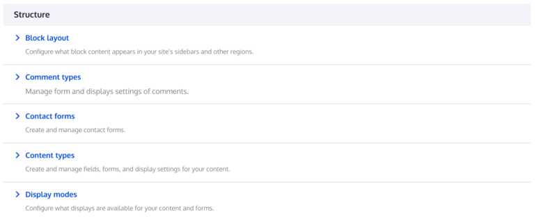
The default UI in Drupal 10 is quick and easy to navigate. Credit: Drupal.
PostCSS Implementation
Claro’s creators chose to implement PostCSS instead of Sass to make life easier for web managers and front-end developers. PostCSS provides features such as cross-browser support for CSS variables.
Developers can use the Claro Distribution for theme development. It includes a dashboard with a variety of markup generator modules for theme components, along with tests.
What About End User-Facing Themes?
Olivero has replaced Bartik as the new default in Drupal 10. Just like Claro, it delivered a far more user-friendly and accessible experience. Learn more about Olivero and its namesake.
More Drupal 10 Improvements For Content Editors
It’s easier than ever for non-technical users to edit content in Drupal 10 thanks to CKEditor 5, the new default WYSIWYG editor. Learn more about the benefits of CKEditor 5.
Planning to migrate to Drupal 10?
Explore other relevant resources from Evolving Web:
📚 Reasons to migrate to Drupal 10
📚 Drupal 7 to Drupal 10 migration guide
📚 Recommended actions for Drupal 7's end of life
🧑🏫 Custom training to empower your team
Evolving Web is a Drupal Certified D7 EOL Migration Partner. We've been supporting organizations through complex migrations since 2007. Partner with us for your move to Drupal 10 and let us do the heavy lifting.
