Overview
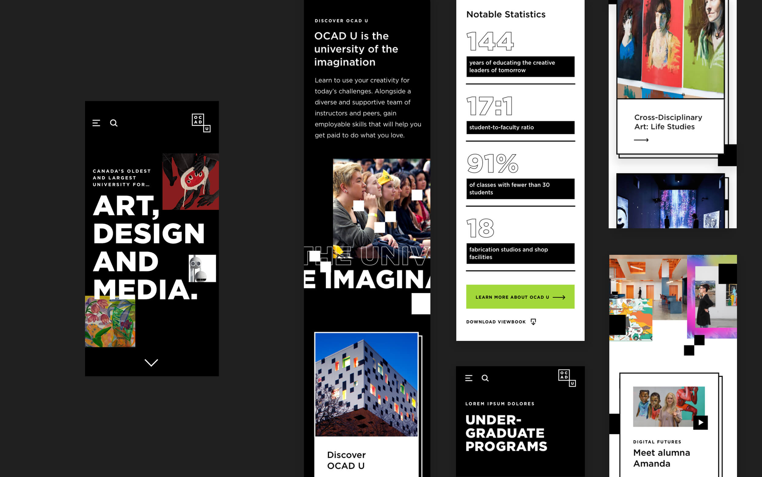
Evolving Web partnered with OCAD University to design and develop a dedicated Undergraduate Admissions website. Subsequently, we built a Graduate Admissions website using the same design and similar architecture. The result is two Drupal-based websites, which are more intuitive, accessible, and visually appealing to prospective students. Each site features a bold new artistic direction and provides a streamlined user experience with clear pathways to researching and applying to the program of their choice.
Services: Digital Strategy, Web Design, Web Development, Content Strategy
About the client
OCAD University is Canada’s largest art, design, and digital media university and the third-largest of its kind in North America. It is dedicated to art and design education, practice, research, knowledge, and invention across various disciplines.
OCAD U has 4,500 students— including over 1,200 international students —in 17 undergraduate and seven graduate programs.
Goals
OCAD U’s primary goal was to make it easier for users to understand and follow the admissions process and, by doing so, increase the number of applicants. Our mandate was to transform the recruitment sections of their website into microsites to help students envision themselves discovering, applying, affording and attending the school after exploring OCAD U’s programs.
These websites were intended to be visually compelling, inclusive presences for the prospective student journey starting at the point of inquiry through to application and enrollment, while being dynamic, responsive, coherent, assistive, and engaging web-based experiences.
Challenges
As a leading art and design school, OCAD U is eager to push the boundaries and follow a visual direction that unmistakably stands out and reflects its reputation. OCAD U recruits potential students interested in creative disciplines, an audience with a refined sensibility for all things art and design. This added the challenge of creating a visual language that makes a strong impact and lives up to the expectations of both the school and its discerning users.
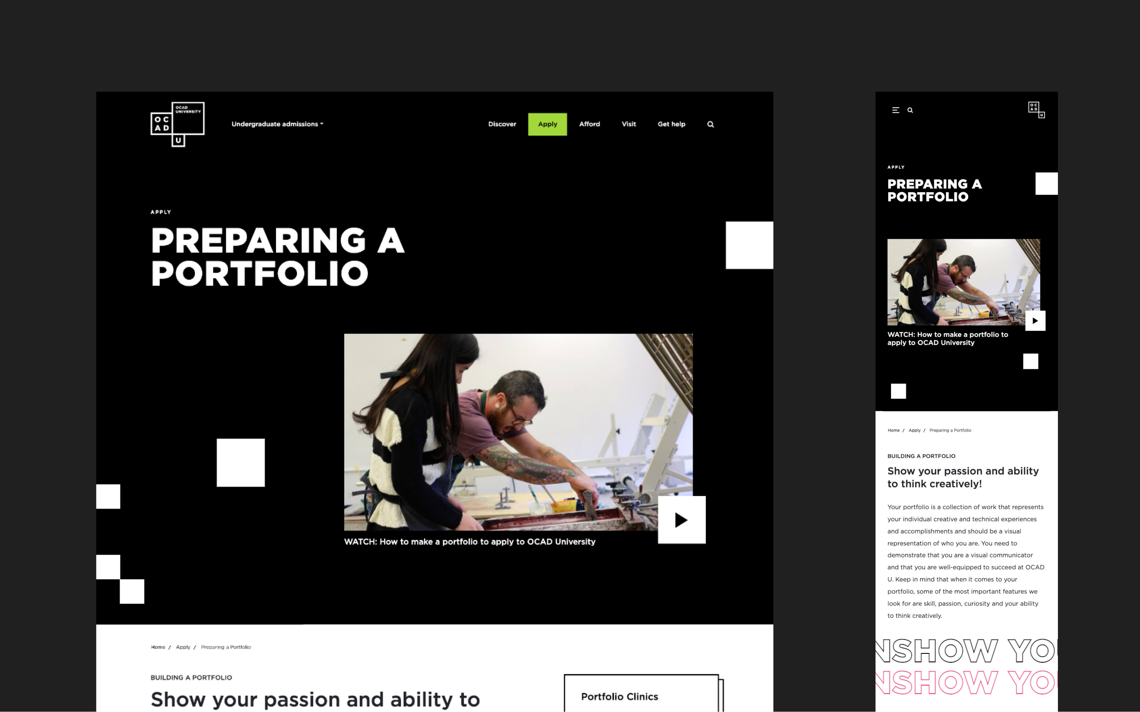
For undergraduate applicants, the portfolio submission is a unique, essential aspect of the University’s admissions process that required special attention to serve users with the best possible explanation.
For potential graduate students, research and connections to industry and their leaders needed to be highlighted as they are factors that can influence their program work and future careers.
Solutions
To help OCAD U achieve their goals, we took a user-first approach from the outset. We started by looking at the website’s audiences to best understand their priorities. Then, we developed a design and UX strategy that could drive engagement and guide users through the admissions process. Finally, we developed the new Drupal-based websites and gave the OCAD U admissions teams the tools to showcase the University’s diverse programs.
Our work included:
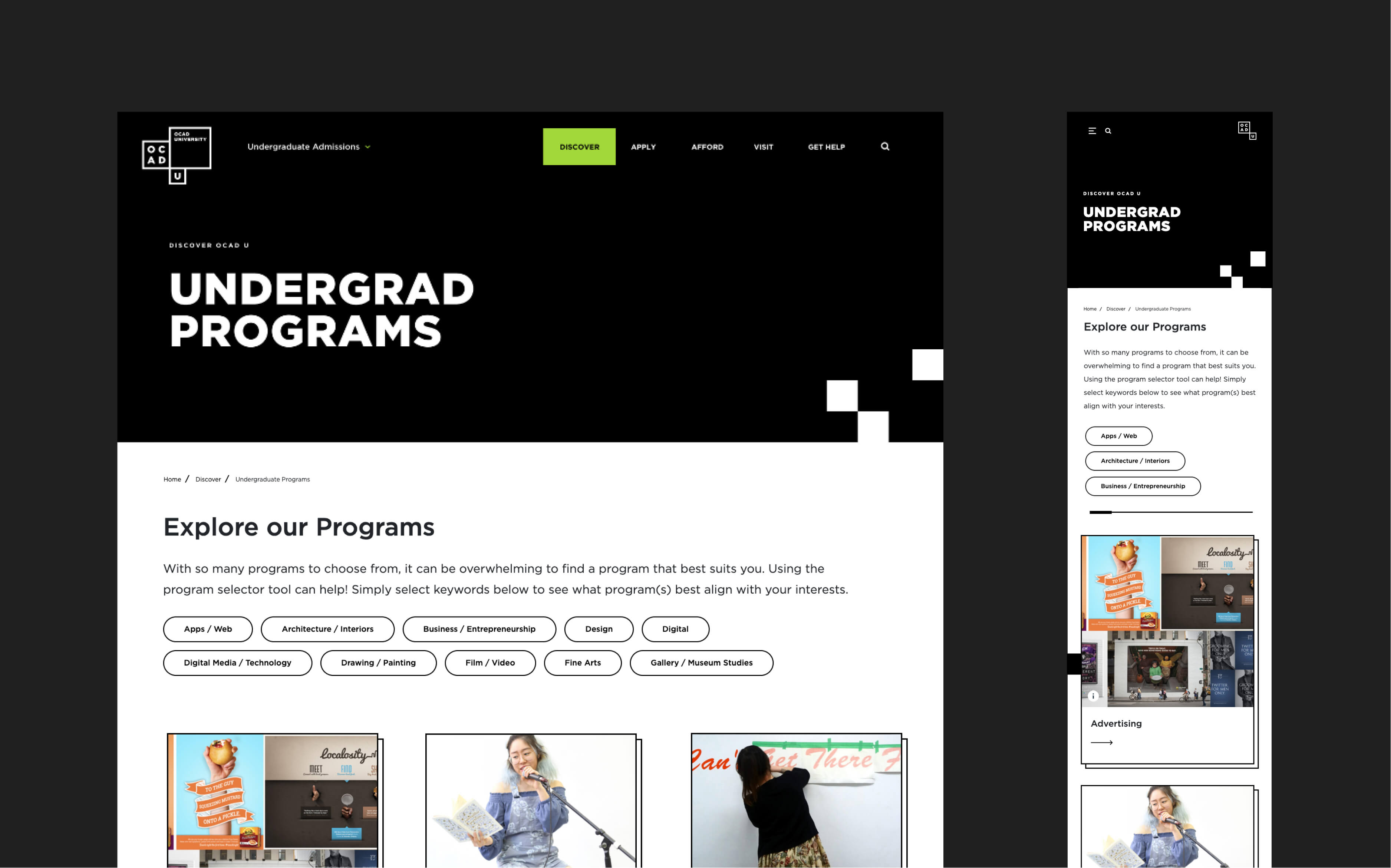
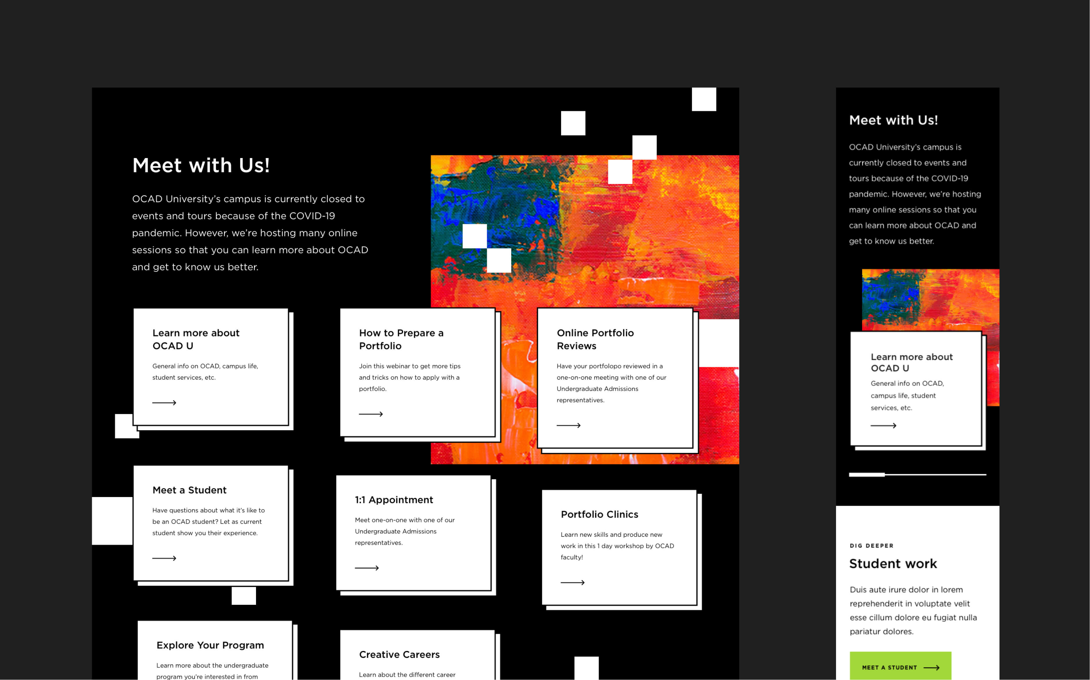
- Designing clearly organized program pages to help students differentiate which is the best fit for them
- Creating highly visible calls to action
- Streamlining the portfolio preparation process for undergraduate students
- Creating relevant, "at-a-glance" content, highlighting application deadlines and details on the entry requirements
- Configuring Drupal so that staff have full access to content editing through drag-and-drop functionality, including easy-to-use page-building tools
- Allowing students to explore programs through a dynamic Programs selector
- Integrating forms for prospective students to express interest and interact with the University via the Slate CRM
- Ensuring compliance with AODA accessibility standards
- Deploying the website to the University’s Pantheon hosting environment
Design
Our artistic direction for OCAD U focused on student achievement, appealing to potential students and standing out from other art and design schools.
The results of our design work include:
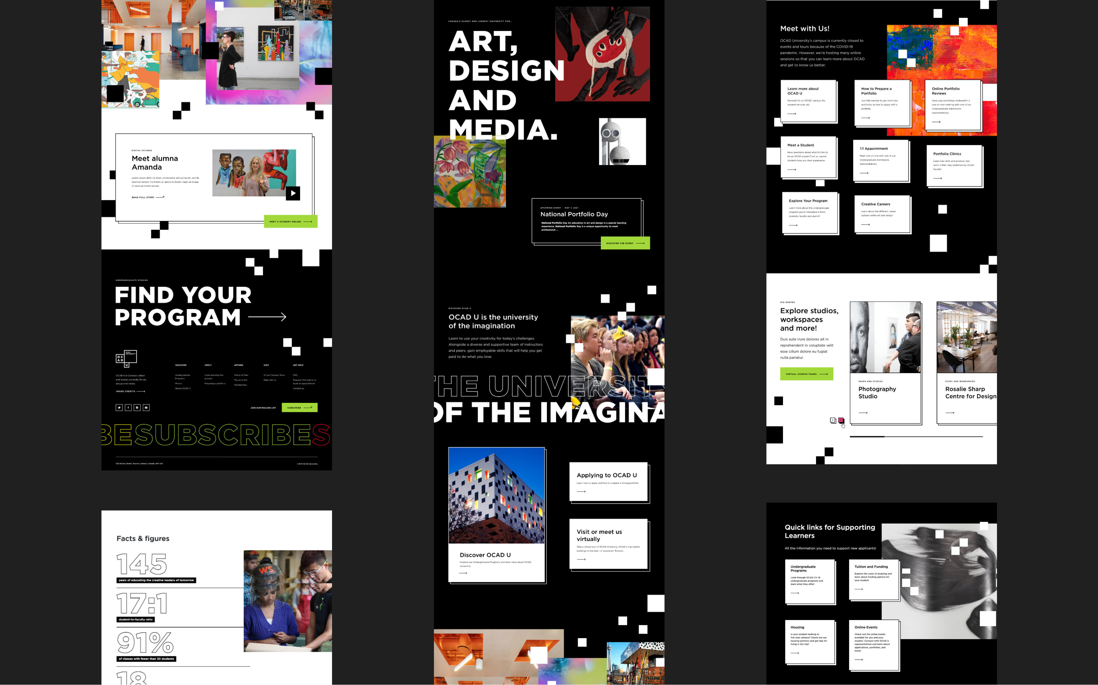
- A creative direction concept called “Windows into OCAD” based on the idea that OCAD U provides each student with windows into different creative possibilities as they develop their identity
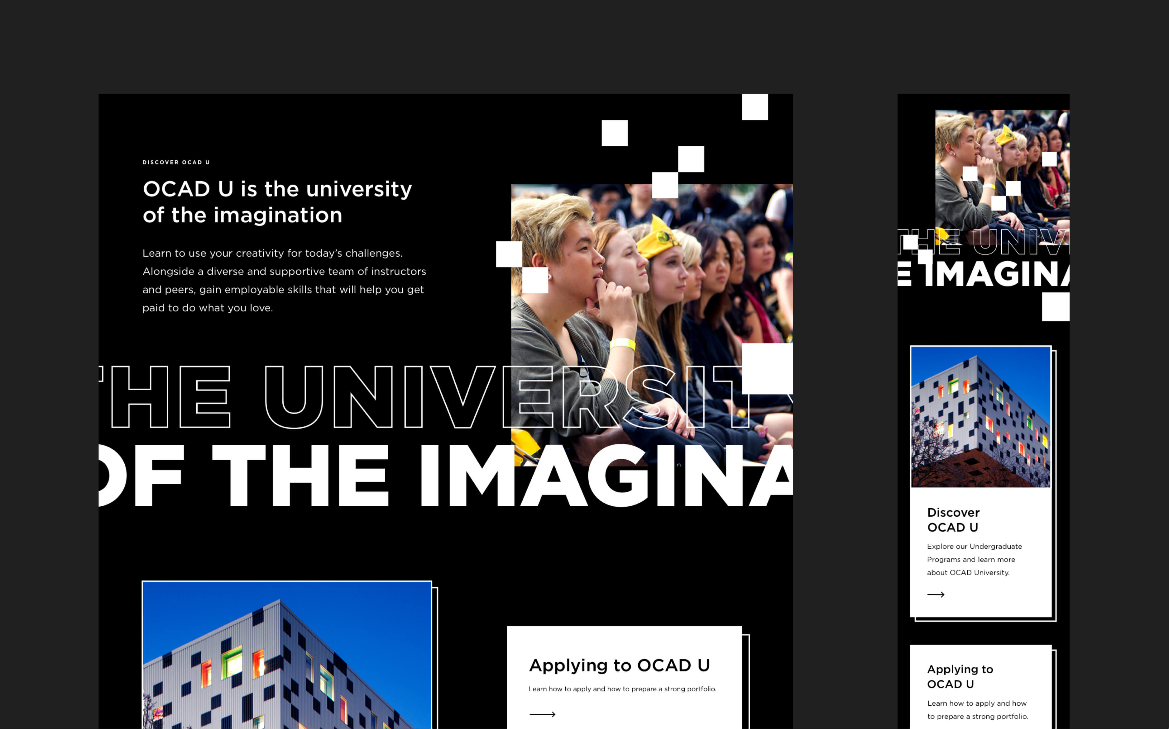
- Imagery that reflects the student experience and conveys inspiration, excitement, prestige, and professionalism
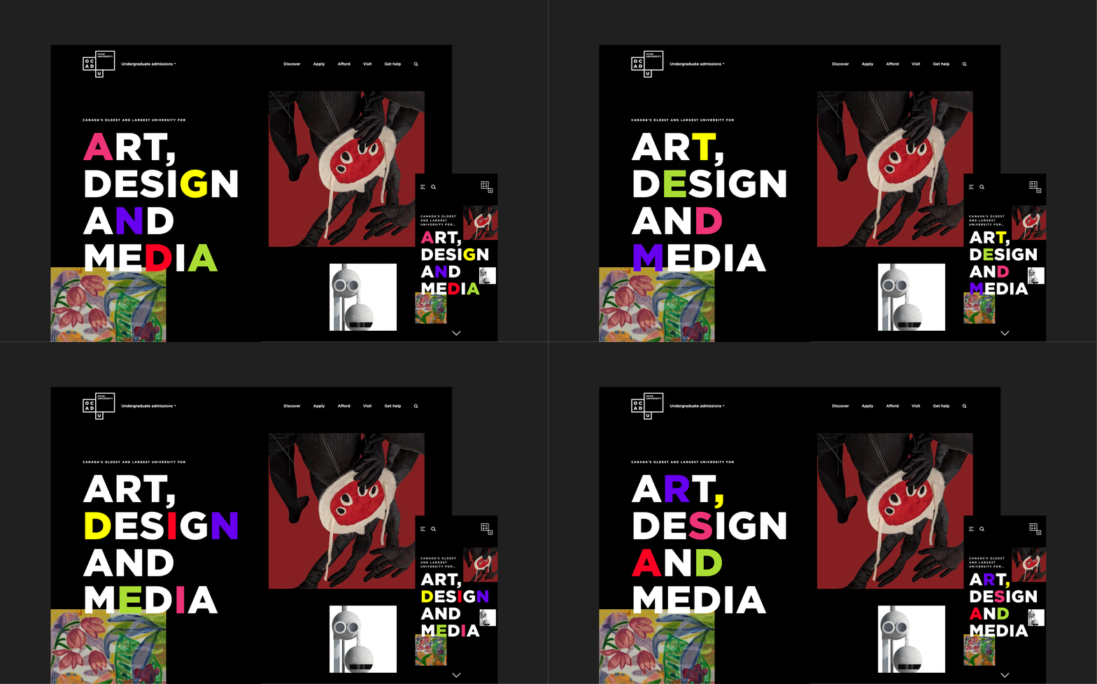
- Prominent use of black & white (OCAD U's primary brand colours), with secondary colours highlighting calls to action in green and hover states in pink
- The use of squares and sharp edges relates to both the main campus building and the OCAD U logo
- Visually striking transitions and animations attract users and create a solid first impression
Results
The new websites provide OCAD U with a streamlined and thoughtful user experience with a bold artistic direction. The new websites feature:
- 21% increase in website visits, 15% increase in applicants,
- A strong UX, with simplified navigation that leads users to helpful information quickly while making content easily accessible Eye-catching calls to action that stand out on the page.
- A bold, less text-dependent design that lets users scroll and explore as they are guided by impactful typography and interactive features conveying creativity and imagination.
- A dedicated portfolio preparation page for undergraduate applicants that makes them more confident in submitting their portfolios by clearly explaining the process.
- An intuitive, flexible homepage that can be easily adapted to the admissions cycle, highlighting the most critical steps in the application process.
