Our digital agency recently launched a company-wide ideathon called Evolve Us. Six multidisciplinary teams collaborated to ideate, research, prototype, and pitch innovative solutions. The aim? To enhance our working practices here at Evolving Web.
We’re giving you a look inside the pitches in this seven-part blog series! Use it to gain inspiration for running your own ideathon or improving your processes and projects. You’ll also get insight into what it’s like to work with our team—either as our client or as one of us.
In this article, I’ll walk you through the solution that I pitched with my Evolve Us team. I’m really excited about its potential to boost collaboration, creativity, and project value. Read on to learn how we’re planning to revolutionize the way we work with components.
The Goal: Standardization that Makes Space for Innovation
Imagine reinventing the wheel every time you build a car. It would take forever! That's why tires are standardized, saving time and resources. Similarly, when we’re creating digital platforms we can't afford to start from scratch each time. Clients increasingly expect more affordable solutions and shorter turnarounds. So we need efficient ways to deliver better value, faster.
Standardized tools and processes allow us to speed up repetitive tasks. This frees up time and resources so we can focus on creating more innovative, customized, and complex solutions.
We already have two ways of doing this:
- DESK (Drupal Environment Starter Kit). This tool allows our developers to hit the ground running with pre-installed contrib modules, configuration, and UI patterns. It guarantees every developer will use the same process to set up their local environment. This saves time, improves consistency, reduces errors, and helps developers switch between projects quickly.
- Design Starter Kit. Housed in Figma, this is a library of design components that are ready to use in wireframes and designs. It includes:
- Atoms – e.g. logos, colours, typography, icons, buttons
- Molecules – e.g. forms, tables, navigation, cards, accordions
- Organisms – e.g. hero banners, card carousels
However, there’s a challenge. One of the Evolve Us teams identified a disconnect between DESK and the Design Starter Kit. This was costing us time and hindering collaboration. So the team decided to explore the problem and pitch a solution. Keep reading to see what they came up with!
Working on internal processes is always interesting to me. Auditing, standardizing, refining, and continuously improving are all great aspects of the lean six sigma approach.
— Charlie Canlas, Senior Project Manager, Evolving Web
The Problem: Siloed Systems
Our Evolve Us team took a closer look at what was causing the disconnect and found two clear reasons:
- Inconsistent naming conventions. DESK and the Design Starter Kit often don’t have matching names for templates, user stories, and components. This makes it harder for designers, developers, QA testers, and other team members to communicate effectively. If developers can’t find a component by the name provided in the design, they may end up creating a new one.
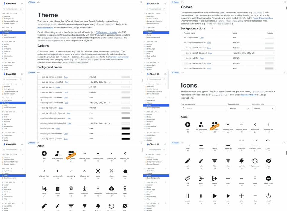
- Lack of visibility. Designers and non-technical staff can’t easily see which components actually exist in DESK. This is because DESK only contains initial Drupal configurations and a project template—meaning there’s no way to see it in action unless you create a new project from it. So it’s hard for designers to know whether adding a certain component will result in custom development.

The Solution: Storybook Integration
The team recognized the need for a clear, shared understanding of available components and a consistent way of identifying them. Their recommendation? A comprehensive component library in Storybook that’s visible to everyone.
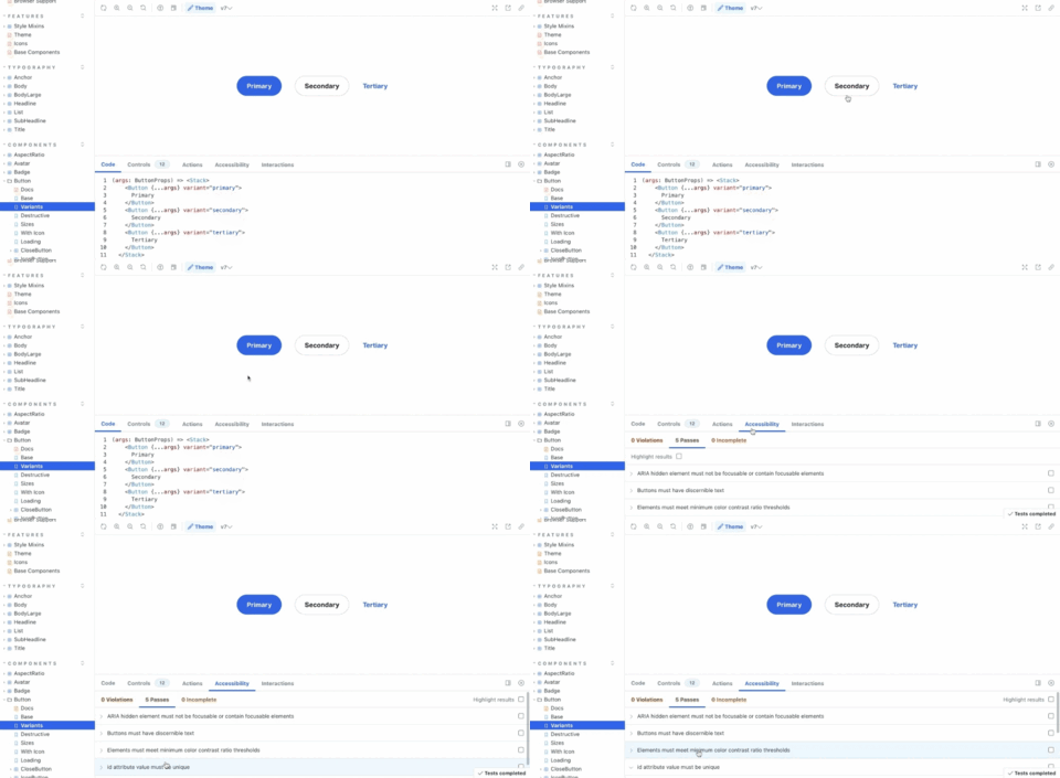
Storybook is a platform that hosts design systems, standards, style guides, and components. It offers multiple advantages:
- Visibility and clarity. Storybook provides a visual platform for designers and non-technical team members to understand the components available in DESK. This will reduce uncertainty and unnecessary custom development.
- Consistency. Naming conventions within Storybook improve communication, fostering a more efficient collaboration between team members.
- Creativity. Storybook allows us to reference a wide array of components. We can use these to inspire and expand our own library. We can see what leading firms like IBM and Airbnb are doing and adapt their practices.
- Efficiency. Storybook aligns with atomic design principles, allowing us to organize components flexibly and effectively. This provides a solid project foundation and streamlines design efforts.
- Seamless integration with Figma. This makes it easier to compare designs and components, ensuring a smooth design-to-development transition.

Integrating Storybook into our workflow will bridge the gap between design and development, while also boosting our creativity and efficiency. Ultimately, it should help us provide more value to our clients in less time and with fewer resources.
Stay tuned as we continue to publish deep-dives into the Evolve Us pitches and reveal who won! Sign up for our newsletter to have them sent straight to your inbox, along with loads more valuable content.
Immerse Yourself in Design & UX at EvolveDrupal
EvolveDrupal is a lively summit that brings together hundreds of diverse professionals to learn, connect, and inspire. It includes an EvolveUX+ Track that’s perfect for designers, strategists, product specialists, and other creatives! Learn more and find an upcoming EvolveDrupal summit.
Explore Careers at Evolving Web
Could you evolve us and your career at Evolving Web? We’re often on the lookout for talented, innovative, enthusiastic professionals to join our team. Learn more about working at Evolving Web.

