Overview
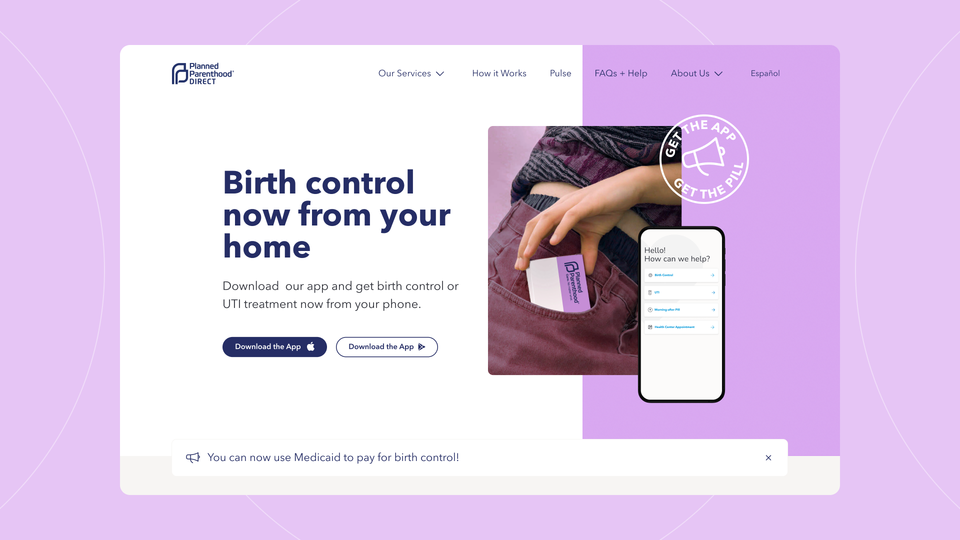
Evolving Web worked closely with Planned Parenthood Direct (PPD) to create a mobile-first Drupal website that guides users to download an app that connects them to reproductive healthcare on the go. We designed the website for young adults and it is personalized so that users see which reproductive health services are offered in each state across the US in a clear, visual way.
Security was an important consideration, as the current political climate around reproductive rights and family planning puts PPD at greater risk of cyber attacks. To address this, we created a decoupled architecture using the Next.js framework for the front-end and hosted the website with our trusted partner Pantheon. The new website provides a welcoming, informative experience that is instrumental in supporting reproductive rights and ensuring access to reproductive and sexual healthcare.
About the Client
Planned Parenthood Direct, a 501(c)3 non-profit ancillary of Planned Parenthood Federation of America, offers reproductive and sexual health care on the go. Services vary by state and include birth control, urinary tract infection treatment, emergency contraception, and the abortion pill. With a mission of providing Trusted Planned Parenthood Care from Anywhere, PPDirect works to create and foster connections between patients and clinicians both virtually and within Planned Parenthood’s network of health centres.
Goals
The main objective of the project was to build a captivating yet approachable website to compel people to download the Planned Parenthood Direct app. A secondary objective was to create a new visual brand identity for Planned Parenthood Direct that resonates with the younger audience and while still staying true to the Planned Parenthood brand.
Challenges
Different states have different services and users need to be able to easily see exactly which services are available in their state. It also needs to be easy for the client to modify the services available within each state since these can change.
Security was an important consideration since the client’s work has become very politicized due to the current political climate in relation to abortion and family planning and they could become susceptible to attacks.
In order to provide service to a large, diverse demographic, there was a need to be able to easily translate the website to Spanish and easily add other languages at a later time. There was also a need to be fully accessible up to WCAG 2.1 standards.
Solutions
To help Planned Parenthood Direct achieve their goals, we used a mobile-first approach, where we prioritized mobile designs and layouts and then adapted them to desktop.
Our work included:
- A decoupled architecture featuring a static front-end page using a Next.js framework and a Drupal powered backend, to optimize website security
- Using Drupal to store content that is used to generate static HTML pages to avoid dynamic code running on a server that could be exploited
- Cloud hosting on Pantheon to provide multiple layers of security protection, including fully managed HTTPS certificates, and DDoS protection to prevent denial of service attacks, as well as a container-based cloud architecture that allows for partitioning of the operating system into dedicated spaces
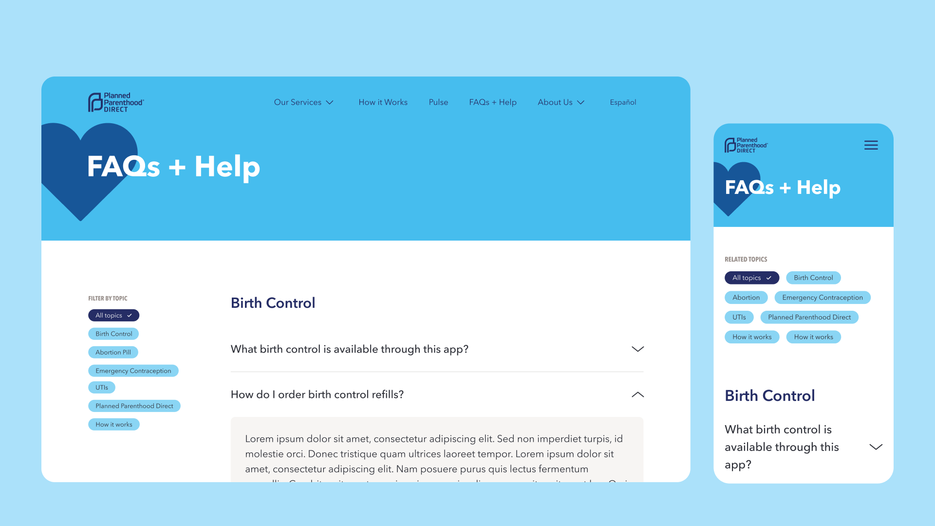
- Progressive disclosure to ensure a clean site coupled with uncomplicated functional pages, presented on a clear layout helps users easily find the information they need
- State-specific pages optimized for SEO make it easier for individuals to search for the services they need online and clearly see which services are offered in their state
- Allowing content editors to easily remove or associate healthcare services to a state
- Compliance with WCAG 2.1 AA guidelines, including a style guide that ensures content editors produce accessible content
- A library of reusable components that can be used by the client to create new pages and make updates to their content strategy independently
Design
One of the main goals was to create a distinct sub-brand for PPD within the Planned Parenthood brand. Advocacy is a large part of Planned Parenthood and the branding reflects that, with a serious tone and dark blue colour as their main brand colour. However, for the PPD website, the client sought a different sub-brand which resonated more with the younger audience and provided a reassuring tone.
Our design work included:
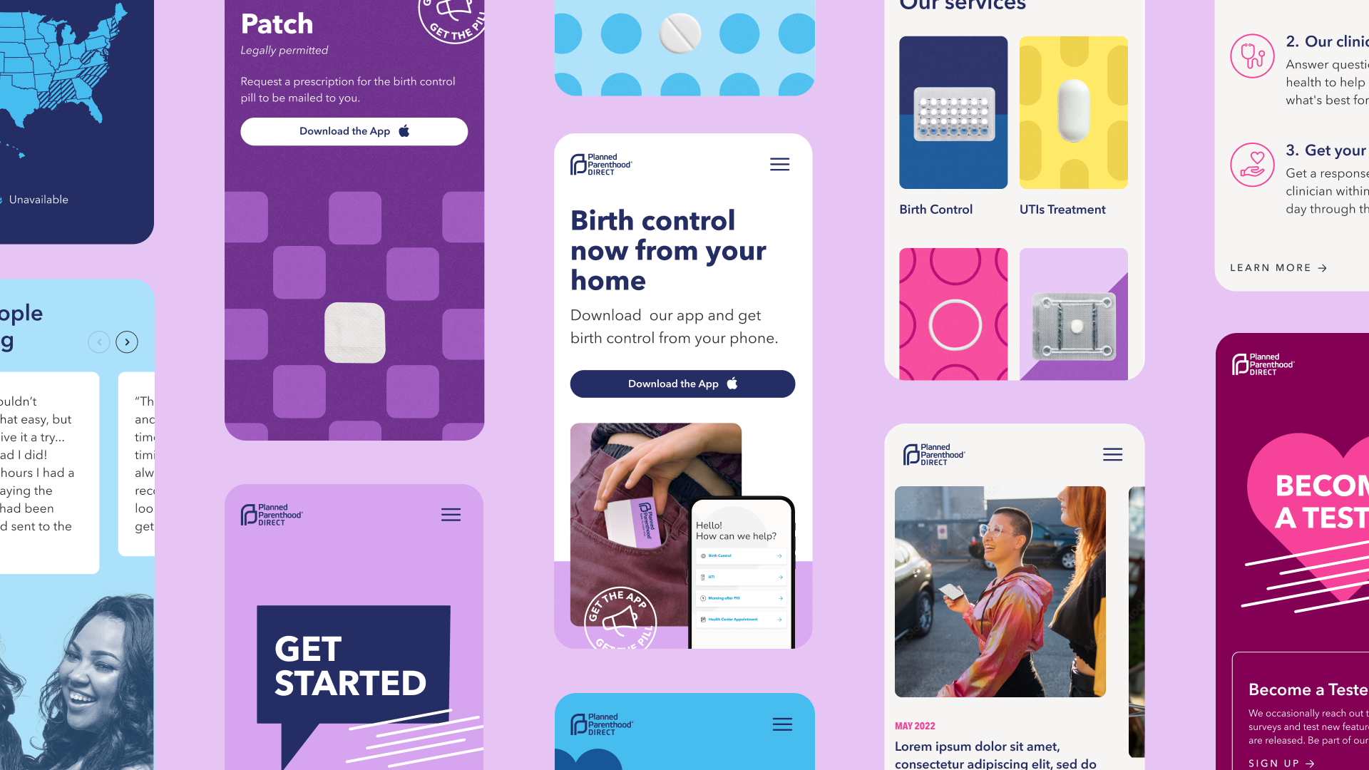
- Art direction and crafting a compelling visualization of the brand’s essence, values and attributes as a stylescape
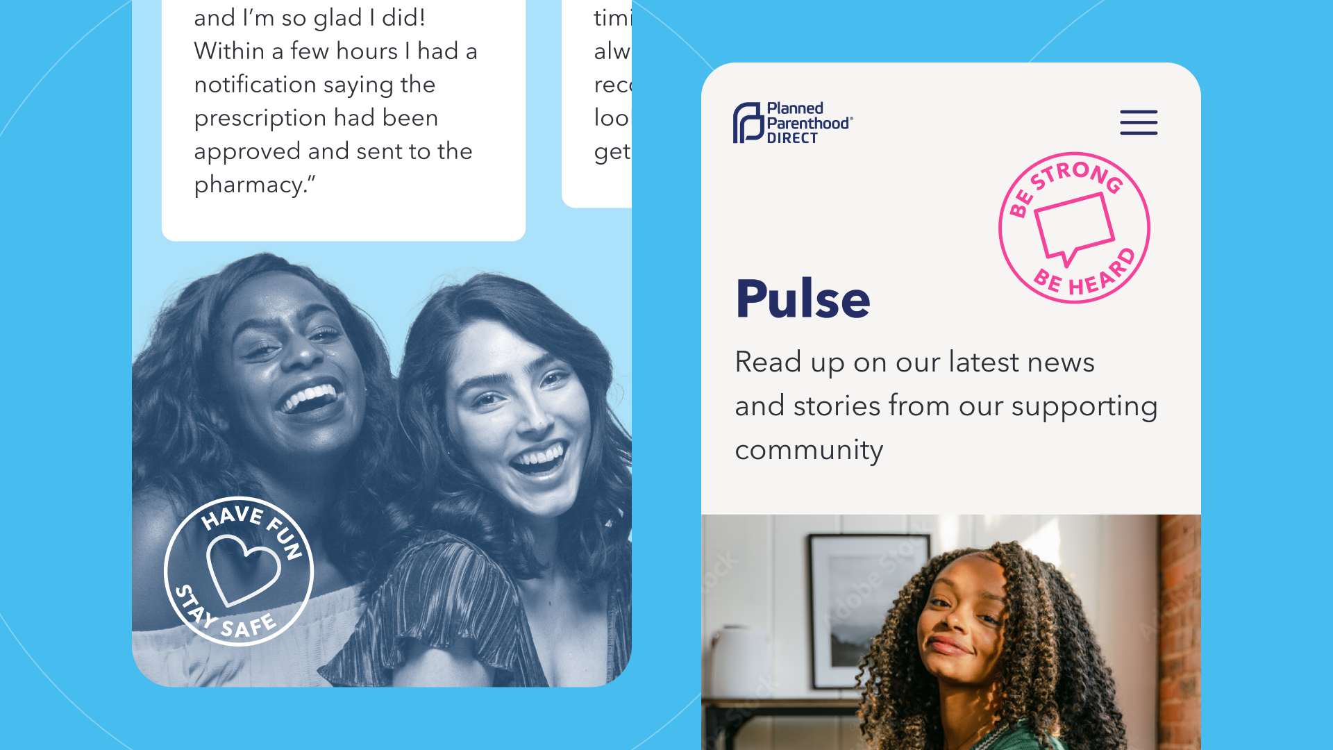
- Design principles that look like social media - visually driven with bold graphics and bright colours to branch out from the main Planned Parenthood site while still keeping some aspects of the parent company branding, including the dark blue colour
- Applying a mobile first approach, with all design deliverables created first for mobile and then for desktop
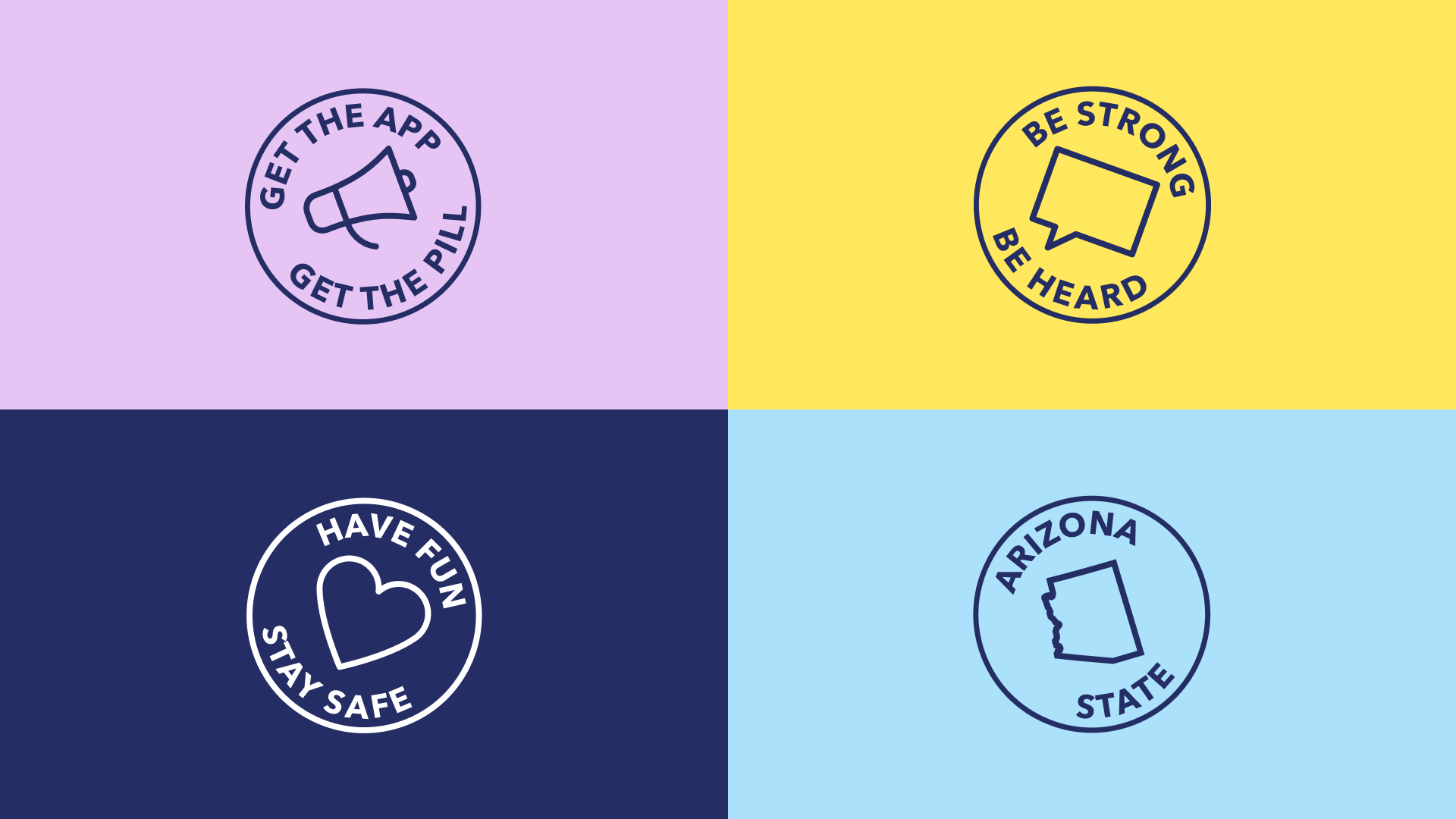
- A sticker set to add a youthful component to the brand while promoting advocacy and supportive messaging
- Call to action (CTA) buttons positioned in key places to act as thumb stoppers to prevent scrolling
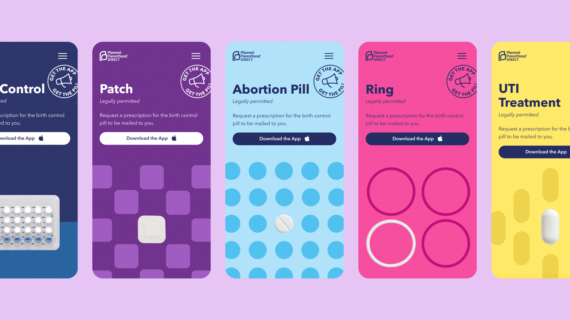
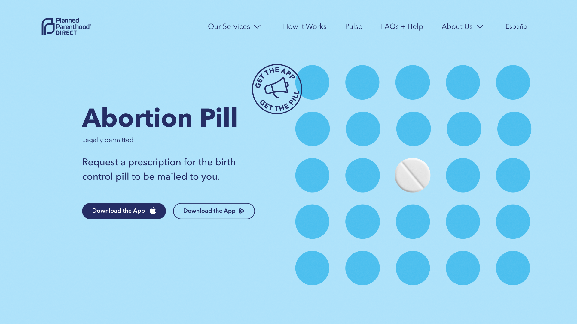
- Clear visuals to distinguish the different services, including a different background colour and graphics for each service
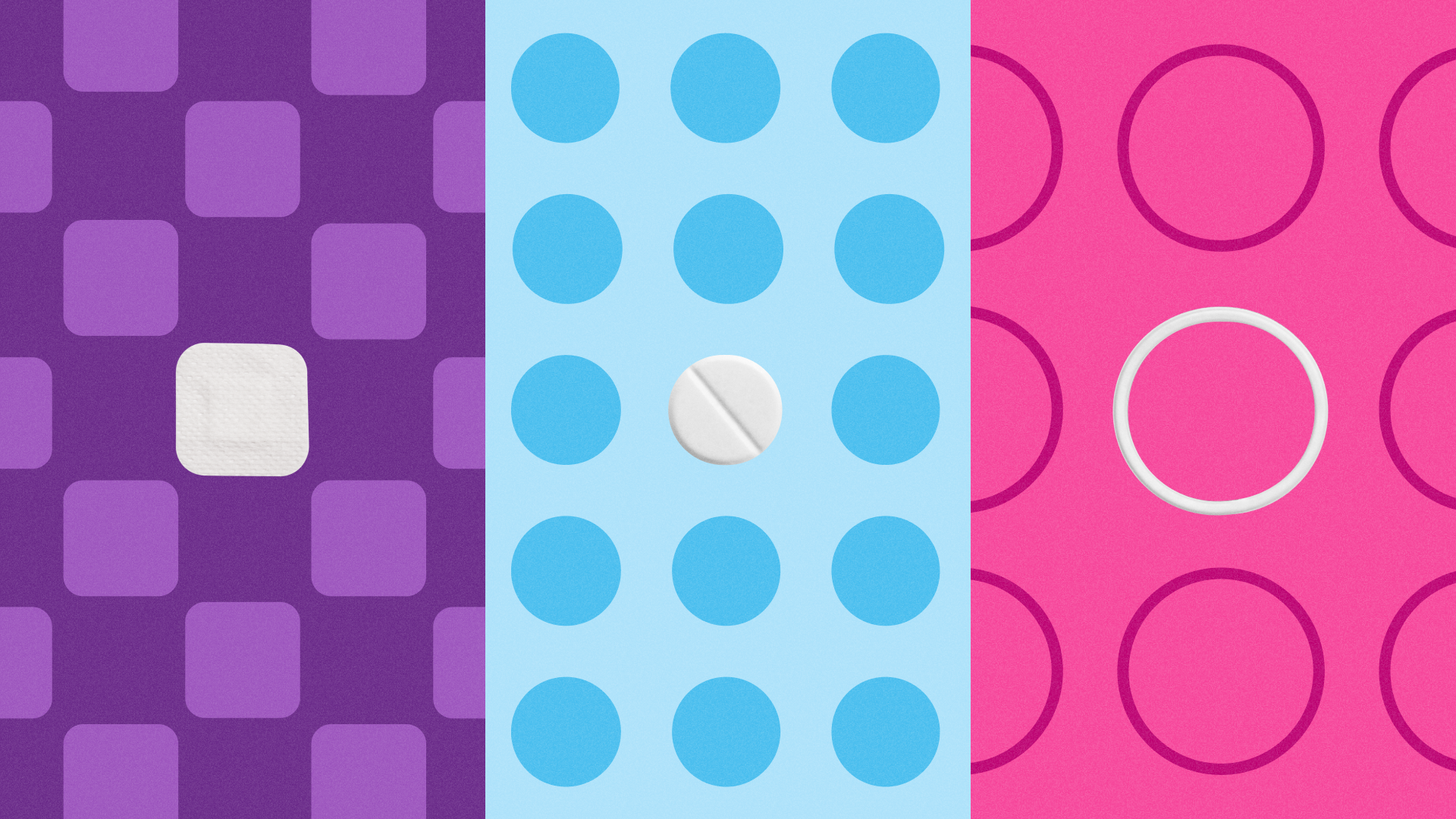
- A set of bold patterns to represent the products in a de-complexed, non-stigmatizing, light-hearted way
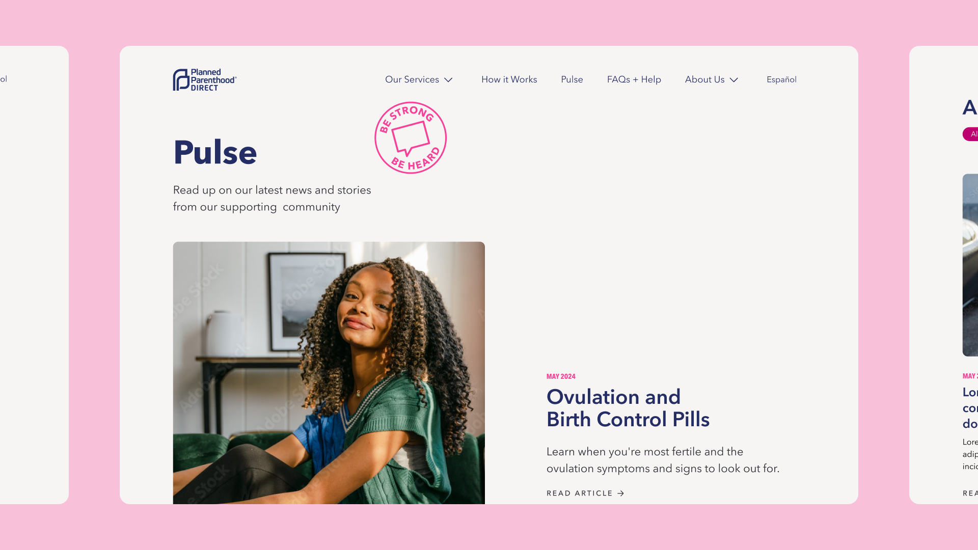
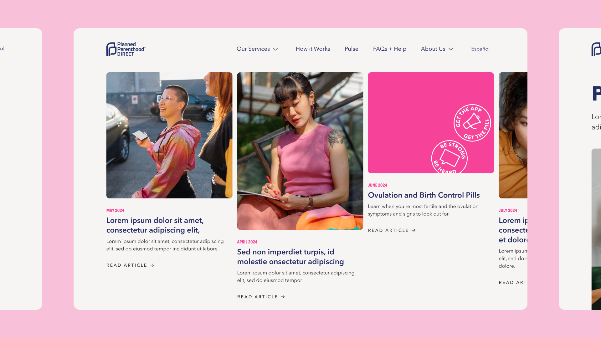
- A blog which evokes Planned Parenthood’s activist side, featuring dynamic images to add interest and advocacy messaging related to the parent brand’s activist roots.
Results
The new website is a secure, decoupled, Drupal-based CMS that is strategically designed to drive users to download the PPD app while also providing the information users need in a clear format. To ensure it resonates with young adults, it leverages mobile-first design and the creation of a distinct sub-brand that features bold colours and supportive, destigmatized messaging. The new Planned Parenthood Direct website is instrumental in continuing to support reproductive rights and ensuring access to reproductive and sexual healthcare, which is now needed more than ever.
The thoughtful team at Evolving Web took time to truly understand our organization’s unique mission as well as the goals we had for the site. They challenged us along the way to achieve a modern, fresh, and welcoming experience for our users. Five Stars!
