Do you work with web content? Are you just getting started with using Drupal to publish your site?
Our team has written extensively about the different things you’ll need to navigate in order to successfully deploy your content strategy with Drupal as your CMS. We broke down this guide into five key themes:
- Demystifying Drupal
- Acing accessibility
- Understanding UX
- Organizing information
- Getting the word out
Demystifying Drupal
If you're completely unfamiliar with Drupal, go download our beginner's guide. It covers what this open-source digital experience platform is all about, what it can do for you and your content, and how to define key Drupal-isms and other important terminology.
Otherwise, you might be aware that Drupal has a bit of a reputation for being one of the more complicated CMSs to master. But dive into the latest version, Drupal 9, and you’ll see huge strides in user-friendliness.
The Drupal Association has been focusing on user experience for content editors and developers over the last several years, and the improvements make the CMS so much friendlier for beginners.
Take the new Layout Builder, for example, which introduces visual page editing functionality for content creators via the admin centre:
Drupal's Layout Builder lets content editors build and modify pages visually using drag-and-drop, eliminating a lot of reliance on developers and speeding up marketing workflows. Using intuitive, block-style layout controls, designers and editors can:
- Build default page templates for different content types (e.g. blog posts or feature pages)
- Autonomously override default settings when a small change to the usual layout is needed
- Create structured single-use landing pages (e.g. for an offer or an event) that don't necessarily follow a default template
Drupal 9 boasts lots of other improvements that benefit content creators, like better media handling and more fleshed out content moderation workflows. Learn more:
- Drupal 8 vs. Drupal 9: More features for content editors
- How content editors use Drupal's layout builder
- Insights into the new design of the Drupal admin UI
And if Layout Builder isn't your jam, Drupal has another page-building solution: Paragraphs.
Paragraphs is great for building structured content that is consistently formatted.
With Paragraphs, you get to create Paragraph Types, each of which has its own set of fields, that live within the parent content. The content editor can pick from a list of options (which the site builder can control), deciding which content components to add to the page.
With Paragraphs, the content editor is building a form, and then filling the content into that form. For example, they can add a call to action and then a video, and then a side-by-side text. And then they can fill in the content for all those elements. Later, they could reorder them.
Paragraphs provides a lot of control and more streamlined options for content editors. It requires fewer clicks to add a new piece of content. It’s great for situations where you want to keep things simple. Many situations don’t actually require variations in layout, but just to need to allow for a flexible content model.
Learn more about Drupal's two main approaches to structuring and laying out content: Layout builder vs. paragraphs: designing a flexible content model with Drupal
When it comes to adding actual content to the page - and making sure everything looks good when you share it - some of Drupal's core modules can help. Evolving Web trainer Trevor put together these videos to demonstrate a couple of ways in which Drupal can help integrate with your social media strategy.
If you prefer to read, these are the relevant articles:
- How to embed Facebook videos with the Drupal media module
- Perfect your social media link previews with the Drupal metatag module
Drupal vs. other DXPs/CMSs
What if you're used to something different? You can get a great idea of the type of things to look for in a content management system in our article What we can learn from Contentful, Craft CMS, Squarespace, and WordPress, which recaps a user research exercise conducted by our co-founder Suzanne and UX lead Annika.
We asked participants for their first impressions of each platform, then asked them to do a few simple tasks: creating an article from content in a Google Doc, editing and previewing it, and then deleting the content. Then, we asked what they thought of the platform.
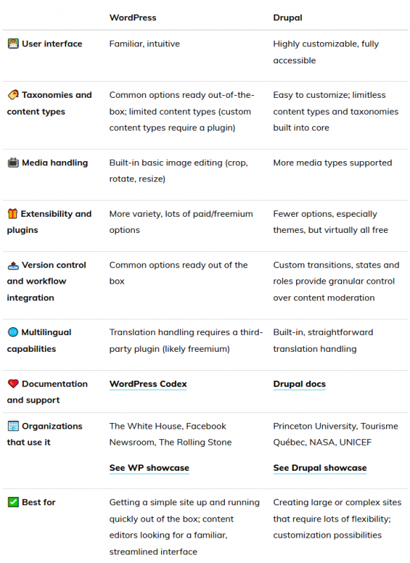
We also did a side-by-side comparison of Drupal and the most widely used competitor, WordPress, from the point of view of a content specialist.
Check out the recap below, and read the full article for the detailed breakdown.

Acing accessibility
More than a simple legal requirement, accessible web content is a matter of human rights. So how do you make sure your site stacks up to the latest standards?
Accessibility: The basics
First things first: understand what web accessibility means in practice for your site - and why it's also vital for your overall business.
"Equal access sounds nice, but why should I care about web accessibility? This seems like an extra headache that is going to cost me money." In fact, the opposite is true: not caring about accessibility is an expensive proposition. If your website is not accessible, you risk losing a significant portion of potential clients since 20% of the population will not be able to use your site. Second, the law mandates it.
In the US, Title III of the Americans with Disabilities Act includes websites and now applies to any public-facing businesses and private businesses in 12 categories, including sales, entertainment, service establishments, recreation and more. A business whose is deemed inaccessible to someone with a disability can be forced to immediately redesign the website in addition to paying monetary damages and the other party's attorney fees.
In Canada, four provinces currently have web accessibility laws: Quebec, Manitoba, Nova Scotia and Ontario. The Accessibility for Ontarians with Disabilities Act (AODA) is the most comprehensive of the four, and aims to create a barrier-free Ontario by 2025.
To this end, by 2021 all private and non-profit organizations with more than 50 employees and all public organizations must make their websites compliant with Web Content Accessibility Guidelines (WCAG). The federal government is looking to pass web accessibility guidelines in the near future with the aim of enforcing WCAG. We can expect Canadian federal web accessibility laws to be rolled out soon.
Read more about accessibility basics:
- What is web accessibility, and why should you care?
- What on earth is WCAG? Web accessibility guidelines demystified
Designing accessible content
Even if you're not a visual designer, you should have a good handle on how to showcase information in an accessible manner throughout your site.

Read 7 design considerations for accessibility for an overview of the key best practices to follow when publishing content on your Drupal site.
Accessibility testing and governance
It's a lot easier to design an accessible website if you consider accessibility from the get-go, but we don't always have that luxury. You’re far more likely to have an existing site on your hands, and, if you're reading this, you're probably wondering how to determine how accessible it is currently so you can get a better idea of what needs to be done.
In our in-depth guide How to test your Drupal site's accessibility, we cover how to manually assess your site content for issues, which tools you can use to help test and monitor accessibility issues, and which Drupal modules are available to make accessibility easier to maintain across your site.
Finally, maintaining accessible content can be challenging. One way to alleviate a lot of the time and effort spent fixing problems with accessibility is to deliberately implement an accessibility governance plan for your organization.
Governance makes it easier to keep track of your progress towards meeting your accessibility goals. It also provides decentralized teams with a single shared point of reference for all things accessibility, which takes out a lot of guesswork and reduces the risk of human error.
What’s more, having a documented governance plan is a great way to demonstrate to authorities that your institution is committed to making improvements. If accessibility becomes a legal requirement in your jurisdiction, you’ll be able to meet any noncompliance issues with a clear roadmap for a solution.
Learn everything you need to know about governance and accessibility in our article Web accessibility governance for higher ed (it's worth a read regardless of your industry!).
More resources
On-demand webinars by Evolving Web
External links
- Introduction to web accessibility (W3C)
- How to create content that works well with screen readers (UK Gov)
- US Government’s accessibility guide (includes lots of useful tools)
Understanding UX
Many people - myself included - believe that content creation is part of the greater discipline of design, and for good reason: the way users experience content is just as much the realm of how the content itself is designed than it is of visual effects.
Key concepts to study:
- User stories
- Wireframes
- UI elements
- Gestures
- Responsiveness
- Microcopy
As a content specialist, understanding the core tenets of good user experience design is key to elevating your practice. Here are a few articles we’ve put together with the help of our all-star designers that’ll get you up to speed fast.

Articles
- Surprising stats and useful facts about university websites
- How to ensure critical health information reaches its audience
- How we plan UX workshops
- Improve your layout design with Gestalt principles
Tools and resources
- UX Project Checklist
- UXArchive (Huge collection of user flows from mobile experiences)
Organizing information
From your site’s information architecture to your overarching content strategy, there’s a lot more than meets the eye when it comes to structuring content. In Drupal, it all starts with taxonomies:
In Drupal, the taxonomy system (which you'll find under Content ➜ Structure in the Admin menu) is made up of vocabularies, which each comprise a series of terms. For example, "red", "blue", and "green" are terms you might find in a "Colours" vocabulary.
Read more: How to organize your Drupal content with taxonomies
Key concepts to study:
- Taxonomy
- Content modeling
- Labelling
- Metadata
- Wireframing
- Navigation and hierarchy
- User research
Articles:
- Avoiding the redesign: how to constantly improve your Drupal website
- How to design a site search experience users will love
- What you can learn from Marie Kondo about running a content audit
- Creating an inclusive digital content strategy
External links:
- How to make sense of any mess, a fantastic introduction to information architecture concepts by Abby Covert
- Complete beginner’s guide to information architecture (UX Booth)
Getting the word out
People need to be able to find the great content you’re putting out there. Here are a few guides on SEO basics and other marketing-related articles that should help you navigate that end of the content creation process.
Key concepts to study:
- Business objectives
- Goals
- Metrics
- KPIs
- Targets
- Dimensions
- Segments
Articles:
- Top 3 key changes in the new Google Analytics
- Google Analytics: How to turn events into goals
- Preview your content before sharing it with Facebook's sharing debugger
- Guerilla marketing tips from ad veteran Pete Favat
Other resources:
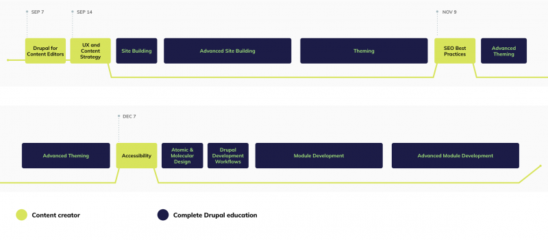
Get trained on Drupal with a program designed for you

Evolving Web's Content Creator training track features four in-depth courses that cover everything you need to know about using Drupal to manage and showcase your content.

