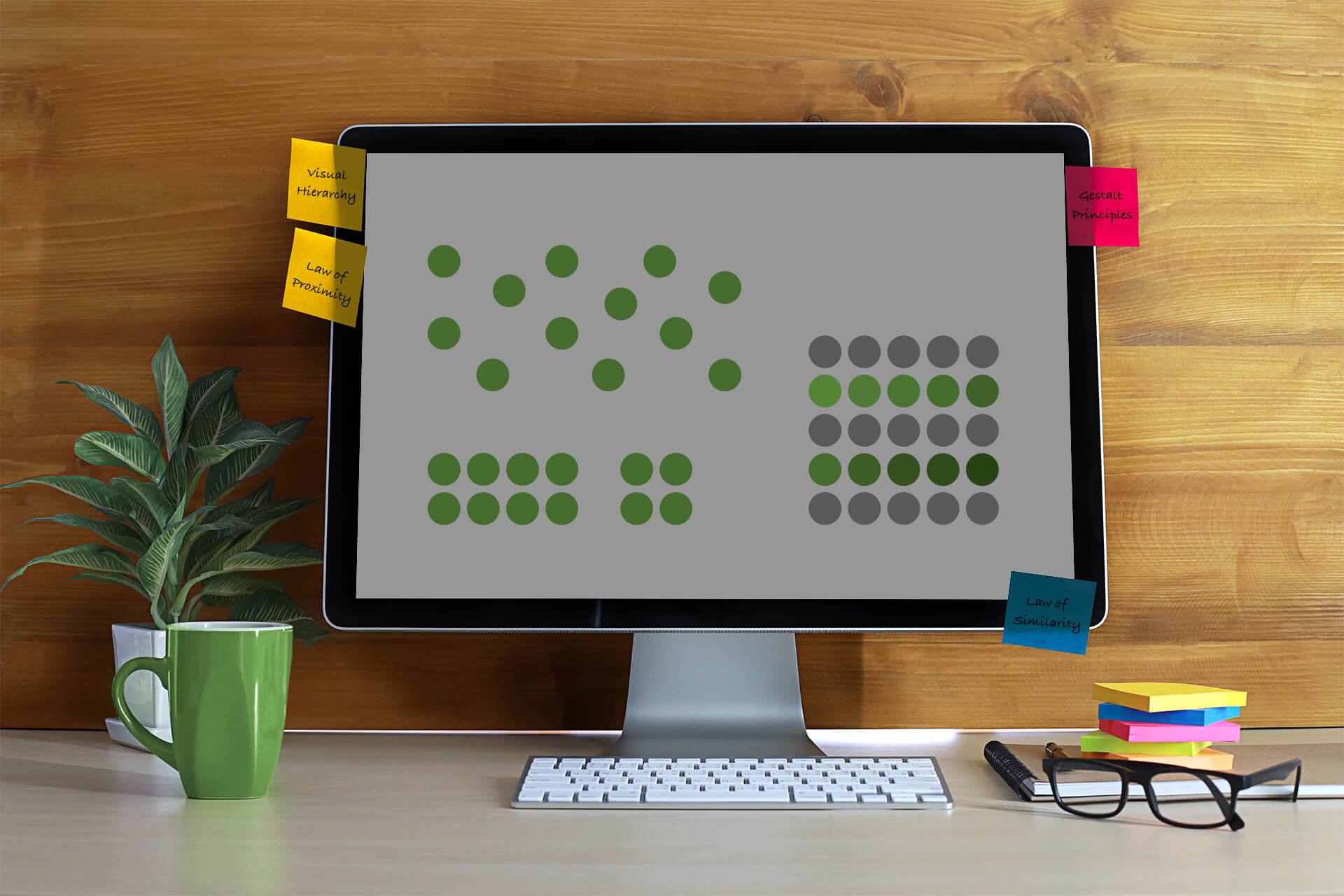
Sometimes people refer to visual design as “doing magic”, because they realize that things look harmonious and pleasing, but they don’t know why. But if you can learn the principles behind the magic, then you’ll be able to create convincing designs on your own.
In this blog post I’d like to focus on design basics and typography. You will learn about gestalt principles and what they tell us about how we perceive visual objects. This will help understand and use the following design tip: Make your copy highly readable.
Gestalt Principles for Visual Hierarchy
“Gestalt” is German and means “shape” or “form”. The German verb for “to design” is “gestalten”. These principles are rooted in psychology and describe how humans typically see objects by grouping similar elements, recognizing patterns and simplifying complex images.
One of the most important and also easiest principles in design is the Law of Proximity. We perceive elements that are closer together as a group.
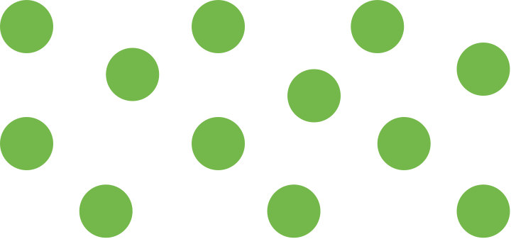
The circles are placed without any particular proximity. They are perceived as separate shapes.
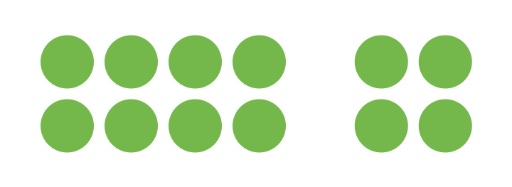
When the circles are given close proximity, unity occurs. While they continue to be separate shapes, they are now perceived as two groups.
The other closely related gestalt principle is the similarity law.
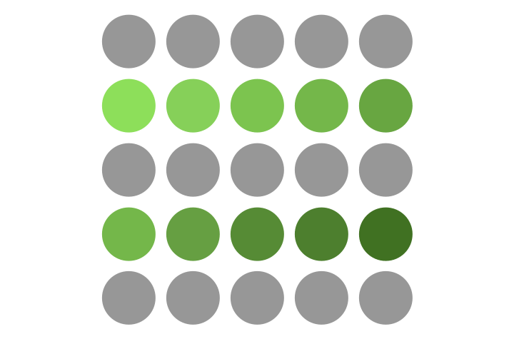
The similarity principle dominates the proximity principle in this example. The proximity between all elements is the same. But you probably see rows of circles long before you see columns because of the similar colours. The principles of similarity and proximity often work together to form a visual hierarchy. You now understand how you can create visual groups—by proximity and similarity. Grouping content is so important, because users often don’t read a text entirely from the top left to the bottom right. They scan documents or websites for important parts in seconds. This is why content should be easy to read and understand.
Make Your Copy Highly Readable.
You can use these design principles to create visual weight and balance whenever you design something. Layout is a lot about proximity and its counterpart: spacing.
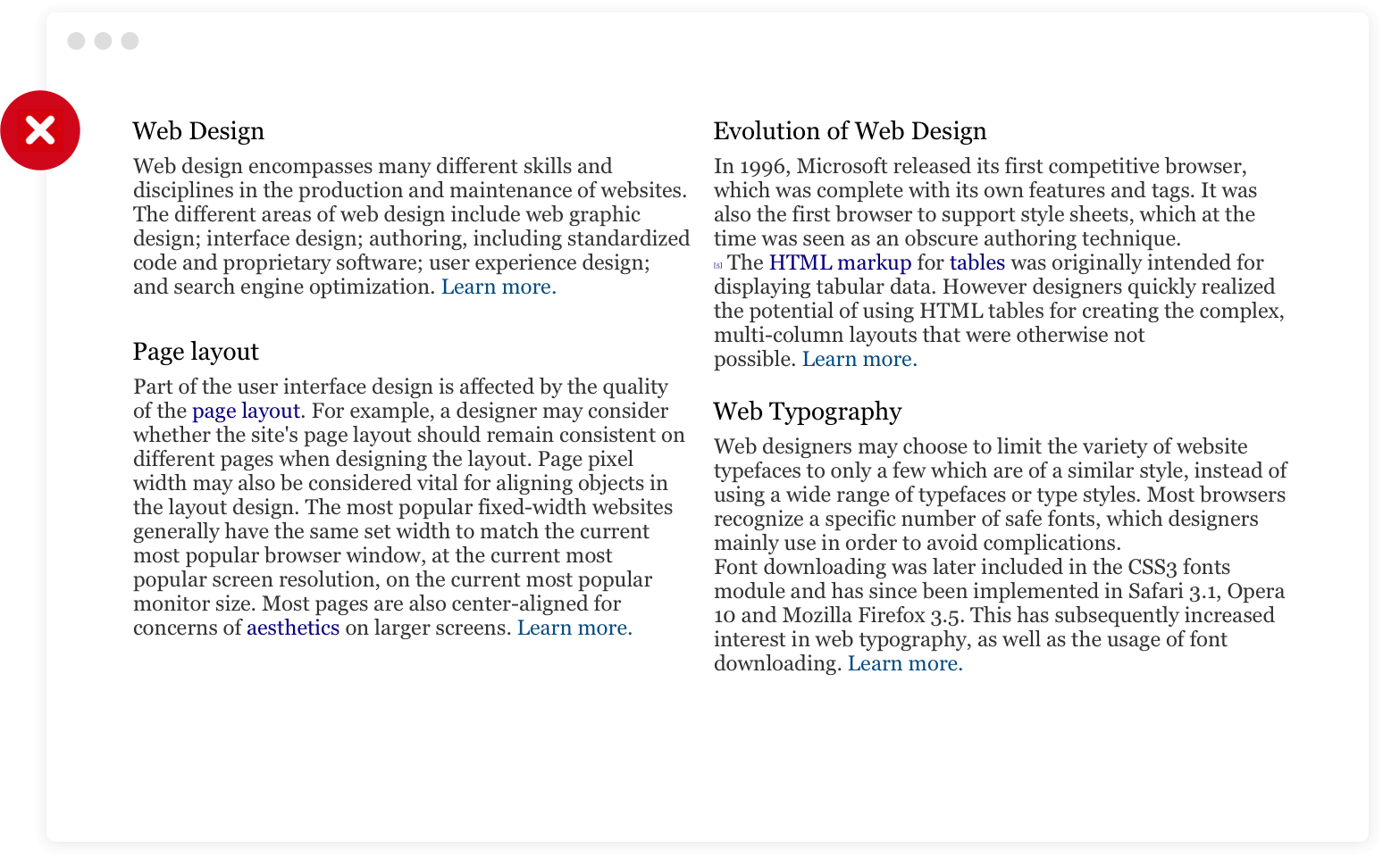
This layout has several problems. First of all, it is hard to browse and understand what is worth reading and where you should click, because there’s no clear grouping, just dense blocks of print. The “learn more” link is hidden at the end of each paragraph. It doesn’t stand out well.
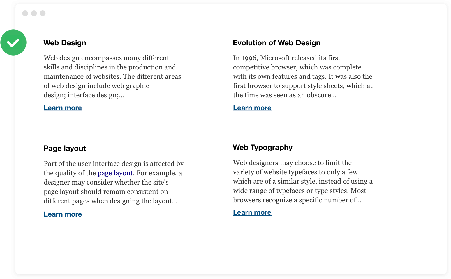
This layout uses proximity and spacing so you perceive each paragraph as a group. The headings of each group have the same styling, they are on the same visual hierarchy. They have more weight than the following paragraph text. This makes it easy to browse. Additionally, the learn more link is positioned in a new row with a little bit of spacing. This makes the link stand out enough to become a clear call to action. On the other hand, it is still obvious that it belongs to the text above. Create clusters instead of clutter. Shorten text where it is too much, especially on a higher level when you are linking to the full article.
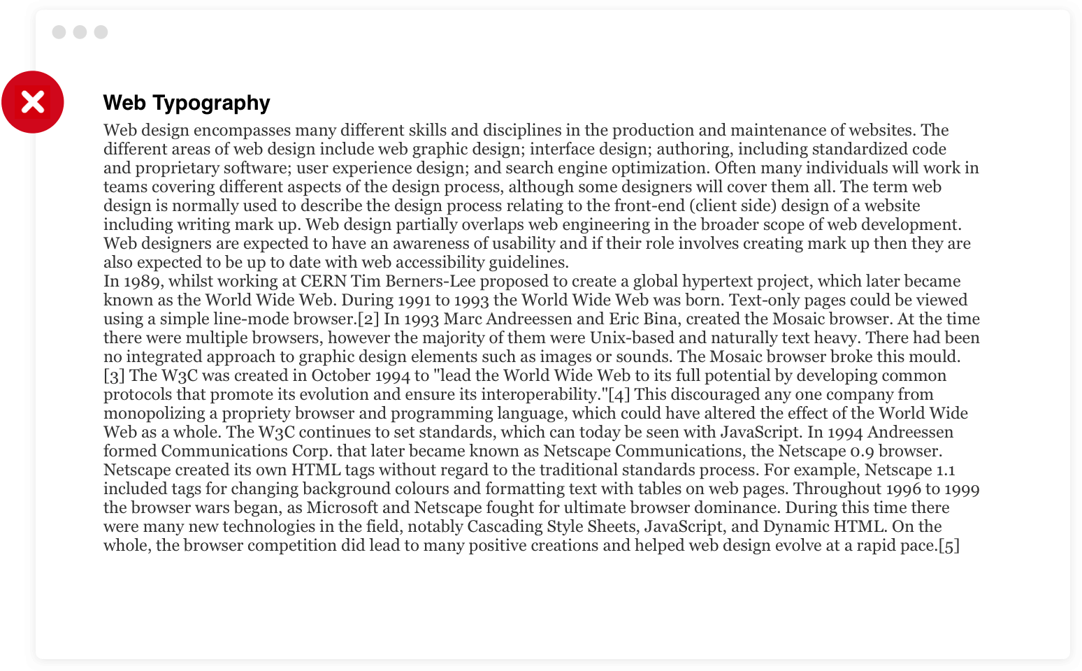
Now you’ve learnt some basics about layout. Let’s look at the details of text styling. The above example is hard to read. The line length is very long and the line height is rather small. With more than 90 characters, it becomes difficult for the eye to find the correct next line when jumping from the far end to the beginning of a paragraph.
Increasing the line height a bit lets the reader perceive the paragraph as a group of rows, not a clutter of lines. Again, it comes down to proximity and spacing that helps readability.
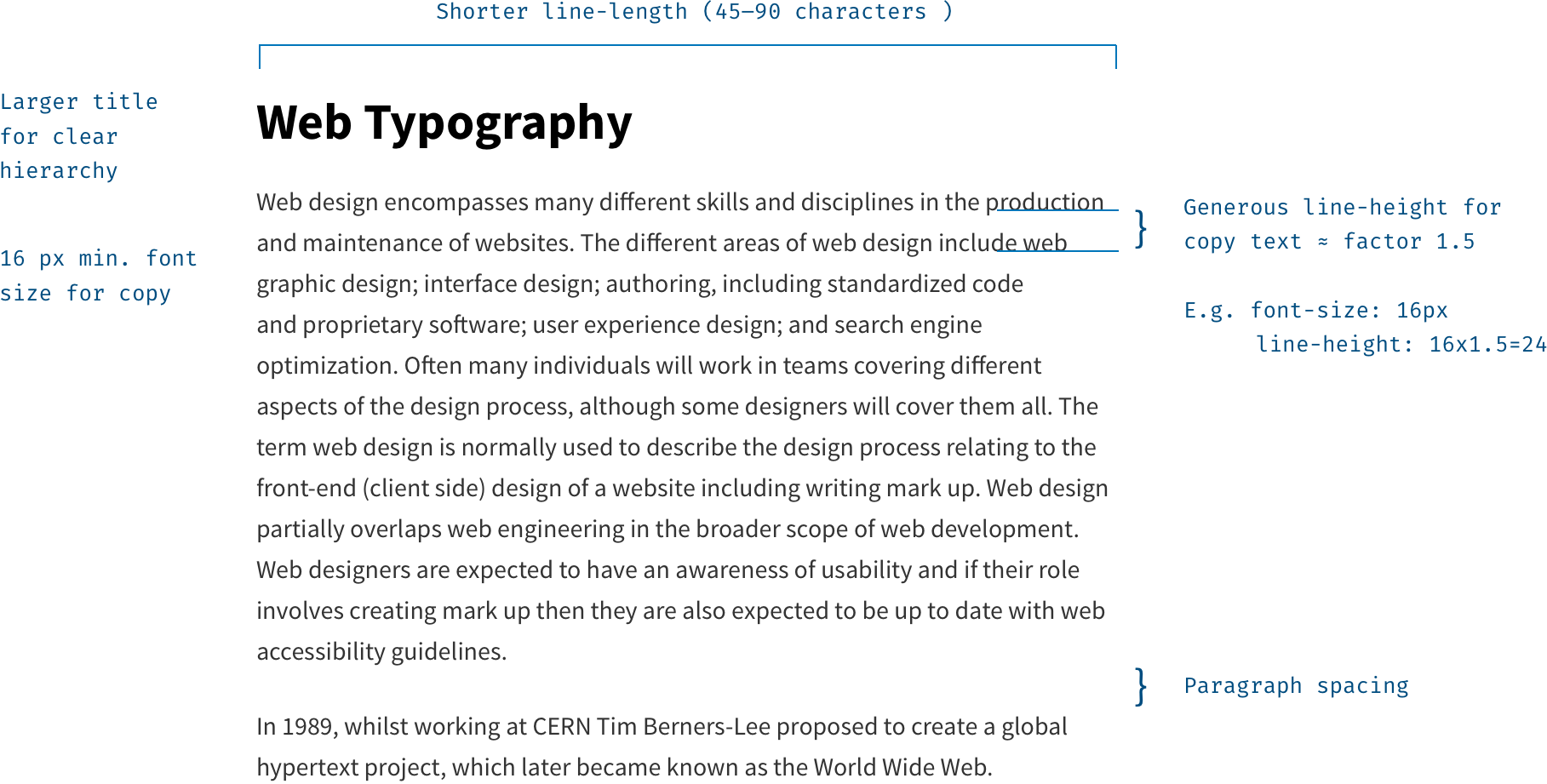
A title should usually have more visual weight than the body text. A good way to do this is making it bold and larger. Or bold and uppercase. Try not to use size alone. And sometimes, less is more. Don’t use uppercase for long titles. All caps means there are too many too similar looking chunks (letters) which makes it very hard to read.
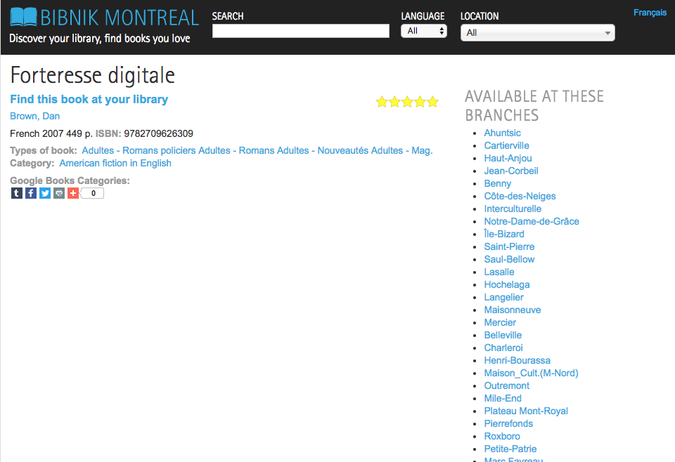
The example above doesn’t use the proximity and similarity principles very well. The rating stars on this book detail page are very close to the right-hand side menu showing available branches. The stars should actually be close to the book title, because this is what it refers to. Besides, the social sharing buttons on the bottom seem to stick to the Google Books Categories. This field was empty and because of a lack of spacing they seem to belong together, which is confusing.
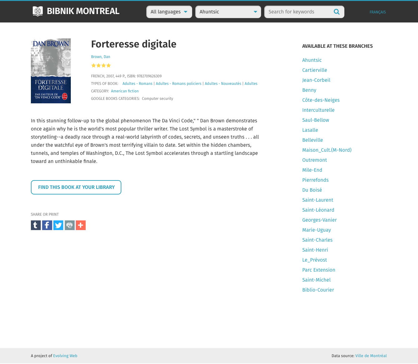
After redesigning the website, the grouping of elements makes more sense. We also added an image and a description of the book, but the modified spacing makes all the difference. Besides, the main call to action on this page “Find this book at your library” now actually looks like a button. In the version before, it was very similar to unimportant links and therefore wouldn’t stand out as a primary CTA.
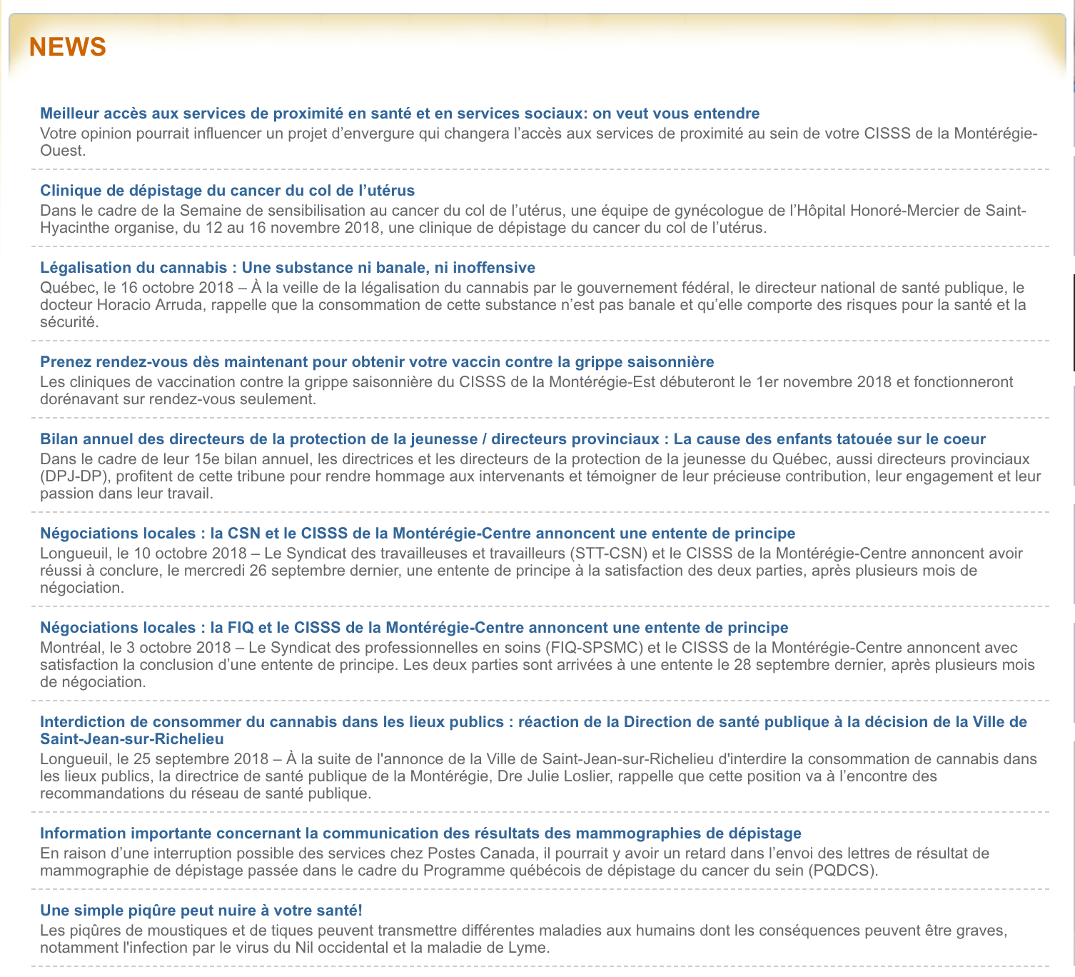
This is the homepage news section of a website before we recently redesigned it. Given the small font size, the line length is too long in this example. It is hard to read and all news items look the same, which makes browsing through a long list very unattractive. We found out that news is published by different regions of this health portal, but you can’t tell these news items apart from each other unless you read the entire text. The publishing date is not highlighted in a repetitive way either, so it’s hard to tell if the news items are sorted by date.
The spacing between the news items is okay, but in addition to that, a border was added. It’s a way to distinguish two elements from one another, but using too many borders can make your design feel busy and look more like a wireframe. Try to resist immediately reaching for a border and increase the spacing between groups instead.
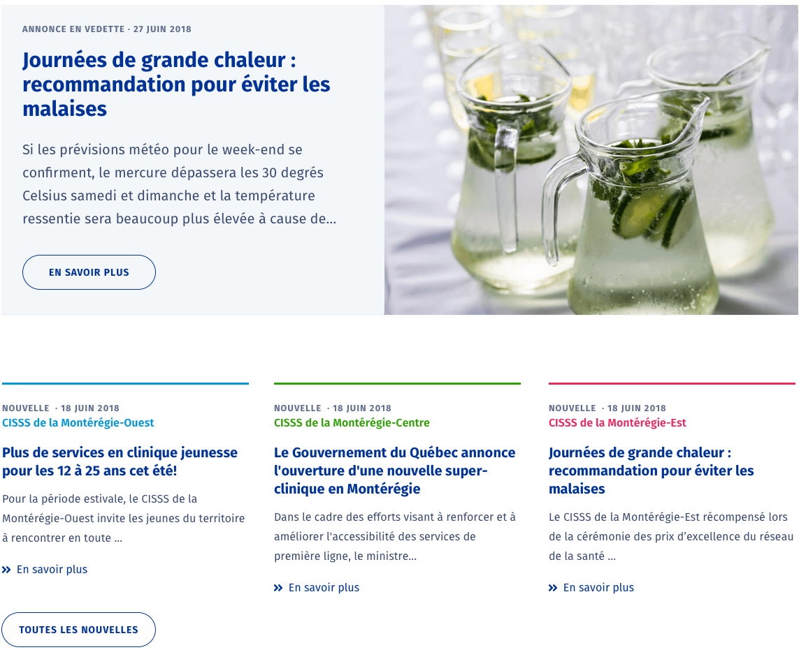
This is the same part of the website after redesigning it. We decided to only display the last news from each of the three different regions, and one additional featured news on the homepage with an image. We use a column layout and therefore reduced the line length.
With the featured news, the most important part now stands out. The three news items below use the same font style for the heading and the short description as the featured news, just smaller. Recurring visitors can recognize the colour-coded area, they are interested in most. All clickable text uses the same blue. All these similarities and consciously chosen differences help users recognize patterns easily.
When designing for the web, where the average page visit lasts a little less than a minute, design principles that are based on gestalt theory are extremely helpful. Good layout and typography basics are key to fast and pleasant reading and understanding of content.
Coming up next: a blog post about how to choose & mix typefaces. It will extend from enhancing the readability to evoking the right feeling with your choice of typefaces.
