
There is exciting work being done in the Drupal community to improve the Admin UI, including the JavaScript Modernization Initiative and an overhaul of the look and feel of the Seven theme. Meanwhile, I've been working with a group in the Drupal community to research what user experience improvements we should be making for content editors.
So far, we have conducted a survey to get feedback from content editors, performed a card sort to see how content editors group their tasks, and recently, conducted a comparative usability study that looks at the authoring experience provided by other content management systems.
We chose four content management systems that offer different experiences: Craft CMS, Contentful, SquareSpace, and WordPress with Gutenberg. In this article, I’ll walk through the different aspects that we tested: first impressions, the editing experience, the publishing workflow, and what we can learn.
The setup
Going through the process of setting up several other content management systems was an eye-opening experience. I highly recommend it for anyone involved in building Drupal websites for a living. The setup process gave me lots of food for thought about the onboarding experience for new users, what configuration comes out of the box, and the language and positioning of Drupal in the CMS landscape.
We recruited volunteers with Drupal content editing experience (from 1 month to 9 years of experience!)
My colleague Annika Oeser and I conducted the studies using a script that we had put together. We asked participants for their first impressions of each platform, then asked them to do a few simple tasks: creating an article from content in a Google Doc, editing and previewing it, and then deleting the content. Then, we asked what they thought of the platform.
First Impressions
First impressions are important. Each platform that we selected had some type of content editor dashboard that we presented to users. While some platforms have more of a learning curve than others, it’s obvious that platforms with a more inviting dashboard will encourage new editors to like the tool and want to use it more.
Contentful
Right away, participants found Contentful intimidating. One even said it looked “scary”. The dashboard’s messaging is not aimed at content editors (although in the setup process, it asks if you're a content editor or developer), and the terminology is just obscure enough to be intimidating. As one participant pointed out that “None of this says build an article”. That being said, the interface didn’t prevent authors from performing their task, it just made them more apprehensive.
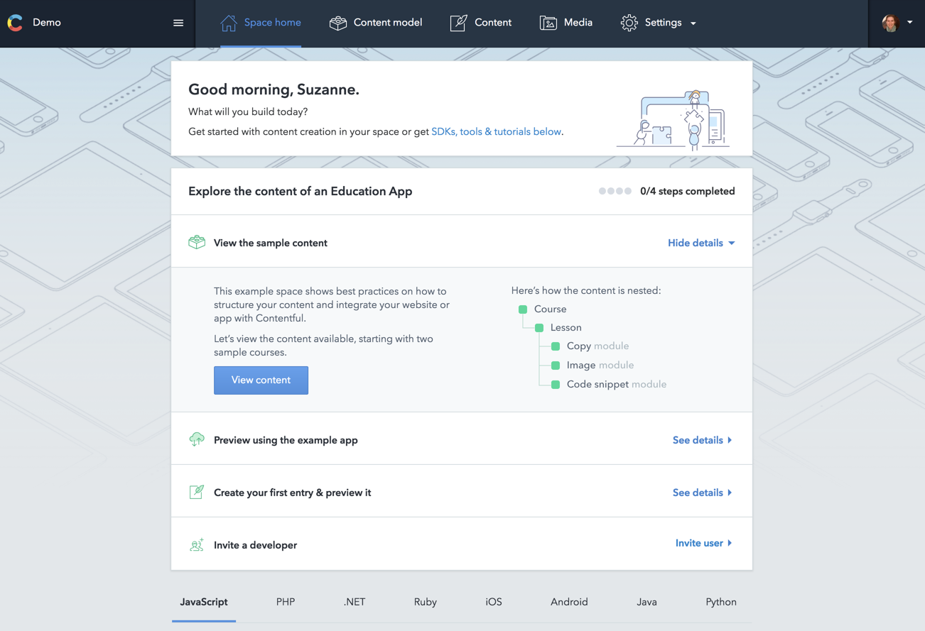
On the content overview page, there are filters to narrow down the list of content. Because of the colorful button-like design of the filter, some participants mistook this for the link to add content.
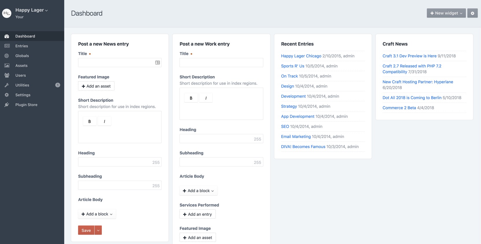
Craft CMS
Overall, participants liked the fact that Craft CMS has a form to create content directly from the dashboard. Putting content creation forms on the dashboard makes it clear that this is a platform designed for content editors. That being said, everyone complained that the form was too narrow, and made the experience of filling in the form not great. Participants all liked it better once they were on a dedicated content creation page.
Some participants mentioned a solution, removing the “Craft News” block form the default dashboard to free up space, which is possible by configuring the dashboard if you know how to do this. I also think that having a button to expand the form or jump to the content entry page would be incredibly helpful.
Squarespace
The Squarespace dashboard gives content editors the impression that it would not be ideal for larger, more complex websites. Everyone mentioned that the UI seemed “simple” or “for a blog”. I found this an interesting observation. The editors in our study were all familiar enough with their requirements for a CMS (a large amount of content, taxonomy, content hierarchy) that they felt that the simplicity of Squarespace might be too good to be true, and that they would be alright with a more complex UI if it meant a more featureful one.
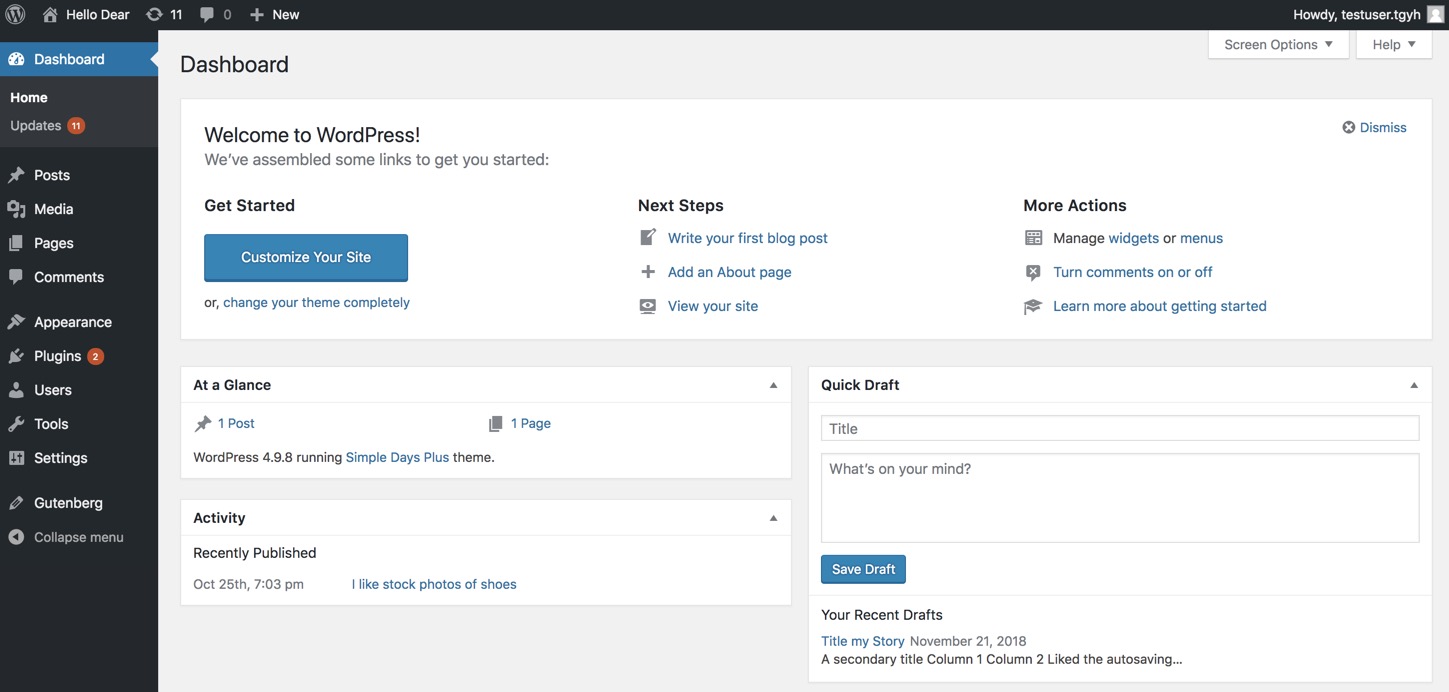
WordPress
Participants described WordPress’s dashboard as “clean”. They see right away that it's an interface designed for them. Although there are more advanced features presented (e.g. Appearance, Plugins, Tools, Settings) the UI for creating and editing content are prioritized. Granted, some of our participants had WordPress experience, giving this particular UI the bias of familiarity. One mentioned that "They don't change the interface often, which is good."
Content Editing Experience
To assess the content editor experience, we asked participants to create an article and then add some standard elements to it (an image, a link, bold text, a quote). When building the study, we selected four CMSs with very different editing experiences:
Contentful
Contentful provides a content structure similar to Drupal, with content types broken down into fields. It has some very particular terminology which will be unfamiliar to most people. Instead of a WYSIWYG editor, it provides a markdown editor with a tab for previewing the content.
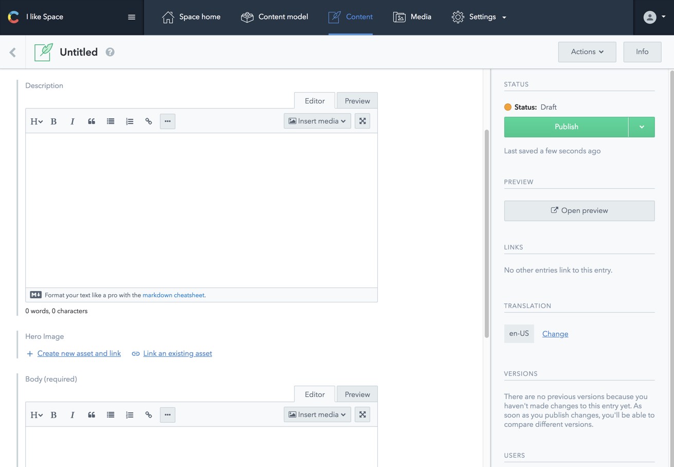
It’s amazing how important labels are. Participants were confused by labels like “Slug” and the subtle difference between the purpose of the “Description” and “Body” fields. Another thing, most content editors don’t know markdown. So as much as developers might love having the markdown editor tab and a tab for previewing the content, this experience seemed like a big hurdle to content editors. A minor experience gap that we noticed was in the way the link button in the editor pre-fills “https” at the beginning of the link. Since most editors copy and paste a URL instead of write it out by hand, this led to mistakes and frustration.
Craft CMS
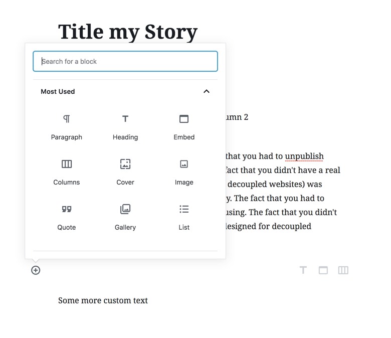
Craft CMS has a WYSIWYG editor for editing long text, but instead of a large main content textarea, it provides a UI for creating sections, such as headings, text, images (this works similar to Drupal’s Paragraphs module).
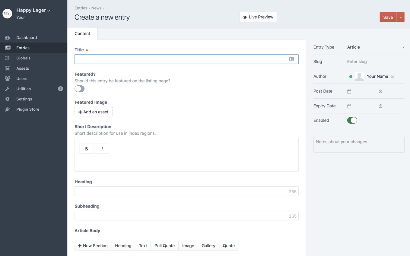
All the participants easily understood the UI for adding sections to create the Article Body. It was somewhat confusing to have two ways to add some elements, for example an image or a quote can be added through a Text section, or by creating a new Image or Quote section. If anything, this maybe shows content editors’ eagerness to add content "the right way" and their willingness to work within a content structure rather than having one large WYSIWYG editor.
Squarespace
Squarespace provides a much more visual editor. The editing interface appears in an overlay. Users paste everything into one text area. There is also the notion of adding new elements (images, quotes, etc.) to this text area using a + button.
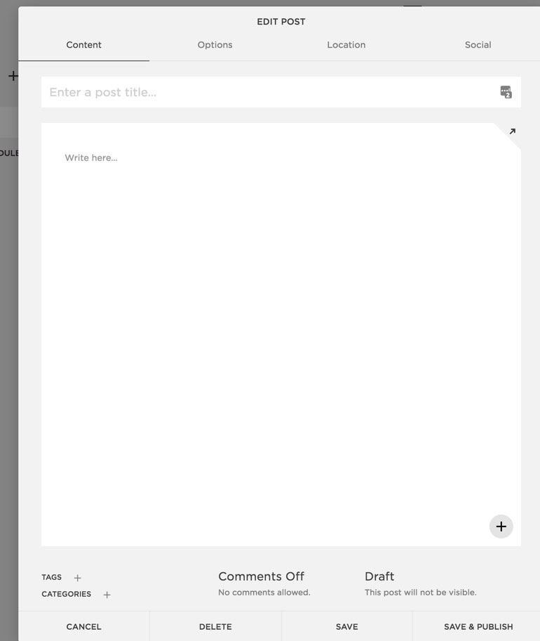
There were a couple ways to add images in Squarespace. Adding a “Thumbnail” image in the metadata of the post, which is used in the teaser version of the post. Or, using the + button to add an image element, which can then be dragged/dropped above or below other elements, such as text, buttons, etc.
None of the participants found the + button without help. I had always assumed that this UI was easy-to-use, but for a content editor not expecting to use a page building experience to add images to content, it was clearly not obvious. As one participant said "I would never have found that, it's so not clear."
Another sticking point was that the thumbnail image field in the "Options" tab doesn’t adequately explain to users that the image won’t be displayed on the full post page, only in teasers. This is something I see a lot on Drupal sites, that have images that are used in content listings, but without a proper help text to explain this to editors.
WordPress
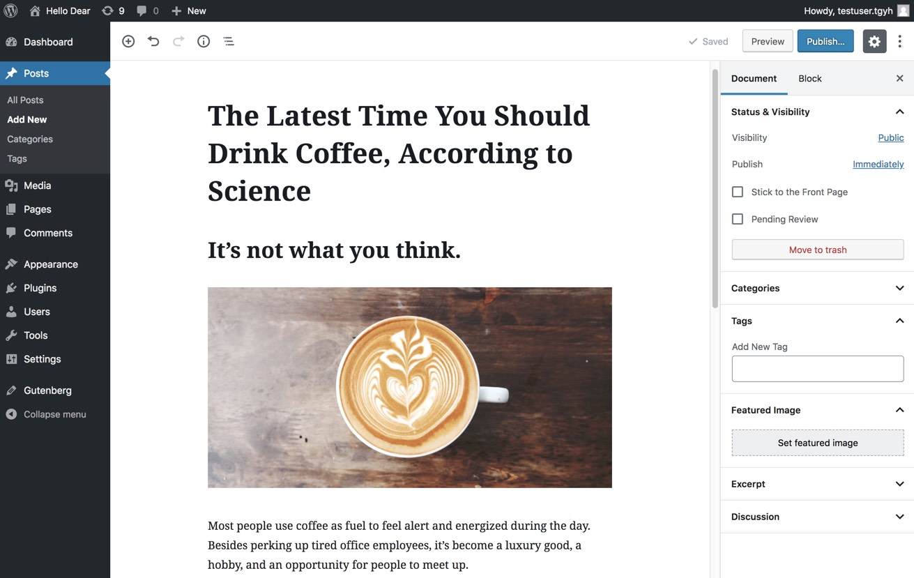
WordPress’s new Gutenberg editing UI provides a similar experience to Squarespace, in that the editor is visual and invites users to create components, such as headings, text, columns, or media.
One participant described the interface as having an “instant preview” quality. It seemed like they thought that the way the article they were creating looked here would be how it would look as published content. "I like this a lot". "The paragraphs are clearly divided with white space". One called the different components that were created "blocks".
"The great thing here is that I can see everything". Almost all the participants brought up the fact that they assumed they could edit the HTML. "I assume I can go to the source code if I need to".
Publication Workflow
We asked authors to preview, edit, and then delete the content they had created. We knew from user surveys that content editors want autosave, but from watching them go through these steps for each CMS, we realized the anxiety that the publication workflow can cause. Content editors really want to be reassured about the state of their content.
Contentful
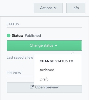
Contentful is designed as a backend for a decoupled website. So the preview provided is not an actual preview, but a read-only version of the fields of content you’ve created. Unsurprisingly, content editors found this confusing. In terms of workflow, users found it difficult to delete the content, because the current state of content and the fact that it needed to be unpublished before it was deleted was not clear. It seemed like the status of the content was unclear, and users ended up back on the content listing page to change the status.
Craft CMS
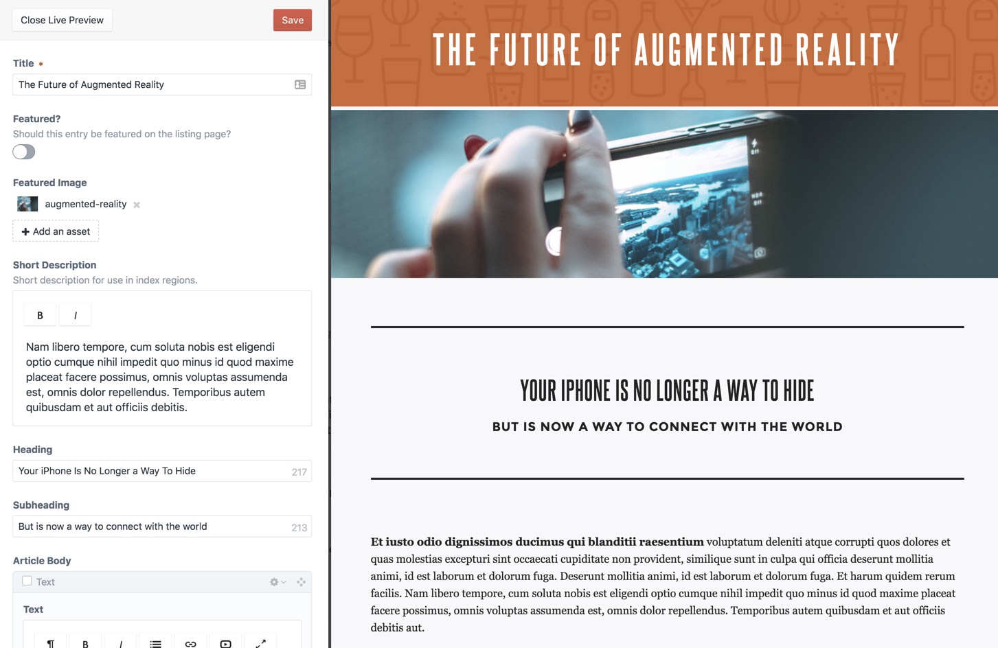
Craft CMS has a “Live Preview” that provides a side-by-side editing and previewing interface. All the editors liked seeing that when they add content, it looks like a page right away. One exclaimed “I'm great at this, look how good it looks.” The one part of the workflow that was confusing for editors is when they click “Save” from the initial dashboard, and they’re not redirected to the page they’re just created. If this button was "Save and preview" and it went to the edit screen with live preview, that would be more natural.
SquareSpace
SquareSpace doesn’t provide a way for authors to preview content before publishing. They expected that clicking on the content in the listing would display the preview. Saving and publishing the content was intuitive for users.
WordPress
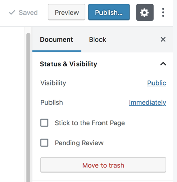
Overall, the publishing workflow in WordPress seemed to be the most clear to users. Having the status of the content, and the links to preview, publish, and delete in close proximity seemed natural to all users. The only part that participants got stuck on was the phrase "move to trash". Some users suspected that this meant they had to empty the trash. One other sticking point was the preview. The WordPress Gutenberg UI looks so much like the front-end of a site that users are surprised or disappointed when they realize that the theme enabled on their site looks different and perhaps less good.
Takeaways
We learned a lot from this usability testing. Here are some of the most interesting takeaways:
-
Editors appreciate that a more complex UI is necessary for a more complex website. This doesn’t mean we don’t need to create a user-friendly admin UI, it just means that some degree of complexity is expected.
-
A content editor-friendly dashboard, with content-editor tasks prioritized and easy-to-understand terminology will help smooth the learning process.
-
Sometimes editors find it hard to distinguish between the admin UI and the front-end UI when learning a new platform.
-
Editors have anxiety about clicking save and what this will do. Having autosave and a clear workflow for previewing content will make this process smoother.
-
Editors feel like they should be able to edit the HTML. They don’t want to learn markdown. That being said, I think the goal of a great content authoring experience would be that authors don’t feel that they have to edit the HTML, because they have the right balance of flexibility and content structure.
-
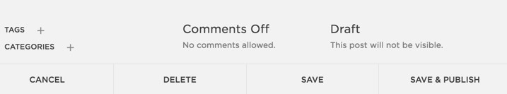
Editors want to know what the state of their content is, and they want clear options to Preview, Save, and Delete. The state of the content and the links to change the state should be in close proximity.
-
Even with a small number of participants, usability testing can help inform improvements in a user interface. We learned a lot from testing with just 5 participants.
What’s Next?
Now that we’ve taken the pulse of how content editors interact with these CMSs, I think it would be helpful to look more closely at the experience of creating more complex content. I would like to do a follow-up study looking at authoring of structured content, something Drupal is highly valued for and excels at, and more flexible, landing-page-style content, something that Paragraphs has been widely used to for over the last couple years. I think it’s essential that Drupal provides a great interface for both these use cases (whether in core or contrib). Testing how editors edit both styles of more complex content will help us understand how to do this better.
How Can I Get Involved?
The Drupal Admin Experience group that includes Cristina Chumillas, Antonella Severo, Jessica Becker, and myself. If you want to get involved, join the #admin-ui channel on the Drupal Slack.
A huge thanks to my colleague Annika for planning and running the usability testing with me and to McGill University for providing the venue for the testing.
