Last updated September 27, 2021
Since I started building websites in 2007, two things that I constantly hear are: “How do we make it easier for non-technical users to update our website?” and “How can we give content editors more flexibility?”
In 2008, when I first used Drupal, it seemed like the first problem was already solved. Drupal is designed for managing consistent, structured content. So creating content with a predictable set of fields, like events, news, courses, or publications, has always been easy to do. You don’t need to know HTML and CSS to fill in a set of predefined fields, and the theme system allows you to display those fields how you want on the page.
👩💻 Get up to speed on the latest version of Drupal! Join our upcoming Atomic & Molecular Design training.
But combining that with the requirement for really flexible marketing content was always tricky.
For example, if you asked me 10 years ago, “How do I build a homepage where I can feature a set of curated news items, display a couple clear calls to action and supporting images and videos that I can customize when I need to?” it seems like it should be a simple question. But you could get 5 different answers, and none of them would be described as “a great experience for content editors”.
In the meantime, responsive design, content portability, and accessibility concerns are increasingly important. Now more than ever, we need to make sure that by adding flexibility, we’re not sacrificing semantic markup and data.
Enters Layout Builder
When I first tried out the Drupal Layout Builder a couple years ago, I got really excited. Finally, the drag-and-drop page builder we’ve all been waiting for that will make creating flexible pages without code possible. Since that first release, the Layout Builder has become a stable solution that we can start to use on real-world projects.
Last year, my colleague Annika and I ran a comparative usability study to see how Layout Builder could be used by content editors for creating flexible landing pages. There are definitely some usability issues when you use Layout Builder for this use-case out-of-the-box. But a suite of helper modules has emerged that make it easier to use for content editors.
Paragraphs Everywhere
In the meantime, over the last several years, a module called Paragraphs has garnered widespread adoption in the Drupal community. Paragraphs was originally designed to create collections of fields within a larger piece of content.
Although it wasn't designed to manage layout specifically, it is often used to build flexible, landing-page style content where the content author can mix and match content components (Paragraphs) to assemble a page. Fields can be added that act as settings for the style of each Paragraph, to add more flexibility.
So, Paragraphs or Layout Builder?
So which is the best approach to creating this flexible content?
As usual, it depends. And the answer might be both.
(Note that the Layout Builder can also be used to create a layout for more predictable content types as well. I’m not going to cover that use case here, and will focus on the flexible page use case only.)
When to use Paragraphs
Paragraphs is great for building structured content that is consistently formatted.
With Paragraphs, you get to create Paragraph Types, each of which has its own set of fields, that live within the parent content. The content editor can pick from a list of options (which the site builder can control), deciding which content components to add to the page.
With Paragraphs, the content editor is building a form, and then filling the content into that form. For example, they can add a call to action and then a video, and then a side-by-side text. And then they can fill in the content for all those elements. Later, they could reorder them.
Paragraphs provides a lot of control and more streamlined options for content editors. It requires fewer clicks to add a new piece of content. It’s great for situations where you want to keep things simple. Many situations don’t actually require variations in layout, but just to need to allow for a flexible content model.

Caveats of the Paragraphs module
With Paragraphs, it’s important to customize the Form display, so that paragraphs are collapsed or displayed as a preview, instead of always displaying the mega-form that can result from constructing a page this way. Nesting a lot of paragraphs within each other can slow down the editing experience.
Also, Paragraphs is a contributed module, although a very popular one. Unlike Layout Builder, it's not part of Drupal core.
Downsides of the Paragraphs module
Paragraphs was not designed to manage your layout.
Building nested paragraphs with field labels like “Two-Column Layout” with sub-fields like “First Column” and “Second Column” creates confusion for content editors. You don’t get the ease of dragging and dropping elements from one part of the layout to the other. And behind the scenes, your content model will get messy very quickly if you use a lot of nesting.
When to use Layout Builder
The Layout Builder is ideal for giving your content editors a visual way to manage how content and layout fit together. You do this by configuring Block Types (similar to how you would configure Paragraph Types) and then giving editors access to edit the layout of a page. They can add Sections, each of which has a layout, and then place blocks into those regions.
Layout Builder provides an open palette of options to the content editor or marketer who will be managing the page, although you can restrict some of the options using the modules below.
The biggest difference with the Layout Builder is the ability to add “Sections” for each page, which display a set of serve as containers for the content that makes up the page. The fact that each Section can have its own layout brings a whole other dimension of flexibility that Paragraphs lacks.
This is the key to your decision of which approach to take: is that extra flexibility desirable or not?
The layout is visually represented in the back-end of the site, so you can see what your layout will look like as you edit—a feature that delights content editors once they've figured out how it works.

Layout Builder caveats
The layout builder requires customization to be usable by content editors. I recommend that you:
-
Use the Layout Builder Restrictions and Block Blacklist modules to restrict which block types and layouts can be added to a page.
-
Use the Layout Builder Modal module to improve the UX, so that editing each content component takes place in a modal rather than in the right-hand settings.
-
Consider other layout builder modules to further customize the experience.
Layout Builder downsides
There will be a learning curve for content editors used to the approach of filling in a form. They’ll need to change their workflow, and it will take time for them to learn. More clicks are required to get your content onto the page.
Regardless of how much you trust the editors’ judgment, you’re giving up more control to content editors when you use the Layout Builder.
Another thing to note is that there are currently no migration tools for getting your content into a layout (although there's an issue for adding a Destination Plugin that would make this easier).
Other Ways to Build Flexible Pages
What about Gutenberg?
Gutenberg for Drupal doesn't store your content as structured content, it gets stored as markup. You can use the Gutenberg interface to create things that appear like content components, but the data essentially gets stored in a large body field.
What about Cohesion?
Over the past few years, the folks at Cohesion (now part of Acquia) have been busy creating their own flexible page-building framework in which you use Components to assemble pages. Cohesion goes beyond the functionality of Layout Builder and Paragraphs, providing tools for changing the look and feel (using CSS and JavasSript) of Components and Templates through the admin UI. It also has features like “Helpers” providing default sets of content components that can be dropped into a page, and the ability to share a library of Components between sites.
Cohesion is optimized for marketing teams that need additional flexibility and control across pages and sites, and need to be able to create new types of Components without a developer stepping in. And by offering the ability to change the look-and-feel without touching a single Drupal file, its ambitions go beyond solving the problems of content editors. Its goal is the ultimate no-code solution for not just one, but many websites. Note that Cohesion is a paid service that Acquia offers as part of its Digital Experience suite.
What about Metadata? What about Accessibility?
I’m so glad you asked! One problem with really flexible content is that it’s inherently less consistent than predictable content types.
📚 Learn more about web accessibility for Drupal in our free ebook.
That means you can easily lose the semantic markup you need for your page to show up correctly in search results and social media and to make your content easily available to screen readers.
Whatever approach you take, it’s important to add metadata to your content along with all the flexible content components, and to make sure that value of this meta data is clear to content editors. You're using Drupal because it's great at managing structured content and outputting semantic markup. Don't get in the way of that!
Takeaways
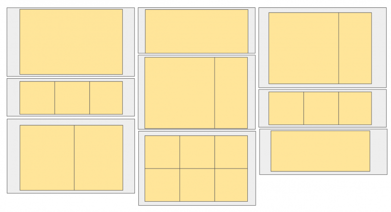
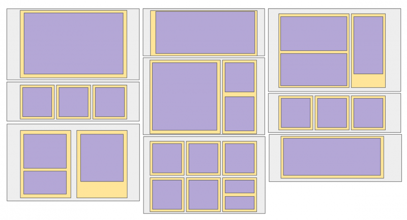
- Think globally. Remember that you’re configuring a system, not building a page. Whatever solution you pick should be the way you’re planning to manage a whole set of content and pages. When you're staring at the diagrams above, look at your whole range of design patterns, or wireframes and mockups, and think about which model would work best.
- Test and iterate. When we were working with the University of Waterloo on their migration to Drupal 8, their team took the step of prototyping both options and running them by their content editors to get their feedback before making a decision. This is a great way to test out the pros and cons of each option in relation to your specific use case, and to get buy-in in advance.
- Consider combining. Keep in mind that it’s possible to combine both approaches. You can use Paragraphs for structured content elements, and use Layout Builder to put the pieces together in a layout. Just try not to over-engineer your solution. Think again about the experience you're building for content editors.
Whichever option you pick to build your flexible pages, try to make a decision at the outset of the project, as you’re designing your content components and creating your Pattern Library or UI Kit. It will have an impact on how components are combined on the page, and the layout options you provide.
Looking to step up your Drupal skills? Sign up for our next session of Advanced Drupal Module Development training.

