Updated on December 7, 2021
The ongoing pandemic has underscored how important it is to have a clear communications strategy to deliver health information. This includes ensuring that the websites containing that information are intuitive, clear, and easy to navigate. Bad UX is a critical problem for healthcare sites—especially during a pandemic.
Let’s start by taking a look at three of Canada's provinces’ official Covid-19 information hubs and discussing what they’ve done right and what could be improved.
Then, we’ll look at some UX best practices that can help everyone get the vital health information they’re looking for on your site quickly and easily.
Real-life Examples: Provincial Covid-19 Information Hubs
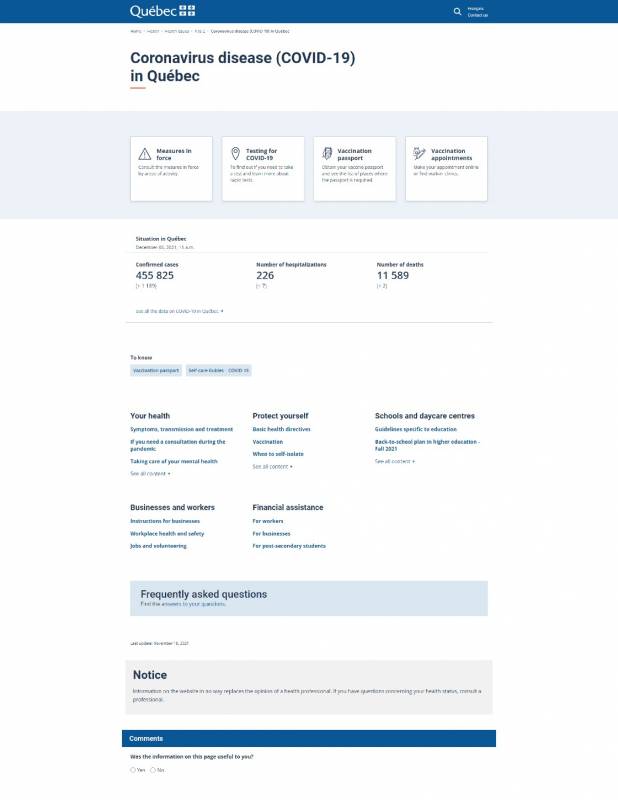
Quebec
Minimalist design, passive language
|
✔️ Good |
🛑 Room for improvement |
|---|---|
|
|
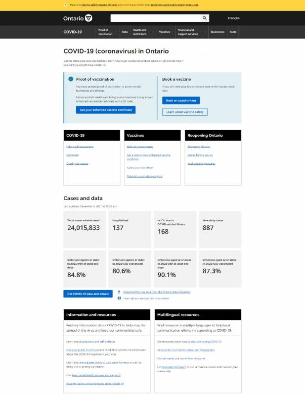
Ontario
Engaging and action-focused
|
✔️ Good |
🛑 Room for improvement |
|---|---|
|
|
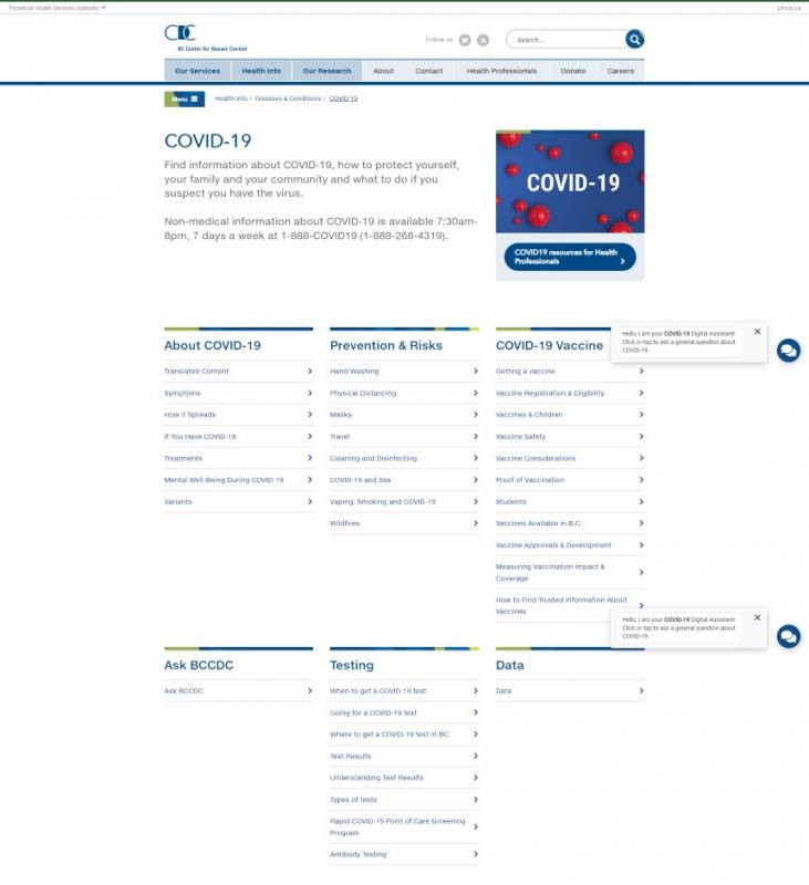
British Columbia
Comprehensive but intimidating
|
✔️ Good |
🛑 Room for improvement |
|---|---|
|
|
Now that we're warmed up and in UX critique mode, let's look at some actionable takeaways you can implement in your own sites.
5 Best Practices for Communicating Health Information
So how do you build a healthcare site with a good UX? Here are 5 best practices that’ll help you communicate vital information clearly and effectively.
- Start at the end
- Think mobile-friendly
- Follow the inverted pyramid
- Consider new consumption habits and accessibility
- Build for your team, too
1. Start at the end
What do your visitors need to accomplish when they visit your site? Find the location of a specific service within a hospital complex? Get information about services they’re eligible for? Find out whether they can get vaccinated? Write that down before anything else.
Mock your website up the way you like and figure out key copy and graphics. Then, when you're finished, go back to what you put down as a goal.
Does your site clearly direct people to that single goal from the instant the page loads?
Is it confusing what you should do first? If so, start again.
Especially in a pandemic, but in any health-related situation, people are stressed. They are not reading as carefully as they could. Odds are high something else is on their mind when they browse your website.
Make it easy for them. Show them the goal and nothing else.
2. Think mobile-friendly
Your website must work on mobile devices and make the most important calls to action visible immediately—i.e. above the fold.
Let’s see how our three provinces perform on this front.
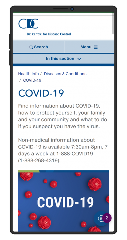
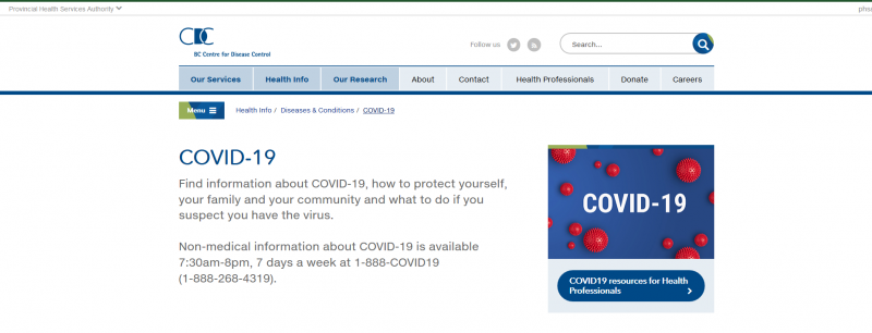
British Columbia’s Covid-19 information hub has arguably the weakest mobile experience of the three. That doesn’t mean it gets everything wrong, though! While the large, nonfunctional image takes up too much valuable space when you land on the page, at least the important phone number information is still immediately visible. There’s also a practical “In this section” drop-down menu to help visitors find what they need on the page.
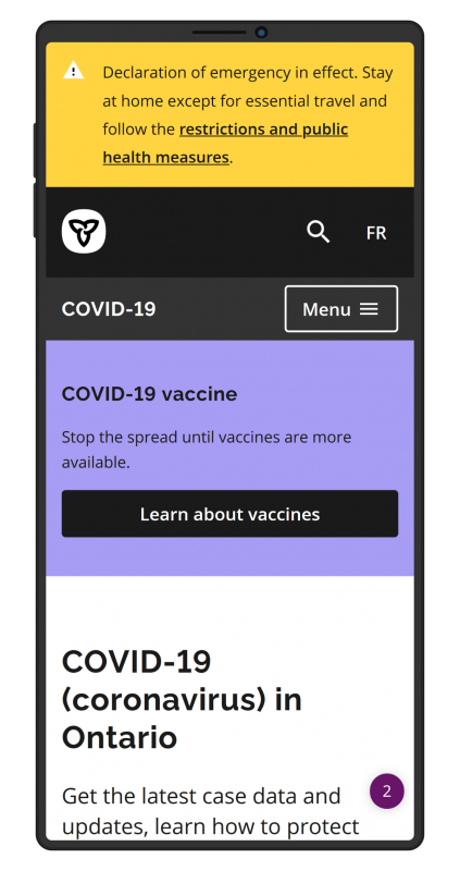
Ontario’s hub checks most of the mobile-friendliness boxes, and I found the site easy to navigate on my smartphone. One potential improvement would be to adjust the size of the topmost elements (update banner, navigation menu) in order to make more room for the key call to action below.
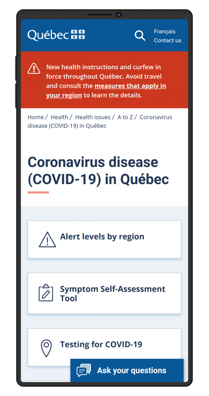
Overall, if we’re just looking at the mobile experience, Quebec’s hub would probably be our winner. Its top elements are proportionally sized so that all four of the key CTAs are visible immediately upon entering the site, giving it an edge over Ontario’s version.
3. Follow the inverted pyramid
Journalists are taught to write their articles in an inverted pyramid structure, which means putting key information in the first few lines to ensure readers can understand the gist of a story at a glance. In other words: the more important something is, the higher up it should be on the page.

Depending on your site’s purpose, highlight information that’s most relevant to users and make sure they can access it quickly. Health information can be complex and lengthy, but it’s important to surface key pieces of information without making users search through pages of content.
Ontario’s and Quebec’s Covid-19 pages don’t highlight exactly the same information, but they both do a good job of emphasizing what they consider to be the most important or sought-after content.
As for BC, while the bulk of the information on the page is organized by topic without any clear hierarchy, at least the province’s 24/7 Covid-19 hotline—ostensibly the most important information people are looking for—is clearly featured at the top.
4. Consider new consumption habits and accessibility
Websites are no longer consumed only by humans with eyes. Siri, Cortana, Alexa, and other virtual assistants are tasked with reading out content for drivers or busy people at home. Search engines constantly crawl and update search listings based. Conversational UIs like chatbots (which you’ll find on two out of our three example sites) are proliferating. And, of course, many people have vision impairments and rely on assistive screen devices to navigate the web.
Good UX is about designing an experience that works for every possible user, which means following accessibility best practices and keeping information as simple as possible.
Use plain language and shorter sentences, and always spell out acronyms and abbreviations. Label action items with verbs, not nouns.
For example, on Quebec’s page, instead of the passive “symptom self-assessment tool” and “Covid-19 testing”, clearer options might be “Assess your symptoms” and “Find out how to get tested” (or, even more simply, “Get tested”).

Finally, mark up your site with structured data. People expect information to show up on Google maps, so make sure to tag location information correctly. Similarly, if someone asks their voice assistant what a clinic’s opening hours are, that information needs to be appropriately marked up in order for Google or Siri to read it back.
5. Build for your team, too
The homepage is designed to serve your customer, but one of the best ways to help guide a customer through a complex problem is to make sure that the healthcare professionals who serve the public during a health crisis can find and use relevant snippets of information from the website.
Of the three provincial Covid-19 hubs we’ve looked at in this article, British Columbia stands out by including a clear CTA targeted at healthcare professionals at the top of the page, which immediately segments audiences and lets visitors access the most relevant content to them.
Consider both how healthcare clients and how healthcare workers label the information they need and ensure that your content is tagged accordingly. In other words, aim to accommodate the different mental models of patients versus practitioners when it comes to seeking health-related info.
Make sure to keep your site up to date, and highlight information that was recently added or modified. Healthcare websites need to be reliable, trusted resources for all that use them.
Finally, when designing content types and taxonomies, consider how internal staff will search for clinics or health services. If staff have a website login, you could also design a more advanced search interface that’s customized to their needs.
Learn more about UX for health information
Good UX is a series of choices involving empathy for the user, an understanding of the complex changes that have occurred in how content is consumed over the last 5 years, and a relentless focus on simplifying and then adding lightness.
Want more insight on user experience for online health information?

