How We Plan (Remote) UX Workshops
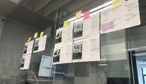
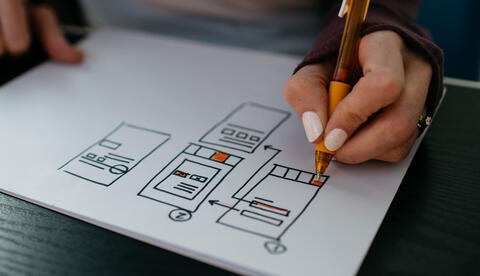
I recently sat down (over Zoom) with our UX lead Annika Oeser, who walked me through a typical UX workshop like the ones we usually conduct with our agency clients.
Find out why your SVG icons look blurry when you export them from Sketch, and how you can work around the issue.
It's a lot easier to design an accessible website if you consider accessibility from the get-go, but we don't always have that luxury. You’re far more likely to have an existing site on your hands, and, if you're reading this, you're probably wondering how to determine how accessible it is currently so you can get a better idea of what needs to be done.
Here’s a simple guide to testing your Drupal site for accessibility. (Most of these apply to non-Drupal sites, too). We've divided it into 3 sections.
Jump to:
Learn how to design accessible, inclusive digital experiences with these seven key tips.
Now that the year is nearing its end, I have the chance to reflect on what I learned about UX design this year, and want to share some highlights from a conference I attended last month.
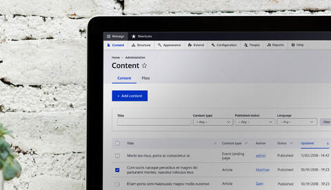
We at Evolving Web are really excited to see the progress being made on improving the Drupal admin UI. As a designer, I’m curious about the process that drives such a huge project. I talked to the designer in charge of the refreshed interface, Cristina Chumillas, and got super interesting insights into what’s behind the new design.
In my previous blog post I gave some tips about layout and design theory. Now I want to speak about typefaces, which is a really fun part of my job as a designer.
Typography can make all the difference in a design. You can even create an entire website with just type. Today, even brands with smaller budgets can access excellent, industry-standard fonts, completely free. The trick is knowing which ones to choose. That's why it's critical to understand design basics, and always be searching for more inspiration.
In the coming months on our blog, I’ll be interviewing some of the members of our team at Evolving Web to give you some insight into how they work, their perspective and their field of expertise.
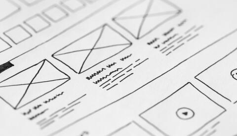
For a web designer, having a good mock-up software is crucial. In the initial phase of design, a mockup software should allow you to plan wireframes and focus more on the utility than on the visual concept. To do that, I use Invision.
As for designing the visual elements within my mockups, I use an alternative to the Adobe products which is super intuitive, Affinity Designer. It’s great either for creating vector illustrations, wireframes, mobile apps or more complicated user interface projects.
If you are a web designer, chances are you have heard about Material Design.
Material Design is a popular "design language" developed by Google that came out in June 2014. Since then, it has kind of become the visual identity of most of Google's mobile applications for Android. Many mobile app developers are using it and the approval rate among web designers is also rising, mostly because of its simplicity and the influence of mobile apps on responsive design.