In the first part of this series, we explored university and college websites focusing on how they present the admissions process. Now, we'll take a look at how higher education websites present academic programs. So, without further ado, let's take a look at the second batch of the 10 higher education websites we love!
👩💻 Blog post: 10 Higher Education Websites We Love - Part 1
Frank Batten School of Leadership and Public Policy (Dual Degrees)
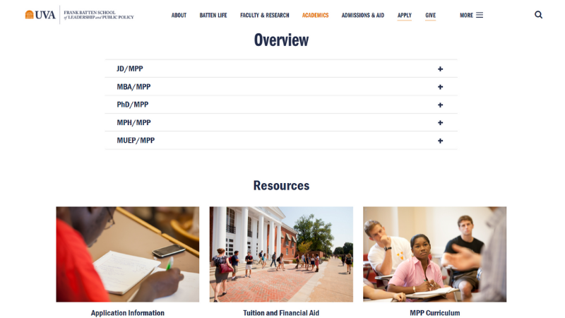
The Dual Degrees page from Frank Batten School keeps a tight focus on its purpose. The page is heavy on whitespace and efficiently steers the reader to their intended program.
- The minimalist design makes content the star.
- Generous whitespace and easily skimmable chunks
- An accordion-style list prevents program options from competing for attention.
- Content is brief and every element helps the reader accomplish their task.
Alverno College
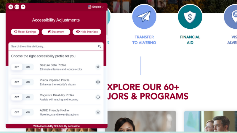
We love how Alverno College's graduate and undergraduate programs landing pages are friendly and bright while delivering great accessibility. It thoughtfully uses colour and whitespace to bring energy to its classically dark brand palette.
- The page directly addresses undergraduates, graduate students, transfer students, and adult learners and directs them to relevant information.
- A popup menu gives visitors direct control over adjustments and accommodations for impairments or assistive devices.
- Simple, bright graphics highlight the school's accolades and metrics.
Yale Jackson Institute for Global Affairs (Master in Public Policy in Global Affairs)
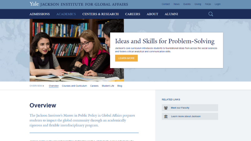
The homepage for the Master in Public Policy in Global Affairs program at Yale's Jackson Institute for Global Affairs has a lot to say. Even so, it keeps it all organized, personable, and task-focused. As a result, the page feels thoughtful and serious while keeping a personal touch, with a rich introduction to the school community.
- Critical information and action links are easy to find with a prominent menu.
- Student work and experiences take center stage, with blogs, video testimonials, and student profiles.
- At the bottom, visitors are invited to "Start Exploring New Haven," with a detailed guide to local landmarks and amenities.
- The soft colour scheme is visually pleasing and minimizes distraction.
University of Notre Dame (The Graduate School)
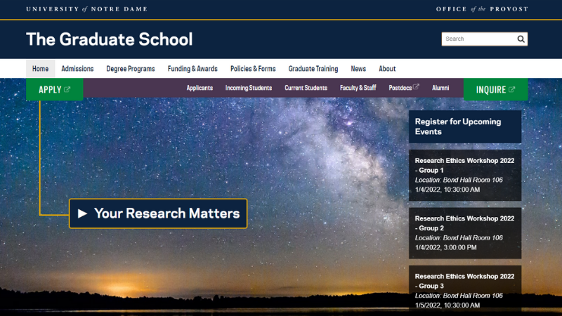
The next higher ed website on our list is University of Notre Dame's Graduate School homepage. The compelling, inspiring art direction for the leading graphic efficiently directs users to the right CTAs within their journey.
If you want to see a similar effect in the use of high-impact art, take a look at the Climate Talks website Evolving Web designed for Emory University.
- The layout is innovative and intuitive, owing to its simplicity and tight focus on users and key actions.
- The minimalist header content with a high-contrast design maintains the balance between imagery and action.
- A consistent design system anchors the homepage with clear calls to action.
- The mobile experience features a well-structured menu and a tidy, action-oriented scroll that prioritizes tasks and information effectively.
Paul H. O'Neill School of Public and Environmental Affairs (Masters program)
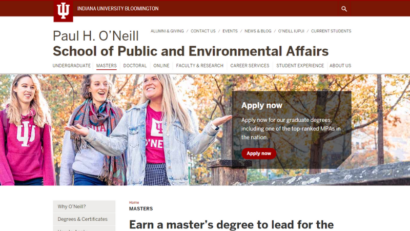
Another higher ed website that delivers a great user experience is the Paul H. O'Neill School of Public and Environmental Affairs at Indiana University Bloomington. The Masters program's website design is bright, full of whitespace and in high contrast, exuding school pride.
- Strong representation of school brand and iconography in page design
- Crucial program information is listed prominently. Below the fold, relevant calls to action entice prospect students to know more about the school.
- At the page bottom, the information request form is highly visible with a clear, engaging CTA: "take the first step."
- The desktop version is clean, plenty of whitespace that helps the components to catch the user's eye. The mobile experience features large, simple chunks and UI components.
Want to dig deeper into creating great higher-ed digital experiences? Check these resources:
- Surprising Stats and Useful Facts About University Websites
- Empowering Universities With Large-scale Drupal Platforms Using Custom Upstreams
- 3 Ways to Avoid Common Information Architecture Mistakes
- How to Design a Site Search Experience Users will Love
- A Beginner's Guide to Web Accessibility Governance for Higher Ed

