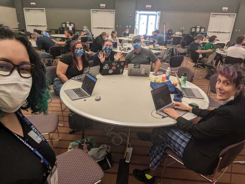
Contribution Day was one of the best parts of DrupalCon Pittsburgh 2023. The Evolving Web team got involved in several different initiatives and my colleague Robert and I decided to work on the initiative for converting Olivero components into Single Directory Components (SDC). Olivero is Drupal's default front-end theme and boasts out-of-the-box accessibility. We chose to work on the SDC initiative because it promises to make Drupal easier for front-end developers and to lower the barrier of entry to those who are new to Drupal. I’d love to walk you through what we did so that you too can learn how to convert regular components into SDC.
For further additional information, you can watch the full recording of the DrupalCon Pittsburg session on Single Directory Components in Core by Mike Herchel and Mateu Aguiló.
What is an SDC?
Basically, SDC is an experimental module in core that allows developers to create components that include all of the required files in the same directory. These components are made of:
- A twig template
- A file with metadata describing the input data needed in the template
- Optional JavaScript files
- Optional CSS files
- Optional images
The objective is to have any type of file that affects how the component is rendered in the same directory.
The Problem With the Traditional Approach
Information gets lost with the traditional approach to building components in Drupal. It’s difficult to know how the assets are being loaded, which assets are related to the component, where they’re located, and what data is expected for the template.
You might get lost too! It's easy to become disoriented in the codebase. Also, you may not have a clear idea of where else an asset is used when you’re editing styles or scripts.
Why SDCs are the Solution
Components are reusable UI elements; they can be considered basic building blocks with specific functionality and purposes. A components-based approach allows us to create directories where all the code related to it is placed in the same folder.
There are many benefits to using a component-based approach, including increased organization, reusability, scalability, consistency and so on. It has the further advantage of helping to orient yourself when editing components. Because everything is contained in a single directory, you’ll instantly know where to go and how to find the assets. You’ll also know that those assets are specifically affecting the component you are working on, making testing easier than the traditional component approach.
In Drupal there are multiple ways to implement components including the modules UI Patterns, Components and some components libraries like Pattern Lab, Storybook and Fractals. So why should we use specifically SDC and not, for example, UI Patterns?
Truth is, UI Patterns and SDC share the same vision—but SDC is a project with a smaller scope than UI Patterns, that pretends to make the components approach a "native" thing in Drupal core. So, it's not a matter of choosing between SDC and UI Patterns. The end goal is to have an ecosystem in Drupal where using components is the default, so even modules like UI Patterns will switch their syntax to create components based on SDC principles.
Before You Start: Get the Right Tools
Before you get started, here are some of the essential tools you’ll need.
Theme debug
This is probably the most useful tool when doing theming. It can now be enabled via the Drupal UI by going to Configuration > Development > Development settings, then clicking the "Twig development mode" checkbox. This will then make some comments appear in the website markup, providing us with valuable information about the templates used, hook names, and template file names suggestions. This option is now available in Drupal core 10.1.
Core-dev module
This provides some dependencies useful for doing local development. If you add this tool to your codebase, you’ll get error messages with more details. To add it you should run:
composer require drupal/core-dev --dev
SDC experimental core module
You’ll need to enable the SDC experimental core module. You can do this in the UI by going to Extend (dmin/modules) or via drush by running:
drush en sdc
Step-By-Step Example: Converting Regular Components to SDC
To start, we looked at a fresh Drupal installation with the Olivero theme as the default theme. We then identified some components and each person at the table took one component. I worked on porting over the RSS Feed icon from the traditional approach to SDC. In this section I’m going to walk you through how I did it.
The files related to the rendering of the RSS Feed component are:
- core/themes/olivero/images/rss.svg → the icon used in this component
- core/themes/olivero/css/components/feed.css → the CSS rules for defining the look and feel of this component
- core/themes/olivero/olivero.libraries.yml → registers the library where we declare the use of the CSS asset
- core/themes/olivero/templates/misc/feed-icon.html.twig → defines the markup for the component and loads the required libraries to ensure it displays correctly
As you can see, all of these files are in separate directories and it's difficult to navigate through them. To convert this component to SDC, we’ll use the same assets but we're going to re-organize them so they’re in one single directory. Then we'll add some metadata.
We need to follow these steps:
- Create a new directory called components/ in your theme or module.
In this case we're working on the Olivero theme, so it needs to be added in core/themes/olivero.
- Create a new directory within your theme’s components/ directory with the name of your new component.
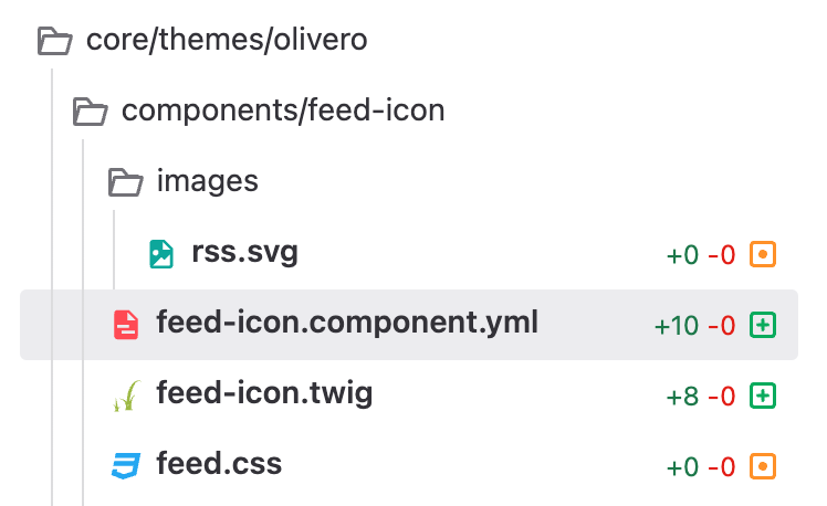
Note that you can nest your components if needed and classify them as atoms, molecules, organisms or any other way you want. For the case of this RSS Icon component I named my component as "feed-icon" and I didn't add any extra nesting levels, so the file structure is as follows:
core/themes/olivero/components/feed-icon
- Add the twig file for your component using the name you previously defined.
In this case, I created a new file called feed-icon.twig. Once you have it, you should start adding the markup and logic you’ll need. Because my feed-icon component already existed I didn't need to reinvent the wheel. I simply took the relevant code from the template core/themes/olivero/templates/misc/feed-icon.html.twig, deleted it from that template, and pasted it into my new template. The relevant code is:
{{ attach_library('olivero/feed') }}

<a href="{{ url }}"{{ attributes.addClass('feed-icon') }}>

<span class="feed-icon__label">

{{ title }}

</span>

<span class="feed-icon__icon" aria-hidden="true">

{% include "@olivero/../images/rss.svg" %}

</span>

</a>
Note that some of this code will need to be updated as routes, properties and libraries may change.
- Add a YAML file with the *.component.yml extension.
You can view/copy the example annotated YAML file to get started. This is the file where we'll add the metadata for our component.
This metadata has multiple levels—in some cases it can be minimal. In its most basic form, it can include properties for defining the name, description and status of the component, as well as the schema properties and slots.
For the schema properties you will define the input variables your template needs. You’ll have to describe them using json-schema.org. For the slots you’ll add the different twig blocks you defined in your template that can be overridden by other templates.
In the most advanced form of this file you can define extra JavaScript files such as libraries dependencies. You can even override components using the property called "libraryOverrides".
For our feed-icon component, I created a new file called feed-icon.component.yml. Within it I added the name and props as follows:
name: Feed Icon

props:

type: object

properties:

attributes:

type: Drupal\Core\Template\Attribute

title:

type: string

url:

type: string
The "props" item from this file needs to be present and it will be of type "object". Inside it you have to list all the variables that your twig template depends on. In this case they were title, url and attributes.
To know the data type of the variable "attributes", I just printed the variable using the Kint module in the original template core/themes/olivero/templates/misc/feed-icon.html.twig.
When reloading the page, Kint shows that “attributes” is an instance of the class Drupal\Core\Template\Attribute. This is why I added it into my feed-icon.component.yml file.
Alternatively, you can also use the dump function to learn the data type of a variable.
- Move CSS and JavaScript assets to the component directory.
The feed-icon component didn't have anything JavaScript related—only a CSS file. So I moved the CSS file from core/themes/olivero/css/components/feed.css into my component directory.
By doing this, the system loads the asset automatically, so we don't need to call the feed library explicitly in the template. This means we can delete the line {{ attach_library('olivero/feed') }}
This also means we can delete the feed library defined in the olivero.libraries.yml file.
- Add other required assets.
For the feed icon component, we’re printing an icon which was originally placed in core/themes/olivero/images/rss.svg.
I created a new folder called "images" inside of my components folder. I then moved the rss.svg inside the images folder so that it’s now located in core/themes/olivero/components/feed-icon/images/rss.svg.
Moving this file means we need to update our twig template to use the right path. So instead of having a line reading:
{% include "@olivero/../images/rss.svg" %}I replaced it with:
{{ include (componentMetadata.path ~ '/images/rss.svg') }}

Now it uses the path to the component folder and then the relative path to the SVG file.

At this point the feed-icon.twig file should look like this:

<a href="{{ url }}"{{ attributes.addClass('feed-icon') }}>

<span class="feed-icon__label">

{{ title }}

</span>

<span class="feed-icon__icon" aria-hidden="true">

{{ include (componentMetadata.path ~ '/images/rss.svg') }}

</span>

</a>
So, now the file structure of the component is as follows:
Congratulations, you’ve successfully ported your first component! Now all that’s left to do is to actually use it in another Drupal template.
- Embed the newly created component.
At this point you are ready to embed the component in the original twig template. In the case of the RSS feed icon this was core/themes/olivero/templates/misc/feed-icon.html.twig.
You can embed the new component using the extend or include twig statements—it depends on whether you are using blocks inside it or not. In this case I'm not using blocks, so I can call the new component by using the "include" function, defining the name of the desired component and the list of props it will receive. It looks like this:
{{ include('olivero:feed-icon', {

title: title,

attributes: attributes,

url: url,

}) }}
Once you’re done with this you should clear caches and reload your page, and the component should still be working correctly.
What's next for SDC?
Ideally, components would be a compatibility layer in themes. This would allow us to easily replace full components by adding the key "replaces" in our components metadata instead of being tied forever to the theme we're using as base.
The plan is to start including components in themes and modules, turning components into a site building tool by exposing them to site builders. For example, it’ll be possible to use them directly by dragging them into the layout builder. Another goal for the initiative is to enable component libraries by leveraging tools like Storybook. SDCs have a bright future that will enhance the development experience for everyone involved.
Building #drupal sites with Single Directory Components in the admin UI.
This demo uses https://t.co/XztXqIlZ44 pic.twitter.com/3SmSVTlSSk
— Mateu A. B. (@e0ipso) July 27, 2023
A demo of building a Drupal website using SDC components in the admin UI
We invite you to start working on this issue to help maintainers port regular components over to SDC. The process for Olivero has already begun—and even though SDC is still an experimental module in core, the plan is to move in that direction. Once stable, SDC functionality will be integrated into Drupal Core’s base theme system. The faster we can convert components to it, the faster that can happen.
Additional Resources
More information about the use of Single Directory Components can be found on drupal.org. You can also watch a quick video of how to convert a component to Single Directory Components.
