Overview
Evolving Web partnered with the Division of Students at York University to rebuild their Drupal-based Future Students website. In this collaboration, we updated the website's content and components to follow York's brand and architecture standards and designed a user experience that is student-centric and intuitive. This has resulted in a significant increase in engagement since the relaunch of the website.
Services: Web Development, Web Design

About the client
Located in Toronto, York University is Canada's third-largest university, with nearly 60,000 undergraduate and graduate students. It's a leading international teaching and research university committed to giving a broad demographic of students access to high-quality, research-intensive learning within a diverse community with a uniquely global perspective.

Goals
The goal of redesigning York University's Drupal-based Future Students website was to offer an engaging, highly informative way for prospective students and applicants to discover the University, while aligning with York's renewed design standards and supporting the needs of different types of applicants. The site also needed to support the parents, teachers, and guidance counsellors who help guide potential students through the research and application process.
The new website needed to support York's digital marketing and recruitment efforts by:
- Driving lead collection and turning new leads into student applicants, funnelled directly into York's CRM for applicant nurturing
- Engaging digital traffic from recruitment events by providing clear calls to actions, such as program search, browsing upcoming events, submitting an inquiry form, etc.
- Supporting admitted student conversion with clear transitional next steps, meeting applicants where they are and delivering the most relevant information to them at every stage
- Increase touchpoints by advertising upcoming recruitment events and encouraging registrations to encourage constant engagement
- Providing a glimpse into student life, helping applicants envision themselves at York
- Reducing inquiries to their frontline email channels by improving self-search

Why Drupal?
Drupal has been the content management system (CMS) of choice of York University's Division of Students since 2007. It's used not only by higher education organizations, but also numerous government agencies, non-profits, well-known private companies, and media outlets around the world.
Here are the main ways that the Division benefits from Drupal:
- Content-first approach enables harmonized content management, reduces duplication by leveraging the Division of Students' proprietary content system, and allows easy meta-data management for improved search results
- Flexibility and open-source allow the development of custom solutions to address business needs and enhance the student experience
- Users can fully customize, integrate, and build applications into their websites, essential for managing and displaying complex databases and highly sought-after information across several pages
- Easier to maintain than other CMS platforms by allowing deep customization, user-based roles and access controls, and direct integrations with other systems without the need for third-party plugins
- Robust security features that are built by, and for the global Drupal community
- Immense support by the Drupal community through crowd-sourced documentation and online forums, enabling the Division of Students to constantly innovate and deliver exceptional user experiences

Solutions
To approach this project, students and stakeholders actively helped Evolving Web trace four different applicant journey maps that outlined the needs, aspirations, and concerns of the target audiences. In total, the project engaged seven Grade 11 and Grade 12 students, and 31 staff members across seven focus groups, workshops and 1:1 interviews. We used this information to map out the new navigation structure and information architecture of key pages, and cross-referenced knowledge, insights and ongoing work around current student journey maps. While alignment with the current student experience was essential, the project team took great care to centre the Future Student website redevelopment project on the applicant and prospective student experience. This included drawing distinctions in language, content themes, and natural wayfinding on the website.
To create this project's journey maps and the new website structure, our team partnered with the Division of Students to collaborate on Miro, one of our favourite tools for remote work, and Figma, an interactive layout and mock-up tool.These tools enable users to collaborate and use virtual boards and sticky notes to build highly visual, easy-to-understand schemes and sitemaps.
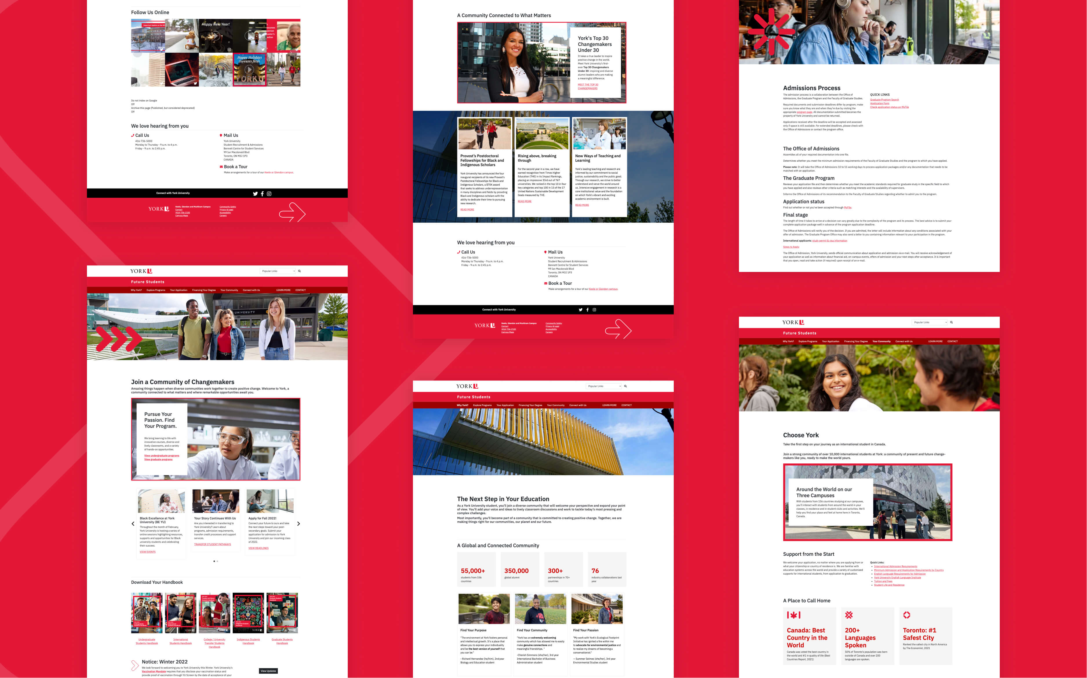
Our team created a set of website components in Drupal, based on a library of patternsprovided by the client that align with their design standards. These components are the building blocks of the landing pages. We also integrated the existing content into the pages, adapting it to take advantage of the new components.
These are some of the new website's key features:
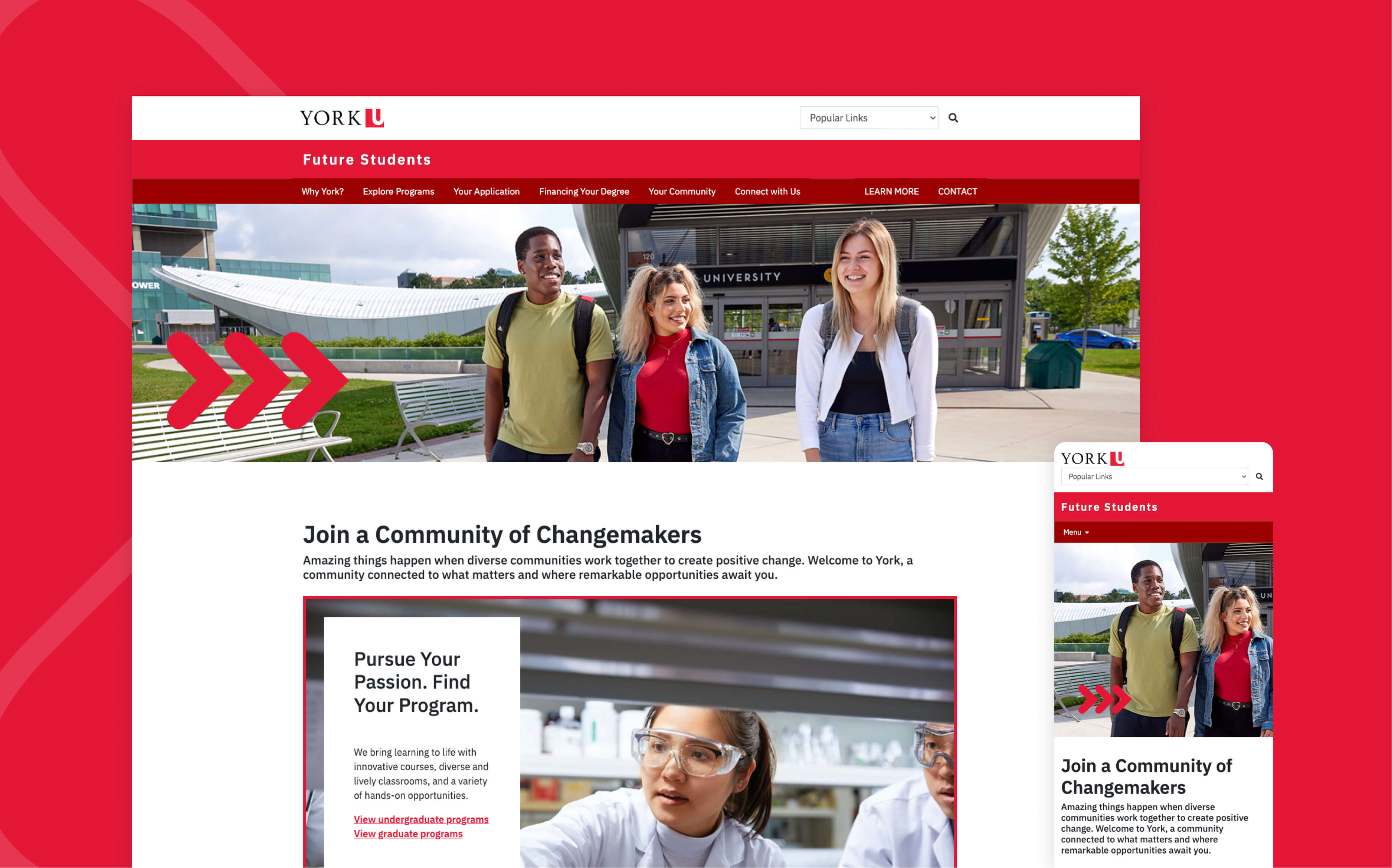
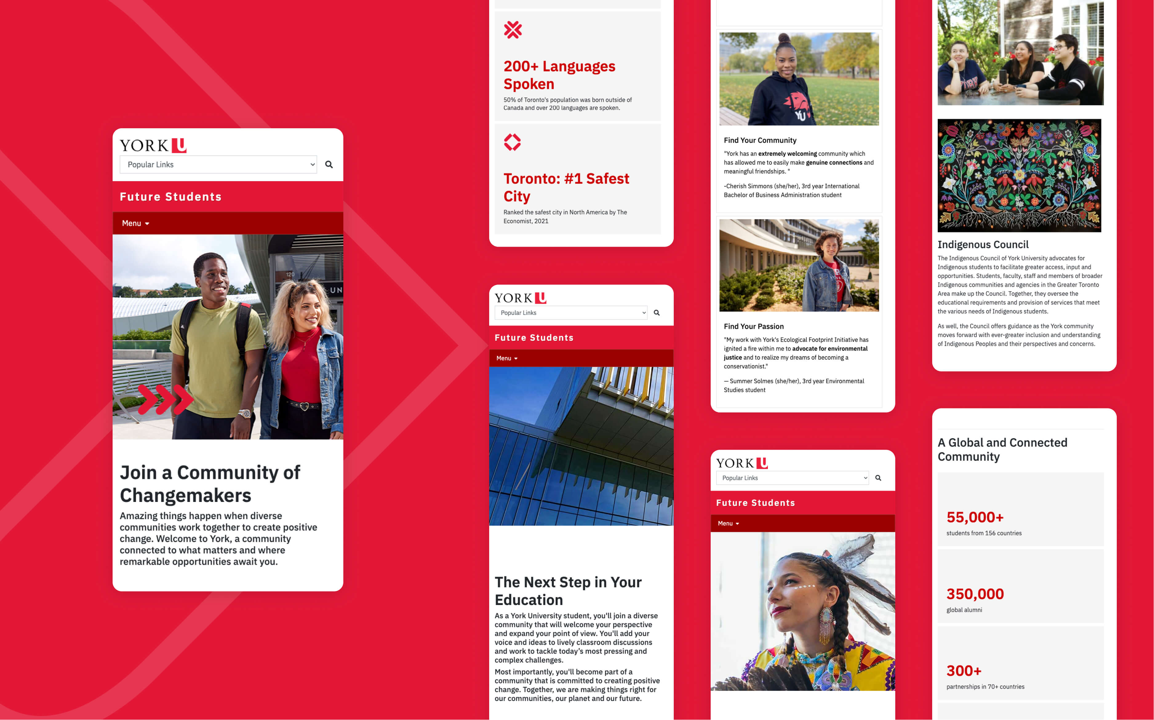
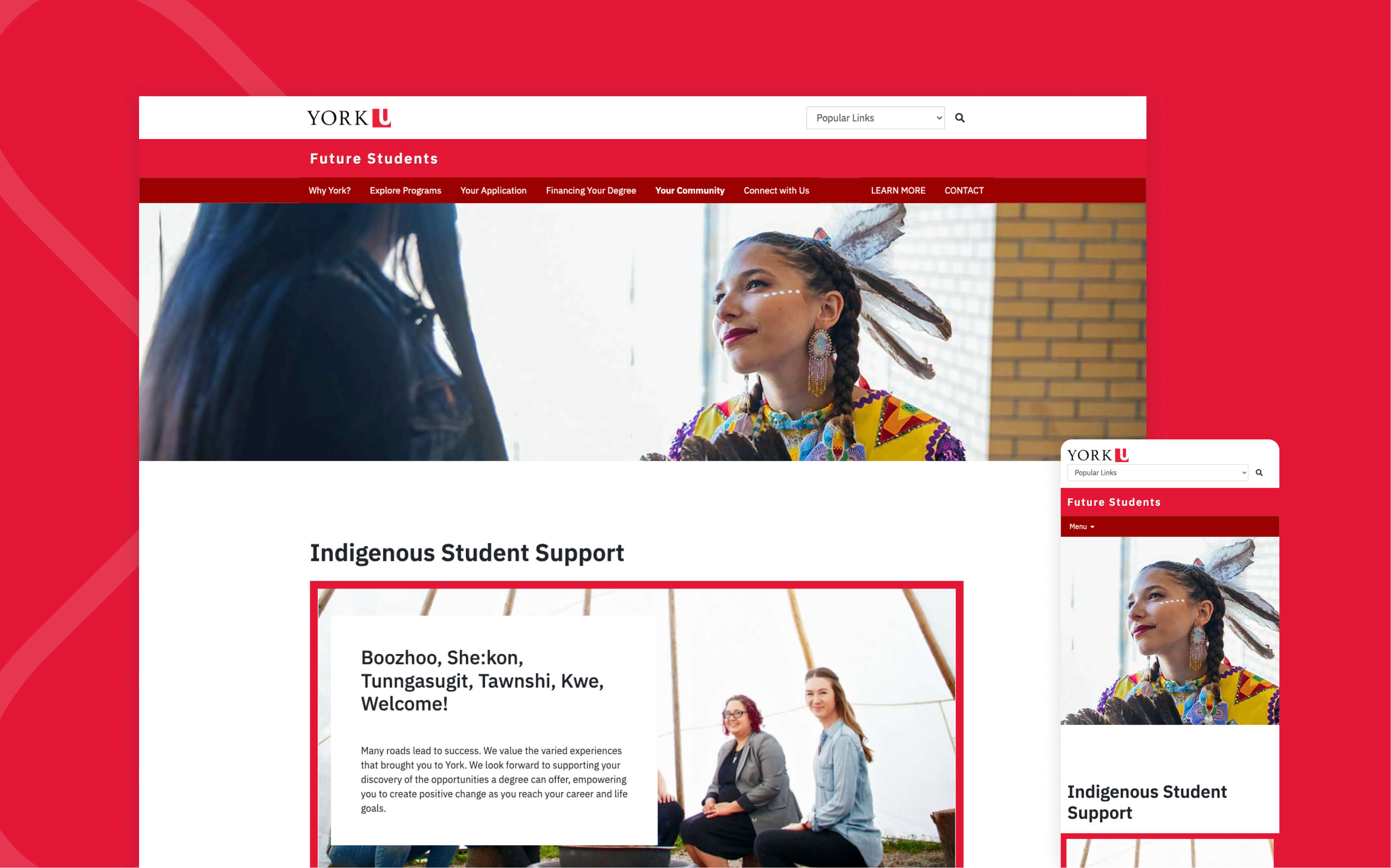
- More imagery, testimonials, and student-related metrics on the webpages, showcasing diversity and inclusivity, so visitors can relate and feel welcome.
- Use of accessible language more appropriate and compelling for Gen-Z audiences (such as Grade 11 and 12 prospective students)
- Top menu navigation was restructured, following the needs expressed by the stakeholders, making information more streamlined and more readily accessible.
- The page footer was redesigned to highlight essential information and helpful links.
- A cohort selector entices visitors to choose between seven different visitor profiles, intuitively and dynamically driving them to customized pages that consolidate the most relevant information according to their needs. The cohort selector is prominently displayed on the homepage and each program page.
- Program pages now consolidate details and relevant documents, such as handbooks, that were previously scattered on different web pages.
- The "Why York" page was rebuilt with testimonials, diverse student images, and relevant metrics, making it more compelling, informative, and inviting for potential students.
- A new "International Student Community" page consolidates critical information for foreign visitors, such as the contacts of York U representatives in different countries and continents and tips about what to expect when students arrive in Toronto.
Our website visitors are looking for specific information to help them make informed decisions. Our collaboration with Evolving Web resulted in a website that is able to meet students where they are, providing a positive and engaging experience for our users

Results
The new website drove an impressive increase in traction. In February 2022, sessions jumped 214% YoY, while page views increased by 79.9% in the same period. The new website also brought a 38% YoY increase in web traffic to the Apply Now page.
Those numbers reflect the compelling, student-first user experience created through the collaboration between the Division of Students at York University and Evolving Web. The new website drives results while presenting the diverse, vibrant community that awaits York's future students.
Evolving Web adapted a total of 39 components for Drupal, drawn from the standard design patterns used across York University websites. Moreover, our team conceptualized a new component that was successfully added to York's repository. We also made recommendations about previously unused components that could be incorporated to best communicate information to potential students and balance text-based and visual content.
This project was a complex, strategic undertaking and the overall result is a stunning website designed with the end users in mind. We are seeing a strong and steady increase in returning visitors.


