Images are a crucial consideration when you’re updating or expanding your website. Done right, they're a powerful tool for communicating your message and enriching the user experience. Done wrong, they can leave a bad impression and weaken your digital presence.
This guide explains how to pick meaningful images that create a connection with your audience. You’ll also learn how to optimize, resize, and compress images so they’re ready for the web.
Selecting the Right Images
Take time to explore the images available to you. You can search and download free images via Unsplash and Pexels.
Here are some key points to consider:
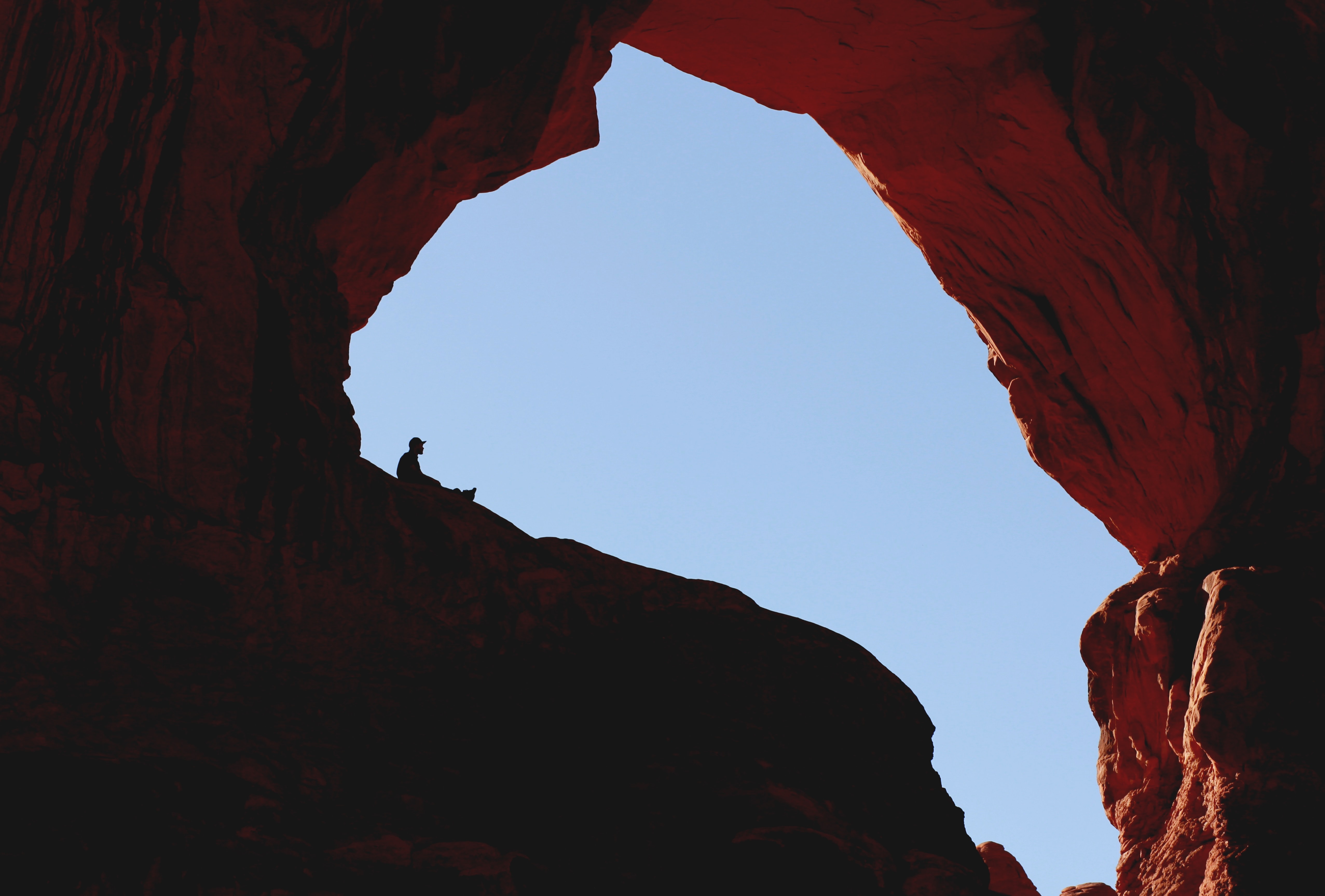
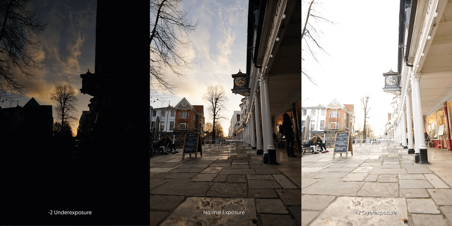
- Quality. Choose images with a high resolution and correct exposure to show users you care about quality. Avoid images that are low-res, blurry, tilted, or incorrectly exposed.
- Tone. Images should match how your organization wants to come across. If there are people in the image, think about the impression their poses and clothing give – for example, do they seem professional, friendly, or casual?
- Inclusivity. Pictures are a great way to connect with your audience. Portraying different people can help make them feel welcome. Be inclusive of all races, genders, ethnicities, abilities, sexual orientations, and other characteristics. Pay particular attention to traditionally underrepresented groups.
- Variety. Show a variety of environments to keep things interesting for users. Have some images that feature people and some that don’t. Switch things up with different crops and angles.
- Composition. Images with simple compositions and no clutter tend to be less distracting and overwhelming. This allows users to focus on what’s really important.
- Distinctiveness. Look for images that make your platform stand out from the crowd. Avoid generic stock photos as they’re boring and leave a poor impression on users.
- Design specifications. For example, banner images can be tricky to pick due to their unusual dimensions. Avoid close-ups of people as their heads may get chopped off on mobile. Ensure any text over the banner is legible.
Examples of Well-Chosen Images
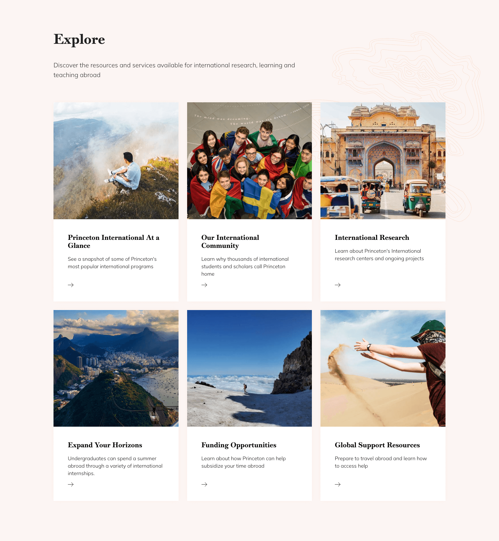
The Princeton International website encourages students to explore international learning opportunities. Its visual design is inspired by travel websites to create a sense of adventure. It includes a variety of eye-catching photos that showcase the exciting destinations and diverse cultures students can experience.
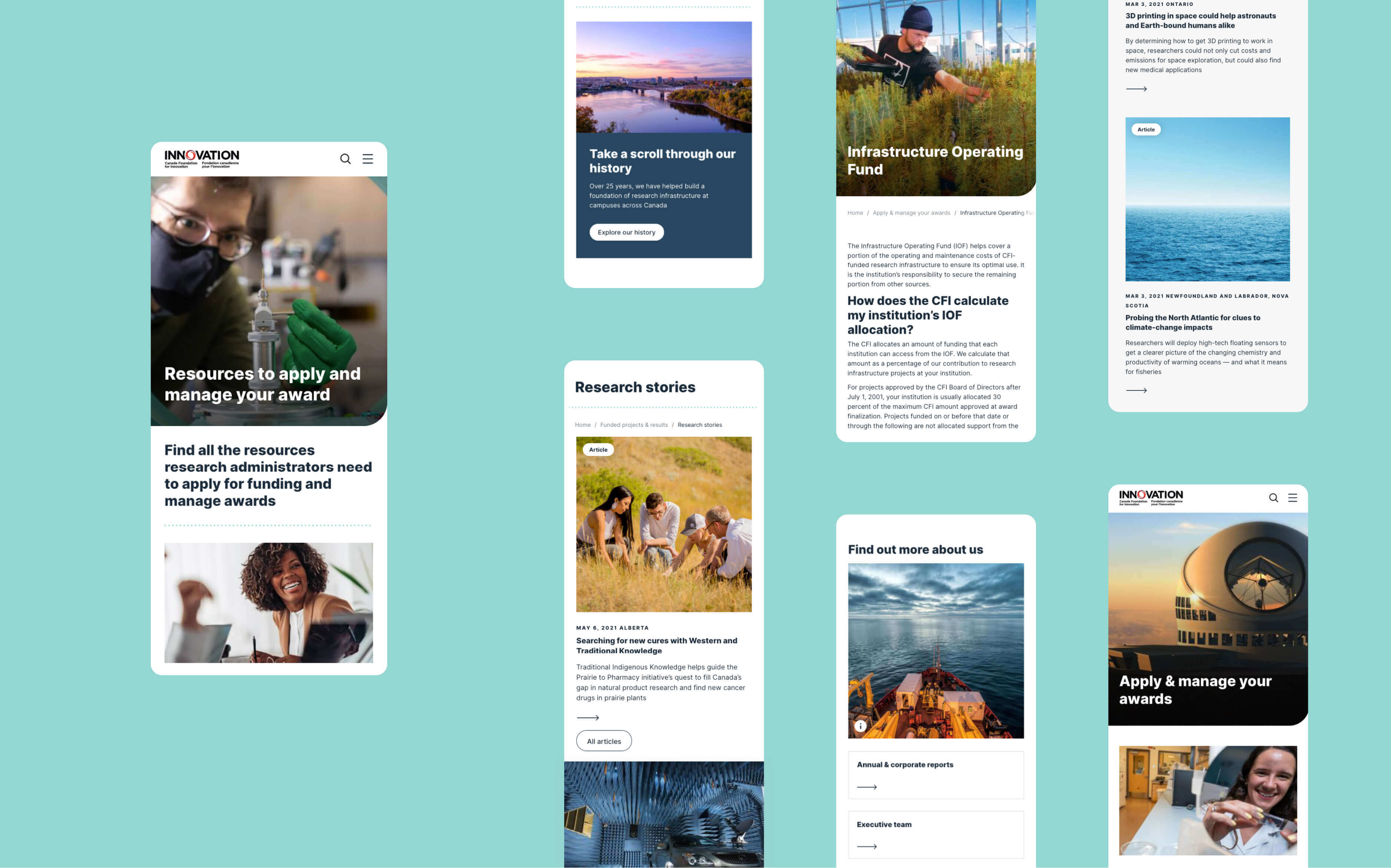
The Canada Foundation for Innovation website features banner images that reflect the key themes of each page. A variety of colours, environments, and angles creates visual interest, while simple compositions ensure they don’t get distracted. The white text is positioned over darker and cleaner parts of the image so that it’s easy to read.
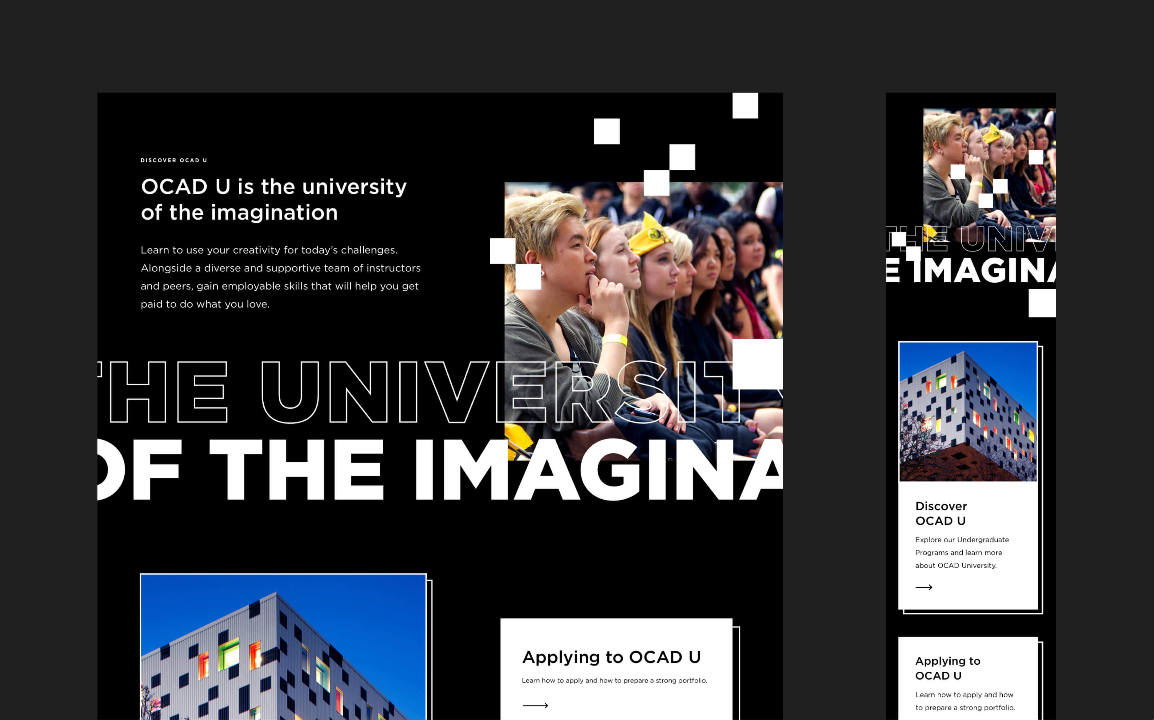
The OCAD U Admissions website features student-created art in a variety of striking styles. It’s a bold visual direction that supports the university’s reputation for excellence in art, design, and digital media.
Making Touch-Ups
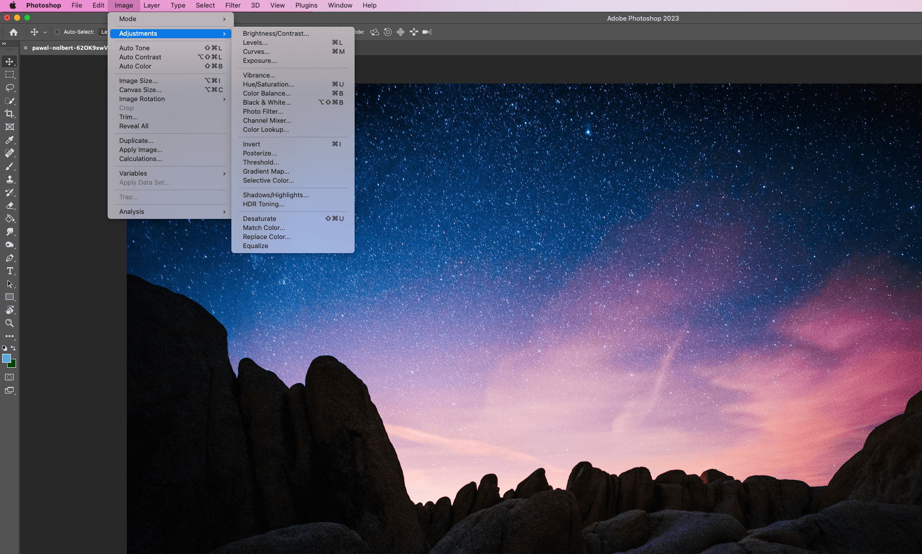
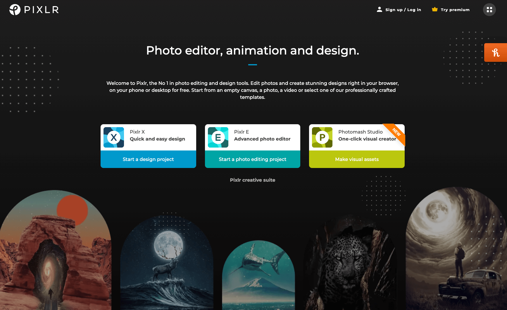
Once you’ve chosen your images, use a photo editing app to fine-tune them. There are a variety of correction tools in Photoshop under Adjustments. Or you could try a free app such as Pixlr or GIMP.
Adjust the following settings if necessary to enhance your photo and match it to the style of other images on your site:
- Exposure to change the overall brightness of the image.
- Brightness to change mainly the brightness of midtones.
- Contrast to control the difference between shadows and highlights.
- Saturation to control how colourful your image is.
Use the crop and rotation tools to fix bad angles and reduce visual clutter. You’ll also need to crop images to the aspect ratio specified by your platform’s design. Aspect ratio is the ratio of width to height. For example, an aspect ratio of 1:1 is a perfect square. If you had a 2500px by 3500px image, you’d need to crop the top or bottom of the image by 1000px for a 1:1 aspect ratio.
Saving Images at Retina Dimensions
Retina dimensions are a nice way to create a higher-resolution image. It means saving an image at double the required dimensions.
Here’s an example. Let’s say that we are designing a picture for a banner whose actual dimensions are 2400 x 1600px. We would save it as 4800 x 3200px to create a retina image.
The image won’t appear bigger than usual if you’re using web components. Drupal will automatically fit the image into the given physical space. By squeezing twice the number of pixels into the same space, it creates a higher pixel density and therefore a better quality image.
A retina image may appear bigger if you’re creating a WYSIWYG page. You can either force the image dimensions in the front-end or upload the image at its normal (non-retina) dimensions.
Compressing Images for Faster Load Times
It’s important to balance image quality with image compression. Compressing your images reduces their file size so that loading them is faster and takes less data. This makes your platform more accessible, especially to users with slow-speed internet connections and those who are using mobile data while they’re on the move.
Images should typically be no larger than 300-500KB. Smaller is usually better, especially for smaller-scale images. If many of your images exceed this, users will experience a slow and laggy web performance.
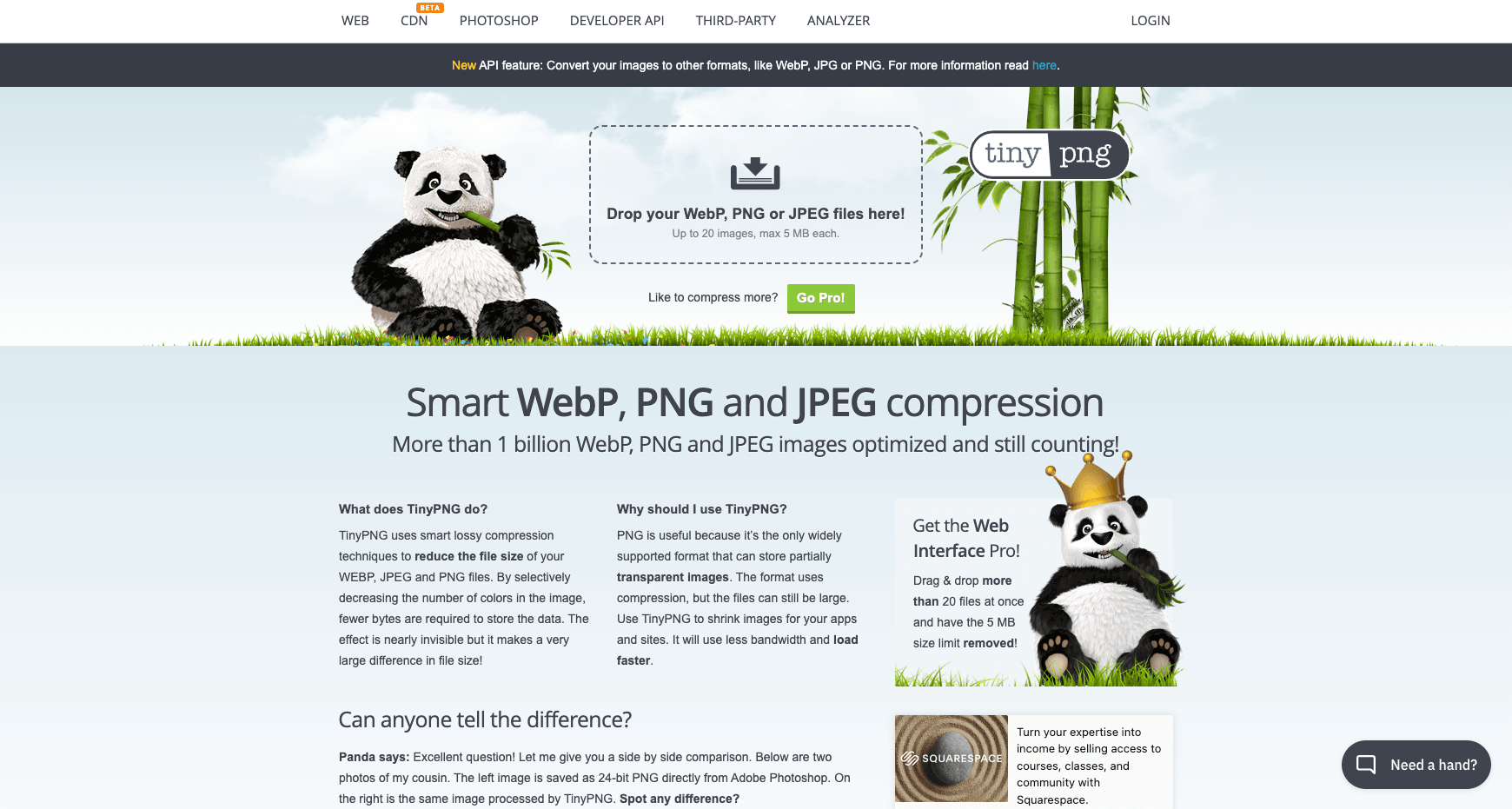
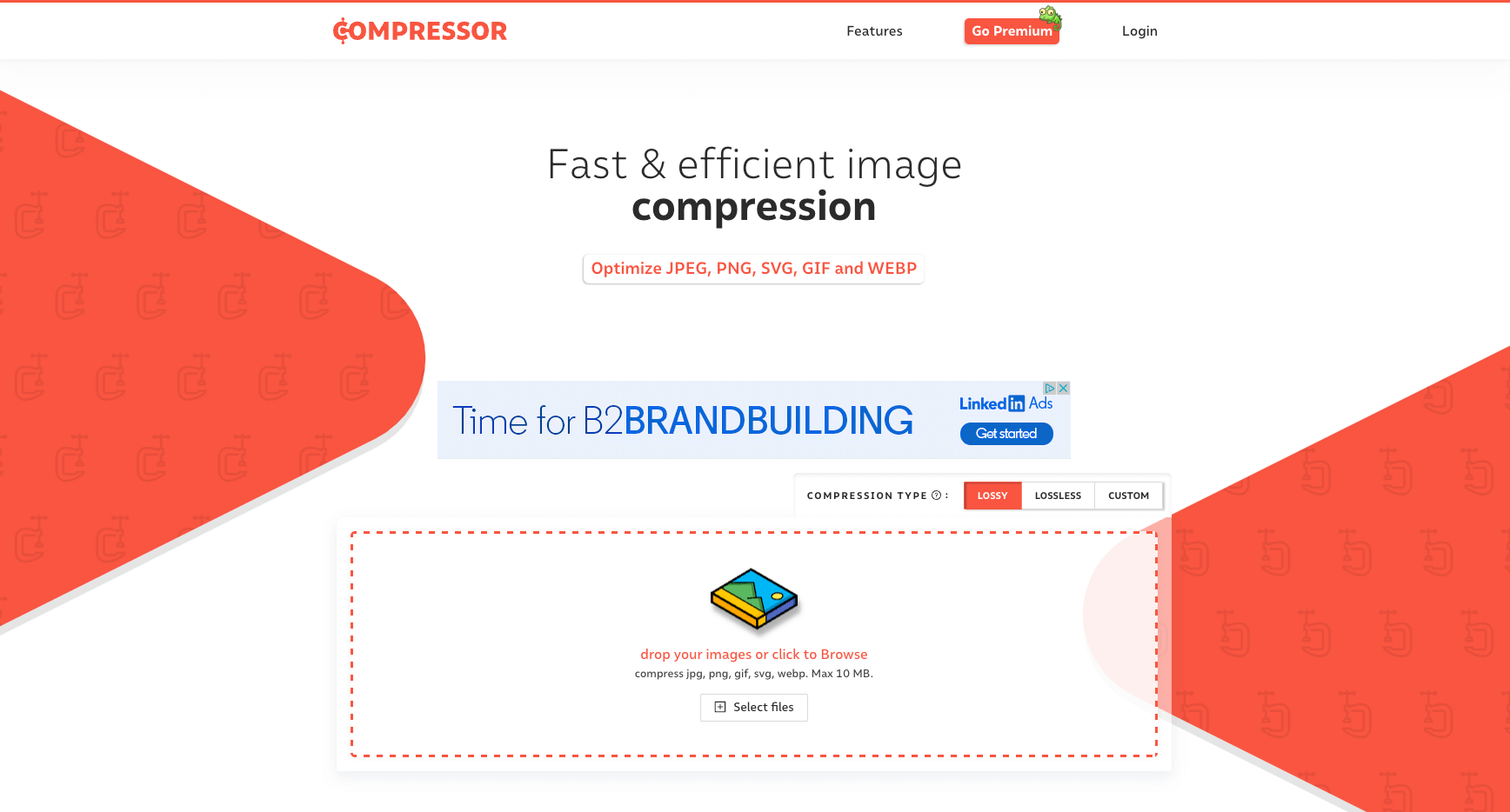
You can run an action in Photoshop to automatically batch and save multiple images in one clean sweep. Export your images at a quality between 80-85%. Finally, compress the images with a free tool like TinyPNG or Compressor before uploading them to your platform.
Defining Focal Points in Drupal
Drupal automatically scales your images for desktop, mobile, and tablet. This means you don’t have to upload different versions of the same image.
Some images will scale at the same aspect ratio meaning the image will look the same except smaller or bigger. Other images (e.g. mobile banners) may be cropped to fit various devices meaning parts of the image may not always be visible.
You can control how images scale on different devices by selecting a focal point on the image in Drupal. Preview the image on desktop, mobile, and tablet to ensure it looks good before publishing.
Need more guidance?
This article is a great starting point for adding visual interest to your site and ensuring your images look as good as possible.
Want to take your knowledge to the next level? Sign up for training in UX design or content strategy.