Information architecture is foundational to good UX design. Simply put, it’s the way you organize, structure, and label your content. If you imagine your content as products in a grocery store, information architecture is how you arrange the shelves and signpost the aisles.
Below, we take a deeper look at why information architecture is critical to the success of your digital platform. We also explore three common mistakes and how to fix them.
Why is Information Architecture a Big Deal?
To answer this question, let’s extend the grocery store metaphor with a mental exercise. Picture yourself shopping for food. You’re in the condiments aisle: an obvious place to keep the sriracha sauce, right? Yet it’s nowhere to be found. You pace back and forth, lugging your heavy basket and scouring the shelves, to no avail. The only thing getting spicy is your temper.
Everyone knows this frustration. We get annoyed that we’re wasting time when we can’t find something fast enough. We feel cheated when we’re led on a wild goose chase by the very system that’s supposed to help.
In the digital realm, there’s an even higher expectation for immediacy and ease. Users have the entire web at their fingertips – and they know it! They’re unlikely to stick around for jumbled information, confusing menus, and irrelevant search results. In fact, 37% of users will leave a website due to poor navigation and design. Some leave for good, with 89% switching to a competitor’s site after a bad experience.*
Information architecture is essential for creating a valuable user experience. It can make the difference between “wow, that was a nightmare to navigate” and “wow, that super efficient.”
And let’s not forget the benefits for your internal team. Better information architecture makes it easier to update and manage content. It can save time, reduce errors, improve workflows, and provide more control over admin permissions.
Now that you’re sold on the value of good information architecture, it’s time for the big question: is your information architecture working for you, or against you?
Let’s look at three common mistakes you may be making with your information architecture, and how to go about fixing them.
*Sources: Komarketing, WebFX.
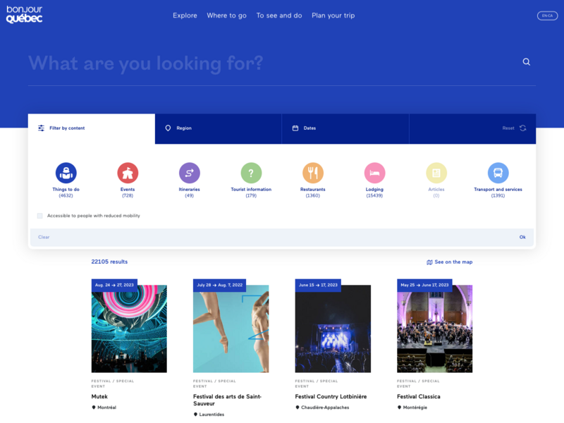
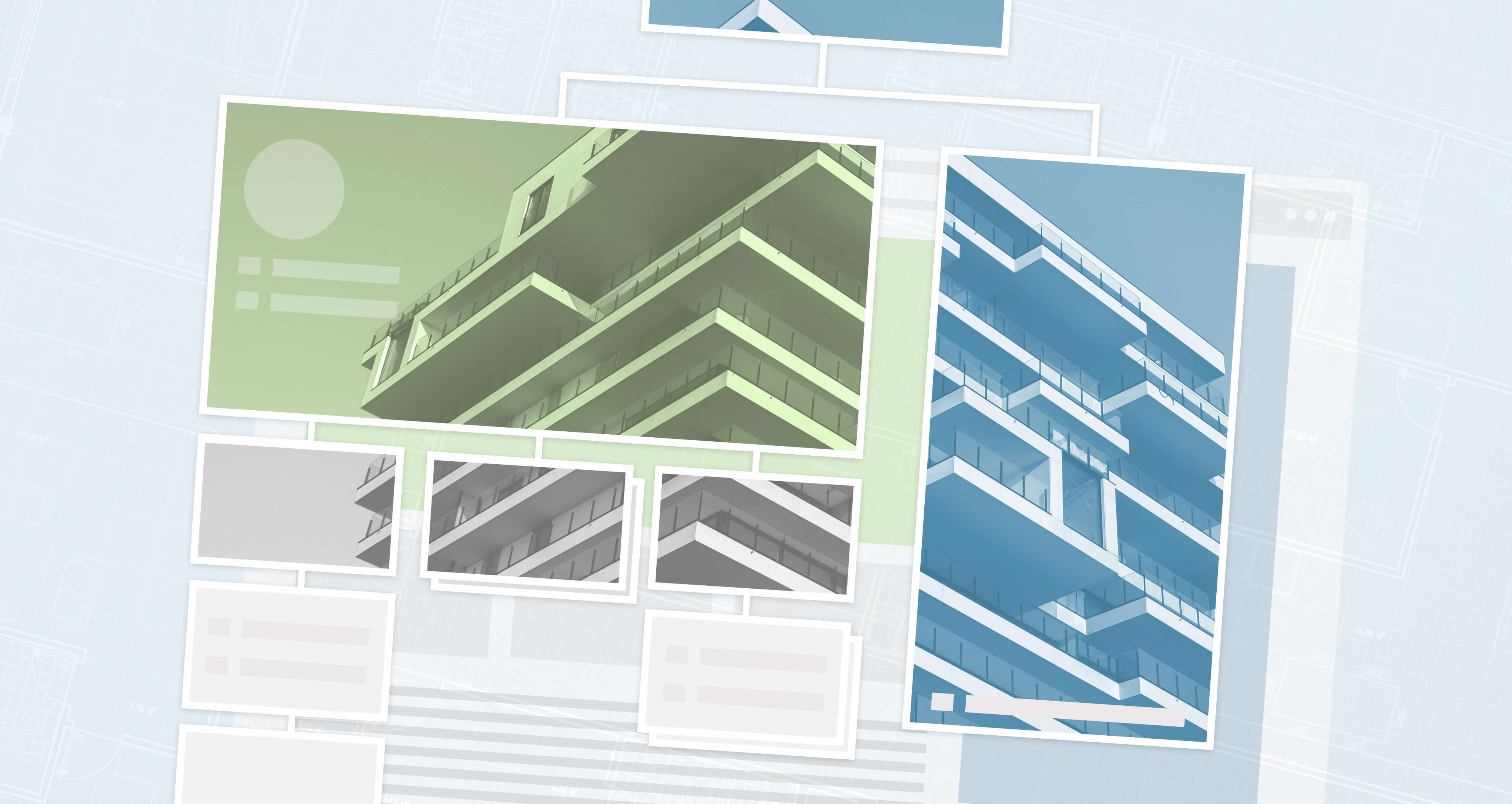
Our redesign of the Bonjour Québec website included a highly complex information architecture comprising more than 30 distinct content types.
Mistake #1: A Messy, Ineffective Taxonomy
Taxonomy is the process of classifying information so that it’s organized and presented in a logical way. Going back to our grocery store analogy, product taxonomies can help users select a top level category like produce, bakery and meats & fish, and then drill down to subcategories such as fruits and vegetables within produce, for example.
Taxonomy is also a powerful core module in Drupal. It lets you label pieces of content and define the relationships between them. But that’s just the start. A clean, well-structured Taxonomy in Drupal can enable you to:
- Automate everything from menu creation to recommendations
- Customize your analytics reporting
- Assign CSS and templates
The catch? It has to be good. Like, really good.
Done right, taxonomies are the backbone of a smart, context-aware information architecture. They enable you to deliver the content that users need, when they need it. But when taxonomies are poorly planned or neglected, they lose power and tarnish the user experience.
Wondering if your taxonomy needs an overhaul? Here are some telltale signs that your taxonomy is weakening your information architecture:
- Your site has orphaned pages (pages that aren’t linked to from anywhere else)
- The search function returns irrelevant results
- The navigation menu is cluttered or confusing
- Categories are overlapping, underused, or inadequate for your content needs
- You’re getting enquiries via email or phone because users can’t find the information on your platform
- Web admins often don’t know where to find or publish content
Fortunately, you don't need to get too technical to understand how to successfully organize your Drupal content with Taxonomies. It’s important to ensure:
- Mutually exclusivity. This means there’s no possible confusion between categories. All items within a specific vocabulary and on the same hierarchical level are completely unique.
- Collective exhaustivity. This means a vocabulary’s terms represent its entire scope. For example, if you have a vocabulary for “colours” then the terms within it should include every colour of the rainbow. Remember that you may need to add new terms to a vocabulary down the line.
- User comprehension. Public-facing labels should be clearly understandable to the people who’ll be interacting with them. Consider your audience’s knowledge of the subject matter and literacy level among other factors.
- Appropriate governance. Which members of your team can add new terms and vocabularies? It’s best to restrict these permissions to prevent your taxonomy from becoming messy and unstrategic.
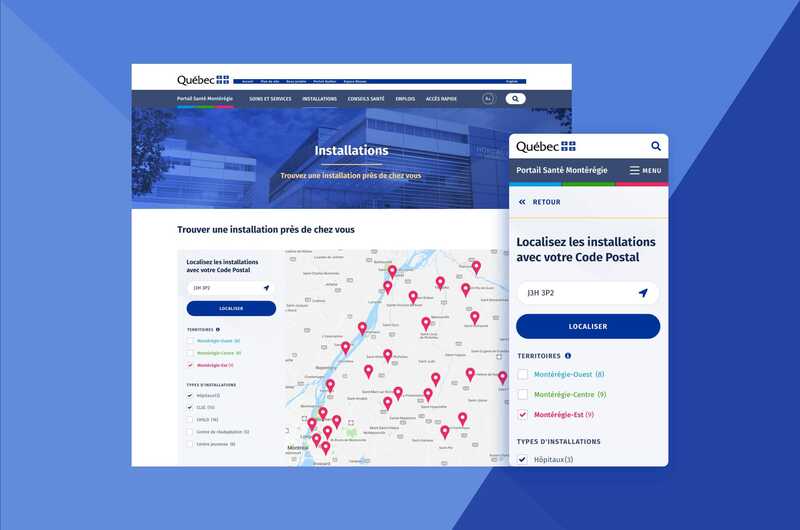
We crafted a balanced information architecture for the Santé Montérégie portal in order to consolidate information from three websites.
Mistake #2: Poor Content Governance
It’s hard to develop good information architecture if there are issues with the information itself. To use our grocery store metaphor: it’s like trying to display a weird mix of products that are out-of-date and badly packaged. You can move things around, but it’s never going to look particularly appealing.
But gunking up your information architecture isn’t all you risk when you don’t regularly review content. It may also muddy your message, thwart your content and SEO strategy, and introduce personal or regulatory risk.
Don't wait to stumble upon bad content – especially in the context of government, financial, educational, medical, and non-profit sectors. In these areas, inaccurate and outdated information can have serious consequences for both your organization and your audiences.
How can you tell if your architecture has left governance by the wayside? It’s worth doing a thorough content audit and identifying any nodes that are unbalanced, or have way too many or too few subcategories, as well as looking at recently added content that seems out of place. With an up to date view of the content you want to keep, try a card sorting exercise in which each piece of content is represented as a card that needs to be sorted into a higher level category. This technique is great for refreshing your architecture, especially if it hasn’t kept pace with your content creation pipeline.
Bonus tip: when it's time to remove information, use Drupal's Redirect module to redirect visitors to more appropriate content if they stumble upon an old link.
In the long-term, good content governance will help you proactively update, optimize, and declutter content on a continuous basis, making sure your information architecture accurately reflects your amazingly-relevant and up-to-date content!
“Good user experience design enables users to achieve their goals effortlessly, leaving them with a positive impression of your organization.”
– Annika Oeser, UX Lead at Evolving Web
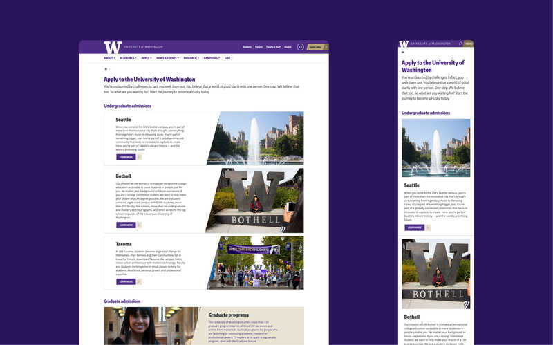
Evolving Web completely overhauled the information architecture of the University of Washington’s College of Education website as part of its redesign.
Mistake #3: Designing for Hypothetical Content
Way back in the day, most websites were either visual playgrounds where designers showed off the latest special effects or fairly simple pages of information, and therefore, a design-first workflow was commonplace. Websites were mocked up with ‘lorem ipsum’ text used as a placeholder for content that hadn’t been written yet.
While it’s true that information architectures should ideally be built as “future-proof”, or able to accommodate new content, if your editorial teams are disconnected from those responsible for maintaining your website, it’s likely you’ll run into problems.
These days we are producing an enormous amount of content, in many different formats, and across a range of devices. What’s more, the evolution of Content Management Systems (CMS) and the rise of Digital Experience Platforms (DXP) has made it possible to adapt, optimize, and personalize content like never before.
If you’re observing content either metaphorically or literally (or both!) spilling over your navigation options, it’s a sign you need to realign and ensure that your information architecture keeps pace with the evolution of your content.
Two ways to avoid or address this are to design with real content, and conduct sanity checks via tree testing at regular intervals. Make sure content creators are always verifying that new content has a logical place in your information architecture and if not, that they’re flagging it to your website team so as to continuously adjust the structure to leave no content behind. Tree testing, or verifying how quickly or directly users can locate a given piece of content in a representation of your information architecture, can also identify issues and signal that you need to update where you content is located, whether adding a new category or modifying existing ones to accommodate it.
Getting input from important stakeholders at the start of a project can help you nail the information architecture (and everything else.) Check out our free guide: How to Involve Stakeholders in UX Discovery.
Elevate the User Experience With Evolving Web
Work with Evolving Web to unleash the full potential of your next digital project. We harness research, strategy, and innovation to help you meet user needs and drive business growth. Our seasoned professionals will collaborate with you, guide you through the process, and help you make decisions with confidence.
