
Designing user experiences in the healthcare industry is a challenge at every level. When it comes to health, users have heightened anxiety and urgency about finding information. On the flip side, institutions have to be careful about sharing information and setting up channels of communication that protect the health of the public and individuals. Investing in websites and apps that cater to the user journey of patients and families is, we believe, worth the extra effort.
This article will walk you through some essential considerations when designing the search interface for a hospital website. It's also widely applicable to health networks, clinics, and other institutions.
(Note: We based this article on a webinar Evolving Web hosted. You can watch the full on-demand webinar by clicking here.)
When we think about goals in web projects, it's natural to assume any client wants to get more customers. However, the goals of hospitals and healthcare providers are more nuanced, and we can typically sum them up as follows:
- Providing access to health services
- Making the system efficient
Serving Patients, Families and Caregivers
At some point, everyone is in the position of being a patient or caregiver.
But while we're all the audience, this doesn't mean that hospitals have a single persona. Many situations bring people to a hospital's website or app. Users might be going through long-term treatment, facing an urgent health issue, trying to access services like a blood test, or attending an appointment with a particular physician. Any of these experiences can feed into a user's emotions, generating responses such as uncertainty or anxiety. All these scenarios present challenges for designing a user experience that's as efficient, smooth and seamless as possible.
What Users Are Looking For
One of the first steps in planning your overall user experience is mapping out the user journey of each persona. While we won't get into the details of this process here, the general needs of a hospital website tend to include the following:
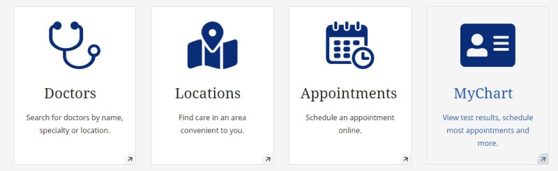
- Immediate care - Information about open hours, locations, directions, and general procedures (such as walk-ins, how to make appointments etc.).
- Online care - When users seek services, resources, and results available online.
- Search - For services, specialties, locations, and professionals. This one can benefit users, given the wide range of things they might be looking for.
Other secondary goals of your website might be to promote fundraising, give people an opportunity to donate or apply for open jobs, and perhaps highlight research. Some hospitals have a separate website for their research institute or foundation, so there might be a need to integrate this content into the main website's search interface.
Consider the First Point of Contact
You need to present the information in a way that makes sense to users. How do patients triage themselves when they first arrive at your website? Where is the first place they go, or what's the first thing they click on? As you go through the user experience, it's crucial to think about what those first calls to action would be.
For example, a user might be searching for a specific doctor, trying to book an appointment or finding the location of your clinic. By suggesting these as pre-populated options, you're helping guide their experience.
You can also hint to users you'll send them to a search page. For example, Quebec's Santé Montérégie—a web experience Evolving Web helped to build—prompts patients to spin out a search, based on typical user journeys:
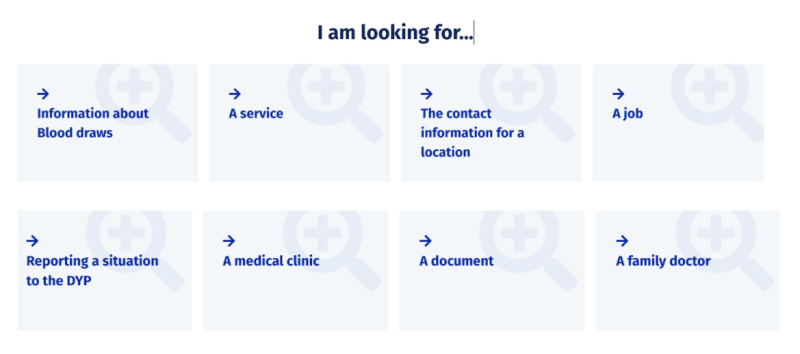
Inviting Users to Search
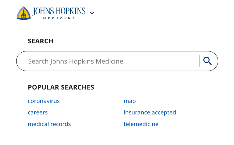
A well-designed search experience is the best way to give people access to the broader services and specialties you provide. First, let's take a look at the main aspects of a search interface:
- Form - Typically, it's at the top of your homepage. However, you can also embed it in different sections on the website to entice users to search.
- Results - They can be formatted in many different ways, with fields and labels that help orient the user when they search.
- Filters - They can be advanced, simple, or plainly non-existent: it depends on the experience you want to provide and how complex the results can be.
- Facets - More common every day, facets take filters a step further, driving users into the specific category they searched. When users click a facet, it updates all other options in the search interface, helping them make sense of multiple, complex results.
These elements are tools that make the search experience more inviting to your patients. Here are some ideas of how to make search more helpful to them:
- Enable filters to give users an idea of what to search by.
- Provide examples of popular result terms to kickstart the search process.
- Show a list of what to search or allow users to browse if they don't know where to start.
Putting People First—For Real
The bottom line is: as commonplace as it might sound, putting people first should be the number-one priority in designing the search interface for your hospital or healthcare provider website. If you do it from the outset, you'll highly increase the chances of building a digital experience that is helpful for patients, relatives, caregivers, and anyone who might need access to your services.
Watch our full webinar if you want more details about building your search experience. There, you'll see lots of use cases and have insights on how to provide accessibility, plain language content, security, and privacy to your users.
