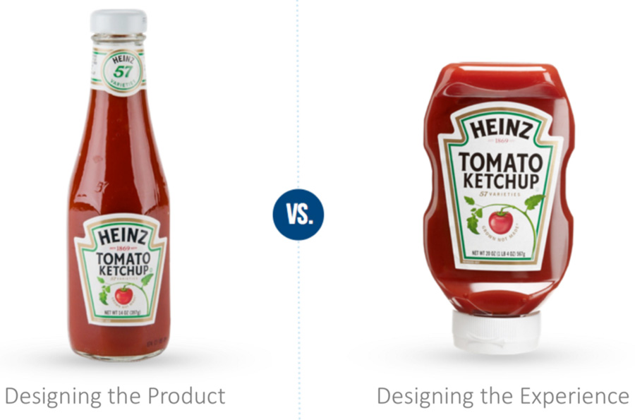
So you have an idea. You want to build something because you think it will make some money. You make a business case. You develop specs. You get your design and dev team on board. You build it, and then you market the heck out if it.
Your idea does all right. Your marketing spend gives you some traction. People use it for a while, but they don't seem to love it. Users start to leave for a competitor. You built a good product that functioned well. What happened?
You designed a product. Not an experience.

Don’t make a business case, make an emotional case
All the business cases in the world won’t make people love your product. The tools, applications and systems that resonate with users don’t stick because someone thought they would make money… they resonate because they meet a fundamental emotional need.
Even practical software meets an emotional need. If people are looking for an app that helps them manage personal finances, the app they choose will help them feel secure, stable and in control of their lives. Despite maybe practical intentions, consumers will choose a product that recognizes and speaks to their (sometimes unacknowledged) emotional needs.
How do you design a product that meets an emotional need? Start from a different angle. Rather than asking: “how do we develop a product that solves a problem?” ask “what basic emotional need does our technology address?”
Adding emotion to the process: How Dropbox created very real scenarios to breathe life into usability issues
After identifying three key problems that users were having with Dropbox usability, the UX team drafted quirky and illustrative examples to help the team align and understand how users were emotionally experiencing these issues. Rather than simply saying "users struggle with tangled accounts", the team crafted this potentially embarrassing scenario: "On some pages, your spicy beach photos might show up next to your company presentation." These emotionally charged real-life scenarios made an abstract UX challenge real to the various teams involved.
Add Value Up-front with Experience Design
...the only products that deserve to succeed are ones that are key components of a valuable experience. If they are not designed to achieve that they will be irrelevant.
* Tim Brown, CEO of IDEO
It's easy to believe that experience design is the arty, high-maintenance cousin of product design. How are you supposed to make money if your team is spending all its time in research, discovery and ideation?
You do this because you want to get it right. If putting more time into your process up front results in a digital experience that resonates with people, it will bring users (and your client) more value, win customer loyalty and gain longevity. Everybody wins.
At Evolving Web, user interviews are a critical part of our discovery phase. These allow us to step into people's shoes to fully understand the problems and emotional needs our project is addressing. We find that interviews can identify and avoid user experience issues that may otherwise only be uncovered during testing.
Start with Empathy
Empathy is fundamental to the process of design thinking, a human-centred design process that applies solution-based thinking to creatively resolve real human problems.
Designing a user experience --- for anything, not just technology --- begins with developing empathy for the person who will be experiencing it. Who are they? What problems are they trying to solve? What challenges do they face in meeting those needs? How can you make it easy/fun/rewarding for them to meet those needs?
A solid experience design starts with user personas. You may have one target customer, or many. Get to know each of them: where they live, how they earn a living, what they struggle with, and what makes them happy. Give each of your personas a name. Get as personal as you can --- family, lifestyle, transportation, dreams.
And give your experience a persona too. What kind of human (or animal) would your app, website or software be? How would it engage and interact with your target customer personas? What kind of guide or supporter is it? And how does it meet each customer persona's needs?
Nothing exists in isolation. Think about how your experience will fit into your customers' overall ecosystem. What other apps, software tools or online services do they use, and why? How does your experience fill a gap or complete the picture for your customers? How are they expected to integrate your technology into their day to day?
Empathy in action: IDEO identifies a behaviour, then builds a banking service around it
Prior to designing a personal savings service for Bank of America, human-centred design firm IDEO stepped outside to observe how everyday people manage their money. IDEO's team noticed that a specific demographic --- boomer-aged women in charge of household finances --- were making addition easier for themselves by rounding up. This observation laid the foundation for IDEO's revolutionary Keep the Change service, which rounded up debit card expenses to the nearest dollar, then deposited the difference in customers' bank accounts.
Develop with Your Personas in Mind
For a user experience to be truly cohesive, everyone who touches the project needs to understand its role in meeting users' emotional needs. If your development team is accustomed to working with use cases and specifications (which are still essential to the process), it may be a shift to ask them to empathize with your target users. Brief them in detail, together with your designers, so everyone understands the emotional context behind what they are building.
Everything Springs from Understanding the User
Any good marketing team or agency will go through a discovery process similar to the one described above to understand who they're speaking to, and how. If your technology is designed from the ground up with the target personas' needs in mind, marketing it is simply an extension of what you've been living during the build.
When you design a cohesive and emotionally engaging user experience from day one, a product's true purpose is baked in. Your app, software tool or website "knows who it is". This trickles down to every part of the its lifecycle and marketing ecosystem.
Getting the word out about your app, software or website means understanding that your target customers will experience your product at every stage of the buying cycle --- through marketing collateral, reviews and other media content --- long before it's in their hot little hands.
Experience Design is Holistic
At Evolving Web, our holistic approach involves stepping back during a project's discovery phase to understand how a client's website or app fits into its overall customer experience. When we begin a new project, we want to be sure we're building an experience that fits seamlessly with all brand touchpoints --- digital and non-digital --- in the customer journey.
To think of apps, software and web content as experiences instead of products aligns them with the needs, hopes and desires of the human beings who use them every day. We'd love to hear your stories about how you successfully tapped into a customer need to develop a better experience. Leave us a comment.

