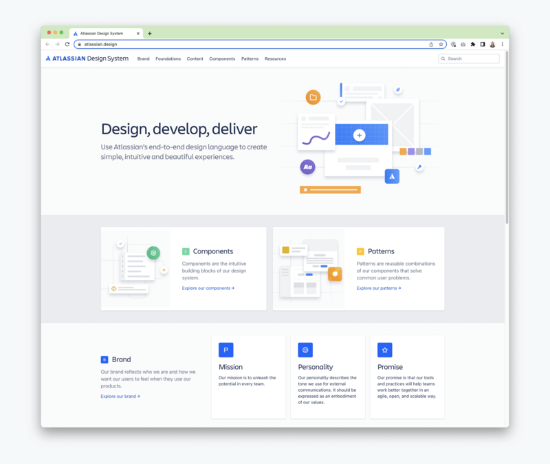
Driven by big software and design-driven companies such as Airbnb, Shopify, or Atlassian, design systems have become a popular way to build better digital products. Here, we share how pattern libraries are different from a design system, and yet an essential part of the system to build a unified design language.
What is a Design System and How is it Helpful?
Design systems are more than a collection of assets or a library of patterns. They are a set of standards, style guides and components used to unify a brand's experience.
I see two main benefits of design systems:
-
Consistency: with a set of core brand elements that are reused consistently across all channels, your audience will recognize your brand among your competitors more quickly.
-
Efficiency: with a lot of web pages, several websites, apps or other marketing channels, a design system makes the design process more efficient.
When designers or developers reuse core elements, the results are not only more consistent with previous designs, but they can also focus on the more complex tasks at hand. No need to start over with the design or implementation of a button or an icon, efforts can go on the hierarchy of elements, their flow and more complicated features.
Think of a design system as combining a cookbook and a shelf of ingredients. You don’t have to start growing avocados whenever you want to make avocado toast. The recipe gives tips on using ingredients that you already have.
Similarly, a design system provides tips, guidelines and ingredients. The first chapter often covers brand elements such as the logo, the colours and fonts and how to use them. It can include design and writing style guides. This is the foundation of the brand identity.

The Atomic Design Approach
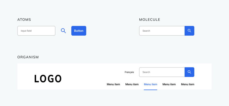
Aside from logos and colours, digital design systems have other ready-to-use web and app components. Those can be buttons, icons or input fields. One popular approach to group components can be found in the Atomic Design approach. The Atomic design groups components as
- Atoms: the smallest parts in the system, such as buttons, icons and input fields.
- Molecules: a typical form, for instance, consists of a label, an input field and a button.
- Organisms: the largest parts are organisms that are made out of molecules; a header of a website including the logo, the main navigation, and a search input is an example of an organism.
Other approaches call the smaller parts “components” and the larger combinations “patterns”.

Pros & Cons of Design Systems
No matter what we call the elements, reusable components make designers' lives much easier! UI design tools like Figma, Sketch and Adobe XD now all provide ways to create and share reusable elements within design files and even across a project team. It fits into an agile development approach too, because it’s possible to iterate on the colour of a button, even late in a design process. If the file is set up well, the button can be applied a hundred times throughout the file and only needs to be updated once in the original file.
📚 Read: Using Design Tokens and Figma Variables to Create Dynamic Workflows
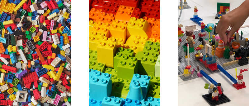
But the benefits go beyond the design process. Websites built with Drupal and WordPress are also set up with reusable backend components. After handing over the new digital platforms to our clients, content editors can pick and choose these building blocks to assemble new landing pages. With this system, the websites can follow clients' needs and grow with their business or institution; a bit like building with Lego, except, in our case, you can even change the colour of your block! (Of course, within the constraints of the branding guidelines and accessibility standards.)

Is Maintaining A Design System Worth it?
There is much more to a design system than the sum of its parts. It needs guidelines to make sure the elements are combined in the best possible way. And it needs people who care about the brand to keep the system up to date because a design system is never static. It can be very time intensive to maintain such a system and you might be wondering if it’s worth it, or if it might come at the expense of creativity.
If a system is applied very strictly and doesn’t allow for flexibility, this can be true. But you'd be blaming the method when it’s the execution that makes all the difference. I believe that, if the brand identity atoms are well-defined, you can already achieve a great amount of visual consistency. Even if you mix and match them to create new molecules and organisms. Just like there are a ton of different ways to prepare avocado toast, you want to allow for some freedom and creativity in the kitchen as well as in the web design process.

Have a pattern library or design system project in mind?

