Higher education institutions face unique challenges when it comes to building successful online experiences—from large amounts of complex content, to the various needs of diverse audiences. On top of that, there’s the constant pressure to keep up with competing universities, colleges, and institutions that are using digital transformation to create fresh opportunities.
Are you looking to evolve your platform this year? We’ve rounded up eight amazing higher education websites to get you feeling creative and inspired. Let’s get stuck in!
1. Rhode Island School of Design
Any institution specializing in design has high expectations to meet with its website. The Rhode Island School of Design (RISD) certainly doesn’t disappoint.
Content is delivered in a bold, expressive way by layering and animating images and text. Modern design elements are paired with elegant references to the school’s history—creating a striking but timeless look and feel.
The simplicity of the colour palette allows the content to shine. At the same time, each colour carries significance: off-white evokes a blank canvas, black hints at ink and charcoal, and blue was the first synthetically produced pigment.
The site’s custom typeface is also steeped in meaning. It captures the process of creation—from incomplete to complete—ranging from a ‘gappy’ display typeface to a utilitarian sans serif. The large font size is both impactful and accessible. There are also custom icons to differentiate internal and external links, which is a nice touch.
2. Harvard College
Visitors to the Harvard College website are greeted by a hero video that immediately plunges them into the idyllic atmosphere of the college and its campus.
As you scroll, animations draw attention to key messages and create an engaging digital experience. Throughout the site, layered elements and call-out quotes recreate the look and feel of a prospectus brochure.
The photography puts students at the forefront, showcasing the diversity and richness of student life at Harvard College.
The main menu is clean and well-structured—and further down the homepage, users can find shortlists of useful pages for prospective and current students. On subpages, accordions have been used to organize content and make it easier to navigate and read.
3. OCAD U’s Admissions Website
Ok, you caught us—we couldn’t help but mention a few of our own projects! Still, we managed not to make the list all about our clients, even though we wanted to.
We partnered with OCAD U to build new microsites that replace the old admissions sections of its main website. Our team reimagined the digital experience with simplified navigation, eye-catching calls to action, impactful typography, and interactive elements.
We built flexible homepages that can be adapted to the admissions cycle, as well as a dedicated page that helps applicants submit a portfolio with ease and confidence.
OCAD U needed a bold artistic direction that reflects its reputation as a leading art and design school. So we developed a strong concept that focuses on creative possibilities and student achievement.
The design features student-created art, visually compelling transitions, and animations to capture the attention of a creative audience. Prominent use of black and white, with highlights of green and pink, ensure an unmistakable brand presence.
The results? In the first few weeks, website visits went up 21% and the number of applicants increased by 15%.
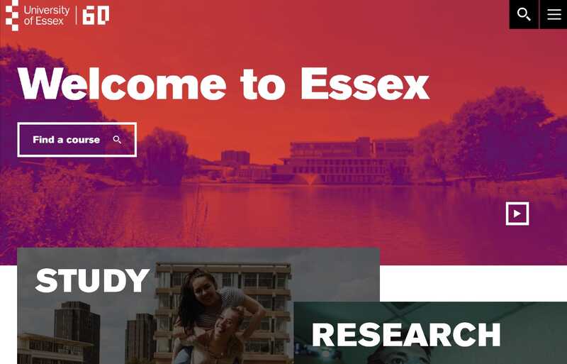
4. University of Essex
On the About page, the University of Essex introduces itself as “home to the curious, brave and bold.” Its website design reflects every inch of this claim.
Bright colours, gradients, autoplay videos, and scroll animations create a sense of energy and ongoing movement. A simple, robust typeface expresses the university’s strength of character.
The page layouts are highly visual throughout the site. Imagery, tables, call-out quotes, and other design elements have been used liberally to make text engaging and easy to read.
The photography shines a spotlight on campuses and students, conveying the institution’s pride in its locality and identity. This is reinforced by headings like “Welcome home, welcome to Essex” and “We are Essex. Are you?”.
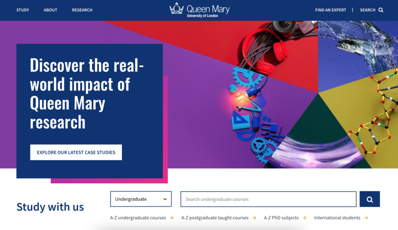
5. Queen Mary University of London
The Queen Mary University of London is a research-intensive institution with a wide range of undergraduate and postgraduate courses. Its website therefore needs to house a large amount of content.
The site does a great job of highlighting interesting content using card-based design. It also offers a robust search experience with plenty of prompts and filters—making it easier for users to quickly find relevant information.
The traditional design keeps things simple, allowing users to focus on navigating and absorbing content. But there’s still a clear brand identity: the university’s bright colours are most prominent on top-level pages, but are also present elsewhere in smaller doses such as gradient borders.
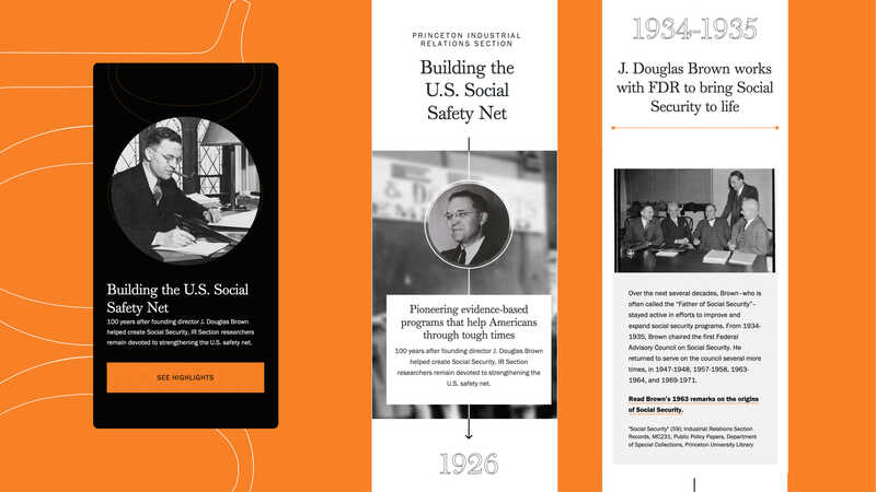
6. Princeton University’s IRS Centennial Microsite
The Industrial Relations Section (IRS) is an applied research center within the Department of Economics at Princeton University. Since it was founded, the IRS has made major contributions to policy discussions and trained more than 175 economists.
We collaborated with the IRS to create an eye-catching microsite that marks its 100th anniversary and promotes its centennial symposium event. In just four months our team built a highly functional digital experience, which should live on well beyond its anniversary year thanks to a focus on evergreen content.
Throughout the site, we used the IRS’ 100th anniversary logo as a central design element, as well as other strategic shapes that evoke connection and the passage of time.
A customizable timeline highlights the IRS’ historical impact, its black background and grayscale images lending a sense of timeless sophistication.
There’s also an interactive family tree mapping relationships between scholars and graduate advisors since the Section’s founding.
Overall, the project is a great example of the benefits of using Drupal for higher education websites.
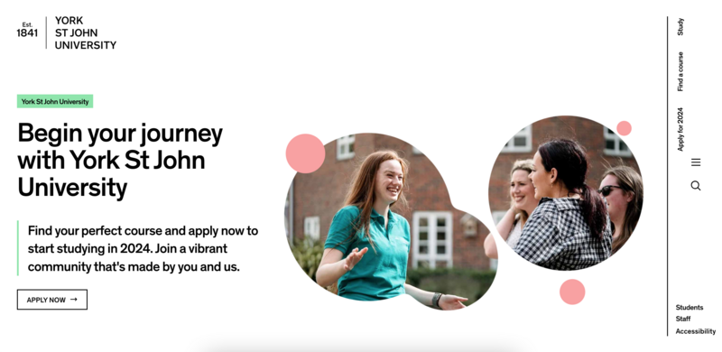
7. York St John University
This website’s minimalist design helps it stand out from the crowd. Content is clearly organized into spacious sections on the page and text is kept to a minimum.
The colour scheme relies heavily on black, white, and grey for a clean look and feel—but the design isn’t boring thanks to a playful splash of bright colours on borders and buttons.
A few subtle animations, layered images, and soft shapes also add visual interest without causing distraction.
The search bar offers a refreshingly simple user experience. It provides a few suggested user journeys as prompts—as well as a tidy list of filters once you’ve started searching.
Unusually, the main menu is on the right-hand side. But once it expands, it offers well-structured navigation with large text and breadcrumbs to ensure users don’t get lost.
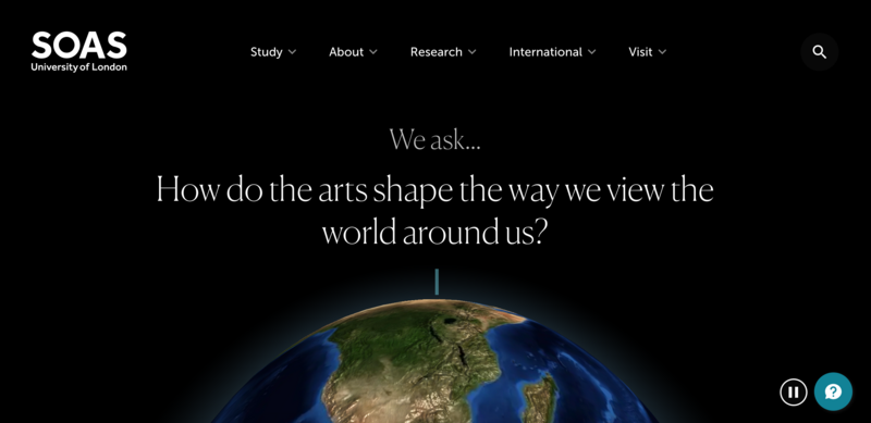
8. SOAS University of London
SOAS specializes in the study of Asia, Africa, and the Middle East. Its website invites visitors to explore big questions, piquing their curiosity about the global issues of today.
On the homepage, a moving planet Earth creates a striking first impression. Additional scrolling animations pull users further into the website to engage with its content.
Pages are divided into clear sections using either bold colour transitions or full-page images. The latter create an expansive feel and showcase a diversity of places and people, encouraging users to imagine exciting possibilities.
What’s Next For Your Higher Education Website?
Need to make the best of your current website? Read: 6 ways to get the most out of your higher education CMS.
Thinking about revamping your digital presence? Browse our design services and check out our expertise in higher education websites.
