Have you ever been truly blown away by a website design? Think about the first time you saw parallax scrolling, a video background, or an immersive experience that feels both intuitive and fresh. Whatever it was, it probably made you say "wow, that's cool!"
What you may not have realized is that behind every "wow" moment is a designer who made strategic choices about what to include and what to leave out.
In this article, we'll explore how designers create websites that wow us, and how to use similar strategies in your digital projects.
Giving users a sense of “never seen before”
With over 1.93 billion websites, how do you ensure yours is remembered by your target audience? Creating unique and eye-catching content can make all the difference and help your website stand out from the crowd.
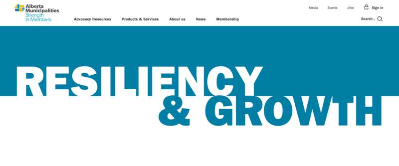
Take our client, Alberta Municipalities for example. With a largely functional website, its main objective is to give members access to services and content they need. To catch the user’s attention, the website uses large typography to build a sense of the organization’s purpose and position the brand in a way that is both bold and subtle. The typography overlaps with the transitions from one content section to another, creating and blurring the divisions at the same time.
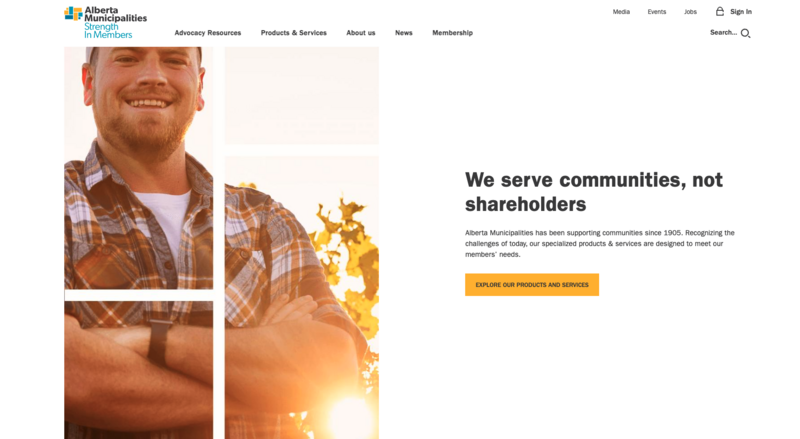
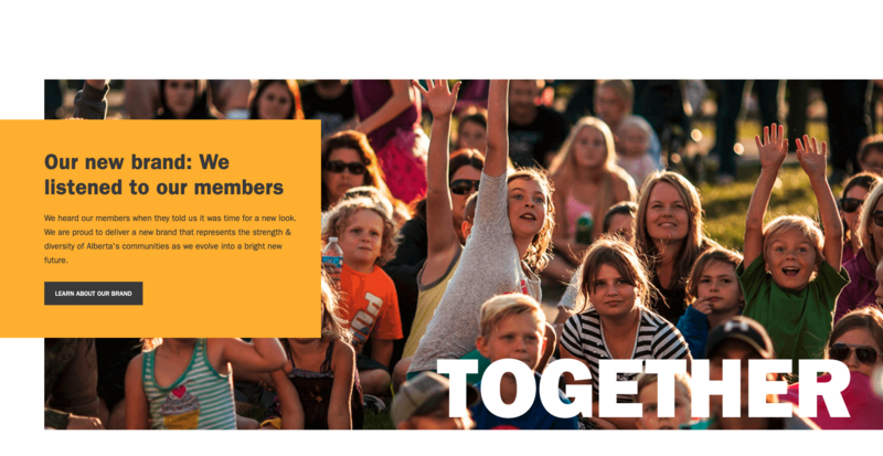
Think about your brand when choosing images to use on your website. For Alberta Municipalities, we used strong and inspirational imagery focusing on people and community to reflect Alberta Municipalities' tagline “Strength in Members”.
We also designed specific icons, image mosaics, buttons, and a mega-menu that refer back to the logo's squares and rectangles for added visual unity and consistency. Our visual design choices convey confidence, strength, collaboration, leadership, and professionalism.
When building a website, it’s important to keep in mind your brand values, business mission and target audience. For example, if your business's mission is to connect people, using warm, friendly visual designs and rounded typography will better suit your brand and thus help achieve your goals. On the other hand, if you are in the luxury market, you would better use limited design with desaturated colours, sharp and serif typography or work-for-it navigation to create a sense of exclusivity.
These small details all contribute to the overall impact of design, creating that “wow” feeling.
Leveraging design tricks to increase engagement
Another way to make a lasting impression on the people visiting your website is to surprise them with uncommon shapes, colours, animation, or typography if your brand guidelines allow.
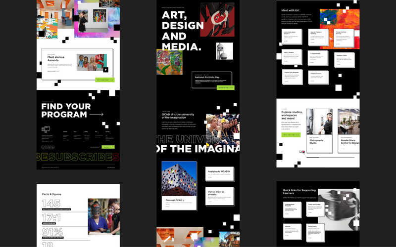
One of the latest design projects our team is proud of is the OCAD U Admissions website design. It features the abundant use of student-created art throughout the interface. As you browse, you’ll find surprising combinations of art in different styles, on the backdrop of the black and white OCAD U brand. While the art itself takes different forms and colours, it’s not disorderly. It’s placed using a predictable geometric pattern, like the black and white squares used to decorate the background.
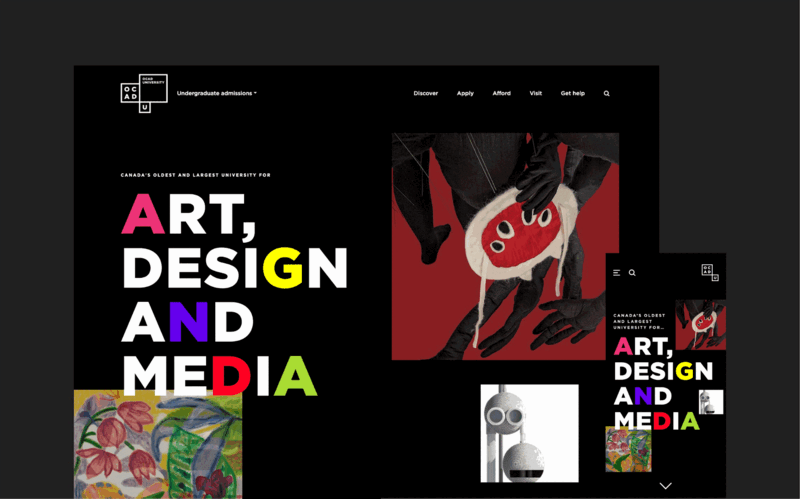
The vision behind this design is to give potential students windows into the artistic pathways they can follow at OCAD U. While every student’s journey and every journey to learning design is different, the website helps potential students visualize what is possible.
Master emotional design for a better user experience
Emotional design is a design approach introduced by Donald Arthur Norman, co-founder of Nielsen Norman Group, in his popular book Emotional Design. This approach aims to create products that trigger a positive and memorable emotional response from the user. It stirs up feelings in the user through deliberate design choices.
The emotions that a product generates can have a great impact on the users’ perception of the product. For example, when using Asana, the work management platform, if you move a task from “In progress” to “Done”, a unicorn crosses the screen to congratulate you for finishing your task. This animation gives a sense of accomplishment and has a great positive impact on the users’ motivation and engagement.
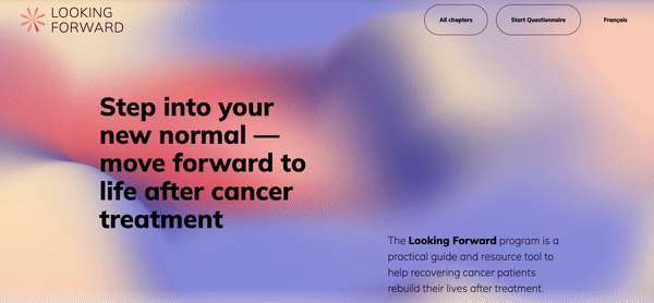
When working on The Looking Forward website, we used a similar approach. The Looking Forward website aims to provide a self-service platform that empowers recovering cancer patients with resources to thrive and overcome the challenges they face in recovery.
The main goal was to use this platform to convey hope, love, and joy to inspire people to look forward. After experimenting with different concepts, we decided to go with an abstract concept.
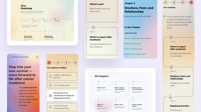
The website does not show cute illustrations of people, as each patient is different and the audience is very broad. The colourful shapes and slow-animated colour gradients bring a sense of serenity and calm that likely appeals to recovering cancer patients. In this case, the “wow” is not created by something bold but by interactions that reflect the mood of the content.
Elevate your design using brand elements
Leveraging your brand elements can help enrich the user’s journey and the brand’s equity. A brand element is a tangible representation of your brand identity and character. It could take the form of a logo, typography, colour palette, messaging, illustrations, shapes or even a sound. Put together, brand elements help cultivate a cohesive brand identity.
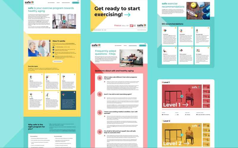
For the McGill University SAFE website, we used the brand’s patterns, colours, and forward-moving arrows repeatedly throughout the digital design of the website. This reinforces the brand and builds a sense of consistency.
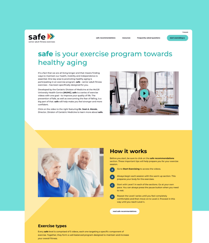
We kept the design simple to ensure the target audience, senior adults, can easily navigate the website to prevent any friction. While the design is simple, focusing users on the videos at their level, the use of custom, geometric icons based on the logo adds visual interest and a unique look that delights the user as they explore the content. The energy and sense of motion creates a “wow” factor that propels the user forward.
When it comes to design, the possibilities are endless. So don't be afraid to think outside the box and explore all the possibilities for your project. With a little creativity, you can find the wow factor that will take your site to the next level.
Need help in (re)designing your website?
