
Every website has the potential to deliver ever-better results. The trick? Continuous evolution. Your digital presence should be a living thing that’s always adjusting to stay relevant and valuable.
I like to think of a website as a houseplant. Give it some tender love and care and you’ll be rewarded with freshness and growth. But neglect it or add the wrong things and you’ve got a mess on your hands.

This article explains how to nurture your digital platform, with a focus on Drupal sites. You’ll also learn how to avoid common pitfalls that weaken the user experience. Here’s what we’ll cover:
- Preparing your team to update your site
- Creating a strategic plan for new pages
- Structuring new pages with web components
- Creating compelling content
- Using WYSIWYG for unique content needs
Preparing Your Team
Make sure your whole team is on the same page and following the same ground rules. This will help you save time and money, ensure consistency and quality, and ultimately set you up for success.
Here are some tips to get your team ready:
- On-board: Familiarize team members with your style guide and branding guidelines, as well as your site’s design, structure and web components.
- Train: Ensure web editors and developers understand how Drupal works and give them time to practice. Consider building your in-house expertise with Drupal training.
- Manage: Create clear processes for approval and quality control. Ensure team members have the appropriate permissions in Drupal.

Creating a Strategic Plan
Before you create a new page (or update an existing one) you need to figure out its overall goal. What value does it offer to users? Where are they going next? What business objectives are you hoping to achieve?
Ensure new pages have a purposeful place in your site architecture, your brand story and the user journey. Pin down the key messages and calls to action you need to convey.
Don’t be tempted to skip or rush this stage. It’s all too easy for websites to get bogged down with pages that do little to enhance the user experience – or worse, impair it.
If you’re lacking the internal capabilities to plan new pages, consider adding a digital strategist to your team, investing in content strategy training or hiring an agency for your digital strategy needs
Structuring the Page Using Web Components
Once you know why you need a new page, you can start structuring and visualizing it. Create mockups and wireframes using a tool such as Miro or Figma. It’s important to leverage the brand elements and web components that are available to you.
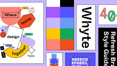
Brand elements are tangible representations of your brand identity and character. They can include your logo, typography, colour palette, and shapes. Featuring them will create a recognizable look and feel and help you build brand equity.
Web components are powerful tools for creating balanced and visually striking pages. They allow for variation and creativity while helping you maintain consistency across your platform.
Here are some tips to make the most of your web components:
- Tell a story. Choose components that enhance the message you want to convey. Structure them in a way that creates a clear narrative on the page.
- Use variety. If you need to use the same component twice, try a different background colour or image alignment (left / right) to create contrast.
- Hire a digital strategist or UX designer. It’s worth getting help from an expert to translate your strategy into a meaningful user experience.
Creating Compelling Content
Consider developing the content and wireframes in parallel and incrementally to ensure they work together. At the very least you should have an idea of the key messages you want to convey in each section when you structure the page.
The quality of your content has a huge impact on the success of a new page. Here are some tips to ensure your message makes its mark:
- Write for components. Think about how the content will fit. Check character count specifications and avoid forcing components to adapt to your copy.
- Use a consistent style. For example, if you use title case for headings then make sure this is applied to all of them. Give content creators clear style guidelines to prevent inconsistencies that may take a lot of time to fix.
- Avoid ‘orphans’. These are single words on their own line. It’s possible to add non-breaking spaces in the front-end but this isn’t best practice.
- Make it easy to read. Follow best practices for writing for the web such as using the active voice and keeping paragraphs short. It’s worth hiring a copywriter if you don’t have one in-house.
- Consider the translation. If your website is bilingual, think about how the content will look when it’s translated. For example, a French version is usually longer than an English version.
- Select images carefully. Ensure images are high-quality and aligned with your organization’s offering and personality. Prepare them to fit the component specifications.
- Finalize content outside Drupal. Ensure copy and images are approved before you populate the new page with them.

Using WYSIWYG for Unique Content Needs
WYSIWYG stands for “what you see is what you get.” The WYSIWYG Editor can give you more creative freedom than web components. But this brings a higher risk of breaking the design or creating accessibility issues. Try not to use WYSIWYG unless absolutely necessary, such as for content-heavy pages and unique content needs. Include web components on WYSIWYG pages wherever possible.
Here are some tips to help you use the WYSIWYG Editor successfully:
- Test the page on all devices. Ensure the content looks good across desktop, tablet and mobile. Look at each breakpoint carefully before publishing a page.
- Add images to make the content more engaging. Try to use large images or videos that fill the container for a bolder and more balanced composition.
- Prepare images carefully. Remember that the WYSIWYG Editor doesn’t necessarily adapt images to specific sizes. Use a consistent ratio and size.
- Follow your style and branding guidelines. Pay attention to things like typography, heading and link styles, colour palettes, and buttons.
- Optimize web accessibility. For example, use headings (H1-H5) in chronological order so you don’t cause issues for screenreaders.
- See if you need new components. If you find you often have to use WYSIWYG to meet your content needs, consider getting new web components created instead.

Need More Guidance?
This article gives you a strong starting point for maintaining and growing your digital platform. It goes hand-in-hand with our blog on Selecting and preparing images for the web
