PDFs have a bad reputation on the internet. In the early years of the web, accessibility was treated as a “nice to have,” rather than a necessity. While accessibility has become a much higher priority in recent years, most attention has focused on core web technologies like HTML and Javascript, with PDFs frequently regarded as an unfortunate nuisance.
However, if maintaining a PDF library is something you need to do, there are many ways to make those documents accessible to all users. Let’s dig into the most common PDF accessibility issues, and what we can do about them.
Why Accessibility Matters
Web accessibility standards apply to everything on the web, including PDFs, and neglecting it can cause a number of undesirable results:
-
Ignoring users with special needs, such as motor or visual impairments, cognitive or temporary disabilities, or disabilities caused by old age
-
Running afoul of government regulations, such as the Americans with Disabilities Act (ADA) and the Accessible Canada Act (ACA)
-
Increased operational costs to provide hands-on support
-
Risk of lawsuits and bad publicity
While full remediation of existing PDF libraries may not always be practical, we can improve the accessibility of high-priority documents and future PDFs by taking a few steps:
-
Set internal accessibility standards
-
Define a web-centric document creation process
-
Audit and prioritize legacy PDF documents
-
Provide document creators with targeted tools and training
-
Audit and remediate on an ongoing basis
Common PDF Accessibility Issues (And How to Fix Them)
If you’re fluent in HTML accessibility, here’s some good news: the goals for PDF are the same. We want to create a properly structured document that is friendly to keyboard navigation and neatly presents all document information to screen readers in the correct order. The principles are the same, it’s just the tools and processes that are different.
This section discusses some of the key ways in which PDF accessibility can go bad—and how to fix those issues.
Basic Do’s and Don’t’s of Online PDFs
Before we think about making a web PDF better, we need to consider whether it should be a PDF at all. Generally speaking, PDFs should only be used for material that is intended to be printed, and for which a printed document is legitimately the best format for your audience.
For all other online information, HTML is the way to go. Web browsers and assistive tools are optimized for it and it’s most adaptable to different devices and screen sizes, providing a highly intuitive user experience.
However, some organizations require PDF because of government regulation or institutional policy, or because the resources to train or acquire more HTML-capable team members may simply not exist. In these cases, improving accessibility will lean more heavily on producing well-structured, properly marked-up PDFs.
Here are some basic do’s and don'ts for deciding whether to use a PDF:
-
Do use PDFs for forms that must be printed and wet signed, or contain sensitive information that should be mailed or faxed in the absence of a secure portal.
-
Don’t use PDFs for general forms to be filled out and reuploaded or emailed back.
-
Do use PDFs for class handouts, worksheets, and templates your students are meant to print and write on.
-
Don’t use PDFs for general class information, lesson notes, and readings that are readily available on the internet.
-
Do use PDFs for brochures and flyers meant to be printed and redistributed.
-
Don’t use PDFs for brochures or flyers that serve as the primary online version of your information.
-
Do consider using both a well-formatted PDF and HTML version of content for material that must be posted as a PDF.
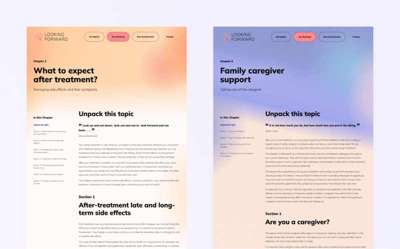
For an example of what switching to HTML can do, have a look at our work on the Looking Forward site. In this project, we adapted a library of PDF-based resources for recovering cancer patients into an intuitive, mobile-first website. The result was a streamlined user experience with much better accessibility.

Using the wrong PDF rendering tools
The tools you use to create your PDFs have a major impact on how accessible they will be. Let’s see some best practices for this fundamental step in the process:
-
Consider Adobe Acrobat. Rendering your PDFs with Acrobat gives you access to the full suite of accessibility features. If you can’t use Acrobat, the next best option is any other dedicated PDF application, or the “Save As” or “Export” commands available in document creation programs. Configure the options to optimize the PDF for the web and preserve structure, links, and other key features while reducing the file size.
-
Don’t use “Print to PDF”. While this feature is convenient and simple to use, the resulting PDF is optimized for printing and strips out much of the structural markup and functional features like links and bookmarks.0
-
Scan your PDF with OCR. If you don’t scan your document with Optical Character Recognition (OCR), it will be treated as a series of images. This makes the text unreadable by screen readers and eliminates any heading structure or searchability.
Rendering from a badly structured source document
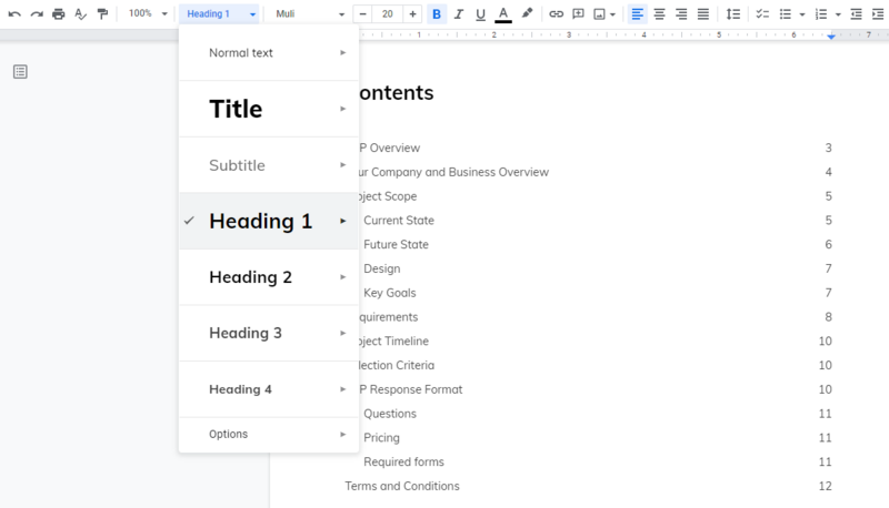
Most common document authoring tools, such as MS Word, Adobe InDesign, or Google Docs, provide system-defined styles for headings, paragraphs, lists, and other document elements. These styles don’t only enforce design consistency: much like HTML markup, they also define the document hierarchy, something we can’t achieve through manual formatting.
This hierarchy is critical for web accessibility. Screenreaders, keyboard navigation, and search engines need this structure to correctly organize the contents of a document. So, make sure to apply those system-defined styles and train your teams to use them well, encouraging the creation of properly structured source documents for PDFs.

Mixed-up element order
Document authoring applications commonly allow users to create text boxes they can drag and drop anywhere in the document and rearrange them during the editing and design processes. Also, a creator may rely on side-by-side boxes to create “columns,” rather than using the application’s less intuitive columns tool.
To most users, this will look fine. However, any computer-based interpretation will read the content out of order, and keyboard navigation will inappropriately jump around the document, resulting in a muddled presentation. Here’s how to improve on this issue:
-
Separate the print and web publishing processes. Rather than designing first for print and then for web, design both independently to avoid tricky web layouts or inaccessible PDFs. For an annual report, for example, present all information in more accessible, user-friendly HTML and offer the PDF to users as an optional download.
-
Provide templates and guidelines. A set of pre-arranged templates can reduce the amount of reordering in your document creation and improve your PDF accessibility.
-
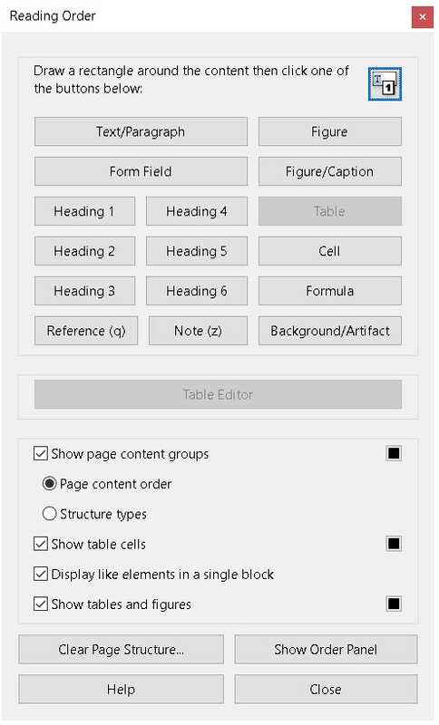
Use Acrobat’s Reading Order tool. If you render your PDFs with Acrobat Pro, there is a Reading Order tool that you can use to check the element order in your document and make corrections before publishing.

Hiding important information in images
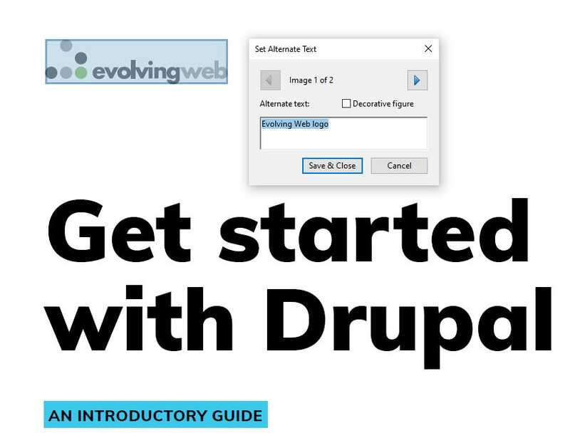
As with images displayed in HTML pages, images within PDFs require alt tags to be accessible to users relying on screen readers. This includes everything from photographs to charts, infographics, data tables, and scanned text. If it’s embedded as an image, it cannot be read by screen readers unless clear, descriptive alt tags are included.
There are several tools and practices for resolving this issue:
-
Inform less through images.When possible, use text to convey important information instead of, or in addition to, images. Text is the most readily accessible format for presenting information and requires the least extra work or special skills.
-
Scan text documents with OCR software. We mentioned this before, but it’s worth saying again: if you don’t scan your document with OCR software, it’s treated as an image in your PDF and therefore inaccessible.
-
Add alt tags to source documents. Most popular document creation applications include the ability to add alt tags to images and other non-text assets like imported charts. Adding descriptive alt tags to source documents and rendering the PDF with fully featured tools (as seen above) will make your PDF images more accessible.

Inappropriate or overly complicated tables
Tables have been misused and misunderstood since the early days of the web. While accessibility-minded web publishers have learned and adopted key rules for using tables, these rules are less intuitive for team members used to create documents for print.
In your resources for document creators, include accessible table-use guidelines and why they matter. The University of Oregon provides a great discussion of table do’s and don’t’s, with clear examples:
-
Use tables only for tabular data. It’s intuitive to use a borderless table to create text columns and blocks. Unfortunately, this prevents screen readers from correctly interpreting the text’s structure and flow. Instead, use application column tools or minimize the use of columns at all, maintaining a cleaner document flow.
-
Keep tables simple. Document and spreadsheet applications provide features that allow complex tables with merged cells, subsections and subheadings. While they can be user-friendly for visual readers, they might create a mess for screen readers. When possible, break up large tables into smaller parts that are easier to interpret.
-
Keep row and column labels well-structured and clearly phrased. Screen readers will read these labels and users rely on them to understand cell contents. Also, Adobe Acrobat’s Reading Order provides a tool for correcting how labels associate with rows and columns. Adding this step is key when complex tables are unavoidable.
-
Include descriptive alt or caption text. When a screen reader runs into a table, it reads each cell in each row, which can be tedious and confusing for users. A summary description gives the user an opportunity to decide whether to read the entire table and provides vital context for interpreting the cell data as it is read.
Migration is an opportunity
Do you have a big site migration coming up? That’s fantastic. A site migration is an ideal opportunity to improve your existing PDF accessibility and to set your team up for much better accessibility in the future.
Also, your migration process includes a content audit, right? So, you can add a PDF accessibility review to your audit and apply the same process to identify which PDFs should be archived, converted to HTML, or prioritized for remediation.
There’s an accessibility and review, isn’t there? Insights from this process can help inform your PDF accessibility standards and ensure they are meeting your audience’s needs.
It’s also quite likely you are reviewing your publishing policies and workflows. That’s a great time to add new PDF standards, ownership, and processes.
And migrating to a new system means that you are most likely providing your content creators with training and documentation. Include a resource module on PDF accessibility standards and practices–for both your desktop and web publishing staff.
More Resources and References
-
Some articles and case studies by Evolving Web:

