Governments have to meet high standards when it comes to their digital presence. They need to meet user expectations and evolve as public services change. They must be secure, accessible, and inclusive. And they need to comply with various national, provincial, regional, and municipal requirements. On top of all that, they can’t cost too much!
It’s a tall order. But the potential for growth and efficiency is considerable for governments who are prepared to invest in their digital platforms. This article explores the challenges and opportunities of government websites, as well as sharing some inspirational examples.
What Makes a Good Government Website?
Here’s a closer look at the standards that government websites need to meet in order to be compliant, successful, and sustainable.
- Secure. Government websites often provide and collect sensitive data from citizens about things like taxes, permits, personal records, and so on. Advanced, reliable security measures are needed to protect against cyber threats and data leaks.
- User-friendly. Government websites should make it easy to search, navigate, understand, and use their content and online services. They need to operate smoothly on various devices and browsers.
- Informative. Citizens rely on government websites for vital information and alerts. There should be suitable functionality and workflows in place to ensure content is updated quickly and accurately.
- Accessible. In Canada, government websites must comply with WCAG 2.0 AA by law. Federal agencies can face fines up to $250,000 for non-compliance. Similarly, U.S. government agencies are required to meet accessibility standards under the Americans with Disabilities Act (ADA).
- Dynamic. Government websites are expected to handle everything from trip planning to marriage registration to tax returns. They need to be flexible and scalable in order to deliver such a wide range of ever-evolving services.
- Appealing. A modern, attractive design helps governments maintain a credible image and encourage people to visit and spend time on their website.
- Affordable. Taxpayers fund government websites, so they shouldn't be overly expensive to build or maintain. Going over budget can attract negative public attention, as happened with the Government of Canada in 2016.
- Inclusive. Government websites should promote inclusion and reflect the diverse communities they serve. This often means providing multilingual content as well as diverse imagery.
Read: The Future of Web Content Publishing in the Canadian Government with Drupal WxT
How Do Governments Benefit?
Despite the many challenges of meeting laws, regulations, and user expectations, governments have a lot to gain from a well-designed website.
- Lower administrative costs. Online services can reduce the need for paper-based processes, in-person visits, phone calls, and physical office space. Also, automating routine tasks such as form submission can boost efficiency and shorten waiting times for citizens.
- Community engagement. Government websites can include tools for surveys and feedback to foster greater public participation. Live chat, forums, and social media integration allow for direct communication between citizens and government officials.
- Investment and growth. Websites are powerful branding tools that can attract economic investment, businesses, new residents, visitors, employers, and job seekers.
- Improved service delivery. A well-organized government website empowers citizens to access services, forms, and information 24/7. By centralizing information they also ensure greater accuracy and consistency.
- Public trust. Governments can increase transparency and accountability by publishing reports, budgets, minutes, and other public records online. Websites also enable real-time updates on projects, policies, and initiatives.
- Data and insights. Governments can use website analytics to understand what services and information are most in demand. This allows for better resource allocation and service improvement.
Read: Drupal for Government Websites: 6 Reasons Why It’s the Best Option
Our Favourite Government Websites of the Moment
Here are six government websites that we love—including some that we had the pleasure of working on, of course! Take a look and find inspiration for your next digital project.
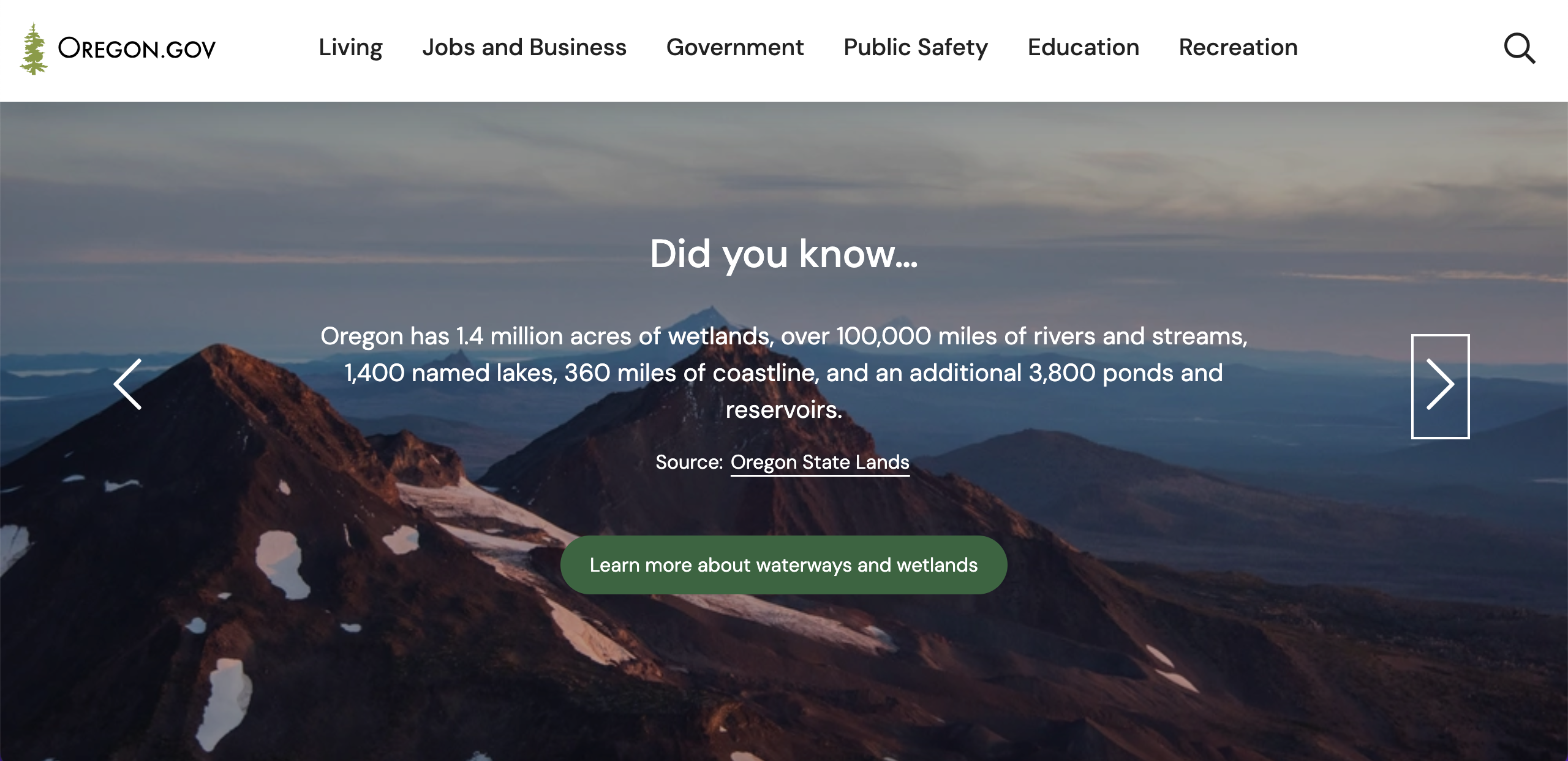
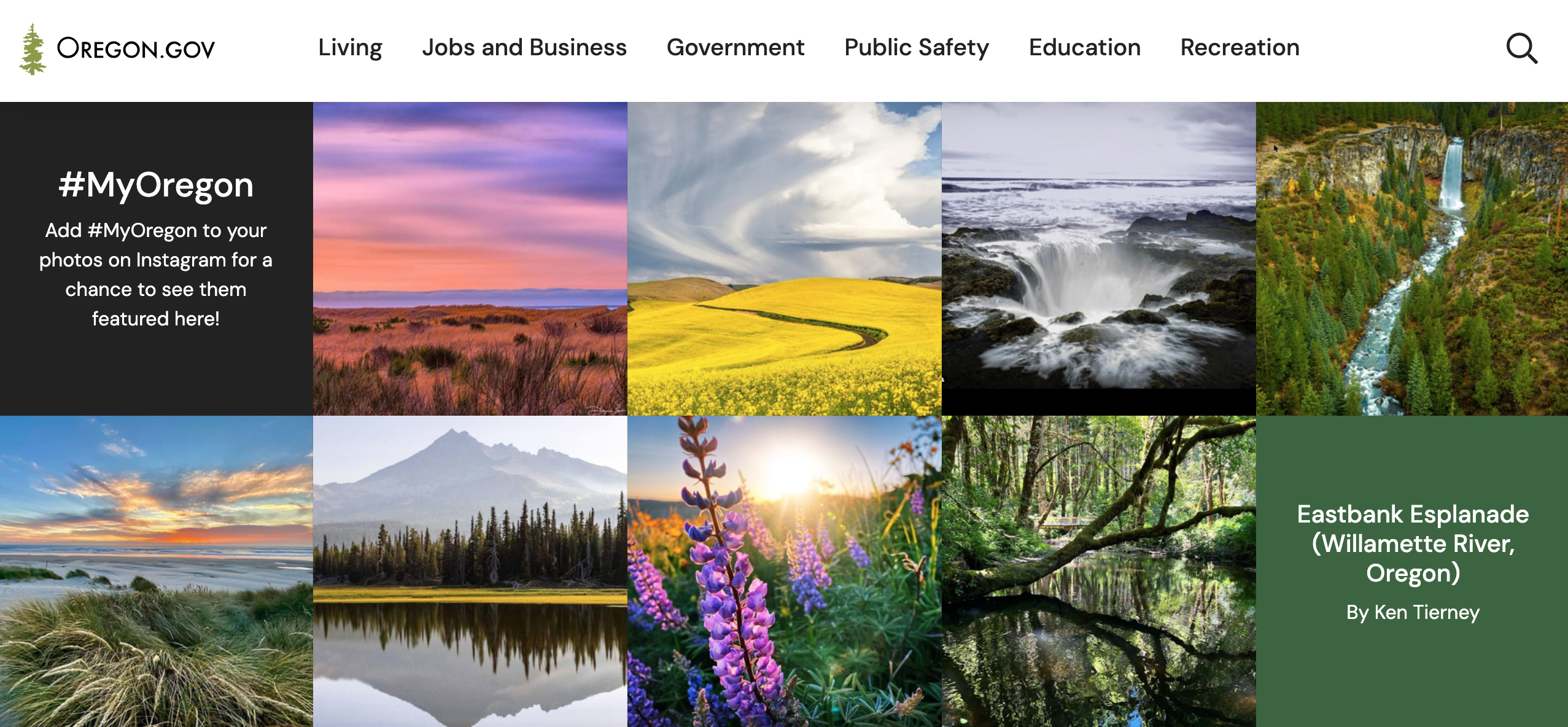
The State of Oregon
Oregon.gov makes a big impact with imagery that showcases the state’s stunning natural beauty. The site’s visual appeal is matched by a user-friendly design that allows users to navigate easily and intuitively.
Standout Features
- Video. Visitors are greeted on the homepage with a full-width video of Oregon's scenic mountains and cultural attractions.
- Menu. Visitors can browse three levels of navigation within the main menu, but without getting overwhelmed thanks to its well-organized content.
- Search. The homepage includes a prominent search feature and a concise list of popular search terms to help users quickly find what they’re looking for.
- Imagery. Powerful imagery of mountains, beaches, and towns is paired with interesting facts about the state. This serves to engage visitors while also positioning Oregon as a desirable destination.
- Social media integration. A section on the homepage features user-generated content pulled from Instagram. Visitors are encouraged to post their own photos with the hashtag #MyOregon.
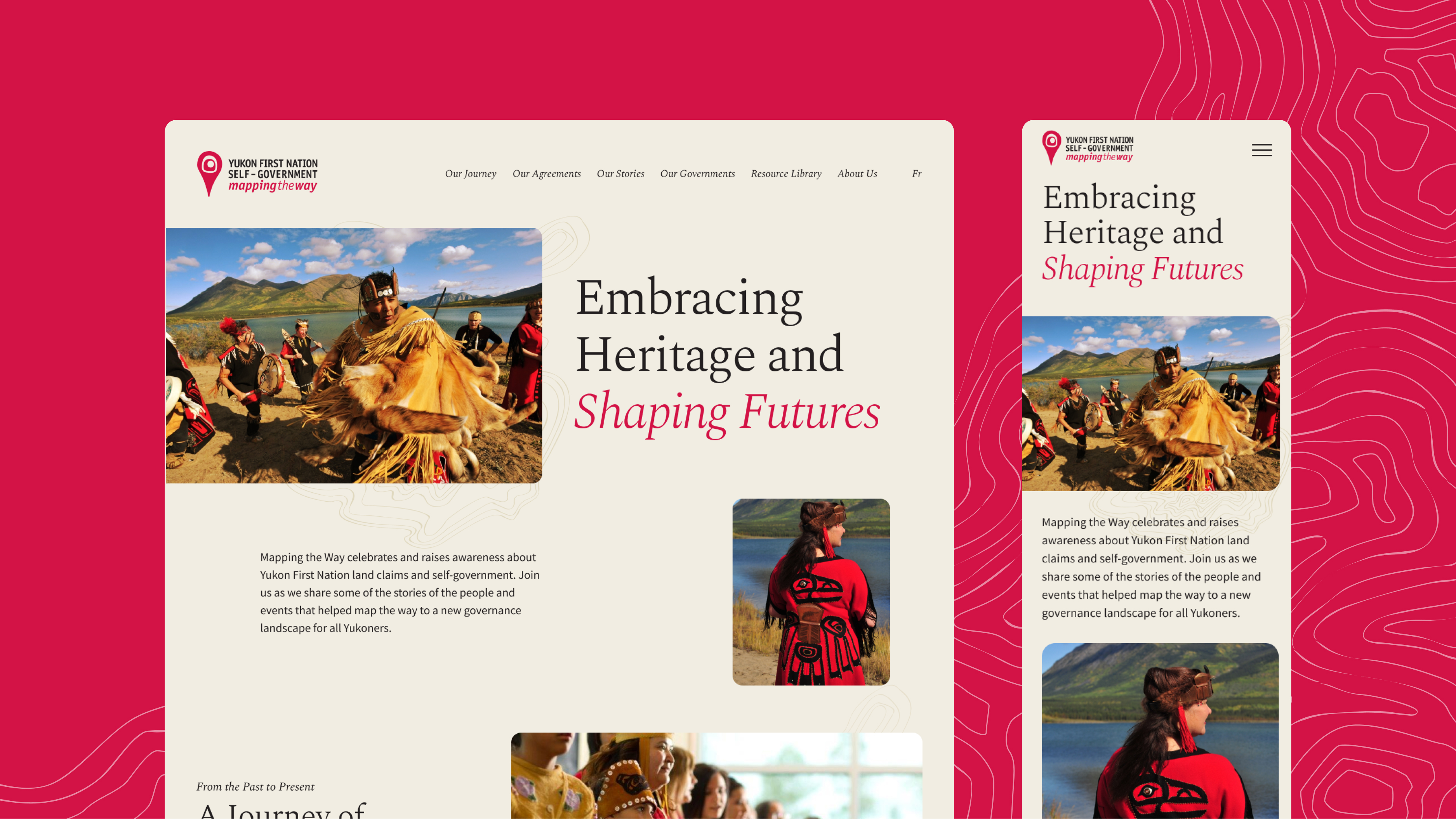
Mapping the Way
Mapping the Way is a non-partisan initiative that raises awareness of self-government agreements and celebrates the cultures of the Yukon First Nations. Its Drupal 10 website supports this mission through immersive storytelling and a user-friendly interface that enhances access to important information.
Standout Features
- Aesthetic. The map-inspired layout creates a sense of exploration and movement, conveying the First Nations’ vital relationship with the land.
- Imagery. Black and white photos highlight the past, while more vibrant coloured photos celebrate the present day.
- Colour. Red accents draw the eye to important elements and create a sense of celebration. Beige gives an organic feel that evokes connection to the land.
- Information architecture. Leveraging Drupal's taxonomy capabilities, we used tags to categorize and connect stories, communities, and agreements. This allows for seamless and dynamic user journeys.
- Accessibility. The site meets WCAG AA standards and allows users to switch easily between English and French.
U.K. Government
Gov.uk provides centralized access to information, services, and news from government departments, agencies, and public bodies in the United Kingdom. It’s internationally recognized for its clean interface and accessible content.
Standout features
- User-centric structure. The website is organized around user needs instead of government structure, making it easy for visitors to find what they need quickly and easily.
- Minimalist design. The clean interface ensures an effortless user experience. Great care has been taken to remove any unnecessary clutter or distractions.
- Task simplification. Information and tasks are broken down into bite-sized chunks to reduce the cognitive load. Each section has a list of contents to give users a clear sense of progress and what to expect.
- Plain language. Gov.uk uses a clear accessibility strategy to build an inclusive experience. Its use of plain language is a great example of how to make complex information accessible to a wide audience.
SkilledTradesBC
SkilledTradesBC aims to build the most diverse and sustainable workforce in Canada by supporting equitable access to skilled trades. They collaborated with us on a redesign project to orient the site around the needs of potential apprentices. The project was also an opportunity to attract more applicants from diverse backgrounds and upgrade to the latest version of Drupal.
Standout Features
- Quiz. Users can complete a quiz that tells them which trades they’re best suited for. This fun feature boosts engagement and simplifies the process of finding an apprenticeship.
- Intuitive search. Users can easily search, filter, and compare trades by factors like salary range and market demand.
- Visual identity. The new website has a modern, professional design with the look and feel of a print magazine.
- Diversity. The site includes dedicated pages for equity and Indigenous peoples in trades. Success stories from diverse apprentices are embedded throughout the site.
U.S. Internal Revenue Service (IRS)
The IRS website has gone through several upgrades, including a major revamp in 2017. Their user-friendly design makes doing your civic duty rather less painful! What’s more, delivering a smoother user experience has helped the IRS reduce the burden on its phone lines.
Standout Features
- Task-oriented. The site’s structure and navigation are centred around user tasks such as filing taxes or applying for a refund. Clear labelling and iconography make it easy to complete tasks quickly.
- Multilingual. Translation is important for inclusivity, especially in the U.S. which is one of the most linguistically diverse countries in the world. It’s great to see that the IRS website offers basic tax information in 21 languages.
- Mobile-friendly. The site’s responsive design adapts to any device, ensuring that users can access important information on the go.
Bibliothèque et Archives nationales du Québec (BAnQ)
Spread across 12 public facilities in Quebec, BAnQ is a cultural hub and institution that democratizes knowledge. Its redesigned website emphasizes search and accessibility to make catalogs, digital services, and other resources available to all.
Standout Features
- Accessibility. The site provides accessibility tools that go beyond WCAG AA. They include the ability to adjust text size, customize colors and contrasts, and select default captions in all videos.
- Updatability. We designed a platform where BAnQ staff can easily curate content and highlight services. This included building a custom Drupal admin interface with 14 content types and 17 reusable components.
- Searchability. Our team built an integration with BAnQ’s existing API to provide the user with a seamless search experience, with results pulled from four different sources.
Want more inspiration? Check out more of our digital projects across government, not-for-profit, higher education, and other industries.
