Overview
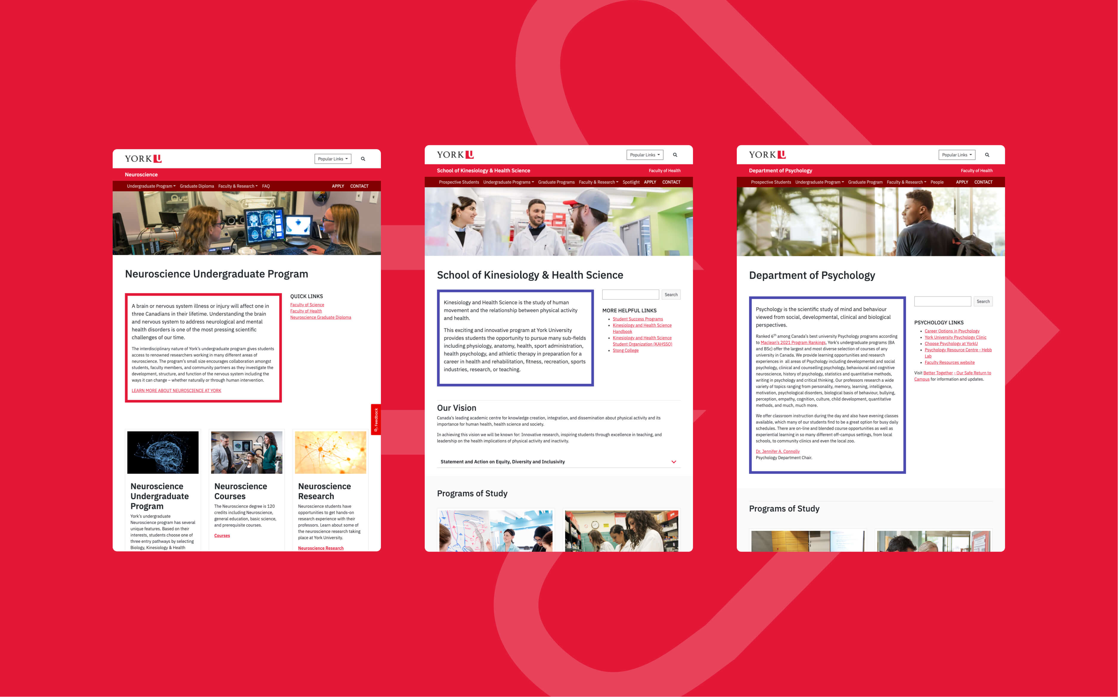
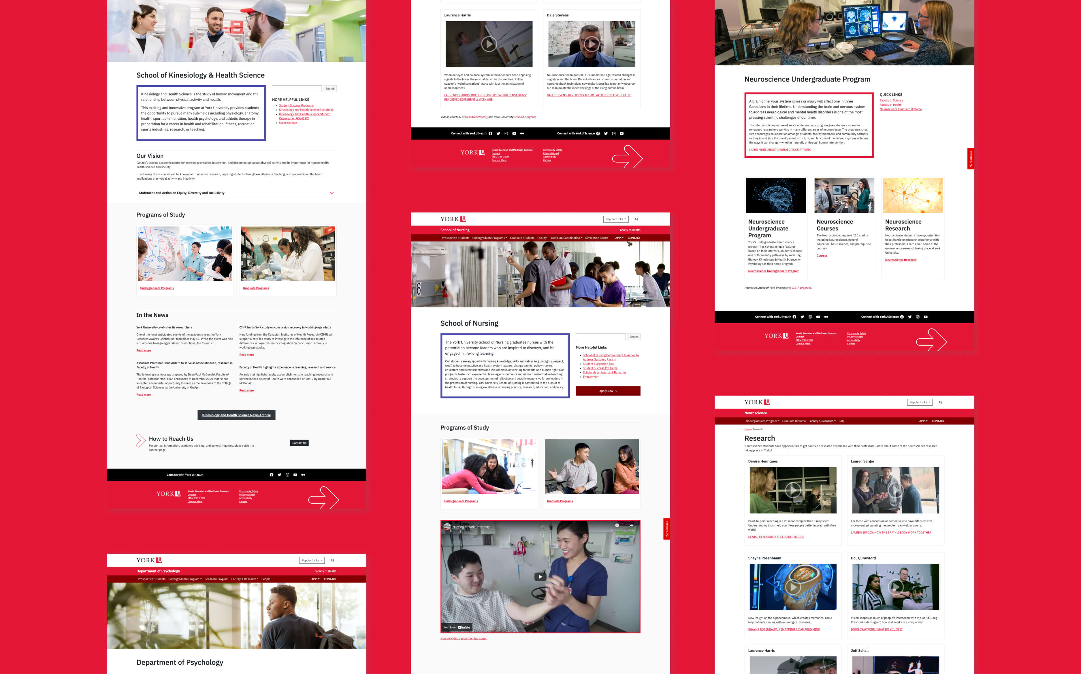
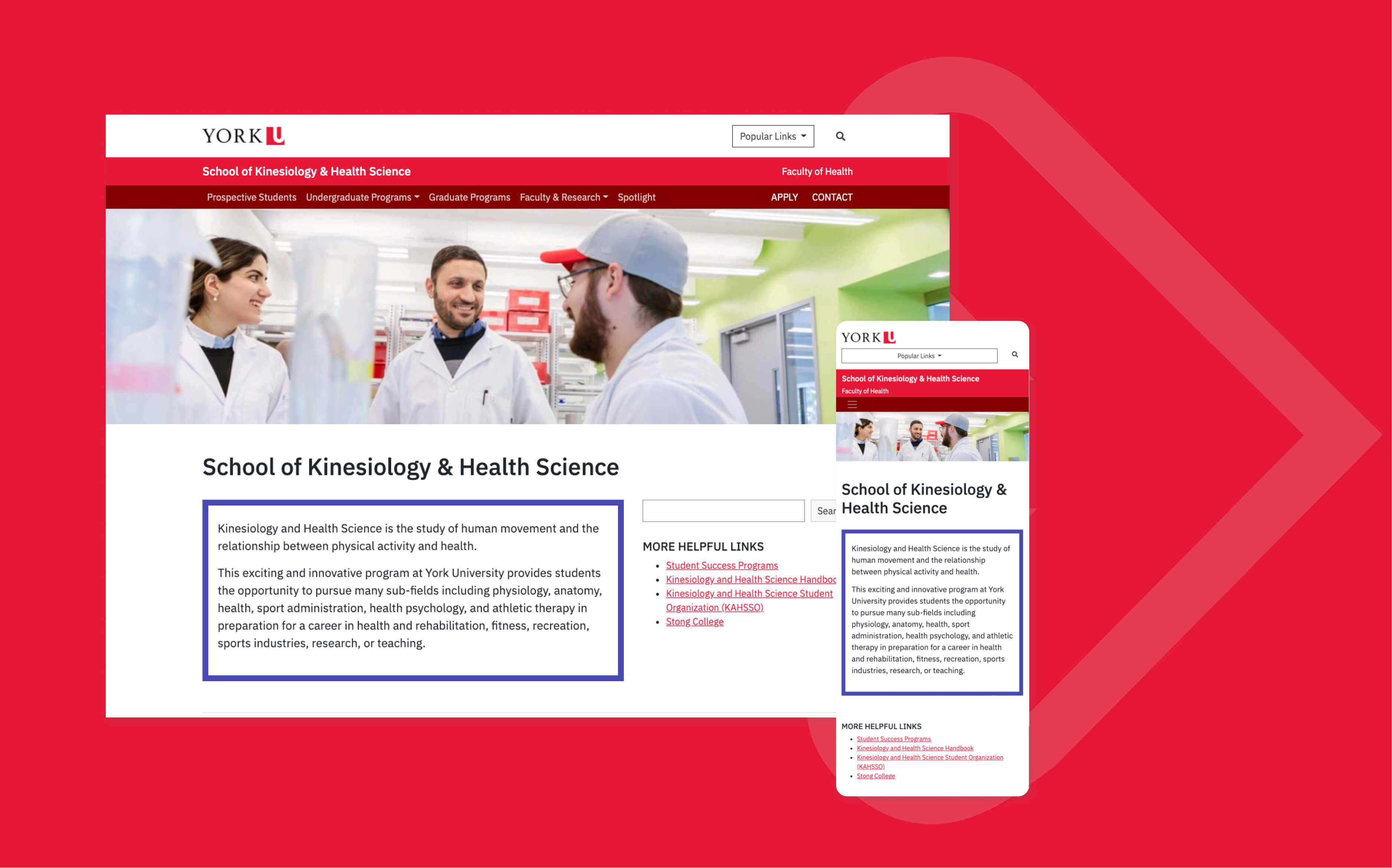
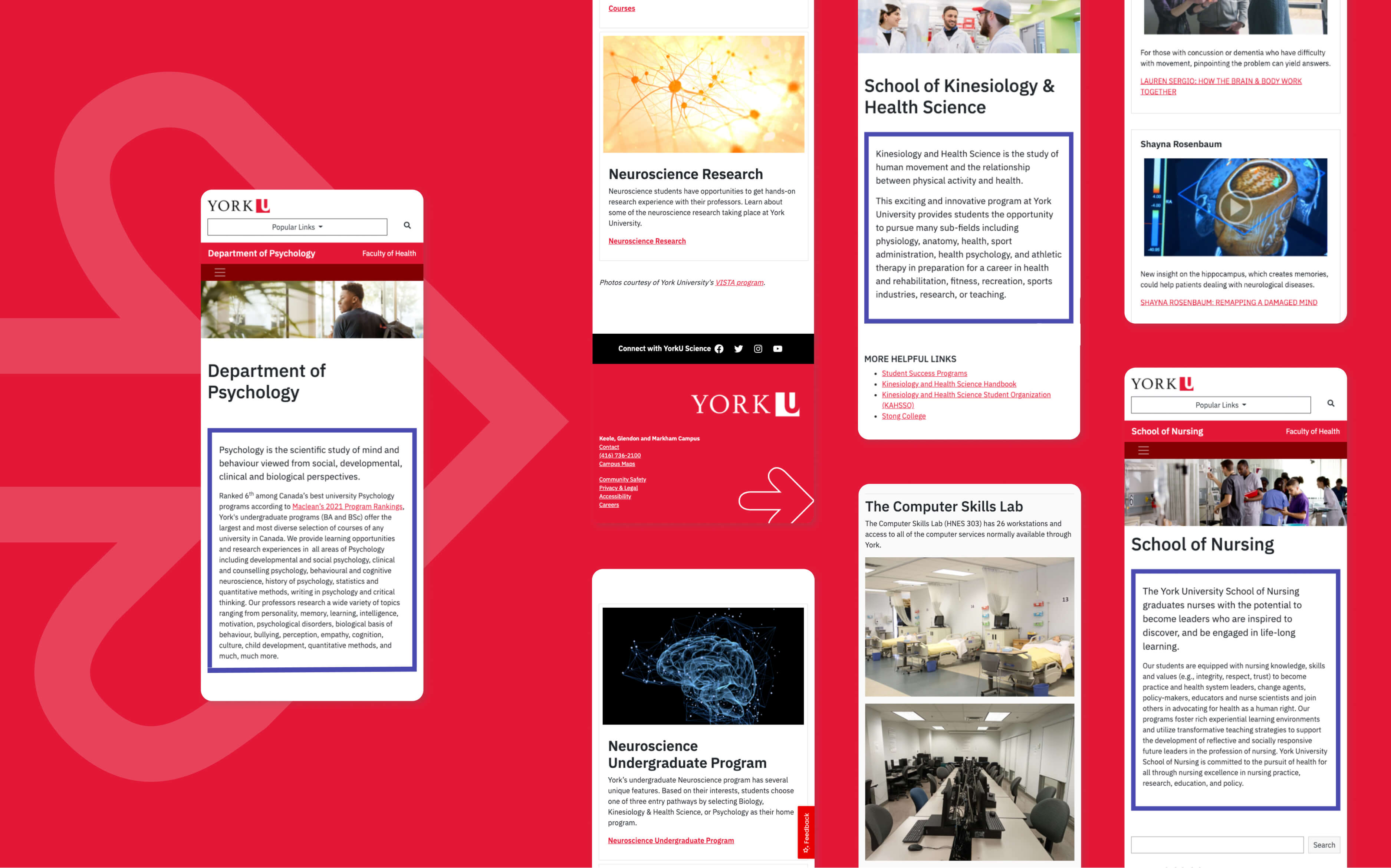
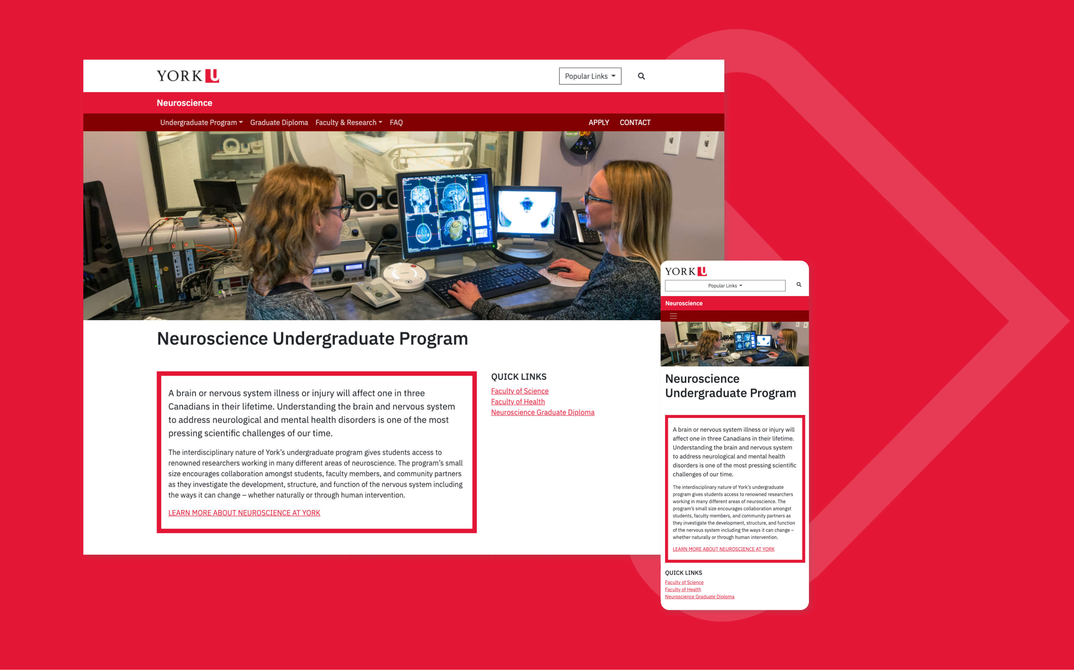
Evolving Web supported York University's Faculty of Health in revamping the content strategy of four departmental websites on York's new WordPress platform. We standardized the websites, aligned them with brand standards, improved accessibility compliance, and created a more engaging and predictable user experience.
Services: Development, Digital Strategy
About the Client
A public research university in Toronto, York is Canada's third-largest university. The Faculty of Health has more than 10,000 students, and is committed to teaching, research and community partnerships that creates positive change local to global.
Goals
In migrating four websites to the university's new WordPress platform, the Faculty of Health's primary goal was to meet York's mandate to improve content compliance with the standards of:
- the York brand;
- user experience;
- and the Accessibility for Ontarians with Disabilities Act (AODA).
The Faculty also wanted to take the opportunity to review the information architecture and layout of the content on the four websites:
Solution
At Evolving Web, we collaborate closely with our clients' teams. To best help the Faculty of Health meet its goals, we assigned a team of content specialists to map, migrate, and adjust the content of the 270 pages of the four websites.
We conducted a content audit at the outset of the project and used a content tracker to give York constant visibility to all work at every step of the way.
Our first action was to leverage these tools:
- York's library of content components (for seamless migration of standardized assets)
- York's brand style guide (to deliver a friendlier, more consistent user experience)
- Discovery sessions (to glean valuable information from more than two dozen collaborators across the Faculty's various departments, by listening to each department's team, discussing their specific content strategies, and understanding their users' needs)
Next, we selected the best content components to accommodate the communication needs. Then, drawing from York's brand style guide, we presented visual layouts for key pages that complied with the university's guidelines and addressed user content needs.
Evolving Web handled the entire content transition. We leveraged WordPress's content import and export features to optimize our migration process. We created the pages on the new platform, adapted the content, and fixed broken links and other accessibility and quality issues as we went. We manually adjusted all the pages, applying our content strategy, UX, and design expertise to improve content, navigation, and accessibility compliance. We focused some of our content editor training on AODA compliance so that authors would have the skills to keep their content accessible.
Results
Consistency and Engagement
Our client now has a nimble, easier-to-navigate web presence with compelling content and delivers on its mandate to respect AODA standards and the York University digital guidelines. An example of just how nimble? Working with our partners at the York Faculty of Health, we pared down the School of Nursing sites from an overwhelming 115 pages to a tidy 56.
The new Faculty of Health websites are more visual, engaging, and consistent with the other York undergraduate program websites. Visual improvements include:
- Embedded videos about the programs for increasing user engagement
- Featured news sections for easier access
- Updated colour palettes, adhering to York's brand style guide
- More images on the homepage, landing pages, and key internal pages for a more engaging, less overwhelming website
- Prominent "Discover" and "Apply Now" links and contact information, for more readily-available next steps
