Digital platforms are constantly evolving. Content shifts, priorities change, and entire user journeys can be disrupted overnight. For organizations, this raises a critical question:
How do we ensure digital experiences remain welcoming and inclusive—even when so much is outside our control?
In this article, I’ll share four strategies to design clarity, support, and trust into your digital platforms.
1. Transparently Communicating Change
Change, whether sudden or carefully planned, can be unsettling for users. When a trusted site suddenly looks different, or when important content disappears without explanation, people lose confidence not only in the platform but also in the organization behind it. That’s why transparency is essential.
There are two main kinds of change to prepare for: swift and unplanned or planned and proactive.
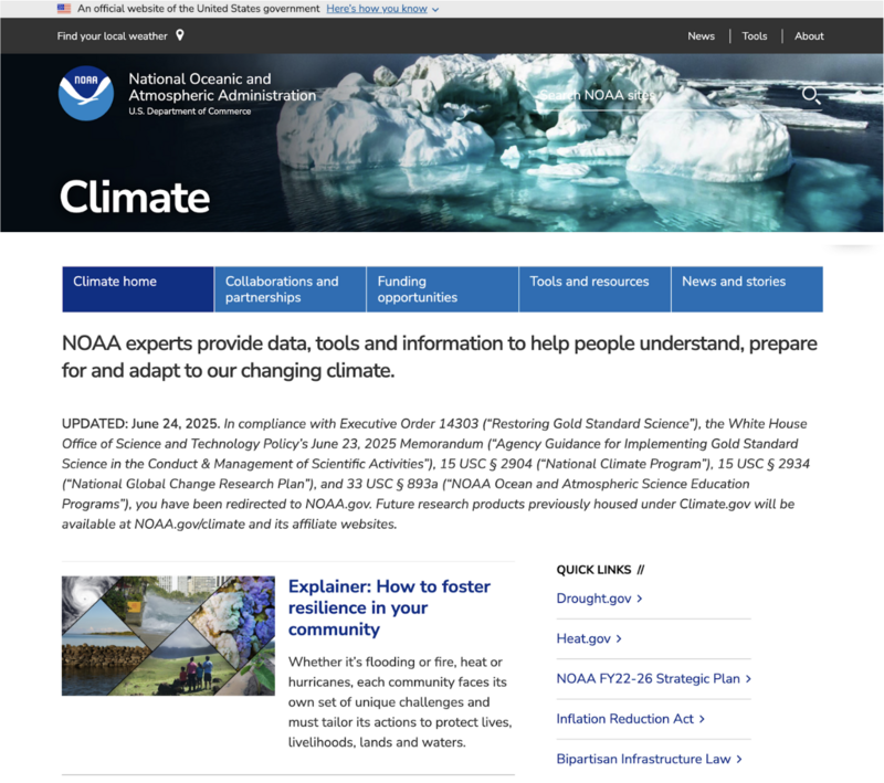
Swift, unplanned changes can be triggered by executive orders, lawsuits, budget cuts, a pandemic or other urgent events. For example, when Climate.gov went offline due to staff layoffs, the team redirected visitors to NOAA.gov’s climate section and posted a note explaining the disruption. It wasn’t perfect, but it showed respect for the user by acknowledging what had happened instead of leaving them in the dark.
Then there are planned changes, such as a redesign, feature rollout, or phased migration. These present a valuable opportunity to bring users along on the journey.
When we worked with ClimateData.ca on the redesign of their map interface, the main objective was to improve usability and make the tool more relevant to different sectors. The interactive map is central: it lets users explore climate variables such as temperature and precipitation, compare data over time, and zoom in for more localized information. This functionality is important for professionals in areas like agriculture, infrastructure, and public health who need reliable, sector-specific insights to guide planning.
Because the interface is widely used, we also put effort into communicating the changes clearly. We developed FAQs, a blog post, a newsletter, and a press release to show users what was new, how it worked, and why it would make their tasks easier. The goal was to ensure that people felt confident the tools they relied on would still be there, while also highlighting the improvements.
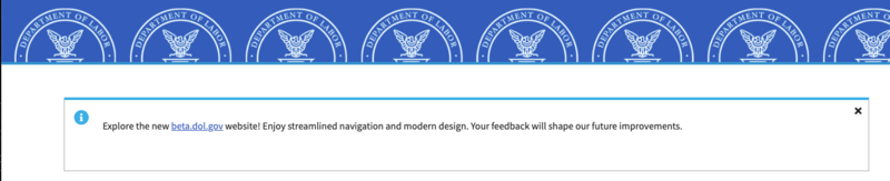
The U.S. Department of Labor took a similar approach, ahead of a new site launch, inviting users to preview the beta site, offer feedback, and get familiar with the changes before the full rollout. This early access helped reduce uncertainty and build trust, since users felt included in the process rather than confronted with an unfamiliar interface on launch day.
Takeaways
- Announce changes early—even positive ones.
- Share updates across multiple channels (site banners, email, social).
- Use plain, jargon-free language when communicating change.
- Offer sneak peeks or betas to reduce surprises.
- Provide next steps and invite feedback.
2. Designing Content for Clarity and Support
Even when content is limited by external factors, you can still control how it is presented. Clarity and support are communicated not only through words, but also through structure and design. This is where plain language comes in.
Plain language isn’t just about using simpler words. It’s a standard in government communications: in the U.S., the Plain Writing Act of 2010 requires federal agencies to write clearly for the public, and in Canada, the Canada.ca Content Style Guide emphasizes the same principle.
Both point to the same idea:
- people should be able to find what they need,
- understand it the first time, and
- act on it effectively.
Wording
Choose familiar words over jargon, acronyms, or legalese.
Keep sentences:
- short
- active
- directed at the reader
Instead of this:
“Applicants must submit the completed eligibility determination form no later than 14 calendar days following receipt of the notification letter”
Try this:
“Send us your completed form within 14 days of getting your letter.”
The latter is more approachable and human, while still precise.
Structure
- Good structure allows users to find what they need quickly.
- Put the most important information first.
- Use clear headings.
- Break text into manageable sections.
Lists and summaries are especially effective at reducing cognitive load and helping people act immediately. In a crisis, when people are anxious and time is short, this becomes even more critical.
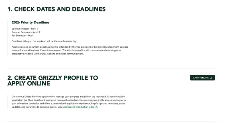
A strong example of this kind of structure is Georgia Gwinnett College’s Freshman Admissions page, which we helped design. It leads with essential information, uses clear headings, and breaks the process into manageable steps. Lists and summaries make next actions easy to understand at a glance—especially important for prospective students navigating application deadlines and unfamiliar processes.
Design
Visual presentation reinforces clarity.
Use whitespace to prevent clutter, high-contrast text for accessibility, and readable fonts that work across devices. Icons, progress indicators, or diagrams can help explain complex ideas without overwhelming users. Good design isn’t only about aesthetics decided in advance—it also means having flexible components that allow editors to respond quickly to unexpected changes. For example, an “alert” style that stands out from body text ensures urgent updates are seen immediately, a lesson many organizations learned during the pandemic. Clear wording, structure, and supportive design create a sense of welcome, even for complex topics.
Takeaways
- Use familiar, supportive words.
- Organize content so the essentials come first.
- Leverage whitespace, contrast, and visuals to support comprehension.
- Ensure components are flexible enough for urgent, high-visibility updates.
3. Crafting Needs-Based User Flows
Most people don’t come to your site to learn about your organizational structure. They come with a task: to apply for benefits, renew a license, pay a bill, or access data. When digital experiences mirror internal hierarchies instead of real-world needs, users get lost and frustrated.A better approach is to center your design on needs-based user flows. For example, someone seeking rent assistance doesn’t care which department is responsible. Their journey is practical: find out if help is available, check eligibility, apply, and track the status of their application. If your site doesn’t make that flow easy, they may abandon it—or worse, be without access to the support they need.
This focus becomes even more critical in times of crisis.
During emergencies—whether a natural disaster, public health alert, or sudden service disruption—people urgently need clear, direct pathways to reliable information. They don’t have the bandwidth to navigate department names or sift through irrelevant pages. In these moments, a poorly structured site doesn’t just cause frustration; it can prevent people from getting the help, safety updates, or instructions they desperately need.
Examples from the field illustrate both pitfalls and successes.
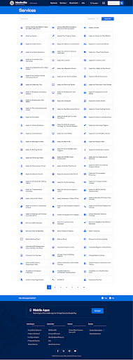
Nashville’s city website lists more than a thousand services alphabetically. While a keyword search is available, it still leaves users to sift through a daunting list with minimal guidance. Imagine facing that in the middle of a flood evacuation or health scare.
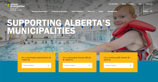
In contrast, platforms like GOV.UK and the site we created for Alberta Municipalities guide users through hub pages organized around common questions or popular services. This reduces dead ends and creates natural next steps.
INSPQ’s COVID-19 portal is another example that demonstrates how clear, needs-based user flows become even more critical during emergencies.
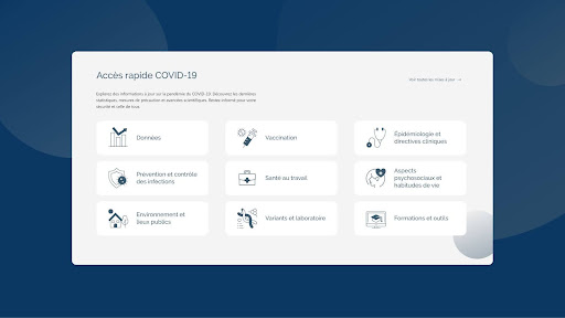
(Accès rapide COVID-19 = Quick COVID-19 Access. Categories include: Données / Data, Vaccination, Prévention et contrôle des infections / Infection prevention and control, Santé au travail / Workplace health, Environnement et lieux publics / Environment and public spaces, Variants et laboratoire / Variants and laboratory, Épidémiologie et directives cliniques / Epidemiology and clinical guidelines, Aspects psychosociaux et habitudes de vie / Psychosocial aspects and lifestyle habits, Formations et outils / Training and tools.)
Rather than forcing users to navigate by organizational structure, the site presents direct, task-oriented categories: Data, Vaccination, Infection Prevention, Workplace Health, Public Environment, Variants and Labs, Epidemiology, Psychosocial Aspects, and Training Tools.
In a crisis—when anxiety is high and decisions must be made quickly—this type of design helps people get exactly what they need without confusion.
Someone looking for vaccination details or infection-control measures can locate that information immediately, instead of wading through department names or technical reports. By structuring content around real-world needs, the INSPQ ensured that both health professionals and the public had rapid, reliable access to life-saving information.
Takeaways
- Start with the user’s need, not your org chart.
- Don’t make people figure out which agency or department to contact.
- Anticipate “what’s next” moments and build them into the flow.
- At the end of each step, guide users toward their likely next action.
- Accommodate multiple paths for different circumstances or for uncertain users (“I don’t know if I qualify”).
- Plan for change. In times of transition—whether adding new services, retiring old ones, or shifting responsibilities—communicate clearly what’s available now, what’s no longer offered, and where people should go instead. In a crisis, this helps avoid confusion and misinformation.
4. Planning Ahead for Change Resilience
No matter how carefully you prepare, change will come.
Policies shift, leadership priorities evolve, and external events can disrupt even the best-laid plans. That’s why it’s critical to build digital systems that are resilient—able to bend without breaking.
Resilience begins with modular design systems. Components like alert banners, callouts, and flexible content blocks make it possible to update or swap information quickly, without overhauling the entire site.
Archival policies are equally important. By documenting what is archived, when, and how it can be restored, you ensure compliance while maintaining transparency with users.
Automated monitoring adds another layer of protection. Tools like Siteimprove or ContentKing can scan for outdated information, while broken link checkers and accessibility monitors like Screaming Frog SEO or DubBot ensure reliability and inclusivity.Tools that scan for outdated content, missing links, or problematic terms allow you to address issues before they damage trust. For example, during the pandemic, many organizations used monitoring tools to identify and update content related to testing sites, masking rules, or vaccination policies as guidance changed.
The goal is to create a digital ecosystem that can adapt quickly while keeping the user experience consistent and reliable.
Takeaways
- Use modular design for quick content updates.
- Centralize high-demand information on hub pages.
- Maintain archival and content lifecycle policies.
- Monitor for outdated or missing content with automated tools, like SiteImprove.
This allows you to respond quickly to new developments without sacrificing the user experience.
Final Thoughts
You may not control every decision that shapes your digital platform. But you do control how users experience it. By communicating transparently, writing clearly, designing supportive flows, and building resilient systems, you create digital experiences that feel welcoming and trustworthy—even in times of uncertainty.
Want to make your digital platforms more resilient and trustworthy? Our team would love to help. Reach out to us and let’s explore what’s possible together.
This article is adapted from a talk I gave at DrupalGovCon 2025, but generalized for a wider audience, since adapting to change applies to not just government organizations. You may watch the original talk on YouTube below:
