
As specialists in all levels of government web design and functionality, we’re all too familiar with a masterful balance of UX/UI design, web governance and information architecture. With so many national, provincial, regional, and municipal requirements to meet, building a website that is a communication hub for your community can feel like an impossible feat. Much is to be accomplished with a government’s site, and with great power comes great responsibility.
This article will cover the particular challenges of government sites as well as our favourites of 2023 that we think can help inspire your community’s digital front door.
Great Expectations
Much is expected of government websites. They’re held to the highest accessibility standards. A wide range of communities rely on them for communication, updates and safety alerts. On a given day, these sites are expected to facilitate a wide array of tasks, from transit trip planning to registering marriages. They’re also encouraged to promote inclusion and diversity, sometimes to the extent of being functionally multilingual.
On top of these requirements, as jurisdictions’ digital manifestation of a living-breathing community, they’re also expected to be attractive and modern-looking. Additionally, because our tax dollars pay for them, we also expect them to not be too expensive. When government websites go seriously over budget, as the Government of Canada’s did in 2016, the public takes notice.
Accessibility-wise, standards continue to rise for government websites. In Canada, WCAG 2.0 AA-level accessibility is now required by law federally and in many provinces, and federal agencies can now be fined up to $250,000 for failing to meet these requirements. In the US, the Americans with Disabilities Act (ADA) requires that all national, state, and local government agencies be WCAG 2.0 AA-compliant.
In addition to being accessible, government websites are also expected to be easy to use – by everyone. In design terms, this means prominent search and navigation features and easy navigability – across a range of digital devices. Lastly, as government websites are vital community hubs, people expect to see themselves in them – by way of inclusive language and imagery that evokes diversity.
Above all, government websites are expected to serve the citizenry they represent. As Cyd Harrell, Chief Digital Services Officer for the City and County of San Francisco, puts it, “Government websites often are about the government. They should be the government and let the users do their tasks online.”
What’s In It For Governments?
Whether federal, regional or local government agencies have a lot to gain from having attractive, well-designed websites. An effective website reduces the workload of government employees in the form of in-person walk-ins and inbound phone calls while offering a modern user-friendly experience.
A powerful web presence also has the potential to increase community engagement. Good web design increases receptivity to your messaging among citizens, drives relevant traffic to your site and improves results of government programs. Websites are also powerful branding tools that help attract economic investment, migrants, visitors and job seekers alike.
A well-designed website goes a long way in justifying their continued operation. As much as government websites need to be budgetarily within reason, they are also a must in public accountability terms as they attest to how public money is being spent.
Our Personal Favourites
For municipalities, provinces/states, and many federally-funded programs with a degree of independence, the sky’s the limit for web design. And some have truly raised the bar for design excellence.
Here’s a list of our favourite six government organization sites that take on this multitude of expectations with grace.
1. State of Mississippi
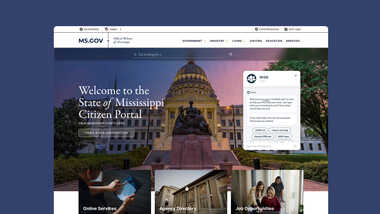
The government of the US state of Mississippi undertook a wholesale transformation of its official web portal in 2013. Created by Mississippi Interactive, a subsidiary of the eGovernment firm NIC, the state’s award-winning website continues to stand out among US states even ten years after its original launch. In 2022 the site was named Best Government Website of the Year by the Web Marketing Association.
“From the beginning, the inspiration for this design has been the residents and businesses of Mississippi,” says Dr. Craig Orgeron, Mississippi’s Chief Information Officer and Director of the Department of Information Technology Services. “With today’s technology rapidly changing, how we do business and interact with one another is changing as well. We feel this mobile first approach addresses the demands of our end user and continues to propel Mississippi as a leader in eGovernment.”
Standout features:
- Fully responsive user-friendly design
- Informative content with up-to-date information
- Swipe-sliders and content box that flips into touch-enabled innovations
- Dynamic search bar animation that encourages users to use it
- Unique accessibility toggle features that allow users to view and customize the experience to their unique needs
- Inspiring high-resolution photography
- Clean and easy navigation
- Navigation titles that are designed to be intuitive and tailored to specific user groups or personas
2. US Internal Revenue Service
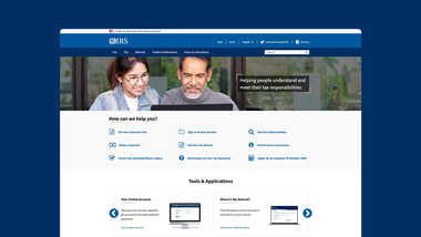
If there’s one website a government ought to get right, it’s the one representing the agency responsible for collecting the money that pays for said websites. A well-designed, visually appealing tax agency website can indeed make doing your civic duty rather less painful. As expected, some governments are doing far better than others on this front.
The United States’ Internal Revenue Service (IRS) website has gone through numerous upgrades since the advent of online filing in 1995, including a major revamp in 2017. Priorities for this redesign were greater accessibility for people living with disabilities, mobile-friendliness and overall improved organization so that taxpayers can quickly find what they need – reducing the burden on agency phone lines. On these and other fronts, the IRS website is a true leader among global tax agency sites.
Standout features:
- Aesthetically pleasing design centred on relaxing blues
- A rotating banner featuring high-resolution photographs of ethnically diverse people engaged in life activities
- Banner message that explains the agency’s purpose with minimal real estate
- Task-oriented, user-friendly “How can we help you” menu covering all major user services, coupled with appealing iconography
- Multiple overlapping organizational structures providing multiple access points to different areas of the site
- Multilingual content spanning 21 languages
- Mobile-friendly design
3. Bonjour Québec
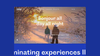
What we said about governments needing to get their tax agency websites just right could just as easily be said of their tourism agencies, although for somewhat different reasons. Where tax agencies promise minimal pain, tourism bureaus compete for recreational travellers and a stellar website can go far in promoting a destination.
In 2020, the Alliance de l’industrie touristique du Québec (Québec Tourism Industry Alliance) officially rebranded as “Bonjour Québec”, a name that it says “invokes the Francophone culture and the warm hospitality that has established Québec as a unique and world-class destination.” The rebrand was accompanied by the launch of a new website by the same name aimed at shining a light on the diversity of the province’s tourism landscape and providing an easy and enjoyable user experience for visitors.
Standout features:
- Inspiring and visually beautiful UI design
- Dynamic animations that allow the content to come to life
- Fully responsive
- A “Plan a Trip” section that allows users to explore different regions of Québec and the vast array of offerings it has to offer in an immersive online setting
- Fully customizable mapping and a drag-and-drop itinerary planner
- Powerful custom search engine
- Full multilingual capabilities (in French, English and Spanish), including a complex fallback system that ensures relevant results even when an exact translation is unavailable
4. Umag 2021 – 2030
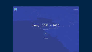
Umag is a picturesque seaside town in the northwestern corner of Croatia, near the borders with Italy and Slovenia. While small in population (about 13,000), it’s multiethnic, historically rich and economically diverse, with a strong winemaking industry and growing tourism. It is best known internationally for its annual Sea Star Music Festival as well as for hosting the annual Croatia Open tennis tournament.
While the town’s official website (umag.hr) is quite good, it is the Umag 2021 – 2030 site that truly stands out. Created by local web design firm ALT, the site is an interactive exhibit for the town of Umag, which highlights the government’s plans for the development of the Umag region in the next ten years. The primary objective of this platform is to engage with citizens and involve them in upcoming civic projects by soliciting their feedback and ideas. The result is an ultramodern platform and a great showcase for the town.
Standout features:
- Impressive 3D interface that appeals to both invested parties and casual visitors, offering interactive experience similar to a high-quality video game
- Simple and bold colour palette
- Compelling map layouts
- Dynamic transitions
- Exploratory character that makes visitors want to dig deeper
5. Canada Foundation for Innovation
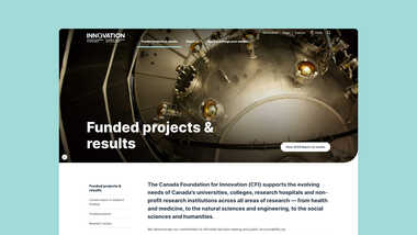
Admittedly we’re biased towards this one, as this is one of our own designs. While technically not a government body, the Canadian Foundation for Innovation (CFI) was created by the Government of Canada in 1997 to invest in research facilities and equipment in Canada's universities, colleges, research hospitals and non-profit research institutions.
The CFI approached us for the purpose of creating a bold, fresh design that invites users to immerse themselves in the site and discover more about the organization and the funding programs. To this end, we created a more mobile-friendly, user-centred interface tailored to the personas identified during the discovery phase, which included a researcher, a CFI liaison, a parliamentarian or other elected official, an international expert reviewer and private sector representative.
Standout features:
- A design focused on easy readability – breathing room, white space, and larger fonts to help users engage with the content
- An editorial approach to the design – big, bold headlines, larger set fonts, big images and clean layouts to attract viewers
- Use of high-quality images to complement the brand and promote innovation
- Easy navigation geared for the CFI’s identified primary audiences
- Effective information architecture that makes this large site (over 1,500 pages and more than 7,000 files) easy to manage
- Superb copywriting that tackles complex subject matters with clear language
- Full bilingualism
6. City of Hamilton
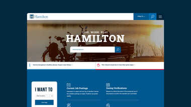
Another one of our designs, the brand new City of Hamilton website was a major milestone for Evolving Web as it was our first official city website project. With Hamilton, we were dealing with a major urban centre with a metro population of nearly 800,000 (Canada’s ninth largest urban area), and therefore a complex set of overlapping stakeholder needs and potentially competing demands.
The main goal of the project was to create an organized, clean, transparent and inclusive website that engages users, keeps them coming back and gives them tools to find information quickly. We wanted the site to be visually attractive and appeal to younger and older demographics alike. Much work went into accessibility, including fine-tuning colour contrasts and large text geared for an older demographic. We also prioritized mobile friendliness and social media compatibility.
Standout features:
- Friendly, positive and inviting tone throughout
- Vibrant, engaging photography throughout the site
- A robust search tool with multiple ways to categorize and filter information
- An intuitive “I Want To…” drop down menu with links to popular topic areas
- Inclusion of icons throughout the site to give each section more meaning and help readers navigate through the site more quickly
- A compact navigation sidebar consolidated by section so that users are not overwhelmed by too many choices of child pages at any given time
- A prominent design for alerts and notifications based on a colour coding and icon system to inform users of recent developments in the city
Let’s Join Forces
Much of the work we do at Evolving Web centres on government services, and we have a lot of experience building sites that meet the nuanced needs of today’s government agencies. If you’re a government agency looking to a partner to lead your next website project, we’d love to hear from you. Learn more about our tailored approach to government websites and get us to work helping you better serve your community.
