Over the last few months, I've been involved in a UX study to shed some light on what would make a good content editor experience in Drupal. I helped run a survey asking content editors for their feedback about the Drupal admin UI and got some interesting results. Then, we started looking around for examples of good content editor UX, which led to a comparative usability test of other CMS's, generating some ideas about patterns to follow and avoid.
I have a job where I get to train lots of people how to use Drupal: developers, site builders, and sometimes content editors. So I've gathered a lot of anecdotes of people's first impressions of editing content with Drupal.
As you've probably heard, there is work being done on a brand new Admin UI for Drupal, but this might take a while to build. So what are some things about content editor UX that we might be able to improve on before that?
Autosave
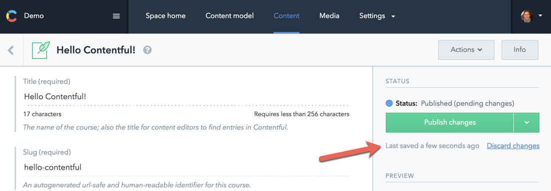
When you ask content editors what we should change about the admin UI, this one always come up. All content authors have anxiety about losing their content. And when we ran our user testing with other CMS’s, autosave clearly reassured and delighted editors. For example, Contentful has a nice autosave message that helps users know that their content is saved.

There is an open issue for adding autosave to Drupal. It would be great to get momentum behind implementing this!
A Content Editor Role
One of the challenges of using Drupal is that there are so many options. For site builders and developers, a UI that provides a lot of options is great because you can see that the platform is flexible. For content editors, seeing a lot of options that don’t relate to content editing is intimidating. From our usability testing, we can see that content editors love using a UI that is more streamlined, less complicated, and clearly designed for them.
Creating a content editor role as part of the Standard install profile might be a nice way to encourage the practice of limiting what content editors have access to by providing a set of default permissions to start with.
What should the content editor role look like? Of course, content editors need to be able to create and edit content. And they will need access to the content overview page. Should they have access to the Administer Content permission? What about working with files, taxonomy terms, revisions, and menus? Based on our content editor survey, it seems like giving all these permissions would align the role with a content editor’s typical tasks. But I think a more limited set of permissions would work as well, as long as it's clear that the permissions are a starting point that can be expanded on by an administrator.
Show Me the Content!
On a standard Drupal install, when you log into Drupal you're redirected to your profile page. I think for most content editors, this doesn’t make sense. Your home base is probably the content overview page. Maybe we should redirect content editors to the content overview page when they log in.
Move the Save Button
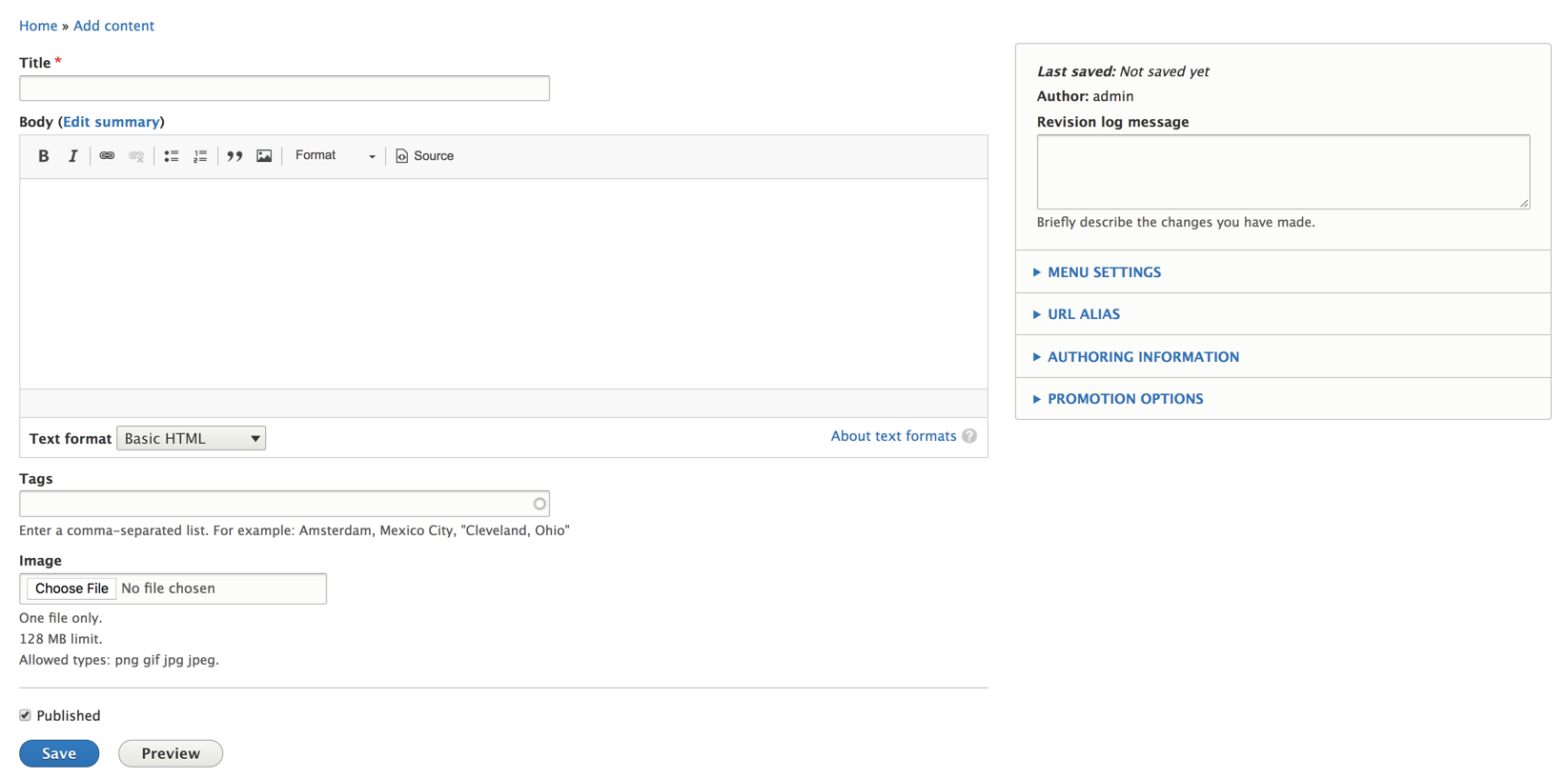
Currently, the Save button, along with the preview buttons and the interface to publish and moderate content is at the bottom of the node edit page. From our usability testing, it seems like content editors expect the Save button to be in the top right-hand corner. For long-form content, this would make those links more readily available and I think this would be a usability improvement for new content editors.

The key to success with all the save, preview, and content moderation options seems to be to put them all together. In the comparative usability testing, this feedback rang loud and clear.
One thing I like about moving the Save button top right-hand corner is that it puts those buttons in proximity to the “Revisions” section of the edit page, which is closely related to the task of saving or changing the status of a node.
That being said, I think it could really confuse existing Drupal editors if we just start moving buttons around. And I assume that there could be accessibility implications that we should take into account. So I leave this one as an open question. What do you think?
Modernizing the UI
One of the big pieces of feedback we got from the content editors survey was that the Drupal UI looks dated. Well, the idea of modernizing the UI already has a ton of momentum behind it. I’m super excited about the work Christina Chumillas and others have done to create new, improved designs for the existing Admin UI of Drupal 8. This is not an overhaul of the UX, but a new, modern style guide applied to the existing one. It's a big improvement that I think will bolster first impressions of Drupal. And it's something that is planned to be implemented in the near future.
What’s Next?
If you’re a UX person who wants to contribute to Drupal, there are ways to get involved! See the #ux and #admin-ui channels on Drupal Slack. If you have ideas for other content editor UX improvements, or know of existing UX issues in the queue that need some attention, I'd love to hear about them here. Or continue the conversation in those channels.

