Overview
The Simons Institute for the Theory of Computing at the University of California, Berkeley approached Evolving Web to upgrade its content management system to the latest version of Drupal and to redesign and reorganize its website. Specific goals included communicating the unique purpose of the institute, modernizing the site’s visual identity and updating the underlying technology.
Get in Touch to Discuss Your Ideas
Drop us a line today to kickstart your project — let's build something extraordinary together.

About the Client
The Simons Institute for the Theory of Computing is a collaborative research institute in theoretical computer science at the University of California, Berkeley. Established in 2012 by a grant from the Simons Foundation, the institute’s stated aims are “to promote fundamental research on the foundations of computer science, as well as to expand the horizons of the field by exploring other scientific disciplines through a computational lens.”
The Simons Institute supports research programs on a wide range of topics related to computing, including “core questions in complexity theory and algorithms” as well as the interrelation between computing and other scientific disciplines. Its core activities revolve around a rotating sequence of programs, each involving between 60 and 70 long-term participants, with each focused on a specific area of theoretical computer science.
Goals
The Simons Institute’s original website, in operation since the institute’s inception in 2012, was no longer serving the client’s needs. In addition to simply looking out of date – a liability for an organization at the global forefront of computing – the site’s contents had long outgrown its original architecture, making it difficult to navigate.
Specific project goals included:
- Creating a brand new Drupal 9 website with an improved information architecture and migrating the content from the legacy version to the new one
- Developing a new look for the site as a whole, with emphasis on colourful, visually attractive navigation
- Creating a simple mobile design allows users to navigate the website more quickly than the previous site
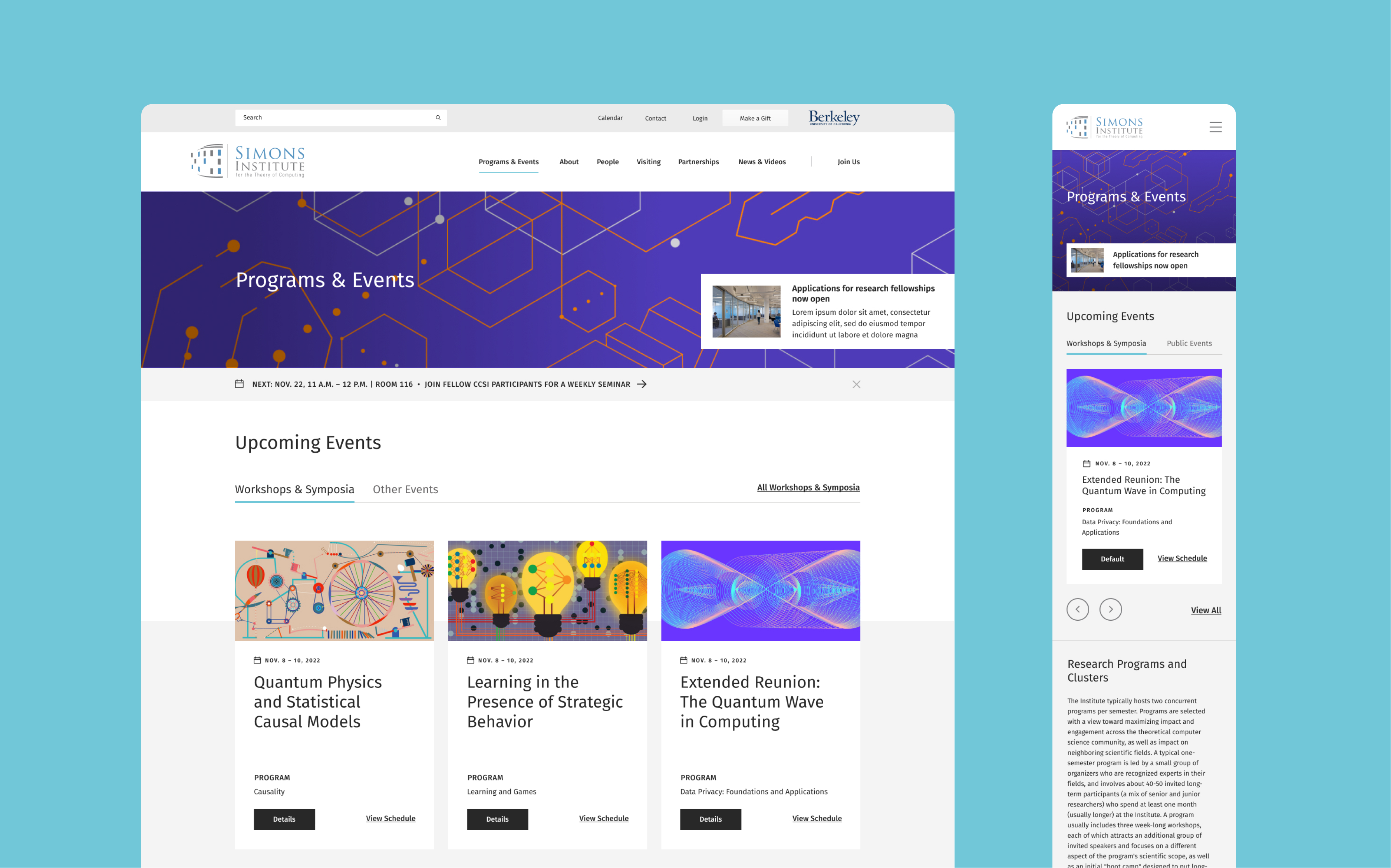
- Redesigning the homepage for ease of access to key content
- Creating a "news hub" for researchers and scientists to find and gather informative content in the field of computer science
Challenges
The original Simons Institute website was massive – close to 10,000 pages in size – and contained a vast array of content types, ranging from videos to event pages to academic program information. Long-running institute programs all had individual workshops within them, all of which require their own page content, with each event featuring numerous profiles of speakers, panelists, professors associated with specific work and so on.
Architectural issues inherent in the original institute website included:
- Difficulty finding information on a day’s events
- Difficulty locating recordings of events
- Lack of clarity over which event categories are relevant to any given visitor (a researcher or someone from the broader public)
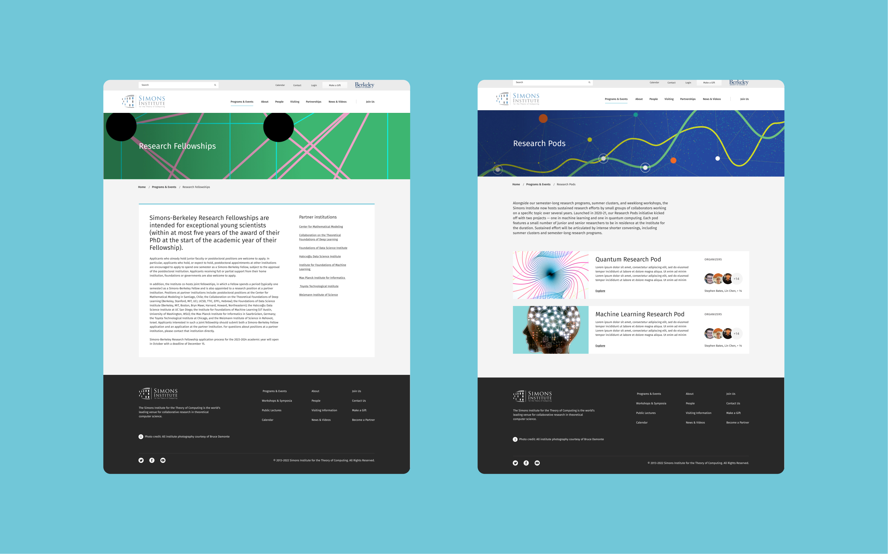
- “Research pods” (information on ongoing research projects) not well integrated
In addition to the sheer volume of content to contend with, the subject matter in question posed challenges from a design perspective. The complex, highly specialized nature of the institute’s research materials tended to result in enormous walls of text with few visual breaks, with the original site being extremely text-heavy. Finding a way to break up text with appealing visuals was therefore a priority for designers at both Evolving Web and the Simons Institute.
From a messaging standpoint, a further challenge was imparting the importance of the Simons Institute to any reader outside this niche community of theoretical computer scientists. A further challenge identified early on was a lack of clarity on why the institute matters to society or the field of computing. Spanning the divide between members of a highly specialized field and anyone else visiting the site was imperative.
Solutions
We began the project with an identification of the institute’s audiences through surveys. We identified the primary audiences as being the scientific and technical community (mainly present, past and future visiting researchers) as well as institute staff and faculty leadership, audiences whose needs from the website pertained mainly to events. Funders and industry partners were identified as a secondary audience, with the broader public representing a tertiary but still important stakeholder group.
Through workshops and questionnaires, it became clear that the new site would need to serve multiple roles of near-equal importance. Specifically, the new site had to be:
- An event registration and information platform
- An archive of scientific content
- A media aggregator for displaying content from the institute’s YouTube, Twitter, Facebook and Mailchimp accounts
- An archive for profiles of visiting researchers
- An application submission platform, with the capacity to accept applications for various programs and positions at the institute
- A scientific collaboration platform
- A content management platform
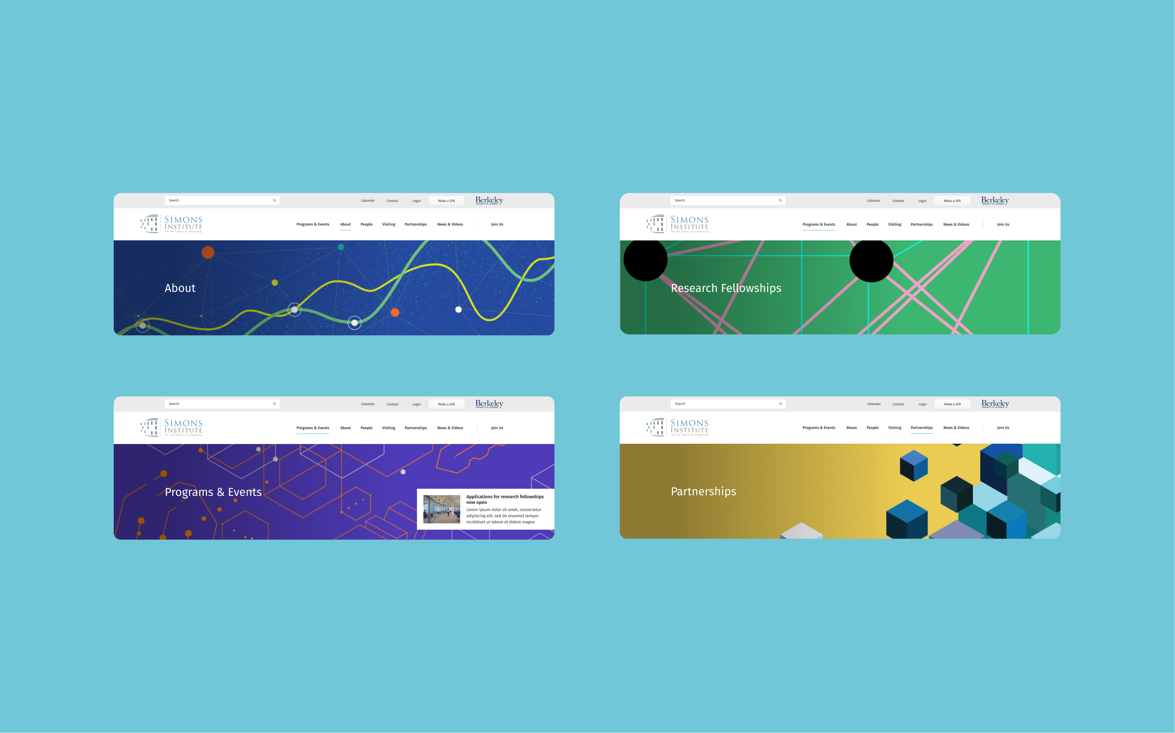
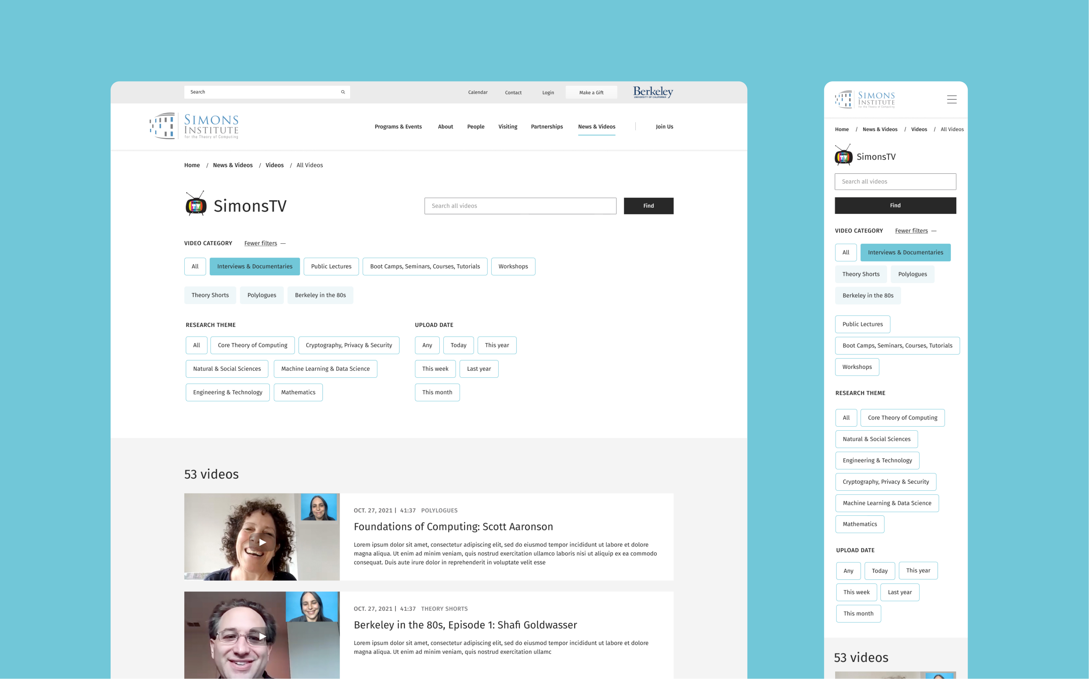
From a UX perspective, we condensed the information into accordions, tabs, and used a hierarchy of elements to allow the information to be understood more quickly. The new design breaks up information into clear blocks using background colour to differentiate sections, allowing users to find information more quickly. Careful consideration of hierarchy was a key aspect when designing content blocks. Important blocks were designed with more emphasis to grab users’ attention while smaller blocks are still visible.
Other solutions we implemented included:
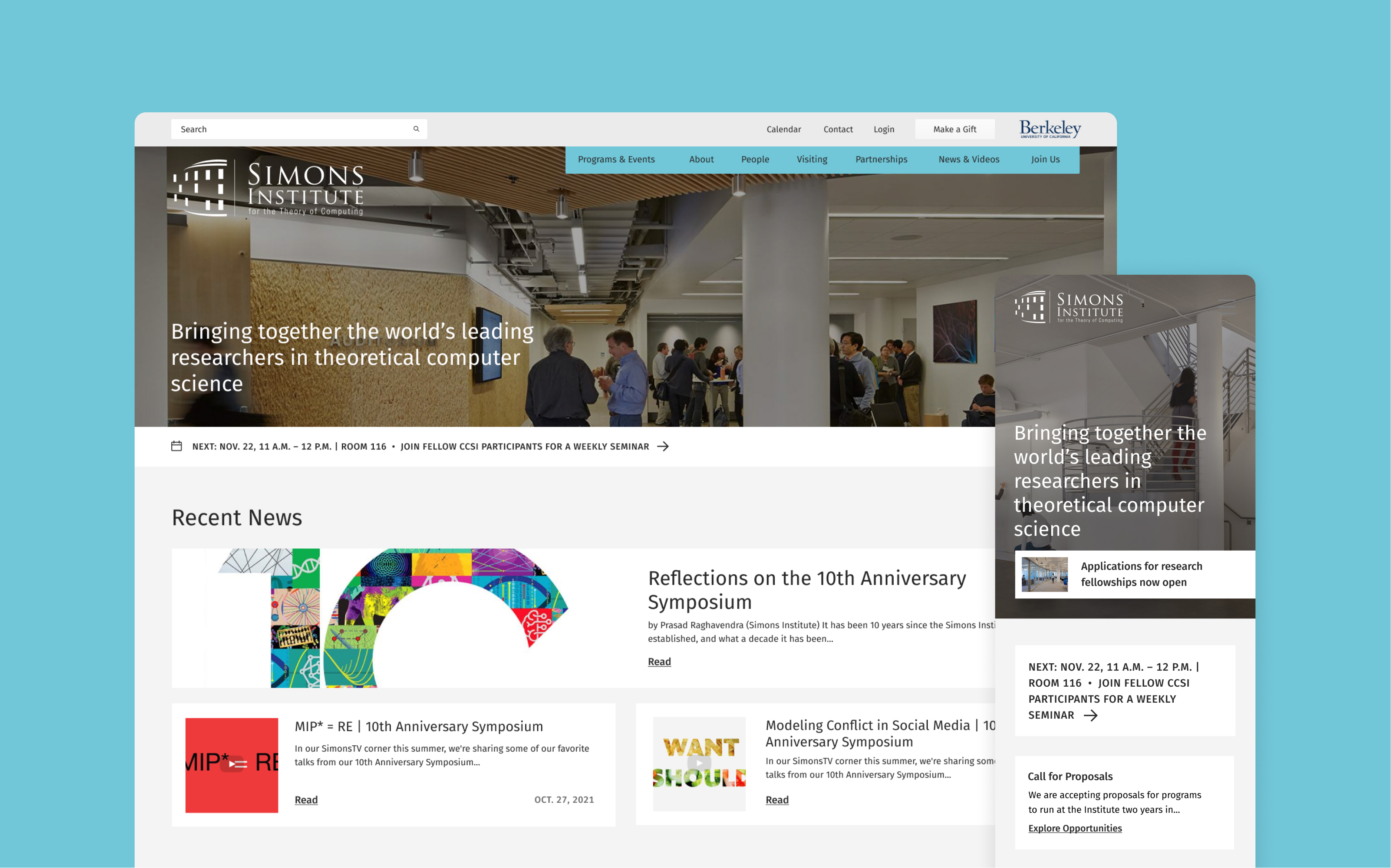
- A new homepage that serves as a digital front door, highlighting the breadth of research and educational content that the institute produces
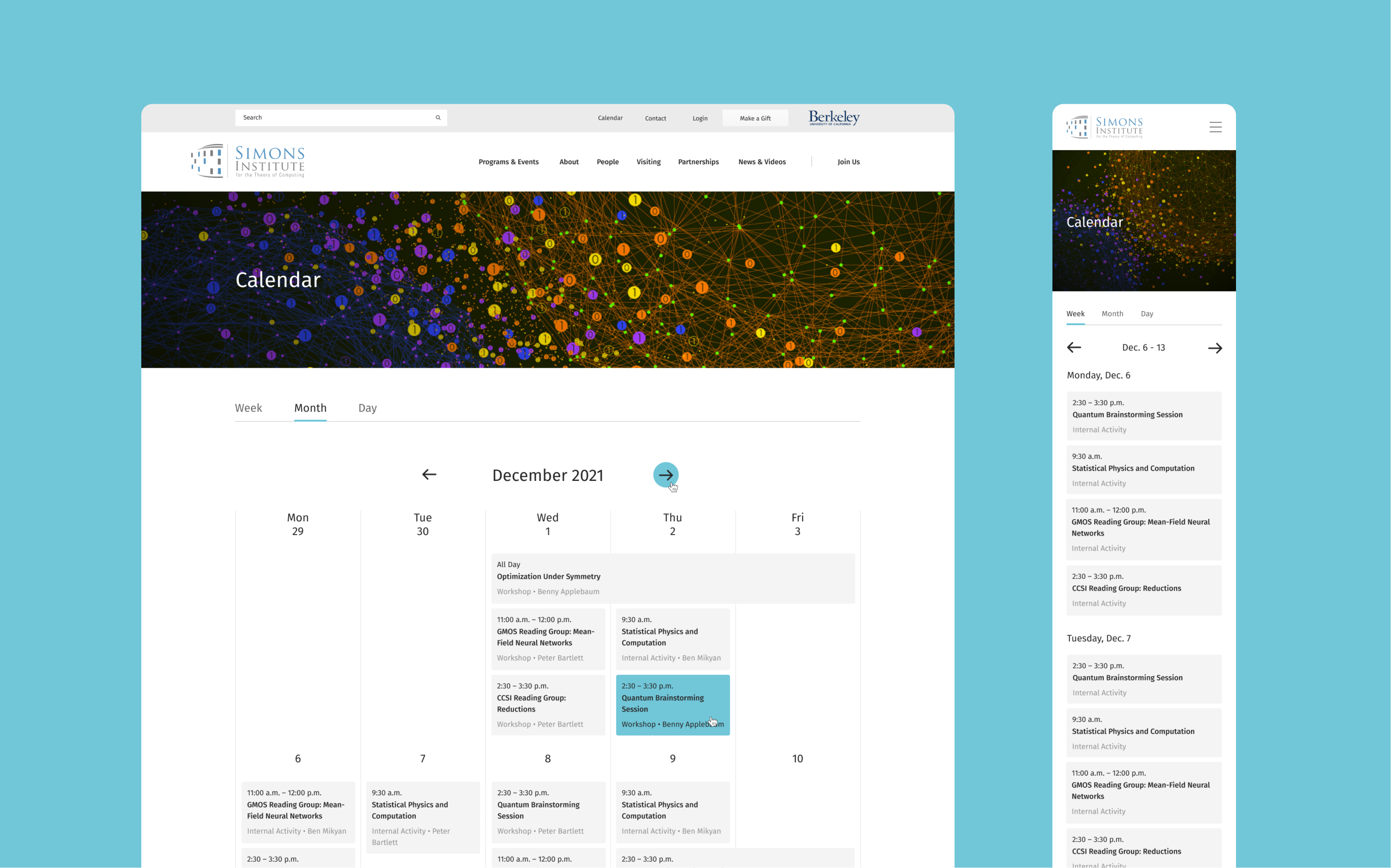
- An interactive calendar built with the FullCalendar JS library to enable users to more quickly filter and find information that appeals to them
- Use of accordion menus and other structures aimed at making content less cluttered
- A highlighted spot for a “featured” item within the news section that creates hierarchy
- Clean white backgrounds and playful graphic references the sweeping curves of the Simons Institute building’s architecture
- Simplified brand colours, including font colours that meet accessibility standards
- Content organized in a hierarchical manner to pull users into the information, with white blocks (with featured and non-featured CTAs) to help split up the information and pull users in
- Use of images centred on people to emphasize the centrality of human beings and community to the advancement of computer science
- Abstract graphic illustrations that also have a human touch, while also being innovative and playful
- Responsive images that enable improved performance across all device types
- Reusable user interface (UI) components that allow the website to stay consistent, on brand and easily managed by the client over the long term
- A dedicated landing page for Simons TV to promote the institute as an active provider of innovative and dynamic content and research offerings
The new visual theme includes new layouts, templates, style sheets and animations. The brand suite follows ADA compliance recommendations and the Simons Institute identity guidelines. The new site introduces the Simons Institute to the world through an accessible, design-forward and user-friendly website that serves a broad audience, with primary users being the scientific community, current, past, and future program participants, donors, the broader public, faculty, staff and the broader UC Berkeley community.
Results
Through close collaboration between Evolving Web and the design team at the Simons Institute, we were able to create an informative, clean, friendly, scientific, inviting, organized and visually appealing new website that strikes a balance between imparting knowledge from the frontiers of computer science and being friendly and open to the public at large.
The new website has improved functionality and a refreshed look and feel. The homepage defines who the Simons Institute is and leads users into their offerings. Use of bright colours in illustrations allows the visual design to look fresh and inviting, while secondary banners integrate colourful illustrations and invite users to discover more. With a lot of scientific information to present, the typography was designed to allow for easy, distraction-free readability which makes the colourful illustrations and photography stand out.
Keywords to describe the new website include: clear typographic structure, accessible, inviting, stronger readability/legibility of content using darker font colours and colour blocking, visual, scientific, people-focused, modern and user-friendly.