Overview
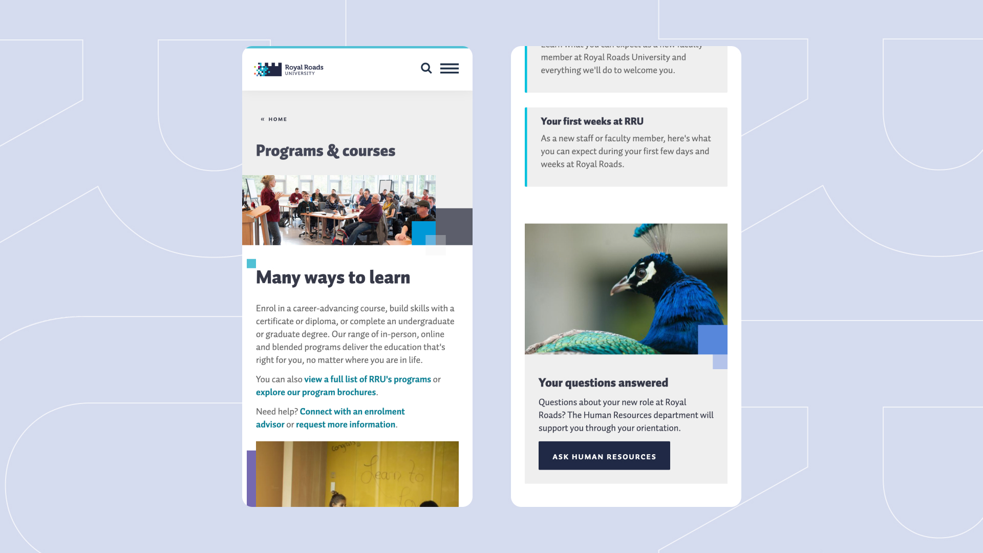
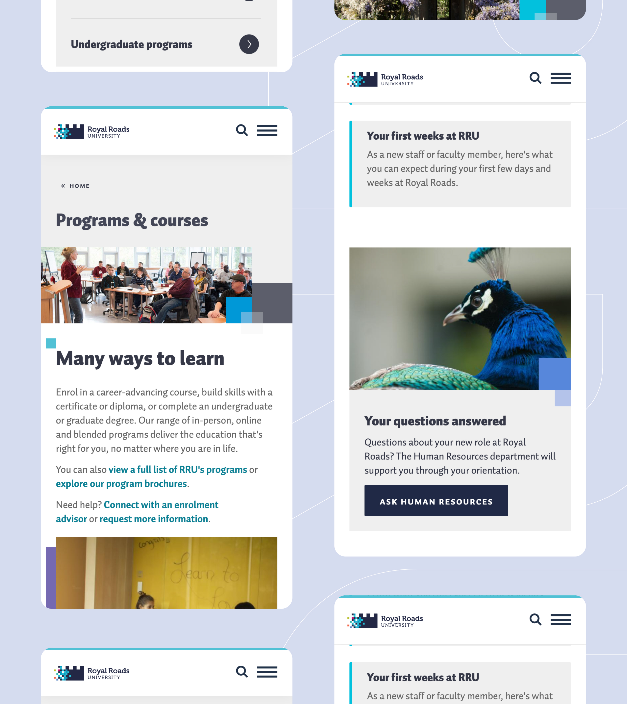
Royal Roads University (RRU) approached Evolving Web to restructure its employee and contractor-focused website “Our People” with an emphasis of getting the right information to the right stakeholder groups.
About the Client
Royal Roads University is a public university located in southern Vancouver Island, in the Victoria suburb of Colwood. Originally founded as Royal Roads Military College in 1968, the college was decommissioned by the Canadian Forces in 1995, at which time the government of British Columbia re-established it as the non military-affiliated Royal Roads University. The university’s main building is the historic Hatley Castle, built in 1908. RRU offers both academic and professional programs at the undergraduate and graduate levels, with a focus on graduate-level career development programs.
The university specializes in blended learning programs featuring a mix of in-person and online studies, a model geared toward working professionals. RRU’s MBA and BCom programs were ranked by Corporate Knights as fourth in the country in the “small business school” category.
RRU operates several different websites. These include a primary online hub for all audiences, with links to a separate MyRRU site for current students, an IT site, a Moodle site and many others. Our People, the latest addition to the university’s online presence, essentially functions as a public-facing intranet geared for all RRU employees.
Goals
RRU’s employees consist of tenured faculty members, associate faculty members, non-academic staff and contractors. Each of these groups requires certain types of HR information, but the original Our People site did not clearly organize material by audience segment. The project’s primary goal was therefore to reorganize the site’s content to connect specific audiences with information intended for them.
Secondary goals included:
- Provide recommendations and best practices for future content strategy
- Clearly differentiate internal links from links to external sites and identify content for authenticated users with a lock icon
- Make cosmetic improvements to the homepage
- Migrate the website from its original hosting platform to Acquia
Challenges
RRU came to us with a new Our People website that was still in beta mode. There was a fundamental mismatch between the website’s content and its target audiences, blocking the launch of the new website. Specifically, the website presented a mix of material that did not differentiate between core faculty members and contractors – two different audiences with very different human resource needs.
The challenges inherent in fixing Our People were primarily architectural in nature. There were other areas for improvement, like better identification of internal versus external content, but the primary tasks at hand were getting to know exactly what RRU’s internal audiences were, identifying what information each one needed and figuring out how to silo that information accordingly.
An additional challenge with this project was the timeline, with the client requiring a three-month turnaround period for the site to be ready ahead of the 2022-2023 academic year.
Solutions
The process began with a series of workshops to nail down exactly what these internal audiences were. This was followed by a painstaking process of combing through every page of content in the existing site and categorizing it by audience type. This formed the basis for an entirely new sitemap, mapped out on collaborative platforms that allowed for detailed notes on page content, such as where to create cross-links.
The discovery phase was the most time-consuming part of the project. As we developed the sitemap, we conducted interviews, written questionnaires and group workshops aimed at fine-tuning the new architecture and ensuring that the correct audience was getting the correct information. The actual development of the revamped site took place very quickly, with university personnel making continuous content updates.
The revamped version of the site features the following enhancements:
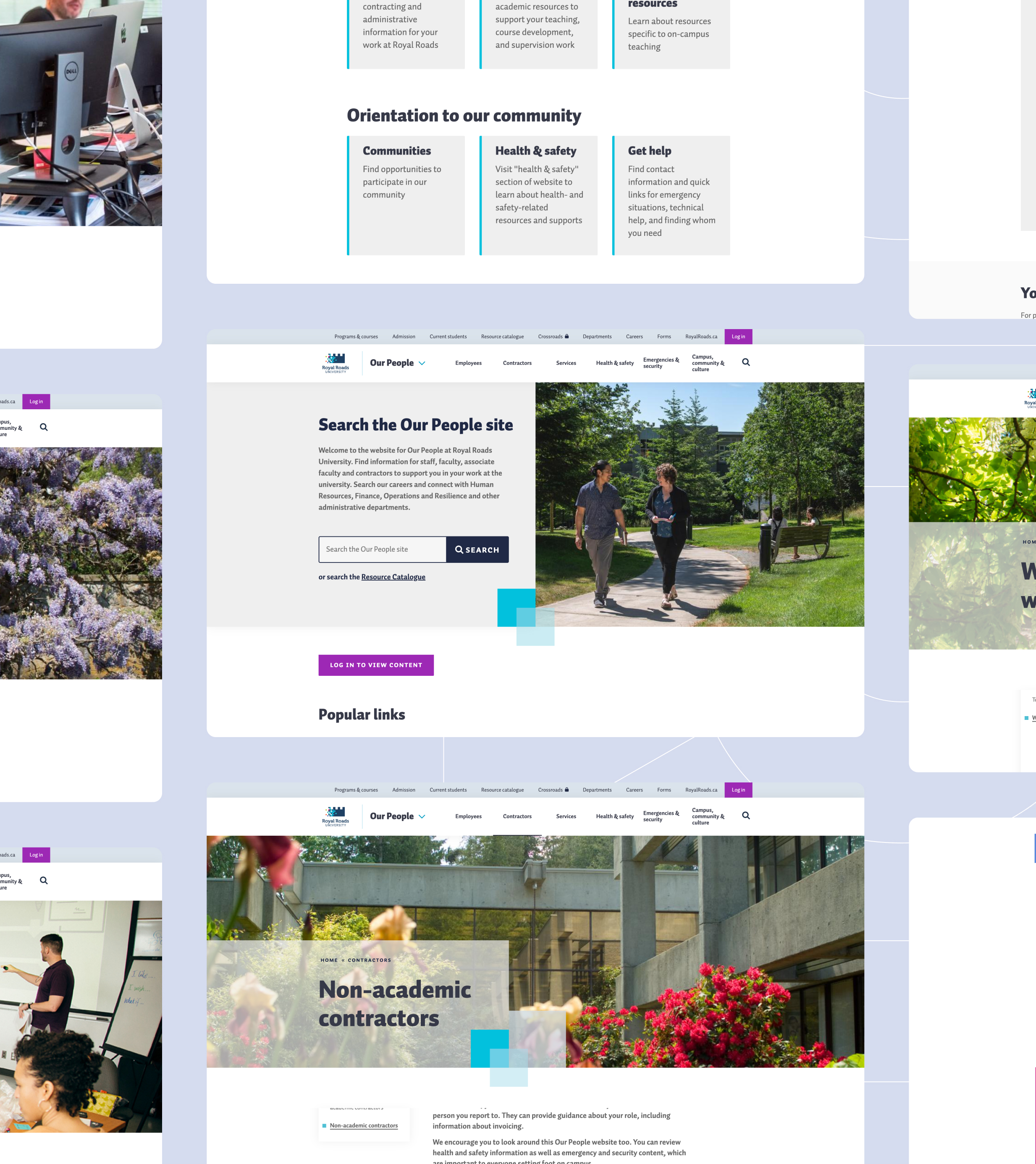
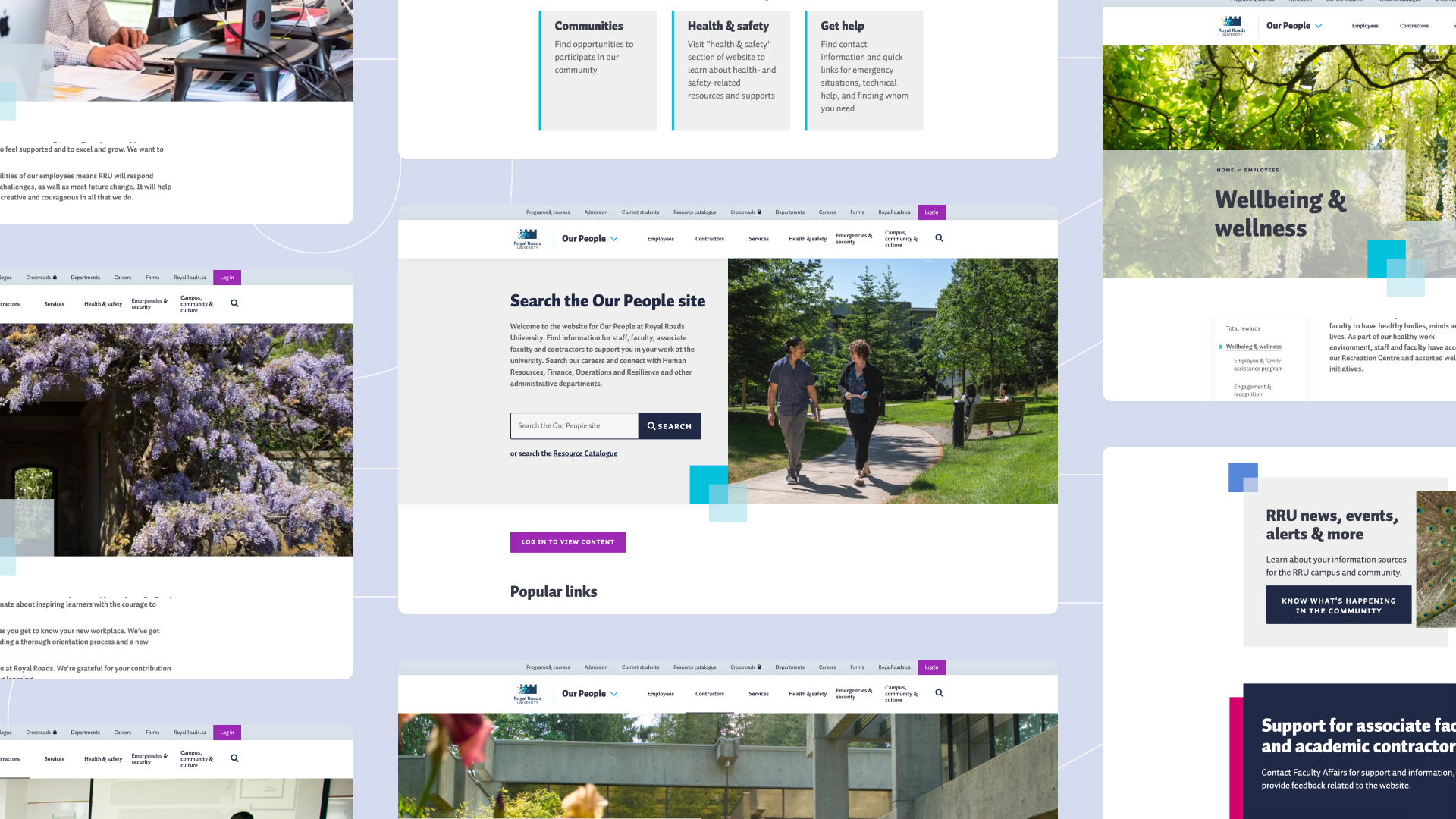
- Drop-down menus that immediately differentiate content intended for “employees” from that intended for “contractors”.
- Labeling of all content by five audience categories: associate faculty/contractor, core faculty, manager/supervisor, new employees and staff
- Further labeling of content into helpful categories such as human resources, learning & development, financial services, equity, diversity & inclusion, campus information, everyday tools, groups, vacation and IT services, among others
- A consistent application of sub-navigation menus on the left side of the screen to ease navigation
- External link icons to identify links to content outside the website
- Lock icons to easily identify content intended for authenticated users
- Removal of external links from dropdown menus
- Improved homepage hero to enhance the appearance of the site and clearly explain to users what the site has to offer
- Recommendations for future content strategy improvements
Results
RRU came to us with a website that missed the mark as far as reaching its intended audiences. The result of our additional UX and content strategy work was a site that makes it is clear from the outset who it is for and what its purpose is. The new site is friendly, easy to navigate and, most importantly, gives the right people access to the right content.
