Journeys by Van Dyke
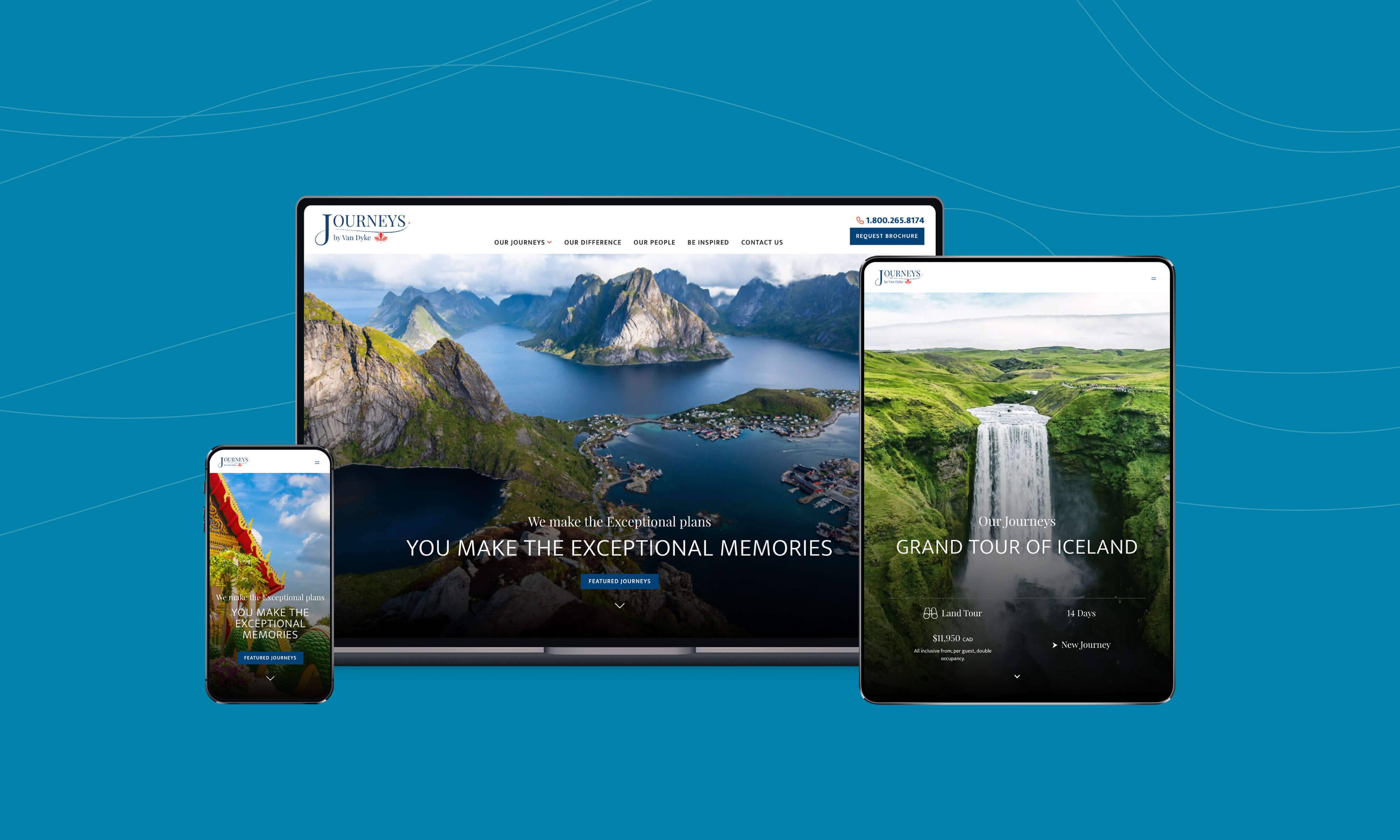
Journeys by Van Dyke is a rebrand of a 40-year-old, well-recognized family business. Run by the Van Dyke family, it has a deep-rooted history of comfortable travel and excellent customer service. The previous version of the website didn’t fully capture the Journeys by Van Dyke experience, or lead to the excitement customers feel when they receive the printed travel catalog in the mail. The focus of our collaboration was to create a beautiful and engaging website, while providing flexible tools for content editing for the company’s marketing team.
Goals
Creating a new travel website for Journeys by Van Dyke was an opportunity to provide a rich editorial interface and flexible content editing tools that empower non-technical content editors. We also wanted create plug and play features and reusable elements that could be used to build new pages quickly.
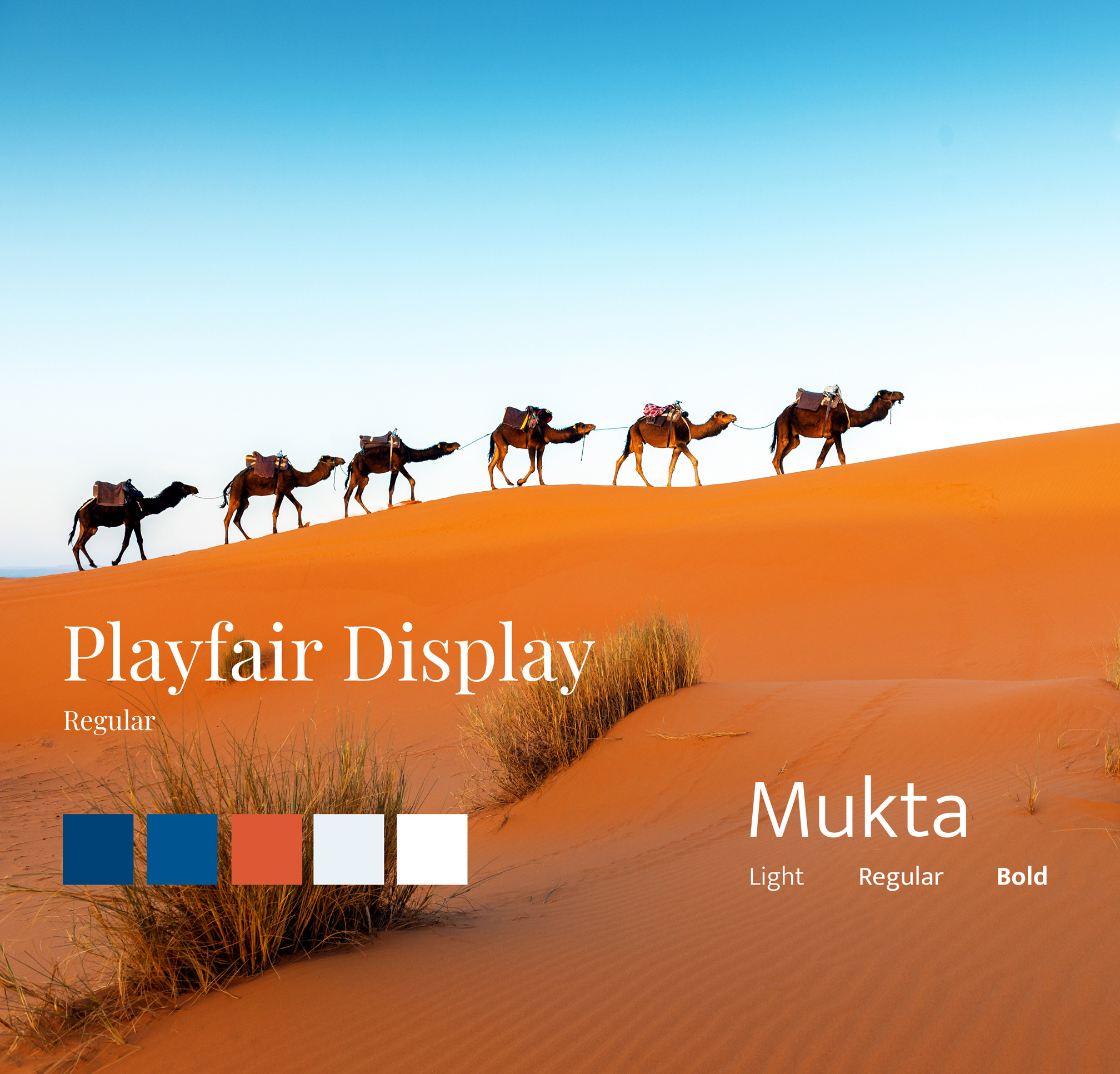
A redesign was also an opportunity to bring visual elements inline with the Journeys by Van Dyke brand. And along the way, we wanted to improve accessibility to make the website available to a wider audience.
The high-level goals for the website rebrand and rebuild were to:
- Create a design that is intuitive, engaging, airy, easy to navigate
- Lean on the beautiful journey images while emphasizing the calls to action
- Make the website appealing to existing users and have traction for potential new users and to highlight the USPs directly from the homepage itself
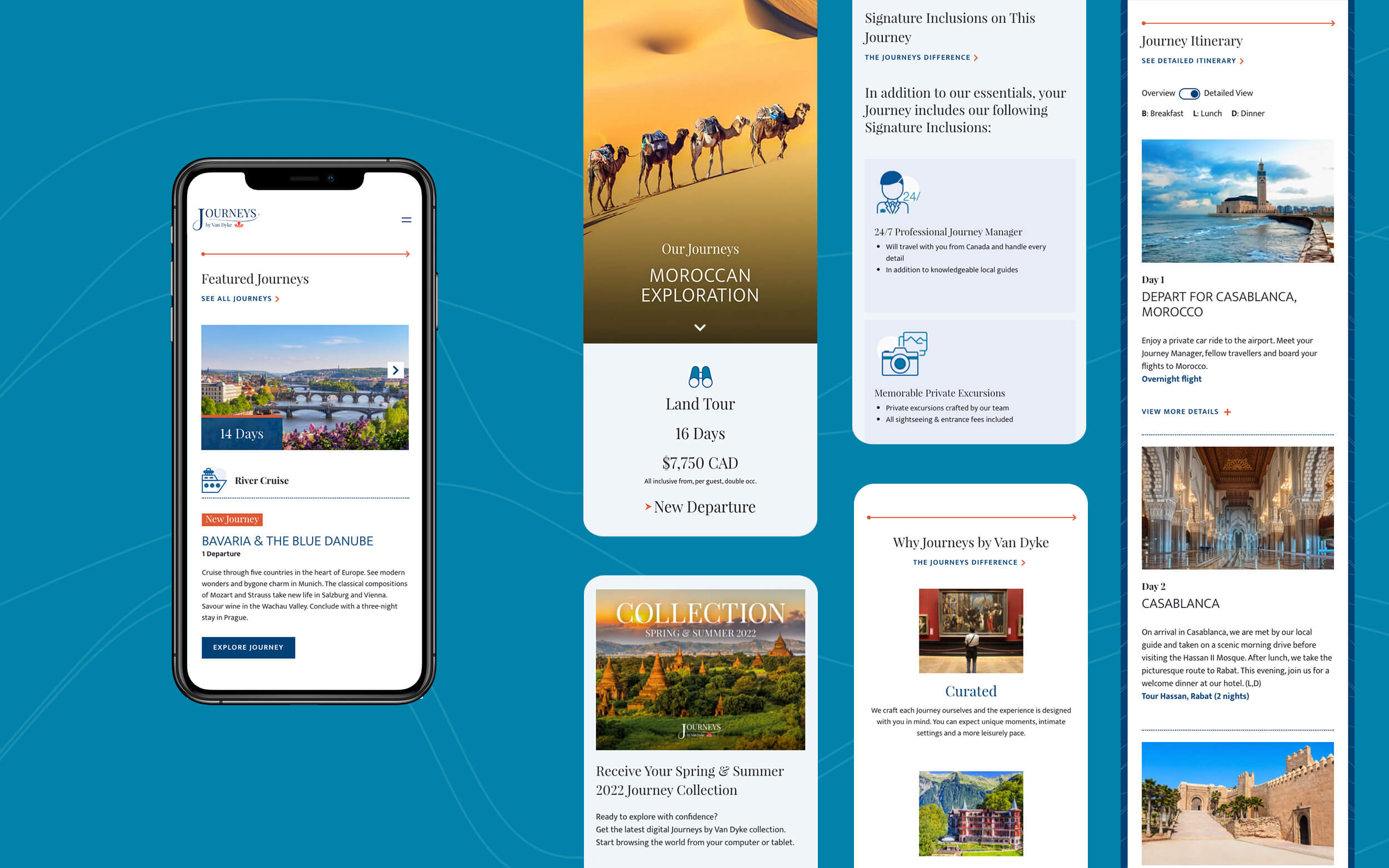
- Create a smooth information flow, without overwhelming the users with the massive amount of information available for each offered journey, to facilitate a dreamy discovery of breathtaking destinations
- Capture an aura of comfort and luxury that every journey encapsulates
Solution
We worked closely with the stakeholders at Journeys by Van Dyke to identify and understand the goals and vision of the rebranding, using agile practices to invite frequent feedback.
Key features of the website include:
- A new identity, look and feel for the website to ensure accessibility and rich user interactions were in place to enhance the user experience
- A library of UI patterns that could be used as stand-alone features and/or be reused on several pages of the website
- Tools for site managers to customize, re-order, and restructure the content pages with just one click
- A website that can be browsed on any device, regardless of screen resolution
- Optimized site performance, while balancing the need for high resolution images and videos
- Content editing features implemented with WordPress Gutenberg and Atomic design patterns
- Advanced Custom Fields (ACF) and WordPress blocks to provide the most flexible experience to end users
- WordPress theme based on Bootstrap 4, to implement the mobile-first, responsive design
WordPress Redesign and Rebuild
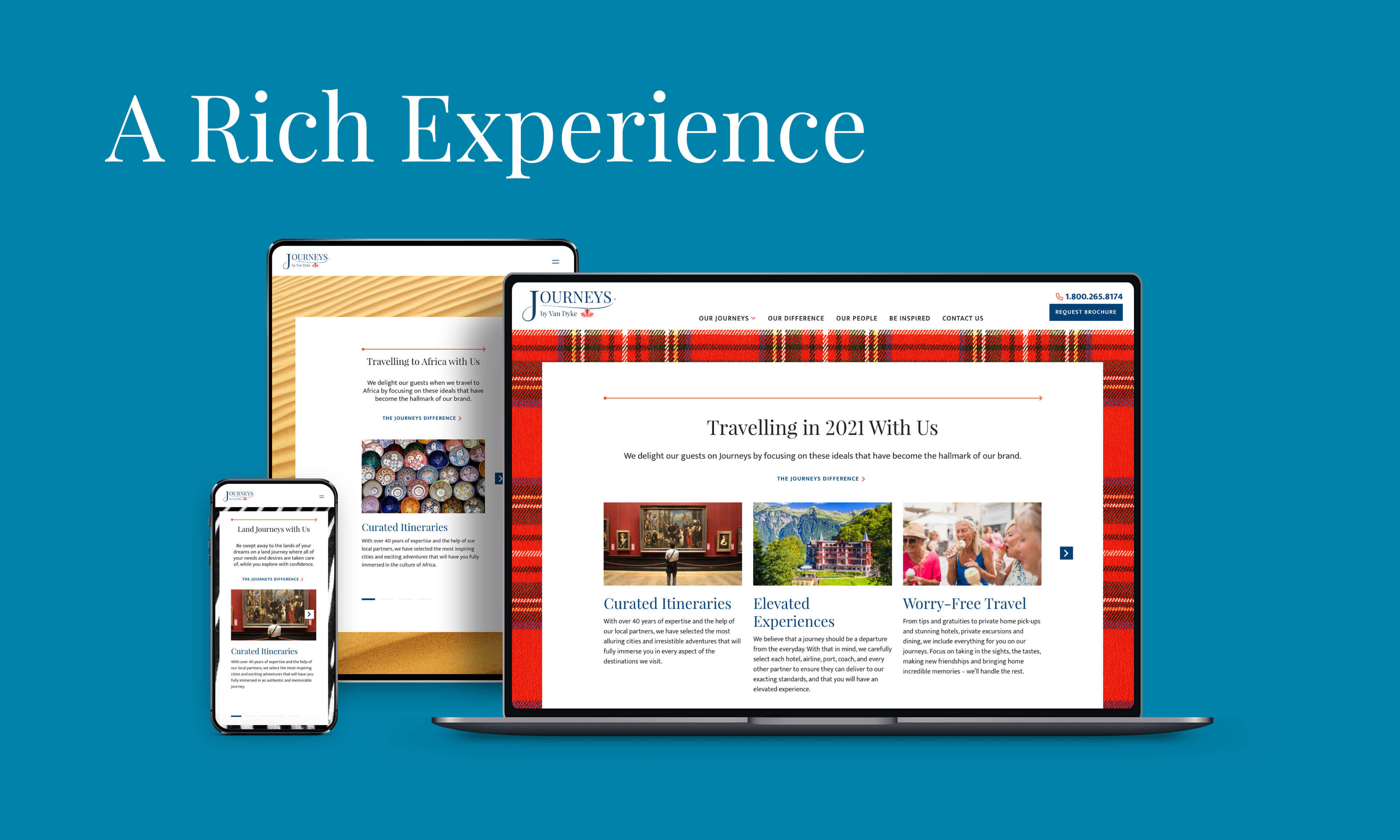
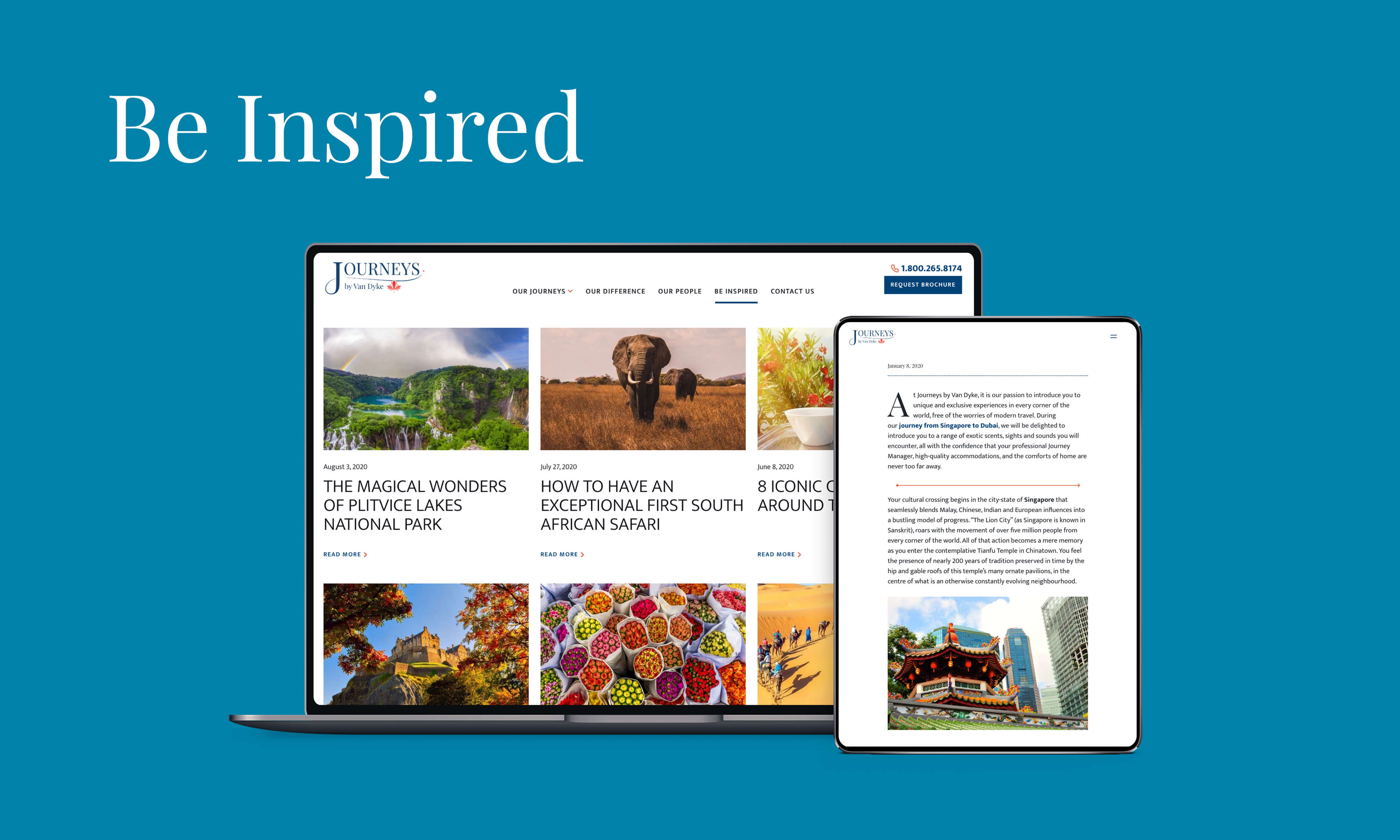
Journeys by Van Dyke partnered with Evolving Web to create a fresh brand identity. We redesigned and rebuilt the website with a more modern, engaging, and accessible design. The new website leverages a rich content editorial experience, powered by WordPress.
Results
The new website carries a fresh, airy feel. It features engaging content and interactions, driving users towards relevant content and clear calls to action. Smooth navigation, responsive and accessible layouts, and a rich user experience capture the essence of the rebrand and rebuild of the website.


