Overview
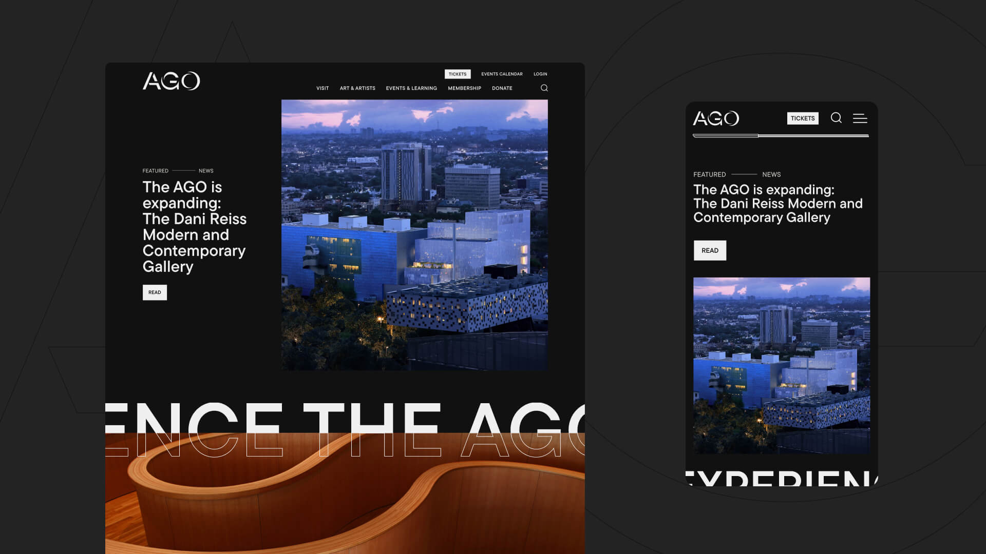
Evolving Web collaborated with the Art Gallery of Ontario (AGO) to redesign their website, focusing on designing a homepage that puts users first. The project aimed to attract repeat visitors and promote memberships, which are crucial for the gallery’s business strategy. Working alongside AGO’s back-end developers, Evolving Web provided the necessary design and development resources to create a visually appealing, user-centric website that aligns with AGO’s goals.
Our relationship with the AGO began in 2016 with on-site training for the development team, and over the years we have helped the team with various projects. Our work has included supporting the development of the Foyer website, a digital magazine focused on promoting arts and culture, performing a technical audit of AGO.ca, and determining the feasibility of integrating a museum-oriented Drupal distribution (the Digital Strategy Fund) into the main website.
About the Client
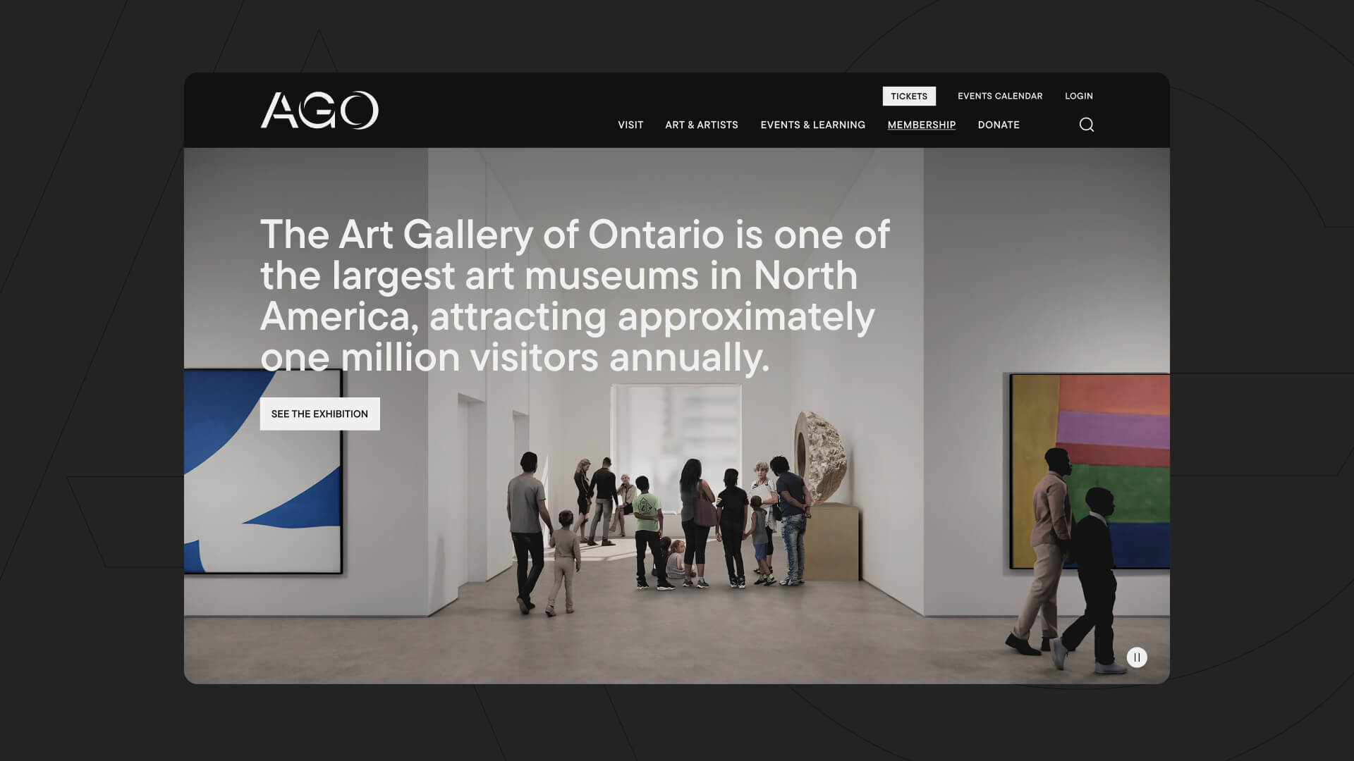
Located in Toronto, the Art Gallery of Ontario is one of the largest art museums in North America, attracting approximately one million visitors annually. The AGO Collection of more than 120,000 works of art ranges from cutting-edge contemporary art to significant works by indigenous and Canadian artists to European masterpieces. The AGO presents wide-ranging exhibitions and programs, including solo exhibitions and acquisitions by diverse and underrepresented artists from around the world. The AGO is embarking on the seventh expansion project undertaken since it was founded in 1900. When completed the Dani Reiss Modern and Contemporary Gallery will increase exhibition space for the museum’s growing modern and contemporary collection and reflect the people who call Toronto home. With its groundbreaking Annual Pass program, the AGO is one of the most affordable and accessible attractions in the GTA.
The AGO is funded in part by the Ontario Ministry of Tourism, Culture and Gaming. Additional operating support is received from the City of Toronto, the Canada Council for the Arts, and generous contributions from AGO Members, donors, and private-sector partners.
Goals
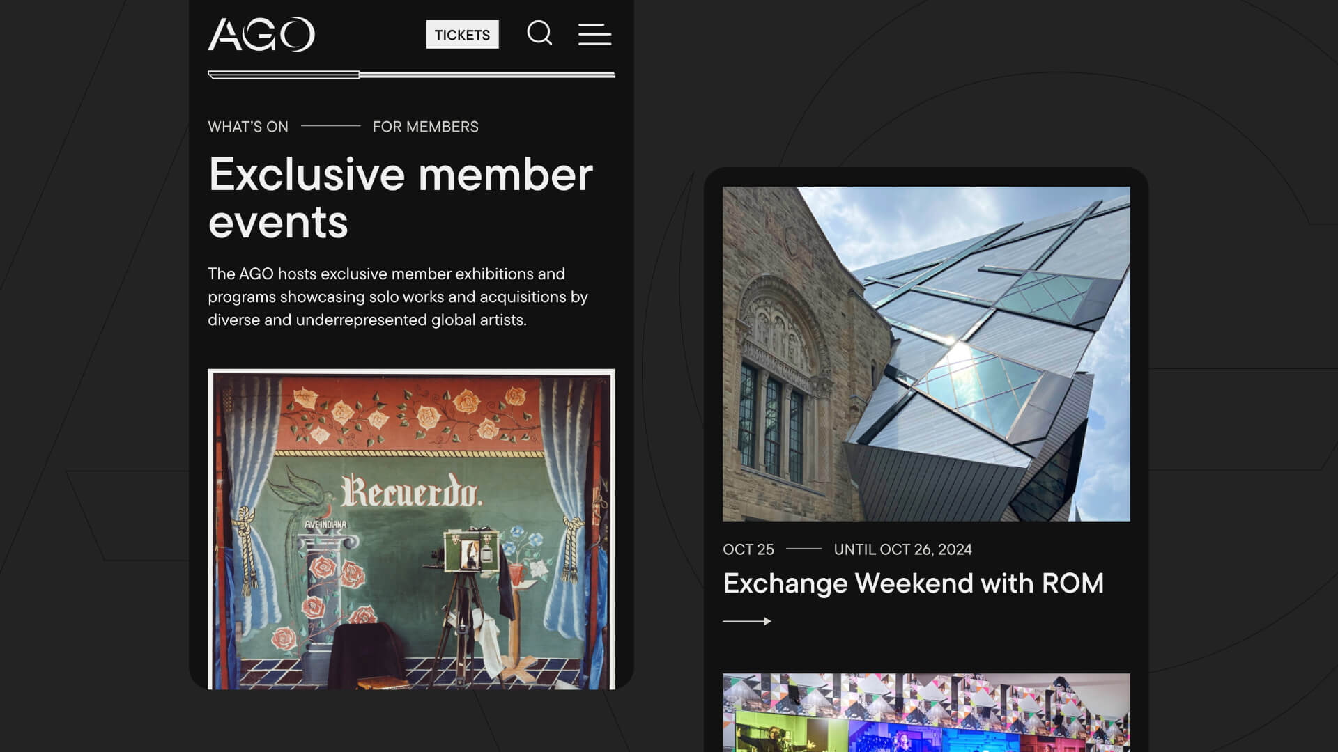
The AGO’s main goal for this project was to attract new visitors and promote memberships, which are crucial for AGO’s business strategy. We wanted to simplify the user experience and make it easier for new visitors coming into the site from the homepage to find information about exhibitions and events, while providing pathways for other audiences like members, donors, and staff. The project was an opportunity to apply the Gallery’s new brand to the website as a whole.
Challenges
The previous version of the website had issues with findability, where users struggled to access information quickly and efficiently. The Gallery offers a huge diversity of events and puts on many different types of exhibitions, often in parallel. Each exhibit has a distinct visual quality, so the design needed to provide a glimpse of each one, while strongly presenting the AGO brand.
Since this is the first time the brand was being rolled out in the virtual space, we needed to provide a visual direction and push the creativity of the brand, while establishing best practices for design components that could be used throughout the AGO website.
Solutions
We redesigned and built the homepage to balance the AGO brand identity with the need to resonate with diverse audiences, including potential members, museum visitors and researchers.
Our work included:
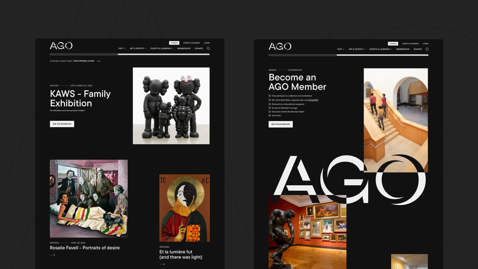
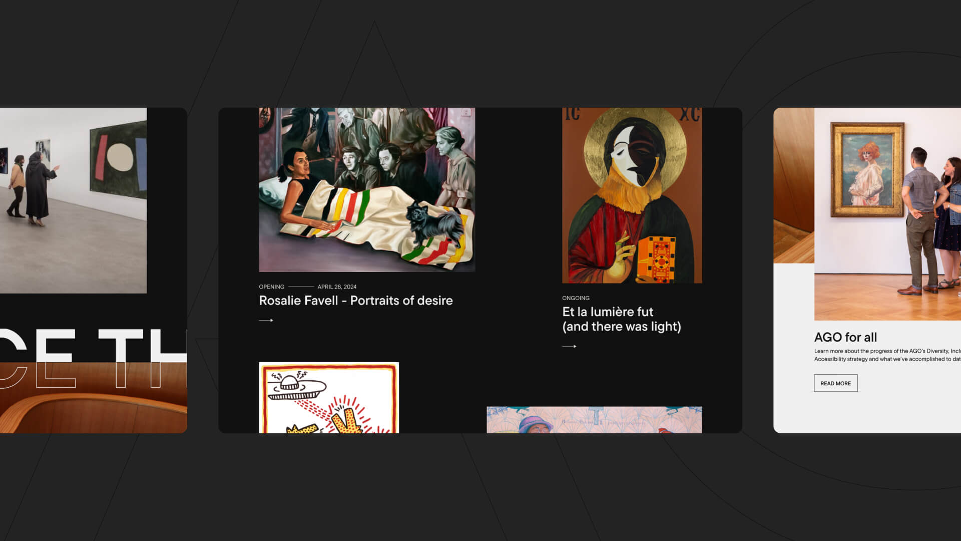
- Designing a homepage that features exhibitions, events, and membership information, with strong calls to actions and prominently featuring visuals of museum art pieces
- Using the AGO’s user research findings to guide the new user experience by adding a clear way to see the differences between membership levels and perks, as well as increasing visibility for exhibition-related events, such as more visuals of the exhibitions themselves to know what to expect.
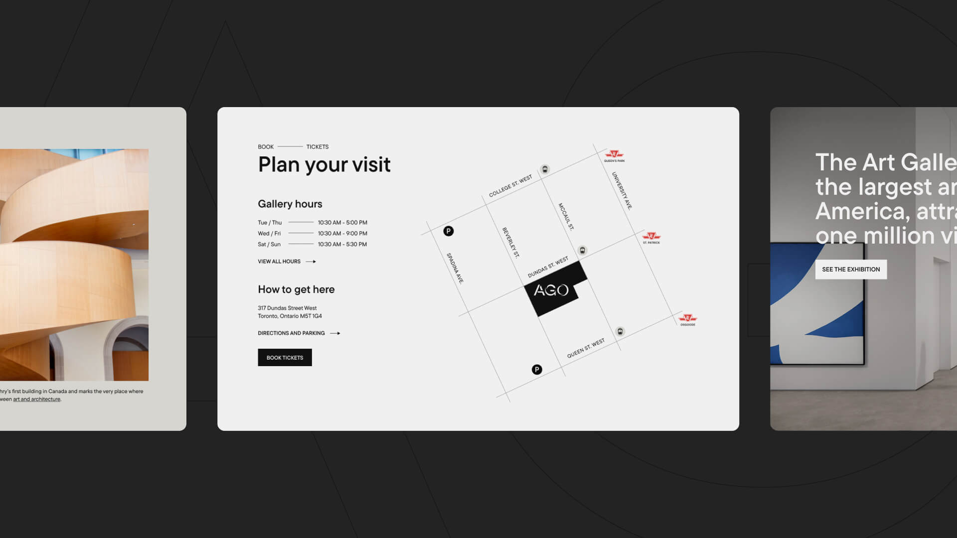
- Making it easier for users to plan their visit with practical information, such as opening hours, a map to help users navigate to the AGO, and public transit and driving instructions
- Simplifying language to remove museum jargon and replace it with plain language to make the site more accessible to diverse audiences and international visitors
- Creating an animated ‘What’s On Today’ module to draw attention to current events
- Adopting asymmetric layouts to align with the presentation style of many AGO galleries.
- The masonry approach adds movement and vitality to the website, complementing the museum's interior and organic architecture, and enhancing user immersion.
- Using dynamic, bold, and inclusive elements to showcase AGO’s new brand digitally
- Highlighting core brand traits, such as horizontal lines to segment information and overlapping typography and images to create varied perspectives
- Maintaining original artwork ratios to honor the artists' intent, while other images are designed as squares or rectangles to align with the golden ratio.
- Adding a dynamic ticker to create movement on the page and encourage users to scroll and engage with AGO's offerings.
- Javascript Component: Introducing a Javascript component (WHAT'S ON) to showcase featured and upcoming events at the gallery, enhancing the site's immersivity and creating a multi-layered experience.
Front-End Development, including:
- Implementing the homepage in the AGO’s Drupal CMS.
- Creating animations and interactive elements to create an immersive experience.
- Adapting the development to work within AGO’s technical limitations and existing infrastructure.
- Creating new components, such as the Postcard, to enhance the homepage.
Results
The homepage redesign and implementation offers a visually engaging and user-centric experience, effectively promoting memberships and showcasing exhibitions and aligns with AGO’s new brand. As the next step, we will redesign the membership page, further enhancing the user experience for current and potential members. Subsequently, we plan to expand our redesign efforts into other subpages of their website, including Exhibitions and Events, and Artists and Collections, ensuring a consistent and immersive experience across the site.
