Interested in exploring this topic more ? Join our live accessibility webinar on August 15 at 12 pm EDT with Janell Sims, Manager of Digital Accessibility Services at Harvard University.
When we talk about web accessibility, it's easy to focus on guidelines and checklists. But in practice, not every feature on a website is easy to make accessible. Some elements—like custom search filters, maps, or dropdown menus—require more testing and creativity than others. At Evolving Web, we’ve encountered many of these challenges firsthand. In this post, we’re sharing some of the techniques we’ve used when tackling tricky accessibility issues.
The Role of Accessibility Testing Tools
To meet WCAG AA guidelines and create genuinely usable experiences for all, we regularly use tools like Axe DevTools, DubBot, SortSite, and Siteimprove. But using accessibility testing during development and QA generally uncovers issues too late in the process. That’s why it’s important to plan for the features that will require extra accessibility work. Designers, strategists, project managers, and QA specialists all play a role in identifying those tricky areas from the start.
Features to Flag for Accessibility Review
Making Megamenus Accessible
Megamenus often include more than just a list of links — they might have headings, images, featured articles, short blurbs, or even interactive elements like buttons or embedded search fields. But adding these elements creates accessibility challenges if the keyboard and screen reader experience isn’t carefully planned.
Issue
When content beyond basic links is added to a megamenu, users navigating via keyboard or screen reader may:
- Not be able to reach all content using the Tab key if focus isn’t properly managed.
- Get stuck in the menu due to keyboard trap loops, especially if tabindex is misused.
- Lose track of where they are because menu sections aren't announced clearly.
Workaround
- To make the entire megamenu accessible — not just the links — we apply a few specific techniques:
- Ensure all focusable elements inside the open menu (links, buttons, form fields) are reachable in a logical tab order.
- Use aria-expanded="true" on the parent menu item when the menu is open, and aria-controls to reference the submenu container.
- Add aria-hidden="false" to the open menu container so that screen readers know when the menu content is available.
- When the menu opens, move focus into the first focusable item inside the panel, and use keyboard listeners (like Escape key and arrow navigation) to allow users to exit or move between items cleanly.
- Ensure visible focus styles are present for extra headings and buttons in the menu dropdowns
Example
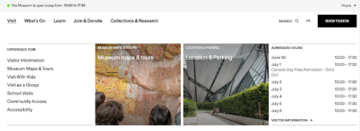
The ROM museum website opens a megamenu under the “Visit” tab. The menu displays three content columns: a list of links like Visitor Information and Accessibility, a visual tile for Museum Maps & Tours with an image, and another for Location & Parking. On the far right, there’s a panel showing admission hours by date. The layout reflects accessibility best practices by grouping content logically, supporting clear tab order, and offering visual structure that could be paired with ARIA roles like aria-expanded and aria-hidden to ensure screen reader compatibility and smooth keyboard navigation.
Main Navigation Dropdown Toggling
In many website navigation designs, especially on desktop, the first-level menu items act both as links and as toggles for dropdowns. But combining these two functions in one element can confuse keyboard users and screen readers. To simplify the experience, we often design navigation so that top-level items with submenus act only as toggle buttons, not links.
Issue
When a first-level menu item functions as both a link and a dropdown toggle, it can cause:
- Confusion for keyboard users: Should pressing Enter activate the link, or open the dropdown?
- Inconsistent behavior across screen readers, depending on how the markup is structured.
- Difficulty in managing focus and aria states cleanly, especially when nesting multiple levels.
Workaround
To provide a clearer, more accessible experience, we:
- Convert the parent menu item into a button (or a link with role="button") that only toggles the visibility of the submenu, rather than navigating to a new page.
- Use the first link in the dropdown to link to the top-level page for that section of the website (sometimes it’s a section landing page).
- Use aria-expanded="false" on the toggle button, and update it to true when the dropdown is open.
- Include aria-controls pointing to the submenu container’s id for better screen reader context.
- Ensure the submenu is hidden by default (using aria-hidden="true" and/or display: none), and revealed when toggled open.
- Place focusable items within the dropdown in a logical tab order, and allow for keyboard-only navigation through all items before returning focus to the parent nav.
Example
We implemented this pattern on the Georgia Center website, where the top-level menu items with dropdowns act only as toggles. This makes it easier for keyboard users to explore all submenu items without accidentally navigating away, and it gives screen reader users clear cues about expandable content.

Making AJAX Search Filters Screen Reader-Friendly
We love using AJAX to make search filters feel fast and responsive—content updates instantly without reloading the page. But while this improves the visual and performance experience, it creates barriers for screen reader users, who may not realize anything on the page has changed.
Issue
- When results update dynamically (via AJAX), screen readers don’t automatically detect or announce those changes:
- Users may not know their filter selection did anything.
- The results section may change visually, but not be announced to non-visual users.
- Without proper cues, users can feel disoriented or think the filter “didn’t work.”
Workaround
To ensure dynamic updates are communicated to assistive technologies, we:
- Add an aria-live="polite" region around the content area that updates (e.g., search results or counts).
- After filters are applied, add a clear message like “12 results found”.
- Use JavaScript to trigger updates to that region after the AJAX request completes.
- Test the implementation with screen readers to ensure the live region is actually being read.
Example
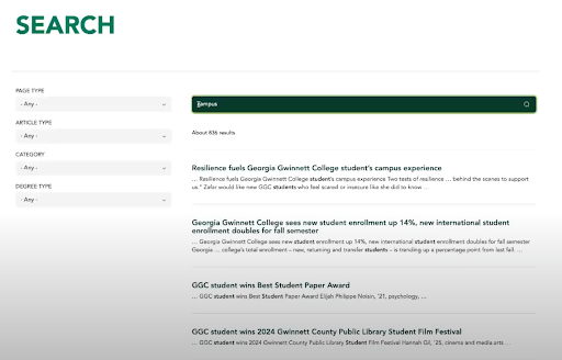
On the Georgia Gwinnett College website, we provided a screen reader announcement for Drupal views that require page reload. We appended the counter to the “skip to main” link with JavaScript so that it’s being read first after the page is loaded.
Making Custom Select Menus Accessible
Custom-styled form elements are a favorite of designers, especially when a project calls for a more branded or polished look. But replacing native form controls—like <select> elements—with JavaScript replacements introduces accessibility challenges. While native HTML elements are the most accessible by default, they don’t offer the design flexibility that clients and designers want.
Issue
Custom select menus often:
- Break keyboard navigation (Tab, Arrow keys, Escape) if not fully implemented.
- Lack proper screen reader support, especially for focus announcements, selection changes, and open/close states.
- Trap users inside the field or fail to return focus correctly after selection.
Workaround
To balance accessibility with visual customization, we often use Select2—a JavaScript library that mimics native selects but with better styling and feature support.
Here’s how we make it work:
- Use Select2's built-in accessibility modes, including ARIA support and keyboard navigation patterns.
- Customize behaviour when needed—e.g., ensuring focus returns to the appropriate element after a selection is made, or that assistive tech announces open/closed states correctly.
- Manually test each implementation with screen readers and keyboard to catch edge cases.
Modal Lightboxes Keyboard and Screen Reader-Friendly
When showcasing visual content—like photo galleries, product views, or exhibition highlights—designers often rely on modals or lightboxes to create an immersive experience. While these interactions look great, they can easily become accessibility barriers if not carefully implemented for keyboard and screen reader users.
Issue
Standard lightbox/carousel libraries often:
- Don’t properly trap keyboard focus inside the modal, allowing users to tab into hidden background content.
- Lack appropriate ARIA roles or labels, so screen readers may not recognize the modal context.
- Fail to provide intuitive ways to close the modal with the keyboard.
Workaround
To build accessible modals for image galleries, we use Parvus, a customizable JavaScript lightbox. If a modal is used to display content or a menu, we create a custom modal with JavaScript.
Here’s are some things to make sure you do when implementing a custom modal:
- Add role="dialog" and aria-modal="true" to the modal container so screen readers know it should get the user’s attention.
- Ensure the modal includes a labeled close button (e.g., aria-label="Close modal").
- Hide background content from screen readers using aria-hidden="true" while the modal is active.
Example
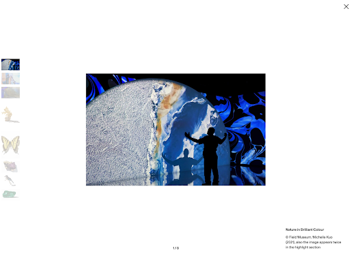
On the Royal Ontario Museum site, we use the Parvus library to create the modal lightboxes for exhibits. When users click the info icon on an image, a modal lightbox opens with detailed content and imagery.
Inside the modal:
- Keyboard users can tab through all interactive elements, including text, images, and the close button.
- After the last item, focus loops back to the first item inside the modal.
- Users can press Escape to close the lightbox and resume navigation from where they left off.
Preventing Keyboard Traps in Sliders
Sliders and carousels are commonly used to highlight featured content—especially in hero areas or product showcases. But when using libraries like Swiper.js, this can introduce keyboard accessibility issues, trapping users inside the slider with no way to escape.
Issue
Swiper’s default loop mode duplicates slides to enable infinite scrolling. This has unintended consequences for keyboard users:
- All duplicate slide elements remain in the DOM and are focusable, even if they’re not visible.
- This creates a keyboard trap, where users tab endlessly through duplicated slides and never exit the slider.
Workaround
To fix this, we use a custom JavaScript function to control which elements inside the slider can receive focus:
- We dynamically set tabindex="-1" on all non-visible slides, and remove it only from those currently in view.
- We detect slide changes using Swiper’s event listeners (on: slideChange, etc.) and update focusable elements in real time.
- This ensures that only visible slides are keyboard-reachable, and users can tab forward to content outside the slider.
- We also test the slider with real content (especially when using links or buttons inside slides) to make sure screen readers and keyboard users can interact without confusion.
Example
On one project, we implemented a looping slider using the Swiper library to feature linked articles and stories within each slide. However, with loop mode on, all slide links remained focusable—even off-screen—creating an infinite tab loop. To solve this, we added custom JS to make only visible elements focusable.
This simple adjustment allowed keyboard users to tab through the slider once and move on to the rest of the page.

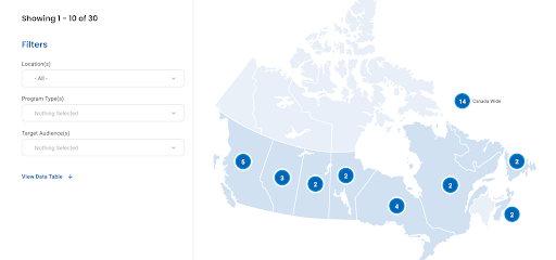
Handling Non-Essential SVG Maps in an Accessible Way
SVG maps can be a visually rich, clickable way to help users explore content—especially for regional directories or filtering tools. But when maps are used as enhancements rather than essential navigation tools, they can create more accessibility challenges than they solve.
Issue
SVG-based maps often:
- Contain many interactive regions that need proper ARIA labeling and keyboard support.
- Are not inherently keyboard-navigable, requiring extensive scripting to manage focus, interactivity, and screen reader compatibility.
Workaround
When maps are non-essential to the user experience we can:
- Hide the map from assistive technologies using aria-hidden="true" or similar techniques.
- Provide a fully accessible alternative—such as a structured list or dropdown.
Example
On the Canada’s Drug Agency website, we used an SVG-based regional map to help users find programs by region. However, making each region fully accessible (labeling, focus control, keyboard behavior) would have required a substantial custom build. Instead, we provide a link to “View Data Table” that shows all the same content in a structured, accessible way.
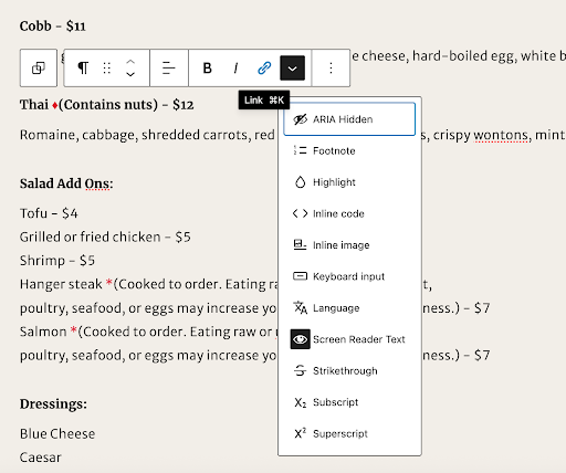
Making Icons Meaningful for Screen Readers and Editors
Icons are everywhere on modern websites. Whether used to break up dense content, convey meaning quickly, or support a brand’s visual language, they’re a valuable design tool. But when icons are used as the only way to communicate important information, they become content, not just decoration. And that means they must be accessible.
Issue
Icons used as content need to:
- Be labelled for screen readers with meaningful descriptions.
- Be structured so content editors can easily manage them in the CMS.
- Avoid duplicating content or creating confusion with conflicting visual/text cues.
- If not handled carefully, screen readers may skip the icon entirely—or announce something generic like “image” or “graphic.”
Workaround
To ensure icons are accessible and manageable by content authors, we:
- Paired each icon with screen reader-only text (e.g., “Gluten-free”) using visually hidden HTML elements
- Allowed editors to add or manage this text directly in the CMS, rather than hardcoding it.
- Used ARIA roles so screen readers interpret the icons as labels, not decorative graphics.
Example
On the University of Georgia (UGA) website, we implemented this solution on the restaurant menu, where icons communicate important dietary info. By structuring the markup to include hidden descriptive text and enabling editorial control in the CMS, we made the interface both accessible and sustainable for ongoing content updates.
Ensuring Accessible Focus States in Dark Mode
Dark mode has become a popular design choice for modern websites. It can reduce eye strain, support user preferences, and create a sleek aesthetic. But enabling a dark mode theme adds an extra layer of complexity when it comes to accessibility—particularly for colour contrast and focus visibility.
Issue
- Colour contrast that passes in light mode may fail in dark mode, especially on hover or focus.
- Focus indicators can disappear or become too subtle against dark backgrounds.
- Keyboard users may lose visual cues for navigation if focus styling isn't tested across themes.
Workaround
- Test all state variations (default, hover, focus, active) in both light and dark modes.
- Use WCAG-compliant color contrast:
- 4.5:1 for text
- 3:1 for UI components (borders, outlines, focus rings)
- Customize styles to ensure visible focus indicators in dark mode (e.g., outlines, box shadows).
Takeaways: What Teams Should Watch For
Whether you’re a developer, designer, or project manager, here are a few things to keep in mind:
- Check keyboard and screen reader support early in development, especially for interactive elements.
- Don’t rely on testing tools alone. Manual testing with user scenarios are key.
- Look for alternatives and fallbacks—like offering a text version of map content or a non-dynamic option for filters.
Conclusion
Accessibility isn’t just about checking boxes or following rules—it’s about creating digital experiences that work for everyone. By identifying tricky features early in the process, your team can better plan, estimate, and design with inclusion in mind, reducing the need for late-stage fixes and improving usability for all.
At Evolving Web, we specialize in helping organizations meet these challenges head-on. From accessibility audits to custom component design and strategic guidance, we support teams in building websites that are not only compliant—but genuinely accessible. . If you're looking to improve your website's accessibility or tackle a specific challenge, get in touch with us.
