Recently, I was registering my kid for swim lessons. I was comparing classes with different age levels and class times and I noticed that both rec centres in our neighbourhood use a third-party booking tool designed for community organizations. The city-run swim classes have their own platform, which you get directed to when you select a class. My expectations for the user experience were not super high. I know that the rec centres are focused on teaching kids and running programs, and swim classes are not high on the list of priorities for the city. But it was a good lens for thinking about what makes for a positive user experience when you have to switch to a third-party booking platform in the middle of your user journey.
Here are some aspects of the user experience to pay attention to when integrating a booking portal with your main website:
1. Provide All the Critical Information on One Page
Users should gain clarity as they move deeper into the journey—not lose it.
In my search for the right swim class, my primary criteria was the timing. I needed time to get my daughter there after daycare, but didn’t want to sign up for a class that would get us home too late. Things like the age range and availability of the class were also critical. But it was difficult to find all this information about a given class on the same page. Often, this information was split between the main website and the booking platform. Availability on one platform, class details on the other. Or with a key piece of information (like the age range) disappearing as you move to the booking portal.
In my work with universities, we often design user journeys where students research programs on a department or campus-specific website, then apply through a central portal. Too often, clicking “Apply” takes them to a stripped-down third-party system—with less context and no comparison tools—forcing them to flip back and forth and lose momentum.
2. Provide a Connection to the Main Website
Think of the main website as the brand anchor. It’s where people browse, compare, and get oriented. Once they flip over to a booking portal, you want to make it easy for them to get back to the main site.
For example, at some point, I was ready to book, but I had a thought about the water temperature. I had heard from other parents that their kid loved their swim classes because the water was warmer than at the city pool, and I wanted to double check. Having a link back to the main website makes this experience smoother.
3. Don’t Duplicate Search Interfaces
Ideally, you have a single search experience, either on the main website or in the booking portal. Creating separate search experiences across systems causes confusion, as you end up with different filter criteria and different results.
For example, in my search for swimming classes, the main website showed me all the classes, whereas the booking portal filtered out the ones that were full. This was confusing because the number of results wasn’t lining up.
If possible, you could embed a search from the booking platform in the main website, so that the same search experience is offered in both places. Another option is to only make the search available on the main website, with a link back to this search interface from the booking platform.
4. Set up Consistent Support Tools
Support touchpoints (FAQs, help links, contact forms) shouldn’t be scattered or duplicated. While a booking platform might offer “features” like FAQ and contact forms, providing two versions of these is confusing for users, as they will inevitably get out-of-synch with one another.
5. Design the Account Creation and Login Experience
The login step is a major risk area for drop-offs, but often necessary when using a booking tool. When the interface prompted me to create an account, I was worried that this would force me to start the whole process of selecting a class all over again.
Using a popular platform on which your users might already have an account is a big benefit. For example, I had created an account to get a membership at a rec centre the previous year, and was happy to discover that I had an account already. All I had to do was use the credentials from the password manager to log in.
Telling users that they’ll be able to continue with the application process after login is reassuring. The page that you’re redirected to after logging in is also important. Being taken to an empty dashboard in the booking portal is less than ideal. A better experience would be taking the user to a checkout page.
6. Save the Users’ State
Session information like selected search filters, date ranges, or cart items should carry over when moving between systems.
This is especially important when I’ve already selected a swim class. If I go back to the main website to search for soccer classes, because I realize these are also offered, the swim class should stay in my shopping cart. Ideally, my search filters are retained so I can keep looking for options that are relevant to my kid’s age range.
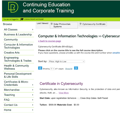
Red Deer Polytechnic’s website provides a strong example of this. When users browse Continuing Education programs on the main site and click through to register, their course selections carry over to the third-party platform without disruption. Branding remains consistent, filters are intuitive, and key details like schedules and pricing stay visible—making it easy for users to pick up right where they left off.
7. Encourage Habit Formation
Help users return—and make them feel welcome.
For example, after I finally register for the swim class, I feel invested in my local rec centre. Maybe the confirmation page can invite the user to opt into a newsletter. The timing feels natural and relevant.
This is also a great time to send an email inviting me to attend an upcoming community festival or invite to a workshop for parents. After I’ve done all the work of figuring out your booking platform, I can practice doing it again. This builds mental pathways for re-engagement and creates stickier, habit-forming digital experiences.
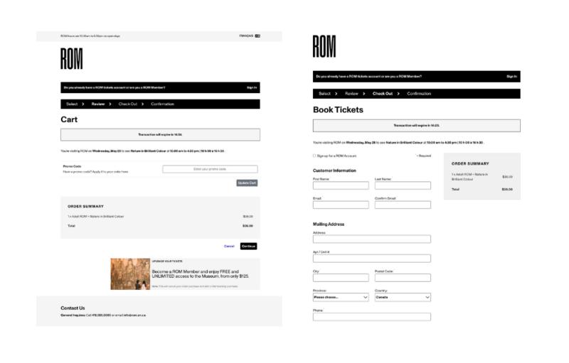
The Royal Ontario Museum provides a great example of this: during the ticket checkout process, users have the option to create a ROM account, allowing them to save their information for future visits and receive updates—all within a consistently branded experience. There's also a smart upsell built in—an option to upgrade a one-time ticket to a full membership right at checkout. These simple, well-timed prompts make it easier for users to stay connected and come back, turning a single visit into an ongoing relationship.
What Not to Spend Time On
You could spend a lot of time optimizing the UX of your website’s integrations. If you’re looking to save some time and valuable resources, here are some ideas for things you can de-prioritize:
- Styling your booking platform to match your brand is not a priority. A well-placed logo and link back to the main site provides a good enough experience.
- Implementing half of your brand (E.g. colours but not fonts) can actually provide a worse impression.
- It’s hard to get great images for every class or program you’re offering. Focus on quality over quantity, and provide a few general images on your main website rather than trying to get images for every single option available.
- Fully embedding the booking flow on your main website isn’t always necessary—and can often be more costly and complex to maintain.
Make It Easy to Come Back
Designing a smooth transition between your main website and a third-party booking platform isn’t about perfection—it’s about clarity, continuity, and keeping users on track. When key details persist across systems and small friction points are removed, users are more likely to complete their journey—and come back again.
If you’re looking for help designing a better integration or want to improve how you offer services online, my team would love to help!
