The start of a design project is always exciting and uncertain—there are so many insights and possibilities to explore. As we discuss initial design ideas with the client, everyone begins to form a rough picture in their heads. Herein lies a challenge: how do we best communicate what’s in our mind’s eye? When we’re speaking in abstract, subjective terms, how can we ensure everyone is on the same page?
Good communication at this stage is as crucial as it is tricky. It’s a chance for everyone to collaborate and agree on a strong, clear direction for the design. Ultimately, this leads to a smoother, more efficient, more enjoyable experience for all. And, of course, an end result that impresses.
Stylescapes are a powerful tool that we use to facilitate communication around design direction. Read on to learn what stylescapes are, how we use them, and why our clients love them.
What is a Stylescape?
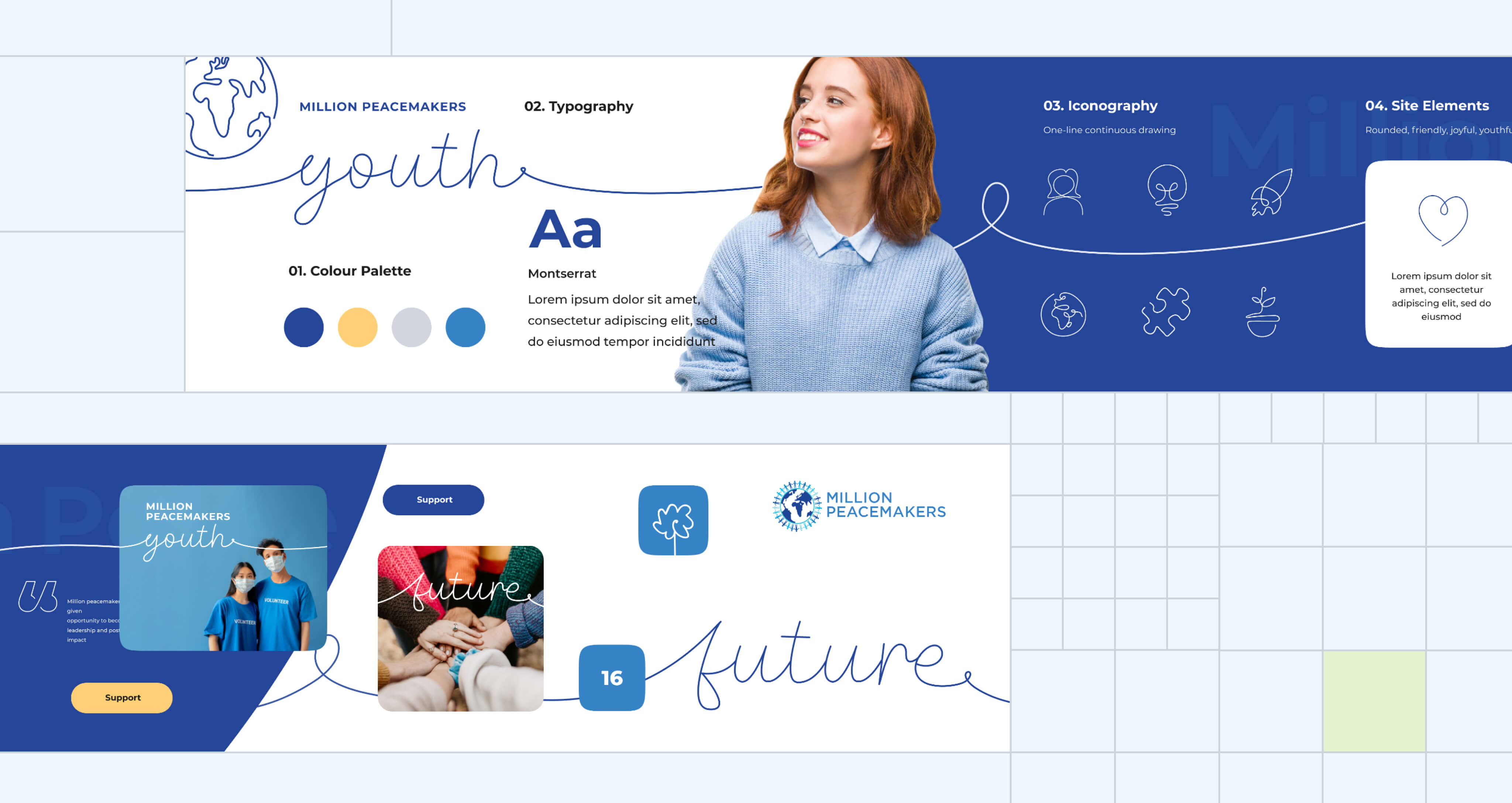
A stylescape is a collection of colors, typography, images, shapes, and other design elements that are carefully arranged to demonstrate an overall visual aesthetic. It’s something between a moodboard and a mockup.
Check out the stylescape that we created for OCAD University’s admissions website below. We incorporated animation into the stylescape to show how we planned to elevate the user experience with an interactive design.

Stylescapes vs. Moodboards
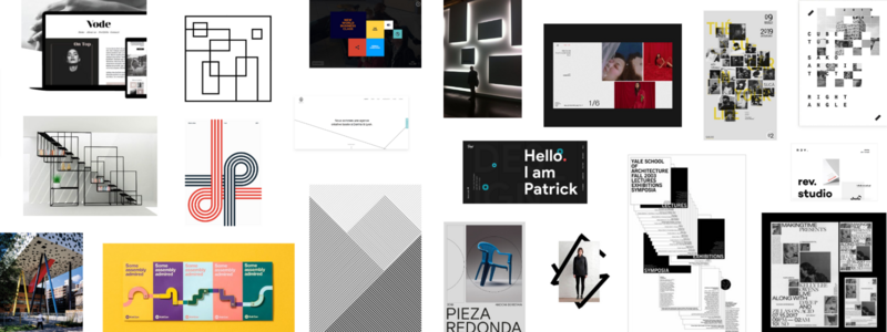
Because a stylescape isn’t as abstract as a moodboard, the viewer gets a more accurate idea of how the end product might look. This makes it easier to discuss preferences—more of “this”, less of “that.” And you can provide broad feedback while pointing to specific examples.
Here’s an example of a moodboard we created for OCAD U:

Stylescapes vs. Mockups
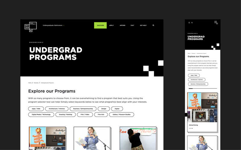
Because a stylescape isn’t as specific as a mockup, it’s quicker to create and won’t lock you into designs for real pages yet. This level of flexibility is ideal while we’re still pinning down a design direction. It helps us use our time efficiently so that we can give you the most value for your investment.
Here’s an example of a final mockup for the OCAD U admissions website:

How and When We Use Stylescapes in Our Design Process
We’ve been continuously improving our design process since Evolving Web was founded 15+ years ago. Incorporating stylescapes into our process has elevated our collaborative, iterative approach.
We typically create stylescapes as we’re finishing the UX discovery phase and starting to develop wireframes (although our timing is flexible depending on the project requirements.) This ensures we know enough about your organization’s brand, goals, priorities, and target audiences to make valuable recommendations. It also means we have an idea of the most important components for us to showcase.
When we present a stylescape to a client, we aim to:
- Communicate our vision for their brand story or digital experience
- Showcase brand assets and how we plan to combine them (e.g. visual hierarchy and a rough idea of layout)
- Demonstrate how we plan to implement the most important elements (e.g. calls to action or metrics)
- Enable the client to compare options and select the bits they like from each
- Get feedback on the overall look and feel and on specific elements (e.g. rounded corners versus square corners)
- Come to a clear agreement on the direction of the design
Case study: Creating a Stylescape for Million Peacemakers Youth
Million Peacemakers is a non-profit that empowers people and businesses to co-create a culture of peace using ‘Nonflict’—a structured approach to conflict resolution. We partnered with Million Peacemakers to design a website aimed at youth volunteers.
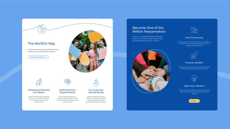
The project had a tight timeline of only 8 weeks. Our team worked quickly to understand the target audience, pitch ideas, and agree on a design direction. We developed a creative concept—”youth volunteers on a hero’s journey”—which we presented to the client in the form of a stylescape.


- A winding line—inspired by the Million Peacemakers logo—communicates connection, continuity, and movement.
- Contour drawings capture a youthful energy and reflect the idea that positive change is a work in progress.
- Rounded shapes express the softness of the ‘Nonflict’ approach.
- Photos show young people in action and supporting each other.
- Cool blues paired with a warm yellow capture the spirit of peace and vitality.
The stylescape enabled us to quickly and effectively communicate our ideas and elicit feedback from Million Peacemakers. The client loved our concept, and feedback was made easy because there were visual elements to identify. After some minor adjustments, we locked down a clear design direction and progressed to mockups.
Our team successfully delivered a beautiful, compelling, functional website within the 8-week timeframe. What’s more, Million Peacemakers was so happy with the new visual identity that they adopted the same treatment on their main website.

Find Your Design Direction With Evolving Web
Evolving Web has spent more than 15 years empowering organizations to create deeper connections through valuable digital experiences. Our Design Team harnesses research, strategy, and innovation to unleash the creative potential in every project—no matter its size. Partner with us and you’ll gain the confidence, wisdom, and support to take your digital design to the next level.

