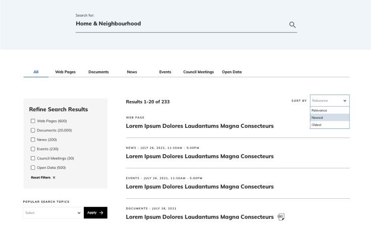
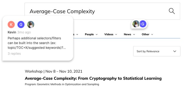
Iteration is an essential part of the web design process. Either as part of a complete redesign or through continuous improvements after your website goes live, iterating leads to higher quality results.
In this article, we'll talk about the importance of your on-site search, and how constant testing and minor adjustments can significantly improve your on-site search interface.
👩💻 Read our article: 10 Signs Your Current Website Is Outdated and Needs to be Redesigned
The Importance of On-site Search
While you might have optimized your website for search engines, once they reach your website, what is their experience like? Do they find all the information they need? When they use your search, does it work as they expect?
If you neglect the design of your search UI, you might be sending users the message that you don't care about them. A user-centric approach is crucial to figuring out how to design your search interface.
Research shows that site search can increase conversions by 80%. And for some e-commerce sites, visitors who use site search may account for 45% of all revenue. So, as you see, there are plenty of reasons to focus on your on-site search.
The Benefits of an Iterative Approach
Now that you know your on-site search experience can make a huge difference for your visitors and your organization, let's discuss the benefits of designing that interface in an iterative way.
In the context of user experience design, iteration is basically a synonym for prototyping. You create your clickable prototype or minimum viable product (MVP), test it, assess the results, and make adjustments until you reach an optimal outcome. After that, you keep track of your metrics and user behaviour to see if a new round of iterative adjustments is needed. This is aligned with using an Agile methodology, which breaks up your project into sprints, bringing feedback, re-prioritization, and improvements to the product throughout the process.
The iterative approach makes sense to practically every element in your website, but especially for the search UI. Since search is a layer you're on top of your content structure, changing its interface and adding or adjusting elements after launch is less disruptive to your project than changing your underlying content architecture.
These are the key benefits of iterative prototyping:
-
It's time-saving. Making quick adjustments in design is less painful than making changes drastically once major features have been developed.
-
You leverage the flexibility of open source. You can create your first prototype using the default features of your open source platform (e.g. Drupal and Search API) and then test it to see what you should customize.
-
You have better visibility. Stakeholders have a more accurate vision of the project's progress.
-
It improves overall quality. Through iteration, users have the opportunity to provide feedback—and you have the opportunity to customize it to meet user needs.
How to Iterate on Your Search Interface
So now you're convinced that iteration is the way to design your search UI. The question is, how to do it? Here are the main steps you should take in your iterative process:
- Plan well. Before you start iterating, there's some homework to do, so you better understand your users' needs and find the best ways to help them:
- Dig into your website's content structure and learn what taxonomy is being used (if any).
- Research your main competitors.
- Review your existing analytics (if there are any).
- Interview users or run unmoderated usability tests.
-
Create your prototype. This is when our planning turns into actual design work. There are numerous elements to consider in your search UI, such as:
-
Deciding between one global search page or multiple pages for different types of content
-
Choosing what options are available in the site-wide/persistent search form before jumping into a dedicated search page
-
Picking the filters and facets to display
-
Deciding if the individual results should include thumbnails
-
Determining if the search form should be displayed prominently on the homepage or other landing pages
-

-
Test, test, test. This is the most crucial part of your iterative process, when users show how your search UI responds to their needs. Monitor their actions closely, make them comfortable to express their opinions, ensure all answers are clear, and document everything. At this stage, being meticulous is key.
-
Review collaboratively. Collaboration is essential when iterating. It makes for a more objective evaluation of test results, decreasing the risks subjectivity might bring in this step of the project. So, gather your insights, rub elbows with your team, and have everyone share their thoughts about where to go.
-
Create a new iteration. You're back to the point where you'll transform your insights into your design or prototype. These are some of the changes you might consider in subsequent iterations, depending on the feedback you collect:
-
Adjusting the boosting of particular fields
-
Adding autocomplete to the full-text search form
-
Enabling PDF search
-
Customizing the search filter widgets according to how users search
-
Changing the order or search facets to make it easier for users to find the most common options
-
-
Monitor results. After the release, you should be open to user feedback and measure your metrics—using tools such as Google Analytics—to track behaviour, so you can make further adjustments.
Our Favourite Tools for Designing and Testing Search UI
For prototyping and testing our clients' search user interfaces, we use some tools that are great for designing, collaborating and, of course, iterating. Let's take a look at them:
Sketch - It's a Mac-only, vector-based digital design app. It's mostly used for web design and icon creation, but its infinite canvas and artboards also make it great for wireframing and prototyping.
Figma - This cloud-based design tool is very similar to Sketch, but with stronger collaborative features. With Figma, you can set different permissions and share projects, files and frames either in the tool itself or through other software, such as Confluence. Our teams use it to collaboratively iterate on concepts either internally or with stakeholders.
Loop 11 - This is a remote usability testing tool that allows you to create online surveys for users to complete on live websites. Its incredibly detailed insights are excellent to measure findability, and its surveys are very similar to regular face-to-face usability tests, with the benefit of not limiting the number of participants.

Keeping the Dialogue Open
Search works like a dialogue. Each time they search, users give you feedback about what they're looking for. By designing and developing iteratively, you're on the right path to understanding your users and improving your organization's overall results.
Want to learn more about designing great user experiences?

