Creating a search interface for a website with a lot of content requires providing a variety of filters. Sometimes those filters can take on a life of their own, providing hundreds of options for users to filter by. While building widgets for our Drupal/Solr projects, we looked at a couple non-Drupal examples of search interfaces for content-heavy websites.
Endless.com Brand Selector: Auto-Complete and Fixed-Height Scroll Box
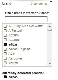
Endless.com is an online shoe store which carries dozens of brands of shoes. Allowing users to search by brand is a must, but it leads to a huge variety of choices which can be overwhelming. Showing more than ten brands at a time takes up too much real estate, particularly when combined with several other filters. The challenge is to provide an intuitive interface in a compact format.
It's important to consider two types of users:
Users who don't know what brand they're searching for.
It's important to provide a way for users to browse all the available brands. Endless.com provides a complete listing in a fixed-height scroll box. Users can scroll to see more than the first ten brands.
Users who do know what brand they're looking for.
These users won't want to scroll through all the options. Endless.com also provides an auto-complete box above the scroll box.
New York Magazine Cuisine Selector: Horizontal Expanding Filter Block
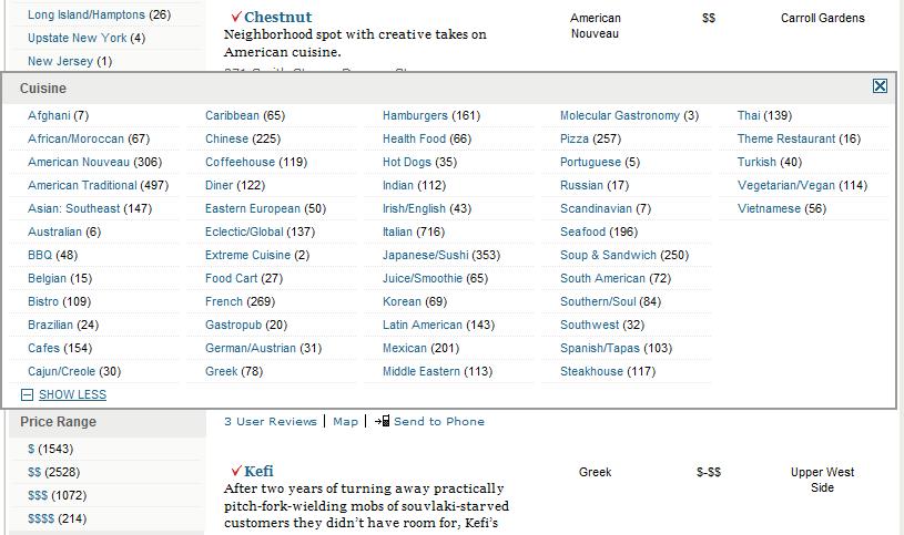
New York Magazine faces a similar challenge. Searching for restaurants on their website reveals a list of over 50 types of cuisine to choose from. Their solution is to provide a "Show More" link below the first twelve options, which expands the block containing the options horizontally, across the entire width of the page, overlapping the page's content.
This solution is somewhat limited. If there are more than 60 types of cuisine, there will no longer be enough space for all the options in the expanded box.

211 San Diego: Drupal Implementation of Horizontal Expanding Filter Block
We thought that expanding the options to the right is a really elegant solution, particularly when the number of options is somewhere between twenty and sixty. The first set of options doesn't move when you click the "Show More" link, creating a seamless transition to the expanded view. The "Show More" link becomes a "Show Less" link after you expand the list, so you don't have to move your mouse to switch between the two modes. We implemented this interface on a recent Drupal project for 211 San Diego.

Inconsistent Search Filters
One issue we came across while creating widgets for a faceted search engine is that the number of options available changes depending on the other options chosen. For example, on Endless.com, limiting the results to four star, critics' pick restaurants reduces the number of possible cuisine types to ten. The filter widget changes and displays six cuisine types by default. Clicking "Show More" displays the four additional options below the first set rather than to the right. This creates an inconsistent user experience because the widget changes depending on how many options it displays.
This inconsistency is almost impossible to avoid without introducing new problems. Endless.com fades out options that lead to zero results rather than removing them completely. However, this sometimes forces users to scroll through a long list of unavailable options. For example, raising the lower level of the cost range to $1,000 drastically reduces the number of available brands, forcing the user to scroll to see the handful of valid options.
Hundreds of Search Options
One of Evolving Web's current projects allows users to search over 11,000 nodes and includes a variety of filters, some including over 500 options. These large numbers of options have led us to consider new widget types, such as an expanding filter box that has a pager to show more results combined with an auto-complete box for users that don't want to scroll through the list.
Users need to be able to quickly learn how to use a new search widget. It's important that new solutions are intuitive and inline with interfaces that users are familiar with. In an upcoming blog post, I'll discuss some of the more experimental search interfaces that we've been looking at recently.

