When it comes to art direction, there is often a lot of talk about breaking the rules and thinking outside the box. However, sometimes the best way to be creative is to work within the constraints of what already exists. This can be especially true when it comes to working within an existing brand.
While it may seem like working within the confines of a brand would limit creativity, it can actually lead to more flexible and innovative thinking. By understanding the existing visual language of a brand, web designers can find new ways to communicate the same message in a fresh and exciting way.
In many cases, the key to a successful art direction within a brand is to embrace the constraints that already exist. Here's why.
Embracing Constraints
Designing a website is not just about adding cool new features, but about knowing what to leave out.
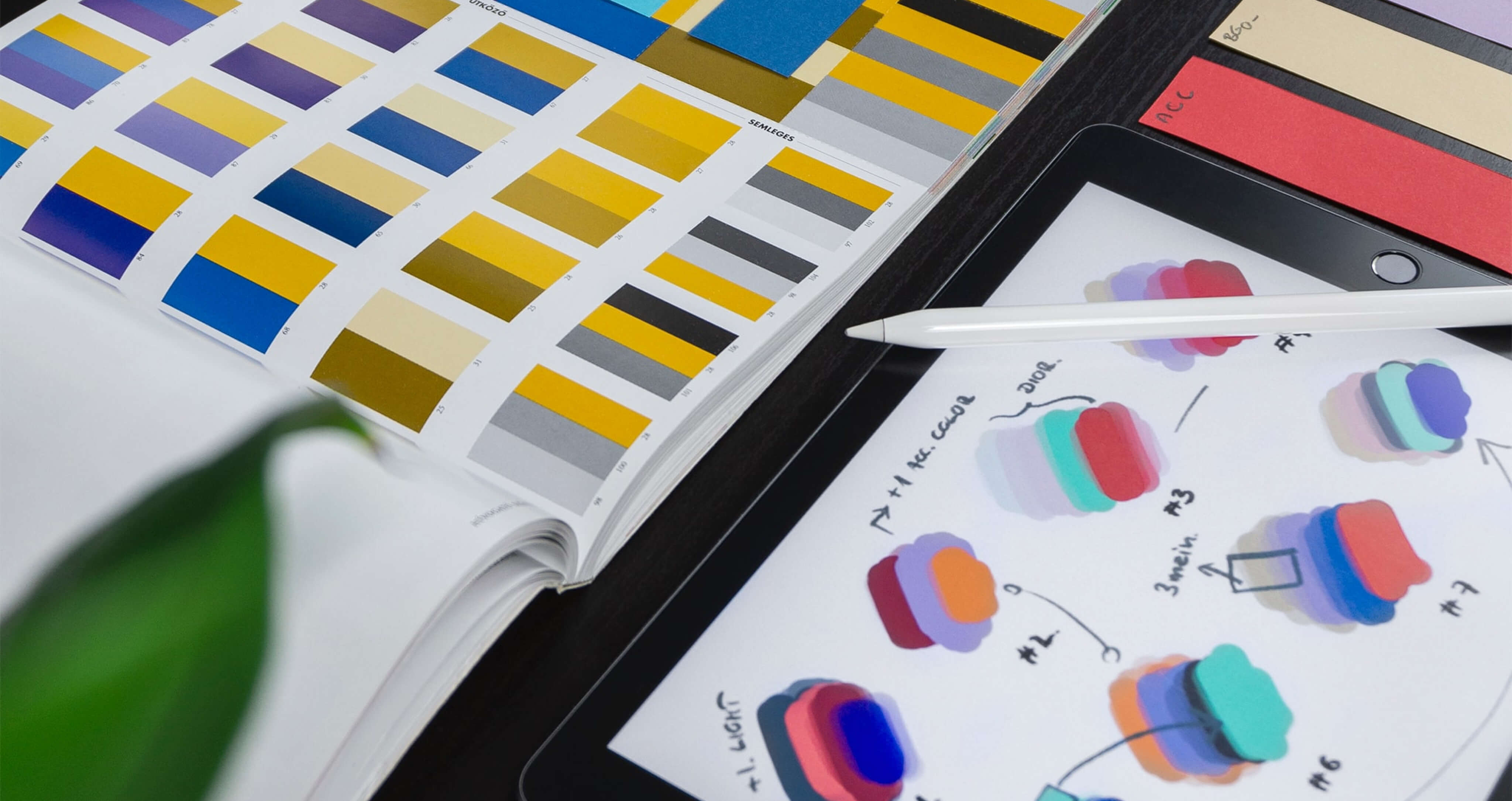
By considering business and user needs, brand guidelines, technology requirements, and your own professional biases and design taste, you can create a closed brief or a defined play area. Within that, you (and your team) are free to explore, create, and invest in the user experience, look and feel, and interactivity — all of the fun stuff.
For example, when working with a limited amount of space, you can be more strategic about what goes into the design and how it is laid out. This can result in a cleaner, simpler, and more effective design.
The same is true for other constraints such as budget, time, or technology. By working within these limitations, you can push yourself to be more creative and come up with truly innovative solutions.
Collaborating with Stakeholders
For every project, it’s important to keep stakeholders’ vision in mind while also considering the feasibility of the project. Collaborating with key stakeholders to create a style guide and image guidelines can help keep the project on track while giving the client a sense of ownership.
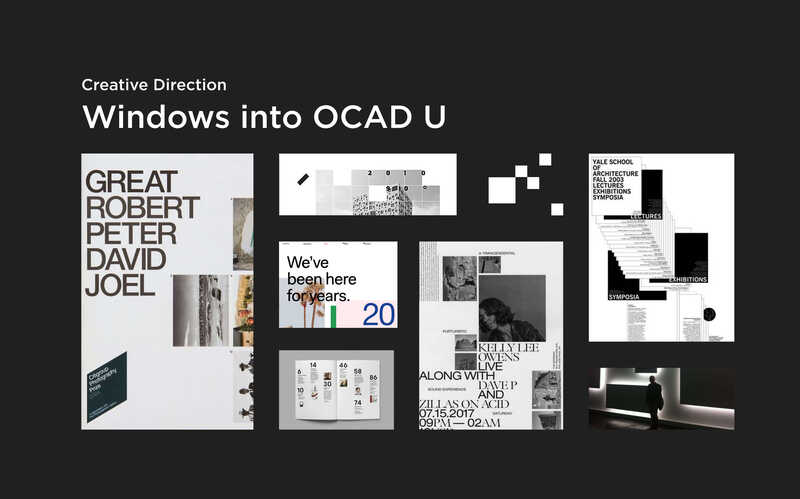
The art direction phase is one of the most important phases in design and redesign projects. This is when the designer works with the client to establish the overall look and feel of the project and what mood the experience will set. It's important to consider the target audience, the appropriate tone to strike, the personality of the content, and the character limits when creating the art direction.
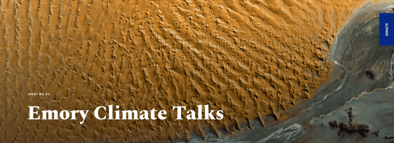
For example, when working with Emory University to redesign the Emory Climate Talks website, the collaboration process was key to success. We worked closely with their team to understand their vision and then created a style guide to keep the project on track. But what really moved this project forward was the client's openness to our ideas and willingness to experiment with design.
This left room for our team to conceptualize the ideas in a way that could truly create buy-in. It's one thing to come up with an idea, but it's another to be able to explain why that idea will work for the project, let alone actually bring it to life.
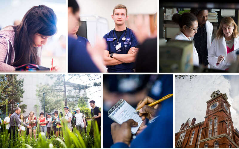
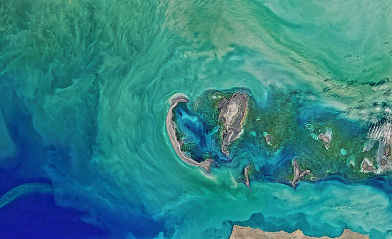
At the heart of Emory’s new communications strategy is an invitation to viewers to start to see and think differently. The photography used throughout the website captures the magic of discovery and innovation and the curiosity and exploration of Emory’s forward-thinking students and faculty.
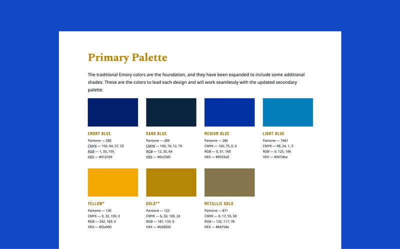
The traditional Emory colors are the foundation, and they have been expanded to include some additional shades. These are the colors to lead each design and will work seamlessly with the updated secondary palette.
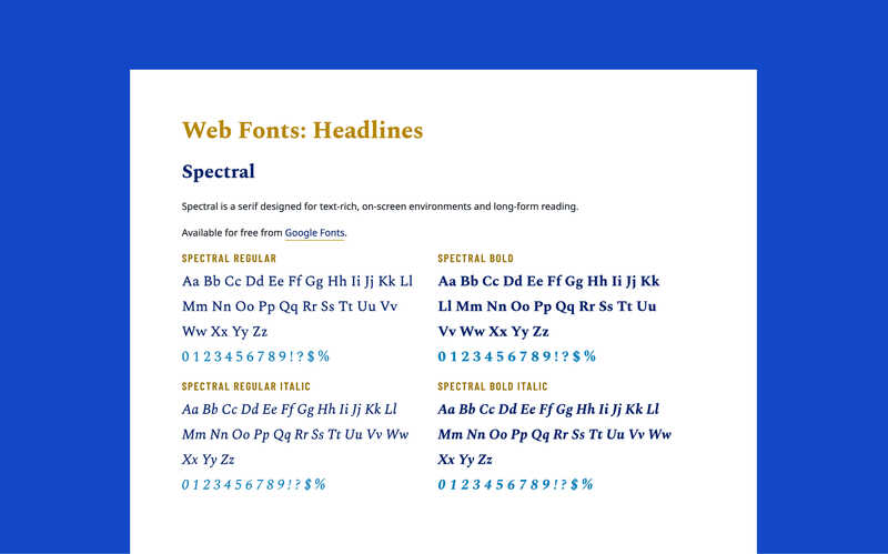
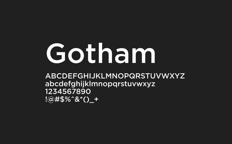
The other font, Barlow Condensed, a slightly rounded, low-contrast grotesk type family, is space efficient and clear. This font is perfect for headlines, as it shares qualities with highway signs and public signage. Any head style in Barlow Condensed should always use the semi-bold weight in all caps.
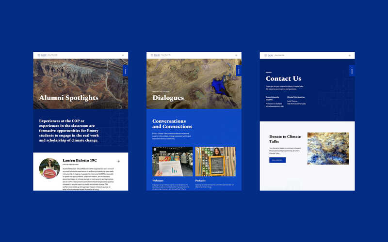
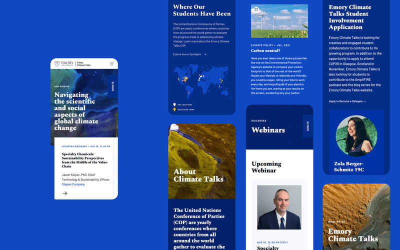
In collaboration with the client, we redesigned and reimplemented the Emory Climate Talks website on Drupal 9, a flexible, secure, and accessible platform. By increasing the visibility of the website's rich media, such as recorded webinars and podcasts, we accentuated the relevance of Climate Talks and the students, bloggers, and speakers who contribute to it. Some of the key results we saw include:
- Improved navigation and content organization
- More user-friendly integration of podcasts, videos, and blog posts
- Use of engaging, visually appealing web banners with beautiful textural open-source images of the planet Earth
- Creation of reusable components to make it easy for content editors to create engaging content
- New, attractive content, such as student spotlights
- A new visual framework within the Emory brand that reflects the environmental and social values of the initiative and attracts students and academics
The client was impressed by our ability to translate the user experience stage to visual design. The team at Emory relied on us to provide more guidance in the form of online sessions to give better direction.
Read more: 10 Signs Your Current Website Is Outdated and Needs to be Redesigned
Implementing a Design That Aligns with the Client’s Goals
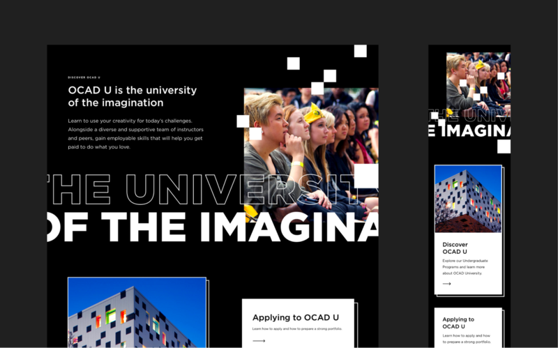
At Evolving Web, accessibility is always a top priority. We want to make sure that our designs are accessible to as many people as possible, regardless of ability or circumstance. This was especially important when redesigning the OCAD University admissions website, as the school has a commitment to accessibility and inclusivity.
To help OCAD U achieve their goals of helping prospective students better understand the admissions process, we took a user-first approach from the outset. We started by looking at the website's audiences and understanding their priorities.
Using colour according to the brand specs and adhering to the do's and don't of the brand guidelines, we developed a design and UX strategy to drive engagement and guide users through the admissions process.
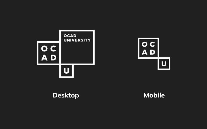
For this project, we focused on student achievement, appealing to potential students and standing out from other art and design schools. The new website provides OCAD U with a streamlined user experience and a bold artistic direction.
Among the notable successes with this design were:
- A stronger UX, with simplified navigation that leads users to helpful information more quickly and makes content more accessible
- A bold, less text-dependent design lets users scroll and explore as they are guided by impactful typography and interactive features conveying creativity and imagination.
- A more intuitive, more flexible homepage that can be adapted to the admissions cycle, highlighting the most critical steps in the application process.
Read our OCAD U case study
Freeing up Creativity
Next time you face constraints in your web design project, remember that they can actually be a good thing. Embrace them, and use them to come up with more creative solutions that will impress your client. And, most importantly, use them to create a better user experience.
When working within the constraints of an existing brand, it can be easy to get bogged down in the details and lose sight of the bigger picture. But by taking a step back and looking at the brand as a whole, you can start to see where there is room for flexibility and creativity.
Start building a brand presence that is accessible, tells a story and grasps all aspects of your user journey.
