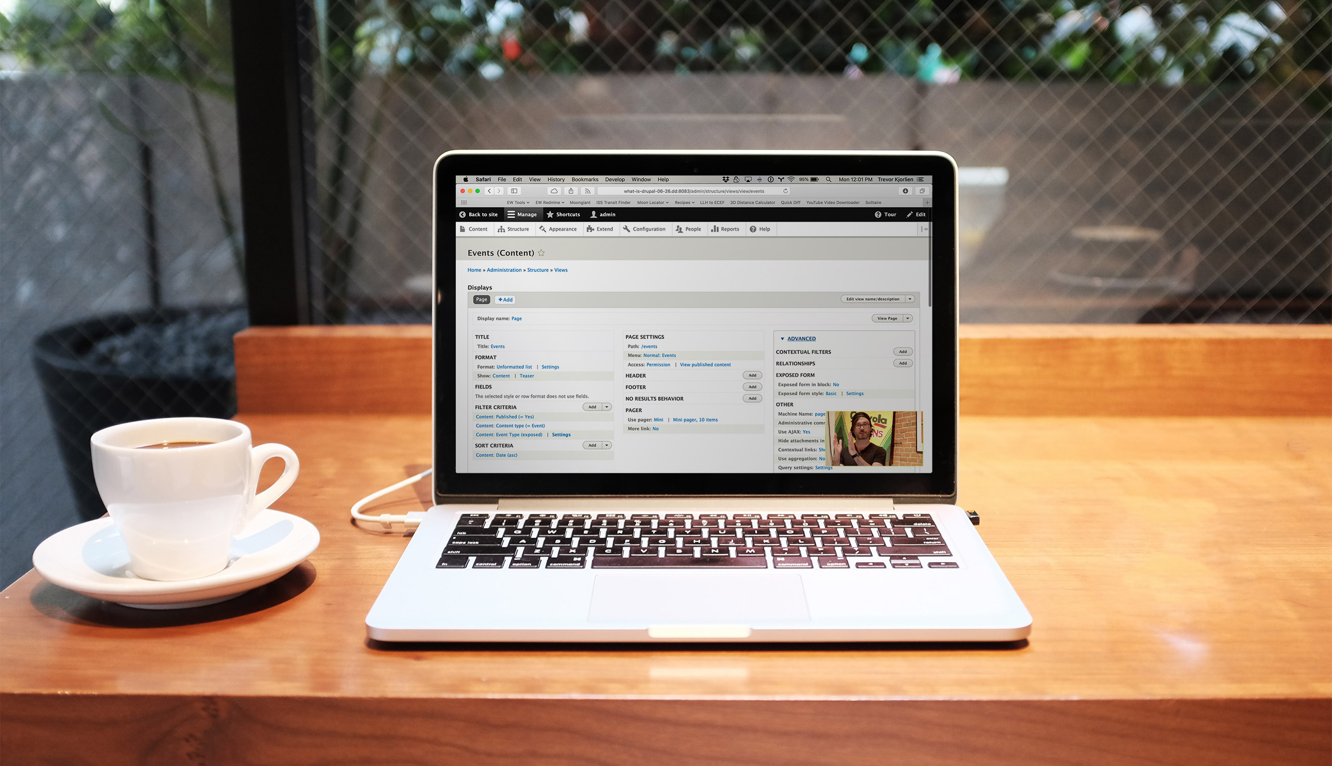
We are all adjusting to a strange new world where suddenly work meetings, university classes, pottery lessons and conference presentations are delivered online. While at times there can be some adjustment pains, everything going virtual has some advantages too. I've been able to virtually attend a web accessibility talk in Miami, a synthetic biology conference in Hong Kong and a dance class in New York, all while wearing grey sweatpants I've had since high school. But I'm young, tech savvy and abled. I'm sure not everyone is benefiting from the world moving online in the same way I am.
With that in mind, here are a few easy ways for you to make your next webinar more accessible and enjoyable for everyone and allow you to reach a larger audience.
1. Choose Your Platform Carefully
Some things to look for include the ability to use live transcription or closed captioning, either through the platform itself or a third-party app. Zoom offers live captioning, transcription, and closed captioning to its premium users (business, education or enterprise). The University of Minnesota provides a nice step-by-step guide to setting up Zoom live transcription. Google Meet also includes a closed captioning feature.
It is important to ensure that your platform is both keyboard-accessible and screen-reader-supported. Both Google Meetings and Zoom have these features.
There are also several third-party apps that allow live transcription, such as Otter Live Notes for Zoom.
1. Include Live Transcription or Closed Captioning of Your Presentation
Live transcription and closed captioning are both great ways to make your webinar more accessible to all sorts of users, including those who are hard of hearing, non-native English speakers, and people in shared spaces.
Depending on available resources, you can either use your webinar platform's built-in captioning, a third-party auto-captioning app, or a human captionist who sits in on the event. If you're using automatically generated captions during the live event, consider cleaning them up manually before publishing the recording.
2. Send Presentation Slides out Ahead of Time
If your meeting or webinar includes a slideshow presentation, consider sending it out to attendees beforehand. This could allow blind users to translate the text on the slides into braille, so they're able to better follow along while listening to your presentation. It's also a good way for attendees to familiarize themselves with the content you will be presenting and allows non-native English speakers to translate key terms into their own language. When sending out the slides, mention that you're available to assist with any questions to help clarify any misunderstandings before the event.
3. Use High Contrast Colours on the Slides
This ensures that slides are legible to everyone, including attendees with low-resolution monitors, those with vision impairments such as low vision or colour blindness, or those watching via a mobile device. For more on this and other ways to design your slides more inclusively, read our post about accessible design.
4. Limit the Amount of Text on Slides
This is my personal pet peeve during all presentations, live or virtual. It might be because I'm near sighted and don't always wear my glasses, but I also just hate having to read paragraphs of text while someone is talking. I find it distracts the audiences from what the speaker is saying. Instead, include key take-away ideas as short bullet points.
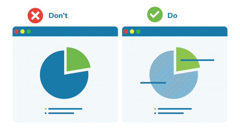
5. Don't Rely on Colour to Distinguish Key Elements
If your presentation includes data visualizations like graphs or charts, make sure your audience is able to clearly distinguish between the different segments.

Don't rely solely on colour-coding for this; also include unique patterns or textures to accommodate viewers with colour vision impairments as well as variations between monitors and other displays.
6. Speak Clearly and Slowly in Simple Language
A presentation that uses short simple sentences in everyday language is always easier to understand than a presentation that uses long run-on sentences and complex metaphors. The exception to simple language is language specific to your field if it is a presentation intended for that audience.
With webinars potentially reaching a global audience, it is more important than ever to avoid colloquialisms or metaphors that might not be understood by non-native English speakers or people from a different region. I'm a native English-speaker, but if you tell me to meet you S'Arvo I have no clue you mean this afternoon. And afternoon is always dependent on your timezone anyway. Regardless, speaking slowly and enunciating properly will help everyone understand, including your transcription software.
7. Consider Recording the Webinar
This can allow audience members who didn't quite understand part of your presentation the first time to go back and listen to it again. It is also an easy way to increase your available online content and can allow potential audience members who weren't able to attend live to access your content. Most webinar platforms offer local and/or cloud recording functionality, and if you'd rather handle it yourself you can always use a third-party screen-recording tool.
8. Describe all Key Content
Verbally describing what's depicted on the slides in a presentation makes it much easier for audience members to follow along. Don't forget to also read any key pieces of text on the slides out loud. Similarly, ask that people identify themselves before speaking, and read questions from the chat aloud before answering them.
9. Ensure Your Sound Quality is up to Snuff
Good sound quality is important for all audience members. Remember what we said in number 7 about not using weird colloquial expressions like "up to snuff"? Just checking if you were paying attention. Do as we say, not as we do.
There is nothing more annoying than weird humming or beeping or feedback going on in a webinar, so make sure your webinar's sound quality is excellent. If available, it is always better to use an external microphone rather than the one built into your laptop. This can help the overall sound quality and reduce background noise, as well as generate more accurate live transcriptions. Always do a trial run before the webinar to test your equipment and ensure that your mic and any audio in your presentation are coming across clearly through your webinar platform. Once the webinar starts, introduce yourself or make other small talk as people arrive to allow everyone to adjust their audio.
Accessible Means Inclusive
I once tried to leave a live presentation right in the middle of it. It was a traumatic experience. I had to try to squeeze by a whole row of attendees while balancing my ginormous winter coat, coffee and laptop, trying to be as quiet as possible. Naturally, I failed to be inconspicuous and everyone gave me evil looks.
These days, I can leave webinars with one click. It's now more essential than ever to have a webinar that is easy to follow for everyone or else you might find yourself presenting to yourself. These are some easy ways to keep your webinars and virtual meetings accessible for everyone. If you're on a mission to make your website or content more accessible as a whole, consider signing up for an upcoming accessibility training course hosted (virtually of course!) by Evolving Web. You'll learn the ins and outs of web accessibility and how to implement these valuable skills into your design or development practice.

