Overview
Evolving Web worked closely with the INSPQ (Institut national de santé publique du Québec, Québec National Institute of Public Health) to migrate its site from Drupal 7 to the latest version of Drupal, to create a more modern interface, and provide a fresh user experience.
About the Client
The INSPQ was established by the Government of Québec in 1998 as a research hub, knowledge broker, and reference centre for all matters related to public health. It offers expertise and specialized laboratory and screening services to support Québec’s Minister of Health and Social Services, regional public health authorities, and health and social services institutions.
The Institute is staffed by researchers from a wide range of fields—from applied and health sciences to social sciences and humanities. It provides ongoing training opportunities for healthcare providers, and produces and disseminates research publications on various public health topics.
INSPQ’s primary audience is public health professionals who are seeking information on important healthcare topics. Its secondary audience is the general Québec public, and third is journalists and policymakers (an audience that was pushed to the forefront at the peak of the COVID-19 pandemic.)
Goals
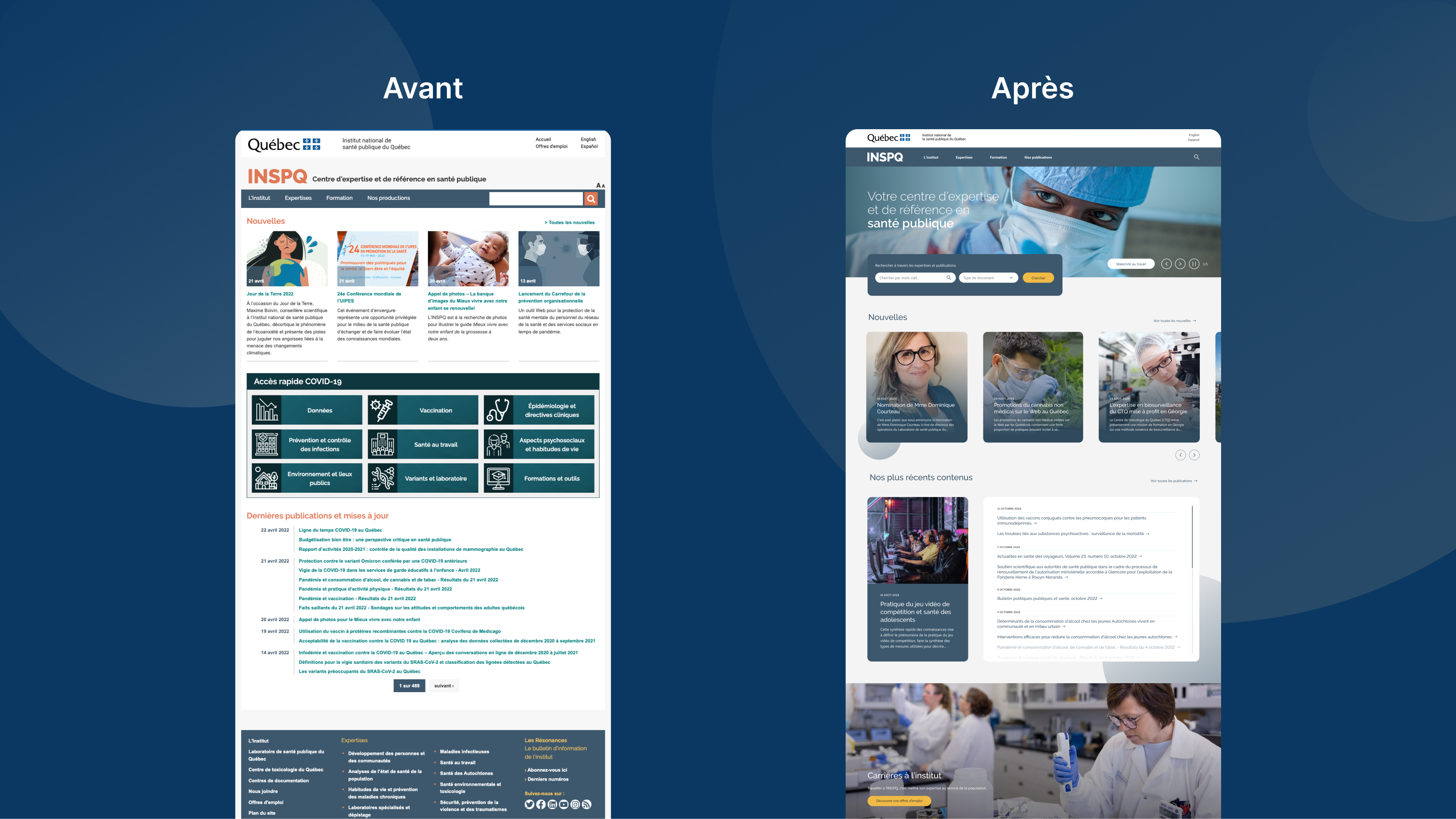
Evolving Web was selected by INSPQ to upgrade its website from Drupal 7 to the latest version of Drupal. The project was quickly expanded to include a UX/UI redesign, as the decade-old site was difficult to navigate and not fully responsive.
The INSPQ project involved a mammoth migration of over 30,000 pages. While this was underway, the goal was to improve the overall user experience by focusing on the following elements:
- Navigation and information architecture
- Search functionality
- Page structure
- Accessibility
- Improved UI and expanded components
Challenges
The main challenge of this project was its scale. Faced with more than 30,000 pages, we had to be very strategic in our recommended changes. The site also had a deep navigation structure (with more than six levels) and extremely text-heavy content, making it a challenge for users to navigate.
Solutions
Migration
While some projects are better served with internal migration, this project benefited from the creation of migration scripts entirely in code. We used this process to migrate content, files, taxonomies, and menu items. We also:
- Conducted an exhaustive analysis of the client’s content creation needs
- Trained the client to input content using Layout Builder
- Produced a detailed information architecture document
- Cleaned up unused content types and removed unused fields
- Conducted occasional strategic merges of content types and conversions of fields
UX
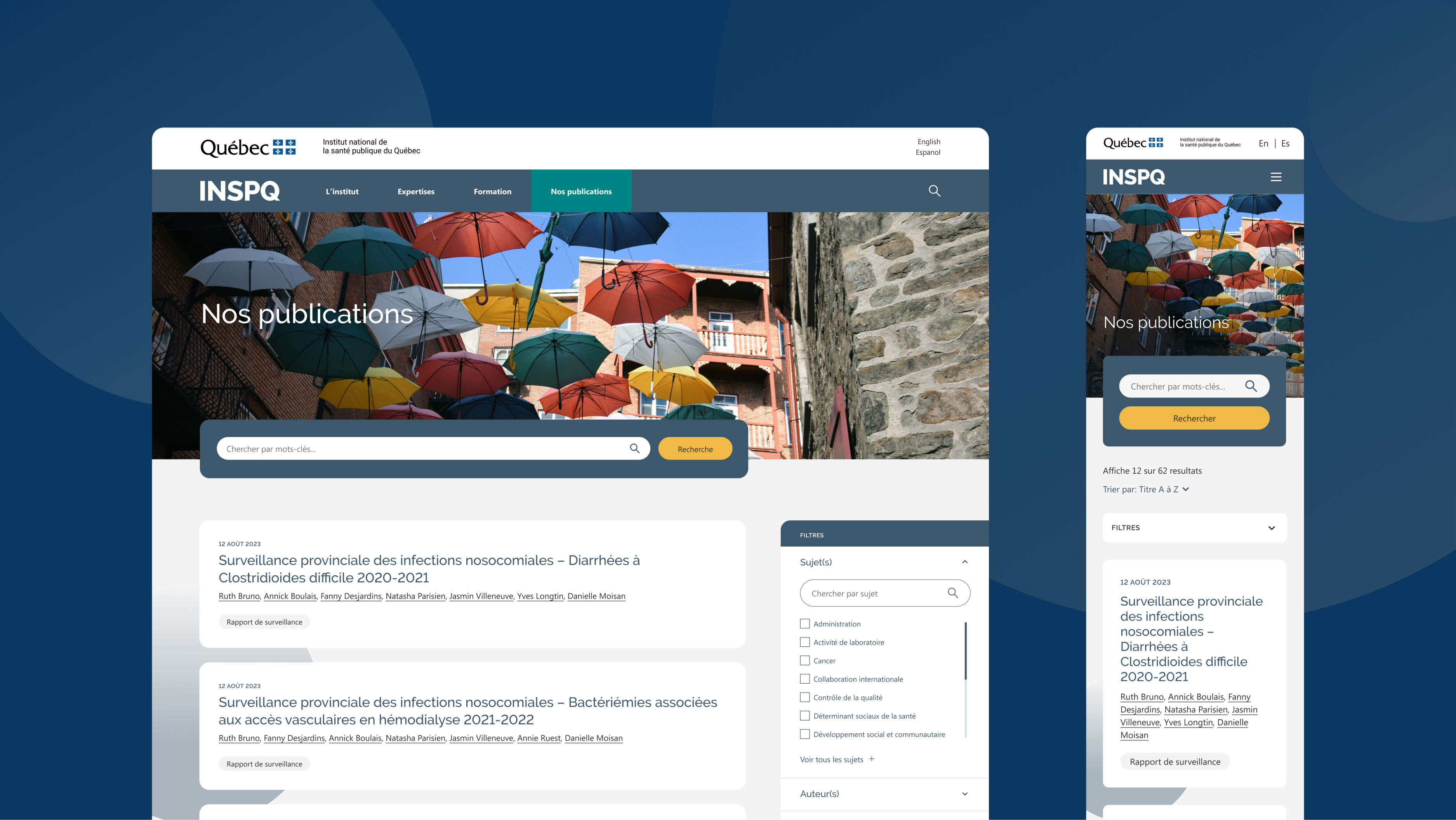
We began the project with a questionnaire to diverse stakeholders that enabled us to prioritize key aspects of the architecture and design. We decided to focus on redesigning the home page, the search results page, second-level hub pages, and the publications page. Our solutions included:
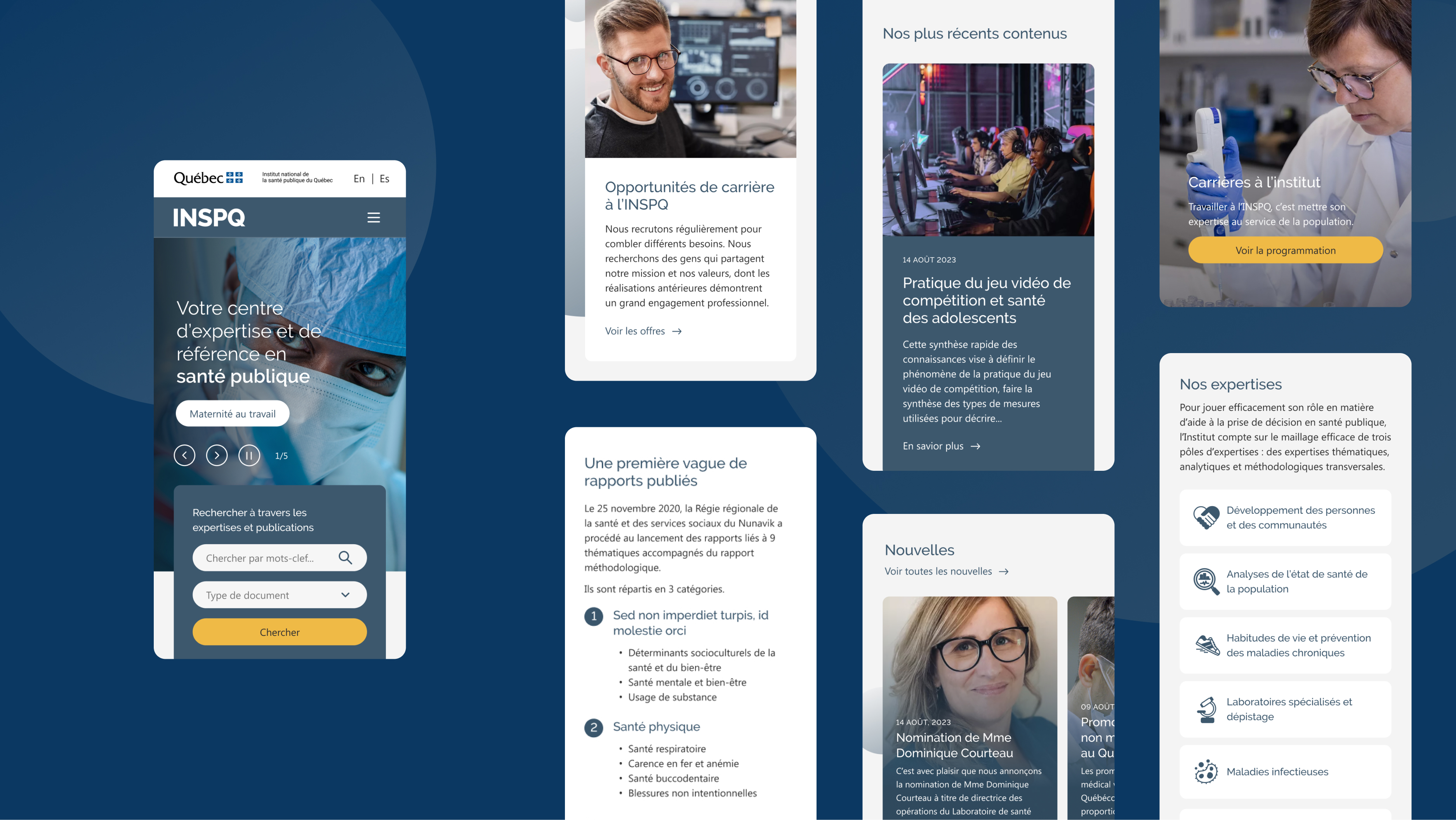
- Designing components for various content types with a focus on reusability and consistency in order to accommodate all 30,000 pages
- Reorganizing and simplifying the main menu to make the site easier to navigate
- Overhauling the search solution and adding a new filter (with auto-complete) to help users pinpoint specific resources
Visual Design
Much work was done to visually redesign the site, as the original site was extremely text-heavy and also had branding inconsistencies. New design features included:
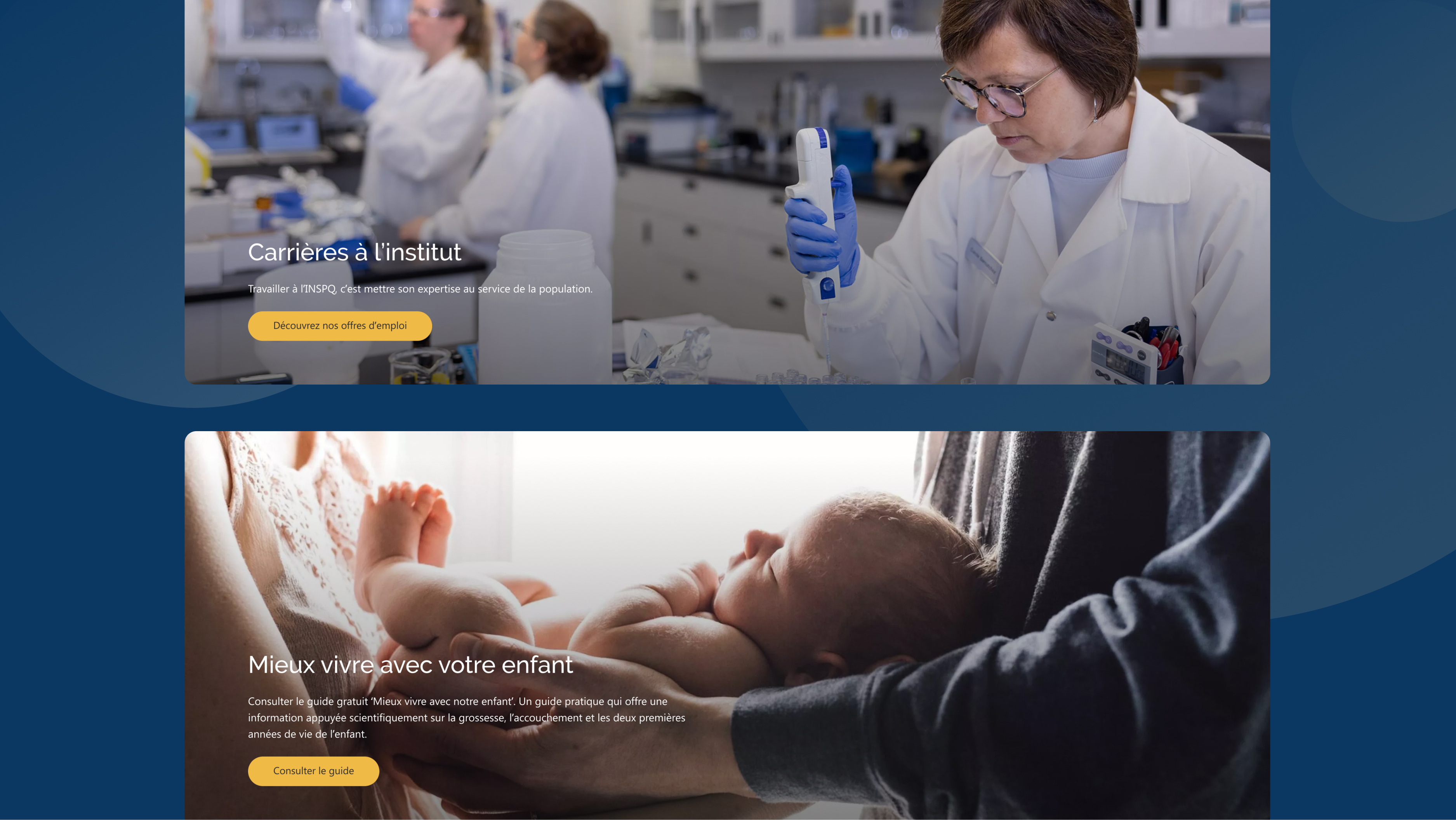
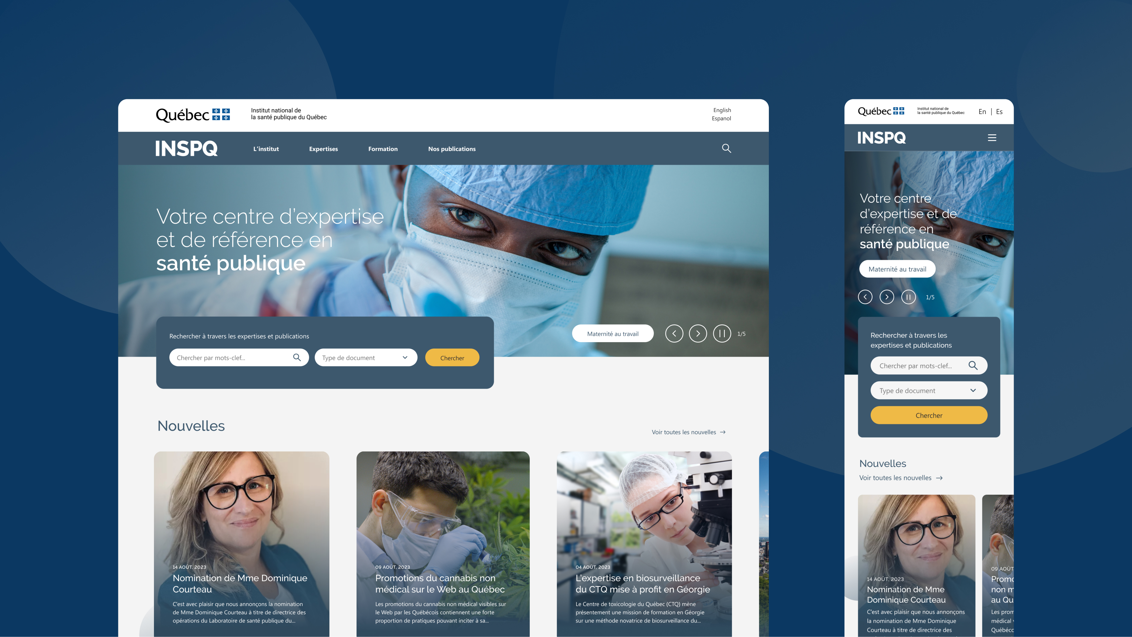
- Home page carousel featuring images of healthcare professionals
- Image cards, iconography, and multi-use lists to break up heavy content
- Textures featuring circular imagery to give serious topics a friendlier look
- Consolidated brand identity

Results
In all, we migrated over 30,000 pages, 30 content types, 500 fields, 500 contexts, 300 views display, and 21,000 files. We improved the overall user experience with regards to navigation, information architecture, search functionality, page structure, and accessibility. We also enhanced the UI and expanded components.
The overall result of this project is a clean, accessible, user-friendly online knowledge centre. The new site empowers INSPQ to nurture a trustworthy and approachable digital presence that reaches all of the institute’s target audiences.
