The world of web design is always changing, and keeping up with the latest trends is essential for any designer who wants to stay ahead of the curve. As people become more accustomed to interacting with websites and apps, designers will need to find new ways to create seamless and intuitive user experiences.
By keeping an eye on these trends, you can ensure that your designs are always ahead of the curve. So, what can we expect to see in web design trends for 2022?
Current Web Design Trends
Bold Typography
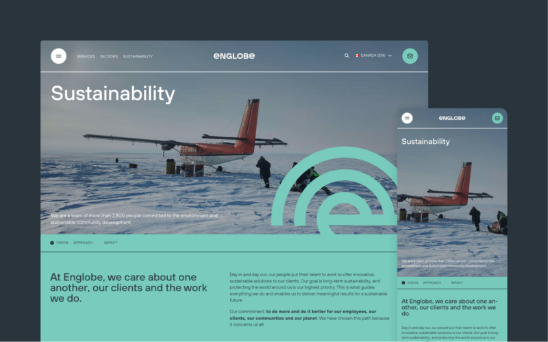
In recent years, there has been a growing trend toward using bold and eye-catching typography. By using large and stylish fonts as we did in our work with Englobe, designers can create impactful messages that grab attention. This trend is particularly effective when used in headlines and calls to action.
Thanks to the popularity of social media, this trend has become even more prevalent, with brands using striking visuals to capture the attention of scrollers.
While the use of bold typography can be an excellent way to capture attention, it is important to use it sparingly. If every element on a page is shouting for attention, the overall effect will be confusing and off-putting. However, when used judiciously, bold typography can be a powerful tool for making your words stand out from the crowd. It’s always best practice to work closely with content writers to ensure you have punchy headlines and succinct content to ensure the typography really pops.
Lightweight and Serif Typography
Sitting on the other end of the spectrum, lightweight typography is another trend that's been gaining steam in recent years. This style uses thin, delicate fonts that are easy on the eyes and don't require a lot of bandwidth to load. Because of this, they're especially well-suited for use on mobile devices. In addition, many lightweight fonts come in multiple weights (e.g., light, regular, bold), which gives designers more flexibility in terms of creating a hierarchy of information.
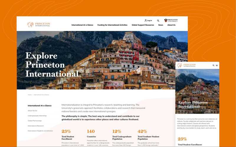
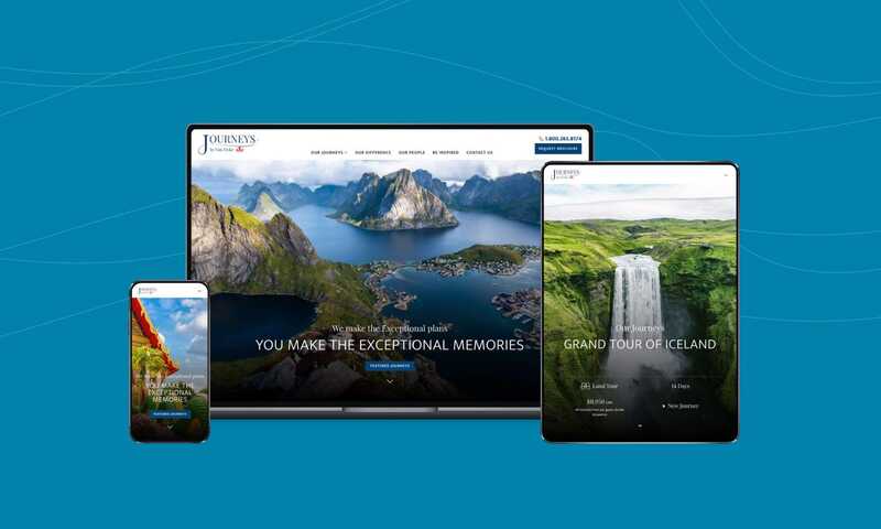
Serif fonts, with small decorative details on the ends of their letters, have been around for centuries. They fell out of favor for web use in the early days because they were harder to read on-screen. Today, newer screens and devices have made it easier to read serif fonts, and as a result, they're becoming more popular for web design. Serif fonts tend to have a classic, sophisticated look that can give your site a feeling of authority and credibility.
Have a look at serif fonts in action through our work for the Princeton International website.
Fun, Optimistic Designs
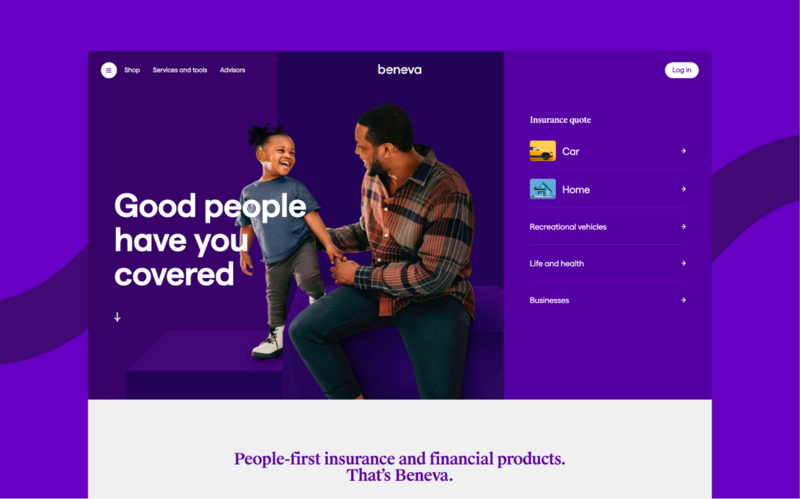
Web design is constantly evolving as designers experiment with new ways to create innovative and user-friendly sites. In recent years, there has been a shift away from minimalistic designs and towards designs that are fun and optimistic. In these designs, you’ll notice a lot of bright colors, organic shapes and textures, and beautiful imagery. This trend is likely to continue in the future as designers seek to create websites that are both visually appealing and memorable.
Fun and optimistic designs, like those found on the Beneva website, help to communicate a brand’s message creatively and engagingly. They can also help set a website apart from its competitors. As users become more and more inundated with information, it is becoming increasingly important for designers to create websites that stand out from the crowd.
By incorporating fun and optimistic designs in a non-profit or higher education website, for example, designers can ensure that these websites will be noticed and remembered. This can be done by using bright colors, interesting patterns, and fun illustrations.
Mega Footers
As anyone who has ever built a website knows, the footer is one of the most important parts of the design. Not only does it provide a place to put important information like contact details and copyright notices, but it can also be used to improve the overall look and feel of the site. In recent years, we've seen a trend towards larger, more elaborate footers that take up more space on the page. These so-called "mega footers" are becoming increasingly popular, for several reasons.
First, they allow designers to include more information and links in a single place. This can be particularly useful for sites with large amounts of content, or for those that want to include links to social media profiles and other external websites.
Second, mega footers can help create a more unified and cohesive look for a website. By including elements like menus and search boxes in the footer, designers can make it easier for visitors to navigate around the site and find what they're looking for.
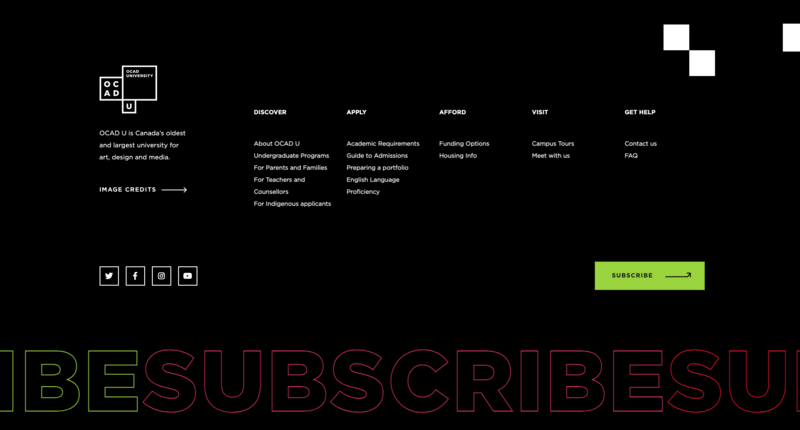
Finally, mega footers can be used to add an extra layer of interactivity and engagement by including features like newsletter signups and live chat widgets. Just be careful with overwhelming amount of items and inconsistent taxonomy. We recommend tree-testing to make sure users can find information they need. Have a look at our use of mega footers in our work with the OCAD University website.
Visual Borders
With websites becoming more and more complex, it's important to use visual borders to help organize the content and create a clean and professional look.
Visual borders can also be used to create a sense of space on the page, making the website appear to float within the limits of the screen. In 2022, web designers are using visual borders more than ever to create a variety of looks, from clean and corporate to fun and funky.
Simple borders on the edges of websites offer a subtle touch that goes well with other 90s-adjacent fads making a comeback. Keep this web design style in mind while developing your website, if you don't want to be left out.
Images of Real People
One key web design trend of recent years has been the use of real people instead of traditional stock photography. This shift is driven by several factors, chief among them the increasing importance of authenticity and connection in our digital lives. In a world where we are increasingly bombarded by advertising, users are craving connections to real people and stories.
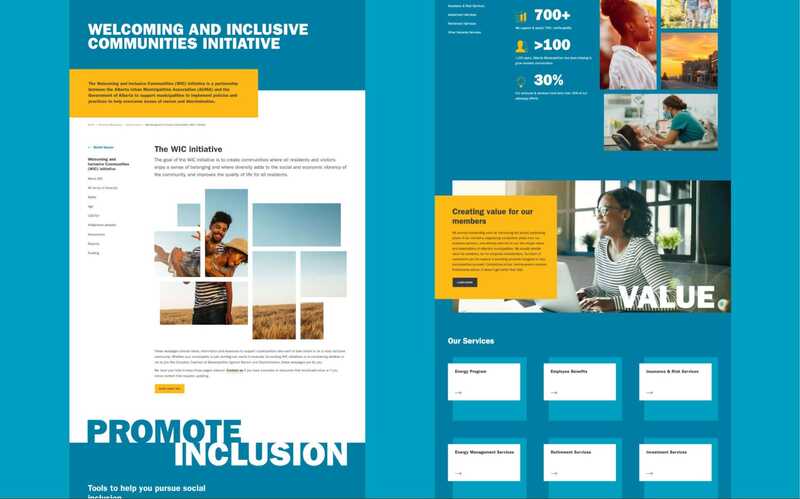
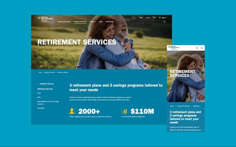
Seeing images of real people creates a sense of authenticity and intimacy, two qualities that are often lacking on corporate websites. You can see this design choice used heavily on the Alberta Municipalities website. In addition, showing real people can help promote diversity and inclusivity, two values that are becoming increasingly important to both consumers and brands.
Some of our favorite higher education websites use photographs of real students on their websites. As we move further into 2022, this trend will only continue to grow.
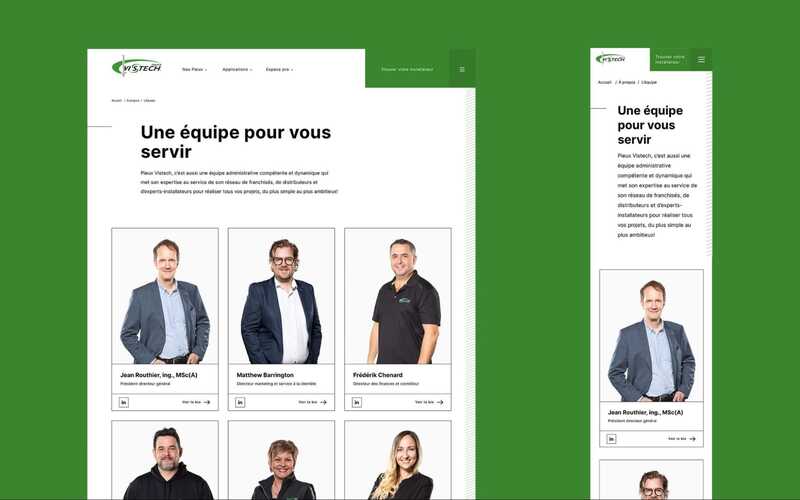
Symmetrical Layouts
are Easy on the eye, symmetrical layouts create a sense of order that can be appealing to users. In a world where we are constantly bombarded with information, a symmetrical layout can provide a sense of calm and visual stability.
These days, many websites are designed with an asymmetrical layout in mind. However, as user experience becomes increasingly important, symmetrical layouts are likely to make a comeback. After all, why should we have to scroll endlessly to find the content we're looking for?
With a symmetrical layout, everything is easy to find and the user can quickly get the information they need. Let's look at the example of a potential patient navigating a healthcare website. If they can quickly find the information they need, they are much more likely to make an appointment. The symmetry of the layout makes it easy for them to find contact details, location information, and opening hours.
The use of symmetry in web design is likely to continue to grow in popularity as designers focus on creating user-friendly experiences.
Typographic Hero Images
A typographic hero image is a banner-like image that contains a piece of text, usually in large font size. The text is often overlaid on top of an interesting background image. While this trend has been around for a few years, it shows no signs of slowing down. There are several reasons for this continued popularity.
First, typographic hero images are very visually appealing. The contrast between the text and the background grabs attention and adds interest. Second, these images are highly versatile. They can be used to convey a message, tell a story, or simply add personality to a website. Third, they are relatively easy to create, even for those with limited design experience. As a result, we can expect to see more and more websites making use of typographic hero images in the future.
You can have a look at how some of our favorite non-profit websites of 2022 make use of typographic hero images in this post.
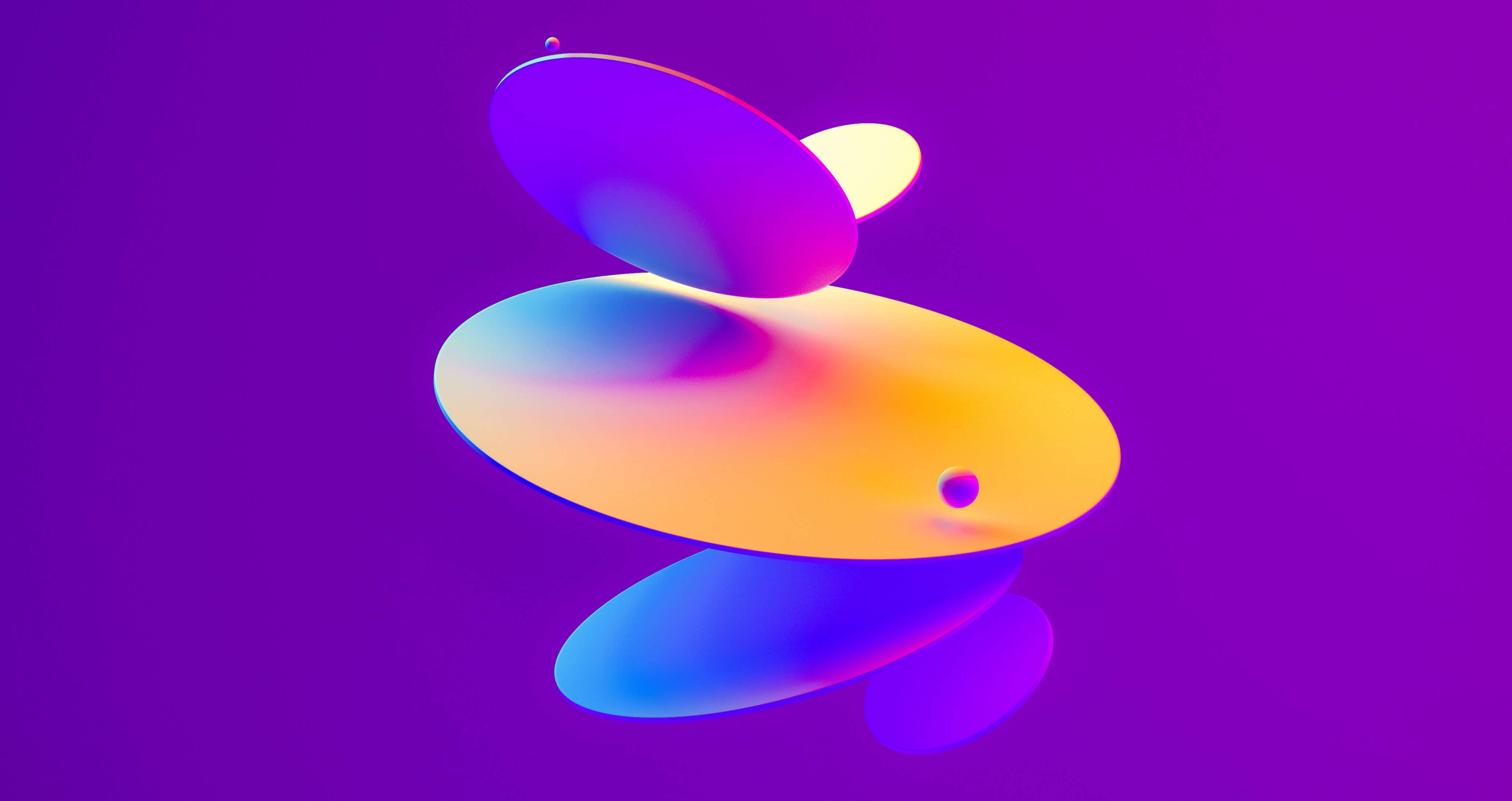
Gradients
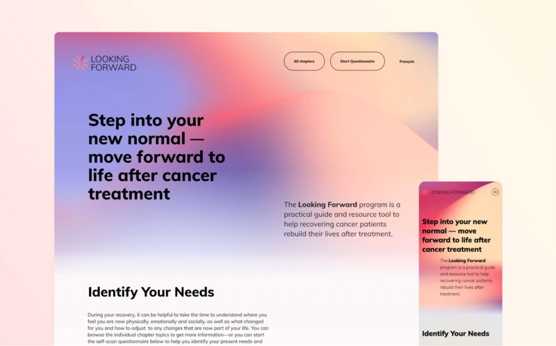
Gradients have been making a comeback in the world of web design in recent years, and it's easy to see why. When used judiciously, gradients can add depth and interest to an otherwise flat design. They can also be used to create a sense of movement and energy as they do here on the Looking Forward website.
Additionally, gradients are a versatile tool that you can use to create all kinds of effects – from subtle to eye-catching. Think about a website for a post-secondary institution. The use of gradients can help add excitement and vibrancy to the site, making it more appealing to potential students.
In the world of print design, gradients have been used for years to add interest and depth. It's no surprise that they are now making their way into web design. We expect to see more and more websites making use of gradients in the coming year.
Earthy & Primary Colors
After years of sleek, minimalistic designs dominated by white space, designers are now embracing a more organic aesthetic. This shift is being driven in part by the increasing popularity of eco-friendly and sustainable brands. But it's also a reflection of our growing need for connection and authenticity. These are feelings you will want to evoke in your users for your next non-profit website project.
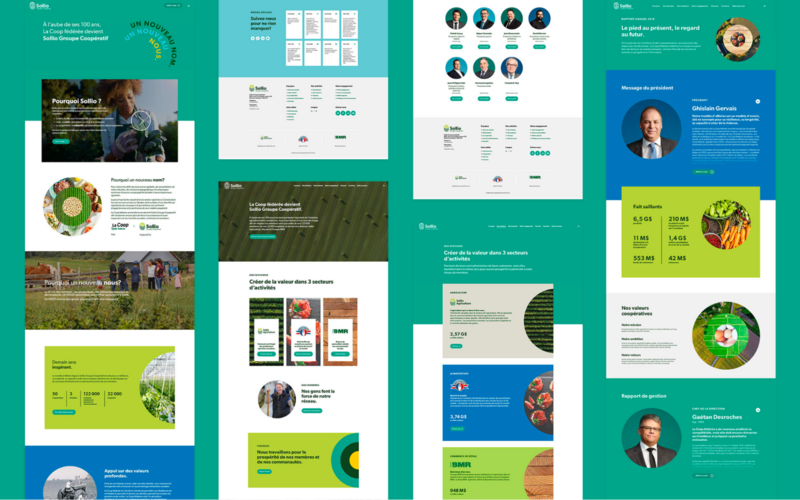
In a world that feels increasingly virtual, we're yearning for designs that feel grounded and real. And what could be more real than the colors of the natural world? They help create a sense of warmth and connection that is so important in today’s world. Take a look at Sollio’s website, it does a great job at connecting with users on a deeper level using earthy colors.
Blur Effects
By applying a blur effect to an image, it can create a sense of depth and dimension. This can be especially effective when used in conjunction with other design elements, such as parallax scrolling.
In addition, blur effects can help to reduce distractions and focus the viewer's attention on the most important content. For example, if you're on a website for a municipality, and there is a very important news article you want people to read, you could use a blur effect to make it stand out from the rest of the content on the page.
We expect to see more designers making use of blur effects in the coming year, as they experiment with new ways to engage and connect with their users.
Let Us Help You Make Sure Your Website Stays Up to Date
Users expect websites to be modern and easy to use. If your website looks outdated, users may be less likely to trust it and may not stay on the site for long. Additionally, search engines may view your site as less relevant and rank it lower in search results.
To ensure your site is up to date, consider implementing the trends we've discussed in this post to keep it fresh and current. By following these tips, you can make sure your website is appealing to both users and search engines.
