In the last five to ten years, I’ve seen a huge shift in how universities and colleges position themselves online. Many have adapted their strategy to keep up with the needs of prospective students and stand out from the crowd as more and more schools rely on their online presence to recruit potential students. Recruitment offices are being asked to justify the price of tuition, attract an international audience, and sell the campus experience. And as more of the user journey in seeking a school moves online, the more weight the website has in the decision to attend a particular college or university.
Now the question is, how do you design a website that helps recruit new students, guides them through the admissions process but also speaks to current students, faculty, and staff? Most institutions opt for a dedicated section of their website or a stand-alone website that serves as the first touch-point for potential students.
But who is your admissions website targeting? You’re likely looking at two very distinct audiences: potential students who know about your institution and want to apply, and students who have never heard of your institution. And beyond that, you have students coming from different geographical and demographic backgrounds who have a range of needs and questions. Mapping your user journeys will help in designing a website that achieves your goals.
Defining Your Admissions Website’s goals
You might assume that recruitment always wants to increase the number of applicants but the actual goals are often more nuanced. Take a look at the goals of your Admissions and Recruitment team. They might be trying to increase international recruitment or the rate of applicant success, or they might be looking to decrease the number of phone calls they get from applicants.
And when you take these high-level goals and translate them into more specific and measurable goals for the website, they will probably fit into three main categories:
- Establish your reputation and build awareness. This is all about building your school's brand. Does your website accurately reflect the values and culture of your institution? The content and design should make a good first impression and give visitors a taste of what it would be like to attend.
- Help prospective students research and select programs. You want to help students research their options and provide comprehensive information about your programs and related admissions requirements, learning and career opportunities.
- Get users to the next step in the admissions process. This often means providing an intermediary next step that a user can take to stay engaged and express their interest, before taking the step of submitting their application.
Winning Strategies for Your Admissions Website
Establish Your Reputation and build awareness
The main strategy to establish your reputation revolves around creating content that will resonate with your audience. Your content should be designed to peak student interest and get them to take the next step in the admission process. For example:
- Evergreen content that reflects your institution's values and culture. This kind of content should still be relevant and useful years from now and should give visitors a sense of what it would be like to attend your school.
- Emphasize the institution's priorities: What are the things that make your school unique? What kind of experience do you want students to have while they're here? Answering these questions will help you in your content and design choices. If you need some inspiration, here’s a list of higher education websites we love.
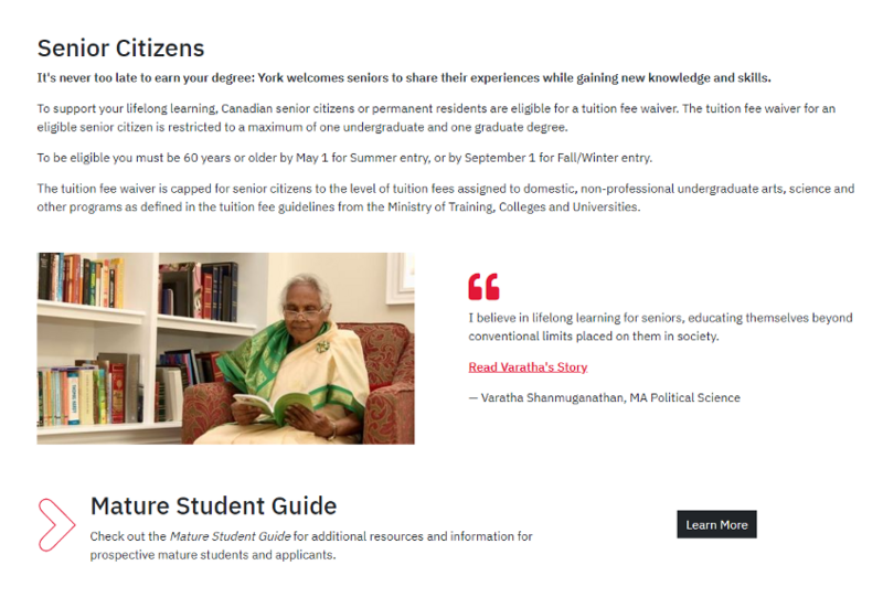
- Talk about the people that make up your institution. You can use recent graduates' success stories or current students, doing interesting things with their education. They're a great way to help potential students see themselves at your institution.


- Create campaigns around a few selected topics you know potential students are looking for: a particular program, experiential learning opportunities, co-op programs, or campus locations. Building organic growth through SEO takes time, so you should plan on sharing your content on various channels and keep in mind to measure which channels are most successful.

Help Potential Applicants Select a Program
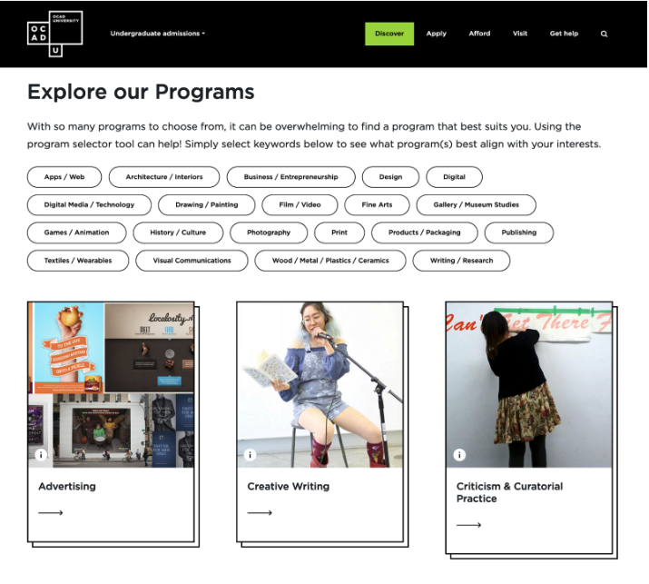
It’s important to make programs easy to find, particularly for large institutions with hundreds of programs available. Many students say they care more about the program than which school they attend. This means that program pages carry a lot of weight in the user journey of an applicant.
Are your programs organized in a way that’s intuitive for potential students? They should be differentiated in a meaningful way. This could mean highlighting the unique features of each program or outlining the career paths that students can pursue after graduation. Providing this type of information can help prospective students make an informed decision about which program is right for them.
Get Users to the Next Step
Building awareness and reputation is great, but not very useful if users don’t engage with your institution. The ultimate goal of an admissions website is to get visitors to apply but not all users are ready to do so on a first visit. And in that sense, having clear calls to action to “Attend an Info Session” or “Talk to a Current Student” is critical.
To start, you need to identify the steps that come before a successful application. These might include researching programs, visiting campus, or meeting with an admissions officer. Talking to actual students, looking at your analytics, or talking to your recruitment team can help you identify what these steps might be. Once you know what these steps are, you can create content and make design choices that guide users toward them.
By making the next step in the admissions process clear and easy to find, you’ll increase the chances that users will take action and that your efforts to build reputation and awareness are fruitful.
The Biggest Challenges for Admissions Websites
While admissions websites can be a great tool for recruitment, they also come with their own set of challenges. These challenges can make it difficult to create an effective website that meets the needs of both prospective students and your admissions office.
The two biggest challenges fall under web governance and the ability to guide users to the admissions section.
Challenge 1: Web Governance
Web governance refers to the process of maintaining and updating a website. This includes tasks like adding new content, fixing broken links, and ensuring that the website is accessible and secure.
The challenge for admissions websites is that they are often managed by multiple people with different areas of expertise. For example, the website might be designed by a marketing team, while the content is managed by the admissions office.
It's important to create a web governance plan that outlines who is responsible for maintaining each content element. It is also good practice to review the goals and analytics for each page and which content should be reactively or proactively updated, and when.
Having a clear plan in place ensures that everyone involved in managing the website is on the same page and that your recruitment strategy continues to drive the direction of the website after launch.
Challenge 2: Beyond the Admissions Website
The second challenge is related to wayfinding. Having a separate website or section for undergraduate and graduate admissions, or for particular campuses and faculties, can help provide more targeted messaging. That's exactly what we did with OCAD University. We replaced OCAD U's website's admissions section with a stand-alone site, making it more intuitive, assistive, and visually appealing to all their prospective students.
But using multiple websites to recruit students introduces the problem of having to create a cohesive user experience. To overcome this challenge, it's important to ensure that the paths between sites are clear, that branding is implemented in a consistent way, and that it’s always easy for users to take the next step without getting stuck in a loop.

Creating a Great Experience for Your Prospective Students
In the end, the goal is to make it as easy as possible for prospective students to find the information they need about your programs.
By following these tips, you can create an admissions website that is both effective and user-friendly. When you start building, ask yourself: What are the goals of recruitment and how can the website support this? Are we making assumptions that our reputation precedes us, or using the website as a way to talk about the unique experience and selling points of the institution?
And if you don’t have a lot of time to plan, don’t shy away from spending some time on strategy. And iteratively work to improve your content and your content governance to get the most out of the website you have.
Read more: Higher Education Marketing: Web Strategies and Trends for 2022
Read more: How Can SEO Help Increase Your Higher Education Website Visibility?

