Designing and building healthcare and hospital websites can be challenging. These websites typically serve diverse audiences, so organizations must put people first, delivering helpful, readily available information for all types of users while ensuring they're supported with compassionate care when they're at their most vulnerable.
In this article, we'll see examples of how to create a compelling user experience in the healthcare context. We'll look at common use cases and solutions to organize information around the needs of patients, families, and the public at large.
Help Users Find the Most Important Content
In our work with healthcare digital experiences, we've noticed that, in most cases, the users' overall needs fit into the categories listed below. These users would not only be people in search of care, but also healthcare professionals searching for information to better assist their patients. By providing straightforward navigation and way-finding, users can get to the following sections of your website fast:
- Immediate Care - Information about opening hours, locations, directions, and general procedures (such as walk-ins, making appointments, etc.).
- Online Care - When users seek services, resources, and results that are available online.
- Health Services - How users can book appointments, find a hospital near them, learn about preparing for lab tests, etc.
- Preventive Health Education - Resources that help people adopt healthy habits that can prevent future health challenges
- Patient Resources & Recovery - Information about how patients can fully recover after long, difficult treatments.
- Search - For services, specialties, locations, and professionals. This can benefit users, given the wide range of things they might be looking for.
👀 Blog post: learn more about building search experiences on healthcare websites
Accessing Immediate Care
One of the most essential patient needs is access to immediate care. This kind of interface should be straightforward and provide simple options and instructions.
Here's an example from Chicago's Rush Hospital, which provides a clear call to action, "Get Care Today." It's designed colourfully and is written in plain language.
Making Sense of a Large Health Network
Many healthcare organizations consist of a vast network of hospitals, clinics and offices. As a result, efficiently communicating where patients can get care and services can be a daunting task, given the amount of content to be managed in their websites.
Some of these networks do manage to deliver user-centric experiences that make visitors' lives easier. Rush, for example, provides a search interface that delivers consistent, highly informational entries, with photos, addresses, and links to get directions. All this content is presented with a pleasing, comforting look—very similar to travel platforms such as AirBnb.
Accessing Online Care
If your organization offers online healthcare, you'll often need to point users to an external telehealth or telemedicine service. Even if you don't provide online care directly through your website, you must build an experience as seamless as possible, so visitors understand the steps they should take to access those external services.
Again, Rush Hospital is a good example of this. Their website presents the types of online care patients can receive, alongside in-person options. It's easy to jump straight to one of the care options, but you can also read the smaller print to see the differences and pick the delivery method that makes the most sense for you.
The NorthShore University Health System, from Illinois, also built a smooth user experience for delivering telehealth services. After selecting the kind of remote assistance they seek from the main website, visitors are directed to a login page on the NorthShore Connect website, which clearly describes what types of virtual services are available, like connecting with doctors remotely, message a care team, and more.
Accessing Health Services
When looking for health services, like an appointment with a specialist, blood tests, or vaccinations, visitors are better served by a centralized services directory. Disjointed, scattered information can be overwhelming for users facing a new health situation that they're not familiar with.
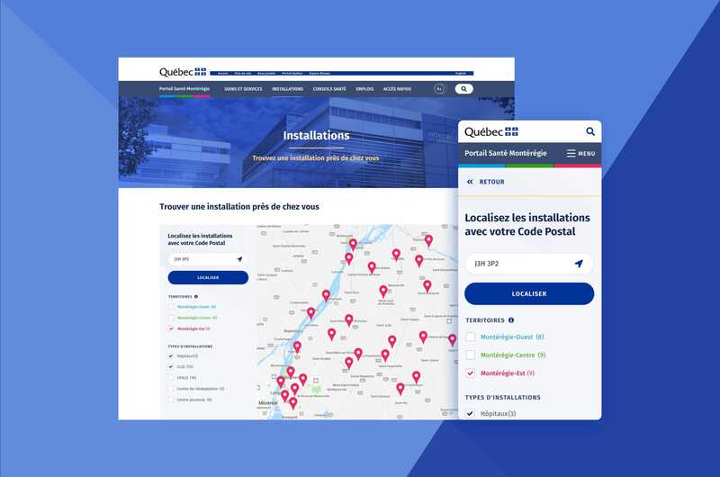
Quebec's Santé Montérégie—a web experience Evolving Web helped to build—is a great example of UX for health services. With a mobile-first, user-centric approach, this website consolidates a massive amount of health services, available in three different subregions in the Montérégie area, into a single online touchpoint.
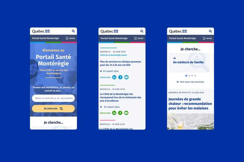
Previously, the website was built around Santé Montérégie's organizational structure, which meant that visitors had to frequently jump between different websites to find the information they needed. After the Evolving Web redesign, it became a customer-centric experience, with streamlined content and a consistent user interface throughout. The Santé Montérégie website also integrates postal code and territorial data to create a point-of-service finder for residents to locate services near them, but without limiting them to services available only in their subregion.
Preventive Health Education
More than ever, healthcare organizations are creating online experiences to better educate people about preventive care. Websites and apps are part of the public health toolkit to increase awareness and show users how to adopt practices and habits that improve health outcomes. This can reduce the incidence of conditions that lead to hospitalizations, surgeries, and lengthy treatments.
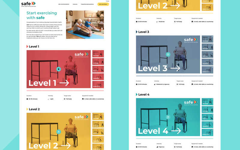
One example is McGill University's Division of Geriatric Medicine's Safe Seniors website. The website's goal is to improve mobility of the seniors, so they can avoid accidents, enhance their quality of life, and maintain their independence. It provides a fun, supportive environment that encourages seniors to follow a set of video tutorials that are fun, engaging, and adapted for different levels of fitness.
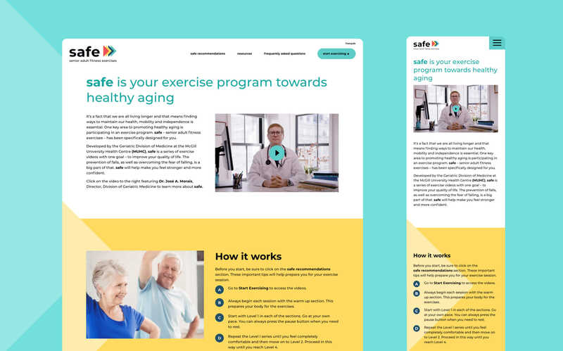
The user experience is optimized for tablets since the target audience is likely to prefer these devices. Users can pick the level that best suits their needs and see other seniors in the imagery and videos. This helps engage an audience that could feel intimidated by the prospect of starting an exercise program.
Patient Resources & Recovery
On the opposite end of prevention is the need to support patients in recovery after their treatment or surgery is over. Many patients feel like they're left on their own after treatment, but often follow-up resources and information can improve recovery.
Looking Forward is a project of Montreal-based St. Mary's Hospital Center and the CURE Foundation, designed and built by Evolving Web. Its goal is to provide information and personalized resources for patients recovering from all types of cancer, empowering them to thrive and overcome the challenges they face in recovery.
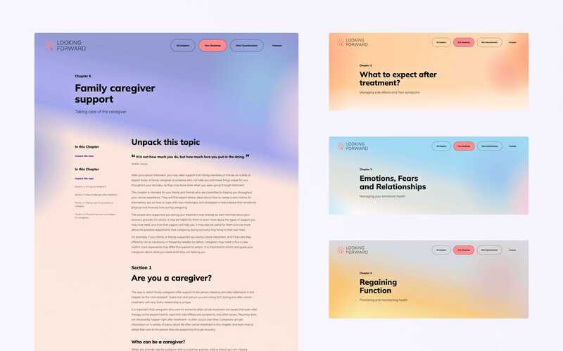
Looking Forward is a mobile-first, self-service platform that walks patients through building a customized recovery roadmap. It collects user needs in an interactive questionnaire and streamlines information while ensuring user privacy. Visually, the website explores colourful shapes evoking love, hope, change, energy, and joy, so users feel more reassured in their journeys.
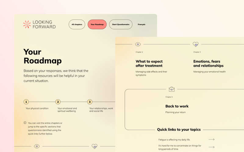
💻Learn how Evolving Web designed and developed this website in our Looking Forward case study.
Accessibility for Hospitals and Healthcare
Accessibility is a key element for every digital experience—and even more so for hospitals and healthcare. A large number of your users might be people with disabilities or seniors looking for health services, so this might impact your choice of default font size, the types of animations that you choose, and your approach to navigation.
By following these principles, you'll not only show your organization cares about its users, but you'll also comply with accessibility standards and legislation, such as the Affordable Care Act's Section 1557, the Americans with Disabilities Act (ADA), the Accessible Canada Act and various other regional legislations, and the Web Content Accessibility Guidelines (WCAG).
🧾 Building a More Inclusive Drupal Website: Download Our Free Accessibility Guide
Here are some accessibility features that are essential for any web experience, especially for hospitals and healthcare websites:
- Use structured content - Having specific fields to store your information and labelling it correctly makes it easier for screen readers and other technologies to access your content.
- Use plain language - Particularly in healthcare, content can become complicated quickly. So try to make your language as straightforward as possible.
- Provide multilingual accessibility - An essential aspect if your local legislation requires your website to be available in other languages. In Canada, many healthcare websites need to provide all content in English and French. In the U.S., healthcare needs to be available in the patient's language.
- Spell out acronyms - Don't assume people will know what every piece of content on your website means: it can make the experience more confusing.
- Summarize technical information - Some published research can be very complex, so providing summaries makes for easier comprehension.
Putting People First, Always
As diverse as the examples presented in this article are, they share one common goal: putting people first. Rather than letting institutional structures and politics dictate the experience, designing for end-users is the most critical element of building a successful website or app in the healthcare space.
Moreover, those digital experiences can be powerful marketing tools, so they must find the balance between providing health services and communicating their goals, mission, and values to the broader community.
Providing a streamlined user experience gets users closer to relevant public health information, different types of care, and resources they need to live healthier lives.

