
Designing, building, and maintaining university and college websites can be a daunting task. Audiences can range from prospective and current students to faculty, researchers, funders, and policymakers. And universities and colleges sometimes have dozens, if not hundreds, of faculties, administrative units, or sub-organizations, each with their own objectives, and sometimes with a distinct brand, tone, and voice.
These elements can present serious challenges from an information architecture and UX standpoint. Choosing the right platform is just one piece of the puzzle. We, for example, usually leverage Drupal, but your CMS options are numerous, depending on your goals and size. But there are a few other fundamental steps to deliver the best possible experience, such as organizing your content well and using a user-centric design process.
We recently explored a number of websites for a range of higher education programs to see what was working and what wasn't. We came up with a list of higher education websites we love, and the time has come for us to share it with you!
This post presents the first batch of higher education websites we love. These websites focus on student admissions. The second part, which we will publish shortly in a separate blog post, will showcase our favourite program pages, another crucial aspect of any higher education website.
👩💻 Blog post: 10 Higher Education Websites We Love - Part 2
Key Traits of Good Higher Education Websites
Before we walk you through our list, here are some common threads between our favourite websites:
- Well-organized pages - The sites we loved seem to understand their audiences and prioritize items well on their landing pages. Some use very little content and focus on directing their audience to tasks, while others present a lot of material right on the homepage. In all cases, they highlight essential tasks and key decision-making information and avoid having content based on their organizational structures.
- Fresh, clean designs - Most sites on the list incorporate generous whitespace, large, easy-to-read typefaces, and colour schemes that keep pages airy, accessible, and skimmable. All are mobile-friendly, and many have a clear mobile-first approach, with adaptive blocks and cards that readily stretch and rearrange at appropriate breakpoints.
- Consistency in branding and components - Each entry in our list does a great job maintaining the university's brand while conveying its mission and personality. They combine the university's colours, iconography, and design conventions with a look and feel specific to the School. Besides, consistent use of components makes for intuitive pages and easily accomplishable tasks.
- Highly visible calls to action - All sites on our list keep calls to action highly visible and quick to find. Big buttons in bold colours dominate, encouraging audiences to apply, request information, or sign up for events.
With all that said, let's have a look at our favourite admission pages on higher education websites.
University of Pennsylvania (Penn Admissions)
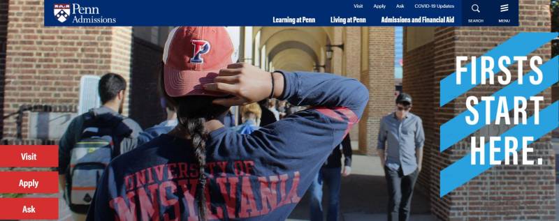
Here's one of the freshest designs we've seen while researching higher education websites. The Penn Admissions page conveys a nice, joyful campus feel that resonates with younger audiences, while relevant information is clearly visible and well organized.
- Visually appealing homepage, with contrasting colours and textures delivering a "fun" quality without being overwhelming
- Navigation options are explicitly indicated at the top bar, as well as important COVID updates
- The cards section on the lower half is rich, colourful, and generous on whitespace
- The "ask" button on the left side leads to a well-organized set of admissions topics
Virginia Commonwealth University (Admissions & Aid)
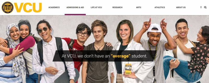
Similar to the University of Pennsylvania, the Virginia Commonwealth University Admissions website is all about energy and youthfulness, but at the same time communicating in a helpful, clear-cut way. Its design is rich in contrasts, and audiences are efficiently assisted through colour-categorized information.
- Top section with striking contrasts and vibrant pictures of students, generating a fresh, youthful feel
- The calls to action make it easier for users to find the information they need
- A dynamic 'Experience Life in RVA' section, made out of lively pictures of campus life, classes, and the community
- Side columns present relevant information on the page, such as tuition fees
McMaster University (Future Students)
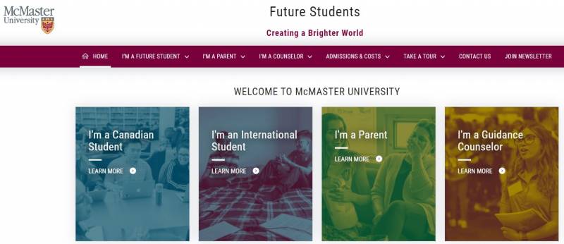
The McMaster University's Future Students page lists their most popular topics as questions, in an effort to increase engagement.
- User personas are presented through four self-identification boxes on the home screen, making the first step clear for the main website audiences
- Design is clean, economical, and rich on whitespace, making for a more down-to-earth, action-focused visual experience
- Topics and issues are formulated as questions, making them more relatable
- Chatbot on the lower right corner is large and conspicuous, with a straightforward call to action
Frank Batten School of Leadership and Public Policy (Applying to Batten)
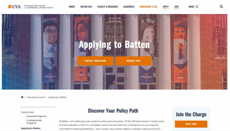
Everything about the Applying to Batten page on the Frank Batten School of Leadership and Public Policy shows that it was designed to make applications as seamless and painless as possible. The page looks clean, bright, and action-oriented.
- Action buttons are prominent and consistently styled.
- Information is intuitively organized, skimmable, and accessible.
- Content is tightly focused on helping prospective students choose and apply to a program.
- Empathetic features and content such as advice articles and sample applications provide applicants with a positive sense of encouragement.
University of Michigan Ford School (Admissions)
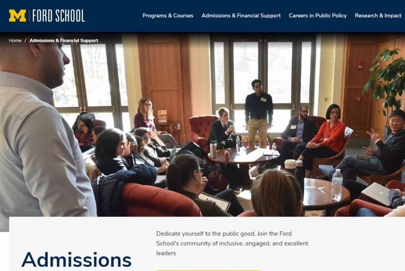
The designers for the University of Michigan Ford School site clearly had mobile users in mind. The clean, minimalist design says, "let's get to it," while the school's brand's bold yellow highlights the most important links.
- A mobile-first design provides a complete experience for both mobile and desktop users.
- A generous line-spacing and whitespace keep content accessible and easy to read on any size screen.
- The simple, card-style layouts adapt readily and neatly for different devices and screen sizes.
Simplicity Is the Key to Success
We hope this first tour through our favourite higher education websites gave you some ideas for your own site. If we were to sum all this up into one piece of advice, it would be: keep your design simple. It should work as a sure-fire antidote to your messaging complexity.
While some of these pages arrange lots of information together, most find their success in pulling it back and letting the absolute necessities shine. To achieve this, a good start is to:
- understand your key audiences deeply
- commit to those you want to reach the most
- tightly focus your design and content on what they need to know and do
If you accomplish this, your website will be halfway through its path to success. And stay tuned for Part 2!
Thinking about the next steps for your higher education website? Check out our previous work with higher education and settle in with some insights from our blog:
- Diversity, Inclusion, and Digital Admissions: A Practical Guide for Higher Education
- What's the Best CMS for Higher Ed in 2021?
- Empowering Universities with Large-scale Drupal Platforms Using Custom Upstreams
- Surprising Stats and Useful Facts About University Websites
- Higher Education Marketing: Web Strategies and Trends 2022
