
This blog post is based on the talk, Component Clarity: Taking A Strategic approach to modern CMS components, given by our team members, Celia McAlpine, Digital Strategist, and Jesse Dyck, Solutions Architect, at Digital Collegium 2025.
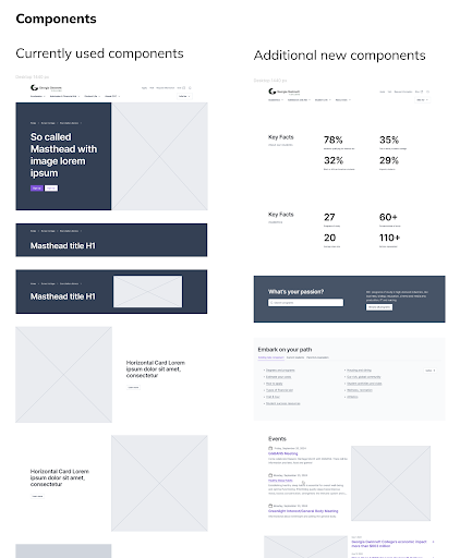
What Are Components, and Why Do They Matter?
Components are the modular building blocks that make up your website’s pages. Whether you use WordPress, Drupal, a decoupled front-end, or a completely different CMS, they’re the reusable patterns: banners, cards, carousels, call-to-action blocks, feature lists, that let content editors build rich, flexible layouts without starting from scratch.
When well-designed, components make your site faster to update, more consistent, and easier to maintain. They bridge the gap between design, development, and content strategy. But when they get out of control or too few or too complex, they can become a hidden source of complexity, making it harder to create consistent content, and contributing to technical debt.
Common component challenges
Components can empower your team, or trip them up, depending on how well they’re planned and maintained.
Too many components
When you have too many components, especially ones that are almost identical, editors face decision fatigue and inconsistency creeps in. Tiny variations in spacing or typography lead to visual drift and a fractured experience. It’s also harder to make updates to your brand when you have a lot of components to maintain and test.
Too many similar components
Three versions of a “card” component with only slight variations? That’s a signal your system needs pruning. Tiny differences in spacing or typography can make a big visual difference, but they don’t justify separate components.
Not enough components
At the other end of the spectrum, not enough options can frustrate editors, leading to bland, uniform content or messy workarounds (“Can I use some inline CSS to make the background red?”).
Overly multi-purpose components
And then there are overly multi-purpose components, the ones trying to do it all. They become confusing to use, hard to test, and difficult to maintain. When a single component, like a standard “Call to Action” or “Text and Media” is used for too many use cases, it often gets crammed with a lot of settings and optional fields. The result is often a slow-growing tower of maintenance debt that burdens both design and development teams.
If these issues sound familiar, it might be time for a component audit.
Related read: When accessibility isn’t easy: Website features that need extra love highlights how complex features and components can affect accessibility—and how to design for everyone.
Conducting a component audit
A component audit is your opportunity to pause, take stock, and bring clarity back to your system. It’s a systematic review of your existing components to identify gaps, overlaps, and opportunities for improvement.
Here is how to do it effectively:
Step 1: Define your audit scope and criteria
Start by choosing a scope that fits the problem you’re solving. Are you solving a governance problem? An editorial workflow bottleneck? A design-system inconsistency?
Your audit might have a narrow focus, like evaluating components used on landing pages, or it could be holistic, examining how your CMS supports your entire digital ecosystem.
Set criteria that make sense for your goals. You might look at:
- Editorial workflow: Are components easy for editors to use?
- Governance: Is there a clear process for requesting or approving new components?
- Consistency: Do components align with your brand and design system?
- UX and accessibility: Are they intuitive, inclusive, and compliant?
Related read: Why a Design System Without Governance Won’t Work explores how governance is the missing piece that turns a design system from a nice idea into a scalable, trusted tool.
Step 2: Inventory your existing components
Next, compile a complete list of your components from the CMS. Document their purpose, behaviours, variations, and where they’re currently in use. Your existing content editor documentation can be a good starting point, but be sure to fill in missing details.
Include practical information like:
- Name and purpose
- Where they’re used (templates, page types)
- Variations and behaviour
- Frequency of use
- Notes from editors and designers
- A screenshot example and link
The clearer your criteria, the more actionable your audit will be.
You can use a standard content or component inventory spreadsheet to capture these details. Several free templates are available online—for example, this component inventory template provides a clear structure for documenting purpose, variations, and usage patterns.
Step 3: Evaluate and identify gaps or opportunities
Once your inventory is ready, evaluate each component against your chosen criteria. Look for duplication, misalignment, or gaps.
Look for:
- Duplication: Similar components doing the same job
- Gaps: Missing building blocks editors need
- Standardization opportunities: Can variants be merged or rules clarified?
- Automation possibilities: Could any patterns be auto-generated or templatized?
- Alignment: Are components consistent with your brand, design system, and accessibility standards?
Step 4: Decide what to do next
Your audit should end with action:
- Retire components that no longer serve a purpose.
- Consolidate redundant ones into simpler, more flexible versions.
- Refactor those that need technical or design improvements.
- Keep the ones that are working well.
- This is your opportunity to bring clarity and control back to your system.
Document everything
Documentation is what turns a one-time cleanup into a sustainable system. Once you’ve rationalized your components, documentation becomes essential. Think of it as the user manual for your system, one that explains not only how each component works, but why it exists.
Good documentation keeps your site on brand, reduces guesswork, and ensures consistent behaviour across teams. It also acts as a test bed for your system: a place to capture expected behaviours, accessibility notes, text length recommendations, and image size guidelines.
Related read: Integrating AI into your content strategy and governance discusses how structured content systems and documentation help teams govern their digital ecosystems effectively.
What to include
Each component’s documentation should have:
- A description and purpose
- Expected behaviours and variations
- Example use cases
- Text length and image/video sizing guidance
- Accessibility requirements
- References to relevant variables or taxonomies
How to document
There’s no one right tool—it depends on your team. Options include:
- Figma for design-centric documentation
- Storybook for developers, showing live code examples
- Web-based component libraries or style guides for broader audiences
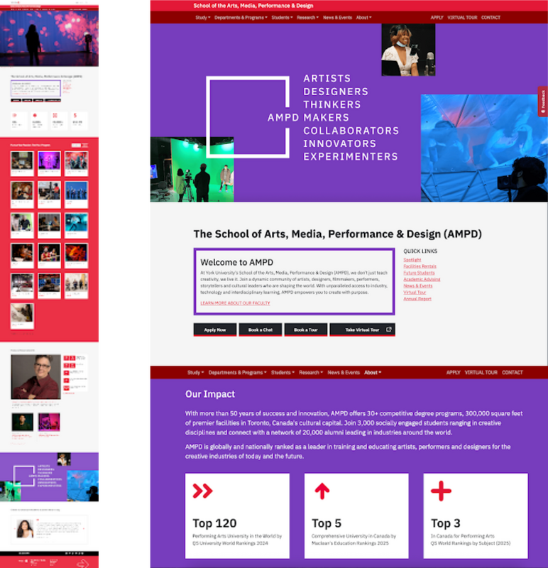
A simple library paired with content guidance might be enough for some teams, while others need a more tightly integrated system with advanced add-ons or developer README files. For instance, York University’s Digital Experience Hub is a great example of a university-wide design system that centralizes shared components, documentation, and accessibility standards, empowering individual faculties to adapt components while staying aligned with the overall brand.
Whatever format you choose, the goal is to have a single source of truth—kept up to date and accessible to everyone.
The role of a design system guardian
Even a well-documented system needs active stewardship. That’s where a design system guardian comes in: a person or small team who maintains vision and quality control across your components.
The guardian is responsible for:
- Overseeing new component proposals and updates
- Enforcing brand and accessibility standards
- Managing versioning and changelogs
- Preventing “scope creep” or duplication
Keeping it maintainable
Once your component library is organized and documented, the next challenge is keeping it healthy over time. Maintenance is steady, deliberate work that keeps your system scalable and consistent.
Future-proof your component library by:
- Maintaining a single source of truth for all components and documentation.
- Using versioning to track changes and understand what’s been updated, retired, or refactored.
- Keeping changelogs visible and accessible to your whole team.
- Avoiding unnecessary dependencies on outdated frameworks or third-party code that might limit flexibility later.
Reusing existing components is an effective way to maintain consistency and reduce development effort—but approach new variants with care. Each additional variant introduces complexity and increases long-term maintenance costs.
Before creating a new variant, ask whether it truly meets a unique need or if an existing component could be adapted instead. When new variants are necessary, build them deliberately: document their purpose, record changes, and make sure they align with your overall system standards.
A maintainable component library balances flexibility with control. With thoughtful governance, clear documentation, and disciplined version management, your system can continue to evolve without losing cohesion or quality.
Working within existing systems
Most organizations don’t build their components in a vacuum, they work within existing design systems and brand structures.
For instance, York University’s School of the Arts, Media, Performance & Design website exists within York’s multi-site architecture and established design system. The team used existing components from the York Digital Experience Hub but applied subtle creative twists, like a school-specific accent colour and bold typography, to reflect their own identity while staying true to the parent brand.
A successful approach balances respect for the existing system with thoughtful adaptation to your specific needs.
Related read: Designing for trust explores how consistency across components, design, and messaging builds user trust.
Final takeaways
Start with an audit. It’s the best way to understand what’s working, what’s redundant, and where opportunities lie. Use those insights to align your components with your content strategy and design system.
Then, document everything. Make your component library transparent, educational, and easy to use.
Finally, assume your components will evolve. Build a governance model that embraces change but keeps it intentional.
Need help getting there
We’ve guided many teams through component audits, design system development, and CMS modernization projects. From the public sector and higher education to healthcare and enterprise, we meet organizations where they’re at and are happy to jump in and collaborate with your team.
Reach out to us to chat directly with our strategy and technology teams about how we can work together.
