
The famous American physicist William Pollard famously once said, ”Information, unless it is organized, processed and available to the right people in a format for decision making, is a burden, not a benefit.” Sage words indeed from a man speaking in the pre-Internet world, before epidemic levels of information overload.
Pollard’s quote sums up the challenge of modern-day information architecture (IA) as it applies to website design. If content is king, then IA is the infrastructure that lets the king govern effectively. The larger the kingdom, the more crucial that infrastructure becomes.
Evolving Web has tackled innumerable IA challenges on projects with large multifaceted organizations. We employ a variety of user experience (UX) techniques to do so, ranging from cutting-edge digital tools to tried-and-tested analogue methods.
IA and UX: What’s The Difference?
Before diving into the details, it’s worth defining the terms IA and UX – two terms that are often used interchangeably – and making clear where they overlap and where they don’t.
Information architecture is the process of structuring and organizing web content so that users can find the information they need quickly and easily. It encompasses sitemap development, taxonomy, tags, and labels – basically anything that narrows the gap between you and the information you’re looking for.
UX is a key aspect of IA. It's about how users experience your website, including whether they find it easy-to-use, efficient, and engaging.
So you can have IA without UX, but not the other way around. Information architects make sure the road gets you from A to B. UX designers ensure the road is properly paved, safe, and smooth.
But while IA can technically exist without UX, it is greatly enhanced by a range of UX tools and techniques.
Women and Gender Equality Canada: Finding Architectural Workarounds
Women and Gender Equality Canada (WAGE) is a federal government department established to advance equality with respect to sex, sexual orientation, and gender identity or expression. WAGE approached Evolving Web in 2021 to reorganize its website, which lives within the Canada.ca infrastructure.
Specifically, WAGE wanted to improve its website’s information architecture, navigation, and top pages using modern and user-friendly approaches. The original site was built following Canada.ca’s Content and Information Architecture Specification with no IA customizations. It represented a mishmash of organizational and topic-based structure and nomenclature.
Early interviews with stakeholders revealed that the site’s shortcomings were making it a liability – so much so that WAGE staff weren’t even directing people to the site in their social media posts. It quickly became clear that a lack of architecture was making the site extremely difficult to navigate.
“If I were living gender-based violence, I wouldn't know where to go for help on this website,” explained one interviewee.
One major hurdle was that the site’s menu navigation included all of Canada.ca’s menu links, not just those within the WAGE site. Because this was a basic constraint of the Canada.ca framework, it was important for us to create logical information architecture where page content would serve as wayfinding tools—with the homepage content serving as a top-level navigation menu.

To address the information architecture challenges of the WAGE site, we did the following:
- Stakeholder and user interviews
- Content mapping with Miro
- Creation of website personas
- Tree testing
We used an extensive research and usability testing process to wholly restructure WAGE’s site. The new homepage serves as a navigational hub for key content, which is organized into categories such as “Services and information”, “Most requested” and “What are we doing”. This means that site visitors don't have use the menu navigation to search for content. It also makes the most popular content easy to find.
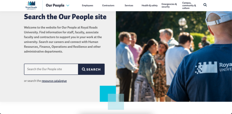
Royal Roads University: Linking Audiences with Content
The WAGE project was an example of common information architecture challenges. But in some cases, clients come to us with very specific challenges. This was the case with Royal Roads University in Victoria, BC, which approached us in 2022 for help with their internal website “Our People” – essentially a publicly viewable intranet.
The university needed to direct fine-tuned information to specific internal stakeholder groups, including full-time faculty members, contractors, and support staff. At the time they approached us, they had a website that was close to complete but that was a jumble of content for various audiences. At best it was confusing and at worst it had possible legal ramifications.
Solving the problem began with a series of workshops to nail down precisely who the university’s internal audiences were. Then we analyzed the entire existing site and flagging every single page by audience type.
From there, we constructed a new sitemap—first on Miro and then on Flowmapp, a platform that allows for more detailed notes such as where to create cross-links. We paid special attention to the use of labelling, as all content needed to be flagged and searchable by audience type.
Unlike the WAGE project, we didn't use tree testing in the restructuring of the Royal Roads website. Instead, we held workshops with the client to fine-tune the sitemap.
Other Techniques
Evolving Web uses a wide range of UX techniques to solve IA challenges, including ones not used in the case studies above. These techniques include:
- Closed card-sorting – a card-sorting technique where the facilitator suggests the categories and the client sorts the cards into said categories
- Open card-sorting – similar to the above except that the client both suggests the categories and sorts the cards into those categories
- Loop11 – an online usability testing tool that helps you identify what content on a website is easy to find versus what content requires a lot of searching
Information need never be a burden. With the right UX tools and effective communication, even the most chaotic website can be restructured into a platform that's easy to navigate.
