When you're trying to search for content on a website, being able to filter search results by date can be a huge help. This is especially true when users know exactly what they’re looking for, like events taking place next week, or an article they know was published three months ago.
In this article, we’ll explore three UI patterns that developers can use to create date filters and explore which option to use based on your use case.
👩💻 Read Our Article: How to Create a Great On-site Search UI Through Iteration
Option 1: Checkboxes or Singular Select Boxes
Checkboxes or singular select boxes to represent lists of years are one of the most popular date filter UI patterns for lists of publications, such as documents, reports, or simply web pages listed in a search. This option's main advantage is its simplicity.
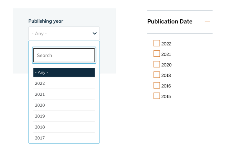
When to use this option:
This is ideal for search use cases where precision is less important, and content is associated with a single date field. But this option can result in a lengthy filter visually, especially if the organization has content from many years. So, before choosing it, make sure to check out the two other options below!
Option 2: Calendar Date Picker
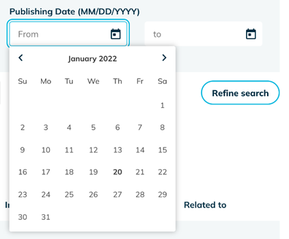
The calendar date picker provides an interface for selecting the start and the end date as filter criteria, as shown above. This is a highly visual option if a user is looking for content, such as searching for events over a particular period.
This design pattern requires users to click several times to filter the results, scrolling through month by month to select the date range. This interface can be fiddly for users who want to choose a broad range of dates.
When to use this option:
This is the standard for accommodation search interfaces for instance. Users can go through this interface to find the most useful and pertinent results within that time frame.
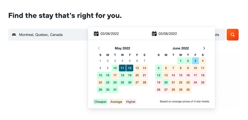
This is a great option to give end-users the most accuracy in their search. Sometimes, your users will want to be very specific about the content they are searching for, and date pickers can give them more granularity.
It’s great for hotel search interfaces and for filtering documents or an archive. For example, if you have an interface for patients to look up information from past appointments, a date picker will allow them to search within a custom range if they can’t remember the exact date.
Option 3: Custom Date Range Selector
For users who want to access the latest documentation or a publication from the past month, six months, past year, two years, or even older, we highly recommend using a custom date range selector as shown below.
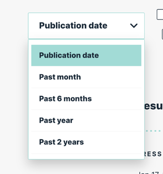
This date filter UI pattern can be designed as either a dropdown select box shown above or a list of checkboxes. The main advantage of a custom date range selector is its speed and flexibility. The user can quickly select from a set of common date ranges (e.g. "Last 7 days," “Past 6 months”, "This month," "All time"). As a UX designer, the options you make available should align with the content on your site and the use cases for search.
If the date filter is used for the published date, look at the frequency with which content is published and how valuable older content is to users. If it's used to filter upcoming events, “today” or “this weekend” will look at the number of events and for which days users are typically searching.
Eventbrite, for example, offers a quick filter for “today” and “this weekend”:

When to use this option:
This option is ideal for search use cases where you have a lot of relevant content for specific periods. For example, if your university has several events throughout the year, a custom date filter can save a lot of time for your users. In addition, anyone wanting to consult past events, and see how far ahead upcoming dates are typically scheduled, can do so with predetermined timeframes. This would help them plan accordingly.
Knowing what users expect when visiting your website and catering to their needs is fundamental to your UX strategy success. In that sense, making the right choices in your on-site search UI is essential to ensure your visitors are having the best possible experience.

