A well-designed non-profit website engages, informs, and empowers users to join your organization in its quest to solve a problem. The best NGO website design—or for any other kind of non-profit organization—should:
- Increase donations
- Support the fundraising process
- Build awareness for your cause and the impact you're making
- Engage the community and grow membership
- Garner loyalty and trust
In this article, we'll provide a curated list of non-profit websites we love, with insights about why its features are important, highlighting UX, design, communications, and action-provoking aspects of their web pages.
👨🏫 Also, check out our 10 Best Non-Profit Websites of 2023
List of Categories
Best Non-Profit Websites — Environmental
Environmental non-profit websites have the benefit of having the most beautiful subject matter—planet Earth—as their backdrop, so environmental non-profits should use that eye-catching imagery to their advantage, as we did when we redesigned Emory University's Climate Talks website.
Only One
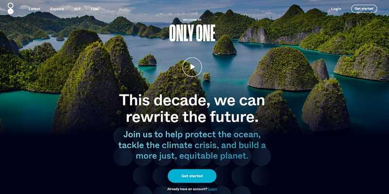
Only One was founded in 2019 by Sea Legacy and the Blue Sphere Foundation to amplify stories that inspire action to protect the ocean, the planet, and those who are disproportionately affected by the climate crisis. It is a platform where individuals and organizations can share information, stories, and solutions to help improve the health of the planet.
The website's homepage greets you with beautiful imagery that immediately grabs the user's attention. It puts the reader at the center of the initiative to picture themselves getting involved and shows them how easy it is to participate.
- Clear mission statement
- Beautiful art direction of imagery
- Clear and concise copy
- Emotional and action-oriented call to actions: "join us" "take action"
1% For the Planet
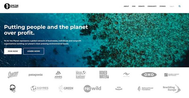
1% For the Planet was launched in 2002 by Yvon Chouinard, founder of Patagonia, and Craig Mathews, founder of Blue Ribbon Flies. It's a global movement that encourages companies to donate one percent of their annual profits to environmental initiatives.
The website homepage is clean and straightforward, with imagery that stirs up emotion as you scroll down the main page. The inclusion of partner logos also helps reinforce the cause's legitimacy, giving users more confidence when choosing to get involved.
- Clear mission statement
- Clear invitations to join or learn more
- The copy is consistent with the theme. (i.e. percentages and their impact are used throughout.)
- Transparent funding process
- Use of stories and visuals is engaging and inspiring.
Best Non-Profit Websites — Health/Medical
The goals of health and medical non-profits can vary greatly. This means medical non-profits need to be very clear about what problem they're trying to solve, who they're trying to help, how they're doing that, and how supporters can get involved.
Mothers2mothers
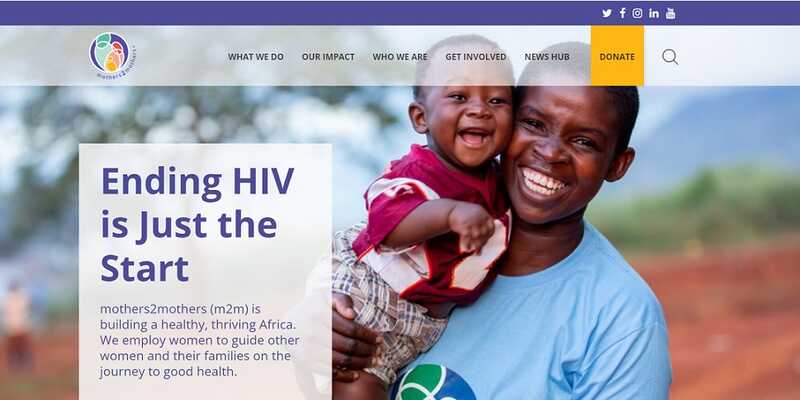
Mothers2mothers employs and trains women in Africa living with HIV as community health workers called mentor mothers. These women support the organization's three core client groups (women, children, and adolescents). They provide vital medical services, education, and support to eliminate mother-to-child transmission of HIV/AIDS while providing meaningful work for women in 10 countries across Africa.
The website uses text and imagery to communicate the organization's impact clearly. While the design layout is somewhat outdated, it's undoubtedly simple, allowing the reader to focus on the goals and message of the organization.
- The impact is clear from the get-go.
- Imagery communicates the impact in the community and humanizes the organization.
- Drop-down menu shares impact and financial reports, so supporters know exactly where their money is spent and how it's helping.
- Community member stories inspire readers to support the organization.
The END Fund
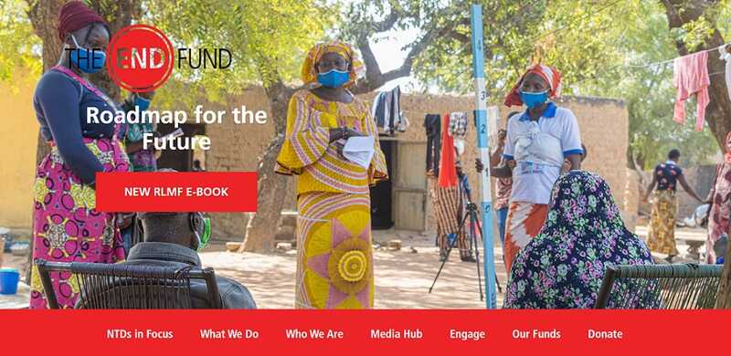
The END Fund's main focus is on delivering critical treatments for neglected tropical diseases (NTDs) to those in need.
The website effectively uses visual storytelling to engage the reader and explain the organization's goals. It also uses clear graphics and statistics to illustrate the problem it is trying to solve.
- Iconography relates closely to the issues, good sense of visual storytelling
- Clear headers
- An interactive map makes the content engaging and easy to explore.
Best Non-Profit Websites — Community/Social Services
Community non-profits may include affordable housing initiatives, local food banks, family services, or homeless shelters, among others. They should emphasize their local roots to build a community feeling when potential supporters arrive at their website.
World Housing
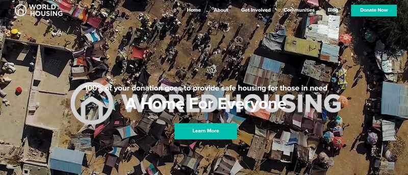
World Housing's mission is to provide a safe home for people in need. The organization has provided safe homes for over 4,000 people in El Salvador, Mexico, Colombia, Haiti, Cambodia, the Philippines, and Canada.
The World Housing website uses an introduction video to capture the reader's attention and explain what the organization does. It includes clear calls to action, providing options to learn more or get involved in multiple easy-to-find places.
- Stats and impact are front and center, giving the organization legitimacy.
- Consistent photo styling makes for a clean, approachable website.
- Memorable brand colours and imagery
- An interactive map shows where the organization is impacting the world.
- The blog section explains the organization's many projects in detail, so donors can see where their money is going.
Double Up Food Bucks: Michigan
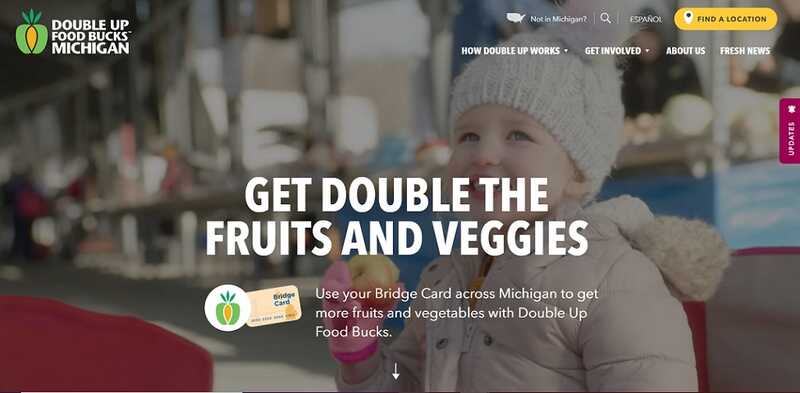
Double Up Food Bucks partners with local grocery stores and farmer's markets, matching every EBT/Bridge Card or food stamp dollar a family spends on fruits and vegetables, up to $20 per day, effectively doubling the amount of fresh food that a family can buy.
The interactive features throughout the website demonstrate the impact of the organization's work, and the use of local images and Michigan-specific content give a local, grassroots feeling. The website clearly offers options for those who are not from Michigan as well, linking to the organization's other state-specific websites.
- Interactive features demonstrate the impact of the work.
- Imagery and content have a local feel—like your own backyard and community.
- Very clear calls to action break down the steps to get started.
- The mission is communicated clearly.
- Drop-down menus are brief and keep the landing page uncluttered.
Best Non-Profit Websites — Conservation
Whether the goal is to protect animals, habitats, waterways, trees, or any other part of our environment, these websites need to drive home to readers why the thing they're trying to conserve is so important.
World Wildlife Fund
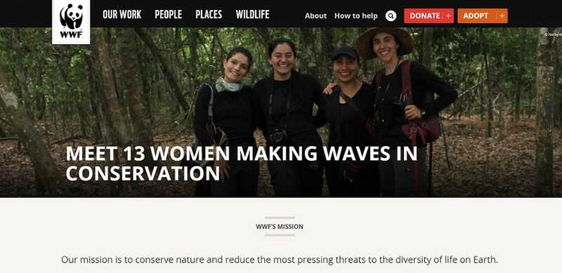
The World Wildlife Fund (WWF) works in nearly 100 countries to develop and deliver innovative solutions to protect wildlife, habitats, and communities.
The WWF website puts its mission statement front and center. It's also organized into easy-to-find sections for users to learn more, and drop-down menus allow readers to choose how they want to support the organization before they even leave the landing page.
- The mission statement is clearly stated.
- Very clear calls to action with options for how to support
- The landing page is organized for users to quickly find the information they're seeking.
- Easy-to-find links to their policy and partnerships, to inform supporters where their money is going
Nature United
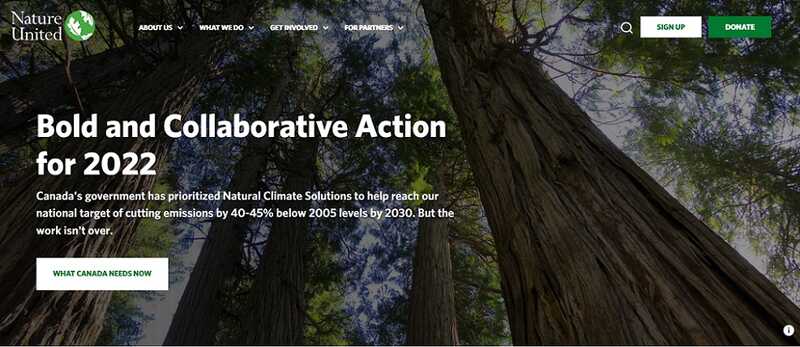
Nature United is a Canadian organization that partners directly with Indigenous Nations across the country along with other environmental groups to create solutions to Canada's most significant conservation and environmental challenges.
The website uses bold imagery and strong type to make its content easy to read while drawing the user in. There are clear calls to action throughout the website, and the opportunity to become a member of the organization helps create a community around the organization's initiatives.
- Very clear calls to action with options for how to become a member
- Clickable drop-down menus make it easy to find more information.
- Eye-catching visuals draw readers in and encourage them to explore further.
- The search option allows users to look for specific information quickly and easily.
- A clean, trustworthy donation funnel includes fields to support individual donor requirements. (dedication, anonymity, tax credit, etc.)
Best Non-Profit Websites — International
International non-profits focus on solving problems that affect the world's most vulnerable people. These organizations need to inspire readers, who often live far away from the people and places they're serving, to want to get involved.
Women Deliver
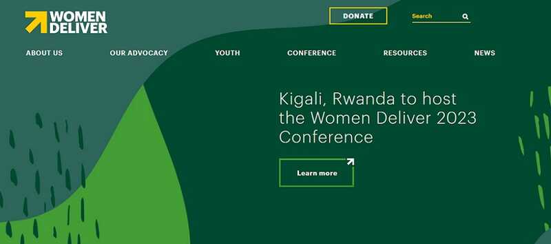
With a focus on sexual and reproductive health, Women Deliver advocates for gender equality and the health and rights of girls and women worldwide.
The clear lettering against a dark background on the main page makes the content easy to read. Their mission is stated clearly, and the quick links box allows readers to find important information quickly.
- Very clear calls to action with links to donate, learn more and join the community
- Clickable drop-down menus make it easy to find more information, with a link to their annual report for financial transparency.
- The 'Meet the Young Leaders' section helps readers see and understand the impact of their donation.
Oxfam Canada
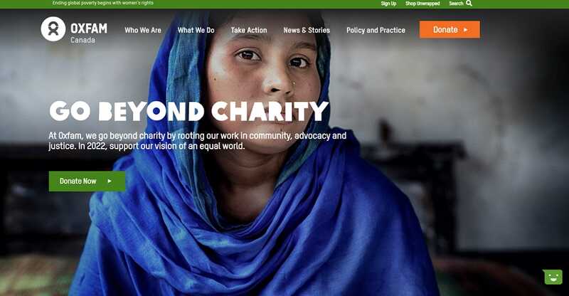
Oxfam Canada builds lasting solutions to poverty and injustice by promoting the rights of women and girls and improving their lives.
The website offers three places for readers to donate right away, including one prominent section that allows $25, $50, or $100 donations with just one click. A video further down the homepage shows you exactly who you're helping and how you're helping them by donating. Readers are provided with different ways to support the organization at every step.
- Imagery is captivating and shows readers who they're helping.
- Very clear calls to action with a variety of ways to support or donate (Take action drop-down, donate buttons, one-click donation buttons, join campaign, fundraise for Oxfam, give a gift)
- Impact stories show the actual results of the organization's work.
- Content is clear, concise and easy to read.
- Content is organized so users can find all the information they need right away.
Best Non-Profit Websites — Disaster Relief
Disaster-relief non-profits focus on taking immediate action in times of crisis. When designing a website, they should leverage the work they've done in the past to encourage readers to support future projects.
Americares
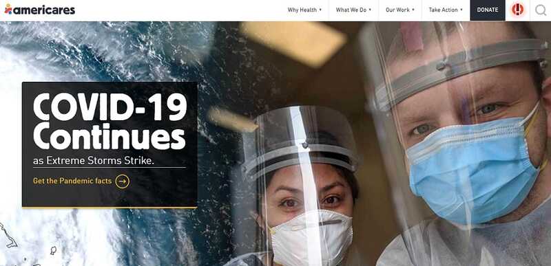
Americares help communities respond to and recover from disasters by providing people access to medicine and supplies, clinical services, and other programs to strengthen their health.
The website uses images effectively to convey the impact a disaster can have on a community. An attention-grabbing emergency icon in the top-right corner points users directly to the organization's most urgent programs. There are also multiple calls to action throughout the site to encourage readers to support the organization.
- The donation page explains the impact of a dollar, encouraging donors to give more.
- Great use of images gives a face to the communities they're helping.
- Each current project has its own page where readers can learn more.
- Content is well-organized and clearly explains what the organization does and how it operates.
- Accreditations on the donation page increase the organization's legitimacy.
ShelterBox
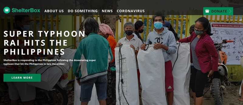
ShelterBox provides emergency shelters to families who have lost their homes due to disaster or conflict.
The ShelterBox website is clean and simple, with engaging imagery that helps to explain who they're helping and how. The landing page prominently features the organization's most current project, indicating the urgent need for support. The website can also easily be translated to multiple languages using the drop-down menu in the bottom corner, making it accessible for people of all backgrounds to learn about their work and get involved.
- Donate button is prominently displayed at the top of the screen.
- Content is clean and organized, so readers can quickly and easily learn what the organization does.
- Multiple options to learn more about the different ways in which the organization has helped around the world increases its legitimacy
Best Non-Profit Websites — Child and Youth
Child and Youth non-profits focus on improving the lives of children both locally and around the world. Children face unique challenges and have specific needs, so these organizations have to be clear about which children they're helping and how. They also need to show how their work will impact those children's families and communities, inspiring readers to support.
Make-A-Wish
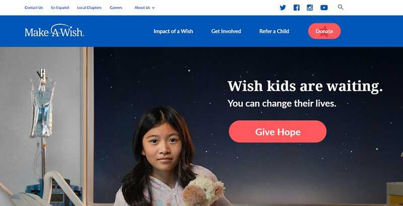
The Make-A-Wish Foundation grants "wishes" to children with critical illnesses as a way to provide them with hope and strength to continue fighting for their health or to just provide a bright spot in an otherwise dark time in their young lives.
Images of current and past Make-A-Wish children are included on every page of the website, driving readers to an emotional response while giving a face to the children their money is helping. The website is clean and organized and highlights children's stories at every turn to illustrate the organization's impact and inspire readers to get involved.
- Donate button catches your eye as soon as you arrive on the main page.
- "Wish Kids" photos and stories generate an emotional and inspiring impact.
- Statistics on the main page show the impact of donating while illustrating the need for more donors.
- Content is well-organized and easy to read with a clear, strong type.
- Consistent, page-to-page branding brings the entire website together.
- The donation page allows donors to choose where they want their money to go.
Girls Who Code
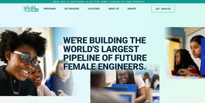
Girls Who Code's goal is to close the gender gap in technology by providing programs for girls to learn about technology and programming so they see it as a viable career option.
Right away, the organization's mission statement takes center stage on the homepage, supported by imagery of the girls who benefit from their programs. The site uses bold colours to make it more accessible, and their donation page includes an FAQ to explain how donations are used, improving their transparency and instilling confidence in potential donors.
- Clean design and bold fonts and colours support the website's theme while being easy to read for users.
- The imagery of girls helps connect readers with who they're helping.
- Statistics and infographics illustrate why the organization's work is important.
- The website uses a variety of formats (text, video, podcast, etc.) to engage with readers and explain the organization's programs and impact.
- A consistent page-to-page branding form brings the entire website together.
- FAQ on donation page increases financial transparency.
Best Non-Profit Websites — Faith-Based Organizations
Faith-based non-profit organizations work at all levels—local, national, and international. With the religion of the organization's founders is at its core, its main users are likely people of the same faith, and the messaging should speak to their beliefs to inspire them to support the cause.
Adra
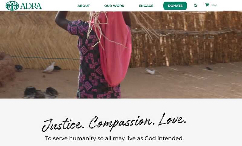
Adra is the official humanitarian agency of the Seventh-Day Adventist Church. The organization works with communities around the world to help them lift themselves out of poverty and create brighter futures.
An introduction video on the homepage draws readers in right away, and a quick scroll reveals their mission statement clearly and concisely. The website is clean and simple, blending images and symbols to illustrate the content and improve its accessibility. The accountability page found in the About menu provides the organization's financial statements dating back several years, giving readers confidence that their donations will be used effectively.
- Clean design and contrasting colours make the content easily readable.
- Video on the main page engages the user right away.
- Symbols on the homepage and the donation page illustrate the content and improve accessibility.
- Good use of consistent branding from page-to-page
- Well-organized content makes for easy website navigation.
- Catalogue feature to purchase tangible donations is a unique way to raise funds.
LifeWater
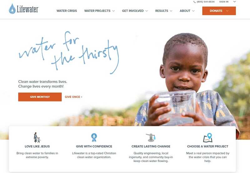
Lifewater is a Christian organization that implements safe water solutions in communities around the world.
As soon as you enter the website, you know exactly what the organization is about. Their mission statement is summed up on the main page in four words: water for the thirsty. The organization includes the names and faces of people who are directly benefitting from their services, creating stories that inspire readers to want to help. Users can also quickly scroll through the projects the organization is involved with and see how much money has been donated to each one of them, to determine the most urgent needs.
- Very effective use of stories inspires readers to donate.
- Symbols on the homepage and donation page efficiently illustrate the content.
- Clean, readable text improves the website's accessibility.
- Well-organized content improves the navigation experience
- Video on the 'Water Crisis' page explains how the organization works in a clear way.
- Project donation infographics show who, where, and how much of their financial target they've achieved so far, encouraging readers to support specific projects.
Best Non-Profit Websites — Animals
Animal non-profits ensure animals are cared for and fight for the proper treatment of animals of all kinds. These organizations can, and should, take advantage of both positive and negative imagery to tell the stories of the animals they are trying to protect.
Fetch and Releash
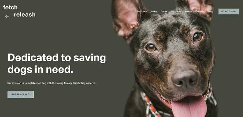
Fetch and Releash rescues dogs from high-kill shelters and helps put them in loving homes through their foster and adoption programs.
The website puts the organization's mission in bold, easy-to-read font at the top of the landing page, using a dark, contrasting background and accompanying image of a dog to let readers know right away what they're all about. It does an excellent job highlighting their adoptable dogs, allowing the animals to "do the talking" and inspiring readers to get involved.
- Very effective use of images and stories to inspire readers to get involved
- Bold, clear font is easy to read.
- Text is concise to keep the homepage uncluttered.
- Detailed FAQ page answers questions and improves transparency.
- Well-organized content allows users to easily navigate the website.
The Humane League
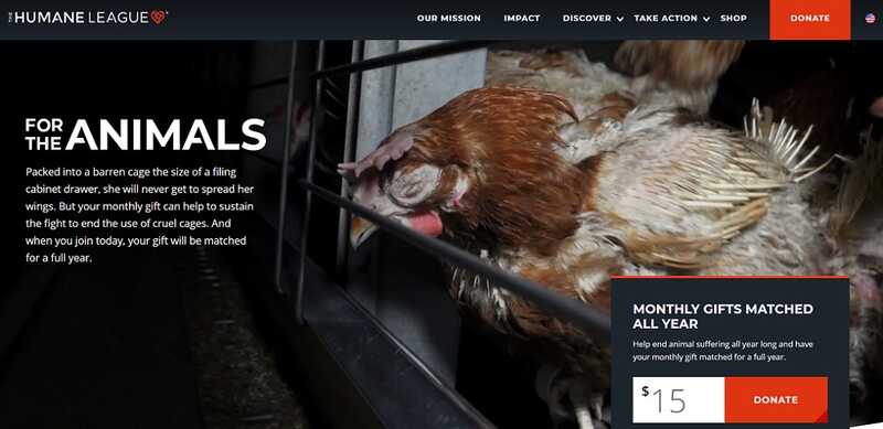
The goal of the Humane League is to end the abuse of animals in the agriculture sector who are being raised for food.
The website uses an uncluttered and straightforward design to deliver its message, along with bold, occasionally jarring images to emphasize the importance of its work. It also includes stories of past and current activists and donors throughout the site to encourage readers to get involved.
- Very effective use of images and stories to inspire readers
- Bold, clear font is easy to read.
- One-time or monthly donations are available right on the homepage.
- Good use of statistics to illustrate the organization's mission and progress
- Top-rated charity awards display on the homepage builds trust.
Best Non-Profit Websites — Sports and Fitness
Sports and fitness non-profits focus on making physical activity and play accessible to people in all types of communities. These organizations need to effectively explain why sports and recreation are crucial to a healthy community to encourage readers to donate to their cause.
Right to Play
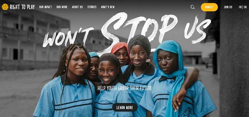
Right to Play uses the power to play as its jumping-off point to help children living in difficult and dangerous places stay in school, resist exploitation, overcome prejudice, and heal from war and abuse.
Large, impactful imagery on the homepage and throughout the entire site supports the organization's vision and engages the reader while putting a clear focus on the people it is trying to serve. The interactive map on the 'Our Work' page allows users to see where the organization is having an impact.
- Very effective use of images to support the organization's mission
- Donate buttons on every page provide plenty of opportunities for readers to give.
- The use of infographics on the 'Our Impact' page clearly explains the benefit of sport for children.
Playworks
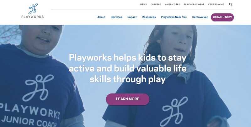
Playworks helps schools rethink recess. The organization works to improve playtime through onsite staffing and consultation to improve safety, engage students and empower them to start activities independently.
The Playworks website uses a clean design and bold font to communicate its message. As soon as you arrive on the landing page, a video begins playing in the background to show readers exactly what the organization is all about---kids.
- Emotive introduction video reinforces the mission statement with their activities.
- Playful micro-animations in the "Learn More" button allude to the playful nature of their work.
- Bold fonts on contrasting backgrounds make content easy to read.
- Real and dynamic photos add to a sense of character and personality and highlight the communities they impact.
- An interactive map on the homepage invites the user to play and learn more in a simple way.
- The homepage is long but well-organized and structured.
- Good sense of organization in the menu bar with consistent categorization and labelling, making their services and organization accessible and approachable.
- Statistics on the homepage drive home the importance of the organization's work.
- Donate page is straightforward, with a clean layout that makes it look trustworthy.
A well-designed non-profit website will elevate your organization and encourage visitors to support your cause. By presenting your content in an engaging and inspiring way while organizing it so that it's easy to navigate for your users, you'll create a larger impact and support your overall goals.
Want to learn how to build great user experiences in Drupal?

